Table of Contents
Preparing the data
We start from the preprocessed SingleCellExperiment object created in ‘Selection of biologically relevant cells for the Grant (C075) retinal epithelial cells data set’.
Motivation
The most challenging task in scRNA-seq data analysis is arguably the annotation of cells with meaningful labels. We might attempt to label cells individually or to label clusters (with cells assigned to those clusters ‘inheriting’ the cluster-level label).
In ‘Selection of biologically relevant cells for the Grant (C075) retinal epithelial cells data set’, we obtained one set of labels:
- ‘cluster’ labels using clustering. Obtaining clusters of cells is fairly straightforward, but it is more difficult to determine what biological state is represented by each of those clusters.
In this section we use Pre-defined marker genes and perform Cluster marker gene detection to construct de novo marker gene lists that can be used to aid the interpretation of the clustering results. The de novo marker genes lists use a data driven approach to identify those genes that drive separation between clusters whereas the pre-defined marker genes are a more targeted approach to cluster annotation. These two approaches complement one another.
As a reminder, Figure 1 shows the clustering results overlaid on the UMAP plot and Figure 2 breaks down the clusters by key experimental factors.
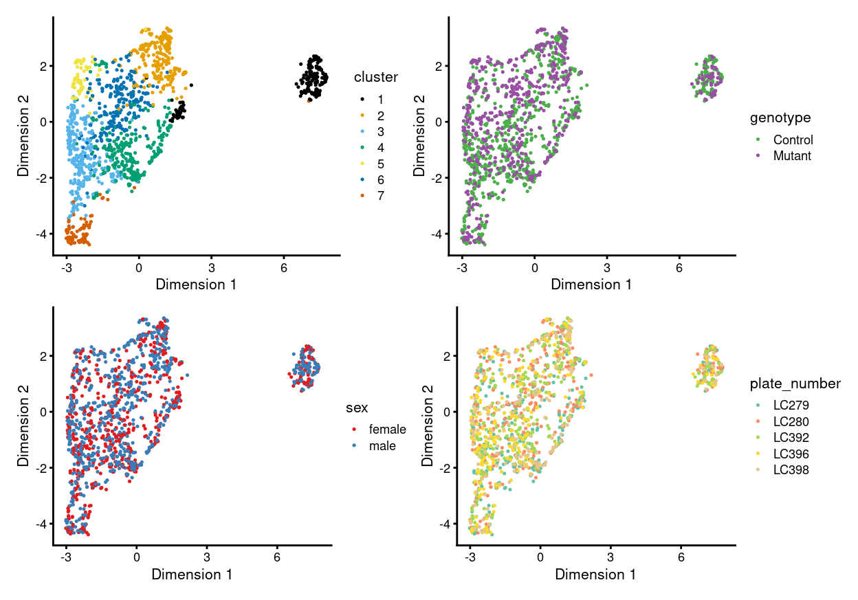
Figure 1: UMAP plot, where each point represents a cell and is coloured according to the legend.
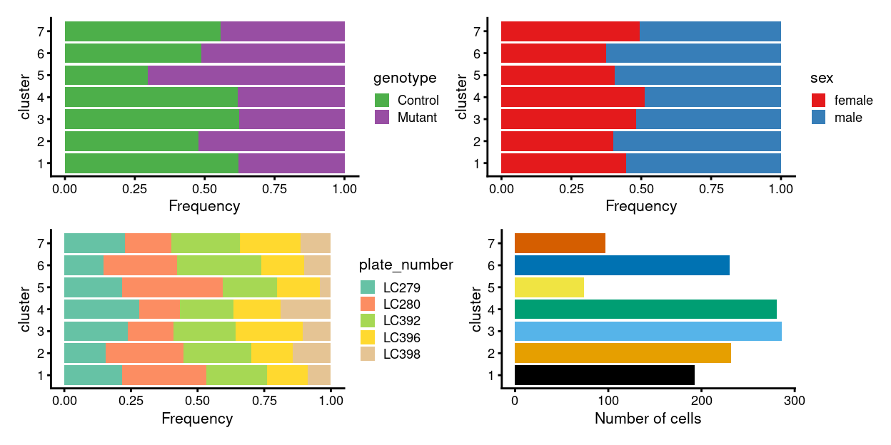
Figure 2: Breakdown of clusters by experimental factors.
We conclude by performing Cell cycle assignment and by describing the choice of Visualization options for the plots used in this report, as well instructions for how to make your own plots.
Pre-defined marker genes
We examine Zoe’s gene list and also perform a simple visualization of the FACS markers.
Zoe’s gene list
Motivation
Zoe sent me a list of marker genes to help characterise the cells1.
Analysis
Figure 3 is a heatmap of Zoe’s marker genes. It is challenging to immediately associate clusters with a cell type on the basis of these marker genes, but some patterns are clear, such as:
Arterymarker genes are highly expressed in cluster 7.Artery, tipmarker genes are highly expressed in clusters 5 and 7.Tipmarker genes are highly expressed in cluster 5.
The expressions patterns for the other marker gene sets are more complex, such as a subset of the gene set being not expressed, restricted to particular cluster(s), or ubiquitously expressed across clusters.
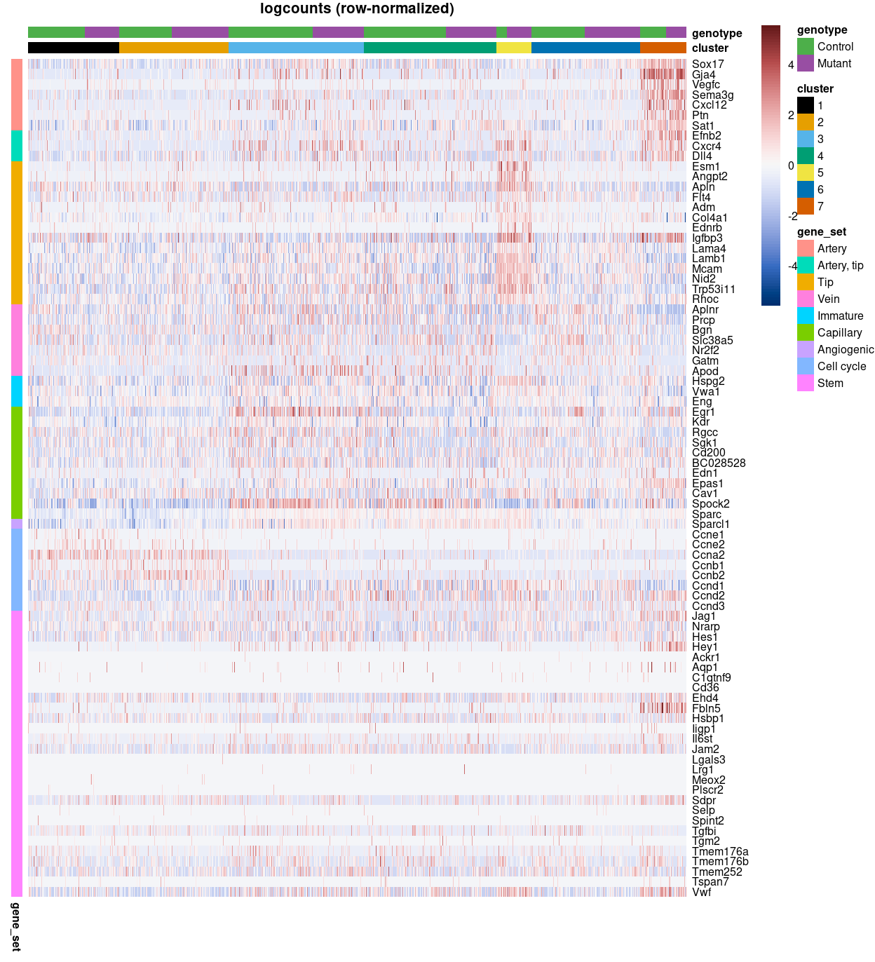
Figure 3: Heatmap of row-normalized logcounts for Zoe’s marker genes. Each column is a sample, each row a gene. Samples are ordered by cluster then by genotype.
FACS markers
Several FACS markers were collected for these cells: FSC_A, FSC_W, FSC_H, SSC_A, SSC_W, SSC_H, R660_20_A_APC, B530_30_A_GFP, Y582_15_A_td_Tomato, V450_50_A_DAPI, and Y780_60_A_PE_Cy7.
Absolute FACS measurements are generally not comparable across samples for a number of reasons2 and normalization methods are underdeveloped. We apply a simple ‘scaled rank’ normalization method, which is to rank within each plate the FACS measurements between 0 and 1 (0 being the lowest and 1 being the highest). This is a very drastic normalization that removes much of the quantitative information potentially available in the FACS data.
Figure 4 presents a simple summary of the FACS data by overlaying it on the UMAP plot.
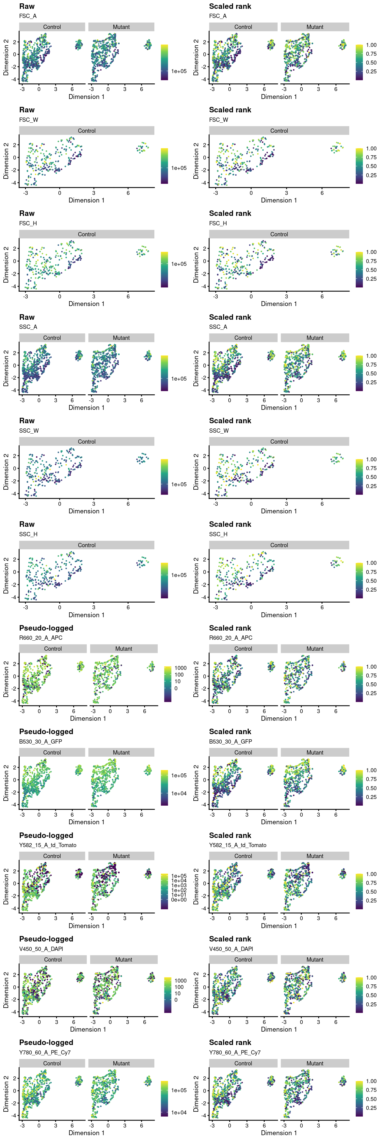
Figure 4: Overlay of index sorting data on UMAP plot. For each marker, the left-hand plot shows the ‘raw’ or ‘pseudo-logged’ fluorescence intensity and the right-side plots the ‘scaled rank’ of the raw intensity. The pseudo-log transformation is a transformation mapping numbers to a signed logarithmic scale with a smooth transition to linear scale around 0. This transformation is commonly used when plotting fluorescence intensities from FACS. The scaled rank is applied within each plate_number and assigns the maximum fluorescence intensity a value of one and the minimum fluorescence intensities a value of zero. It can be thought of as a crude normalization of the FACS data that allows us to compare fluorescence intensities from different plates.
Cluster marker gene detection
Motivation
To interpret our clustering results, we identify the genes that drive separation between clusters. These marker genes allow us to assign biological meaning to each cluster based on their functional annotation. In the most obvious case, the marker genes for each cluster are a priori associated with particular cell types, allowing us to treat the clustering as a proxy for cell type identity. The same principle can be applied to more subtle differences in activation status or differentiation state.
Identification of marker genes is usually based around the retrospective detection of differential expression between clusters3. Genes that are more strongly DE are more likely to have driven cluster separation in the first place. The top DE genes are likely to be good candidate markers as they can effectively distinguish between cells in different clusters.
Statistical methodology and considerations
It is important to have some understanding of the statistical methodology used for marker gene detection. This section gives an overview.
Gene lists
For each cluster, the DE results of the relevant comparisons are consolidated into a single output table. This allows a set of marker genes to be easily defined by taking the top DE genes from each pairwise comparison between clusters. Other statistics are also reported for each gene, including the adjusted p-values4 and the log-fold changes relative to every other cluster.
Use of pairwise comparisons
We intentionally use pairwise comparisons between clusters rather than comparing each cluster to the average of all other cells. The latter approach is sensitive to the population composition, potentially resulting in wildly different sets of markers when cell type abundances change in different contexts. In the worst case, the presence of a single dominant subpopulation will drive the selection of top markers for every other cluster, pushing out useful genes that can resolve the various minor subpopulations. Moreover, pairwise comparisons naturally provide more information to interpret of the utility of a marker, e.g., by providing log-fold changes to indicate which clusters are distinguished by this gene.
Blocking
We perform intra-plate comparisons by blocking on the plate_number to avoid confounding effects from differential expression between plates5.
Choice of test statistic
The Welch \(t\)-test is an obvious choice of statistical method to test for differences in expression between clusters. It is quickly computed and has good statistical properties for large numbers of cells (Soneson and Robinson 2018).
Alternatively, we could consider the Wilcoxon rank sum test (also known as the Wilcoxon-Mann-Whitney test, or WMW test). Its strength lies in the fact that it directly assesses separation between the expression distributions of different clusters. The WMW test statistic is proportional to the area-under-the-curve (AUC), i.e., the concordance probability, which is the probability of a random cell from one cluster having higher expression than a random cell from another cluster. In a pairwise comparison, AUCs of 1 or 0 indicate that the two clusters have perfectly separated expression distributions. Thus, the WMW test directly addresses the most desirable property of a candidate marker gene, while the \(t\)-test only does so indirectly via the difference in the means and the intra-group variance.
Another alternative, the binomial test, identifies genes that differ in the proportion of expressing cells between clusters6. This represents a much more stringent definition of marker genes compared to the other methods, as differences in expression between clusters are effectively ignored if both distributions of expression values are not near zero. The premise is that genes are more likely to contribute to important biological decisions if they were active in one cluster and silent in another, compared to more subtle ‘tuning’ effects from changing the expression of an active gene. From a practical perspective, a binary measure of presence/absence is easier to validate.
The Welch \(t\)-test is our default method for identifying marker genes.
Direction and magnitude of the log-fold change
There are 3 ways of specifying the direction of the log-fold change used in the statistical test when comparing cluster \(X\) to cluster \(Y\):
direction = "any": Identify genes that are upregulated or downregulated in \(X\) compared to \(Y\).direction = "up": Identify genes that are upregulated in \(X\) compared to \(Y\).direction = "down": Identify genes that are downregulated in \(X\) compared to \(Y\).
Generally speaking, downregulated genes are less appealing as markers as it is more difficult to interpret and experimentally validate an absence of expression. We therefore mostly focus on identifying genes that are upregulated (i.e. direction = "up") in the chosen cluster relative to any/some/all other clusters . Of course, this increased stringency is not without cost. If only upregulated genes are requested then any cluster defined by downregulation of a marker gene will not contain that gene among the top set of features in its gene list. This is occasionally relevant for subtypes or other states that are distinguished by high versus low expression of particular genes.
Choice of combining pairwise DE results into a marker list
There are 3 ways of combining the pairwise DE results to obtain the per-cluster marker gene lists:
pval.type = "any": Consolidating with DE against any other clusterpval.type = "all": Consolidating with DE against all other clusterspval.type = "some": Consolidating with DE against some other clusters
It is important to understand the differences between these strategies, which are described below in some detail.
pval.type = "any": Consolidating with DE against any other cluster
If pval.type = "any", the null hypothesis is that the gene is not DE in any pairwise comparison. The genes in each cluster’s gene list are sorted by the minimum rank (by significance) across all pairwise comparisons (called the Top value). Taking all rows with Top values less than or equal to \(T\) yields a marker set containing the top \(T\) genes from each pairwise comparison.
This strategy guarantees the inclusion of genes that can distinguish between any two clusters.
To demonstrate, let us define a marker set with a \(T\) of 1 for a given cluster. The set of genes with Top\(\leq1\) will contain the top gene from each pairwise comparison to every other cluster. If \(T\) is instead, say, \(5\), the set will consist of the union of the top 5 genes from each pairwise comparison. Obviously, multiple genes can have the same Top as different genes may have the same rank across different pairwise comparisons. Conversely, the marker set may be smaller than the product of Top and the number of other clusters, as the same gene may be shared across different comparisons.
This approach does not explicitly favour genes that are uniquely expressed in a cluster. Rather, it focuses on combinations of genes that - together - drive separation of a cluster from the others. This is more general and robust but tends to yield a less focused marker set compared to the other pval.type settings.
For each gene and cluster, the summary effect size is defined as the effect size from the pairwise comparison with the lowest p-value. The combined p-value is computed by applying Simes’ method to all p-values. Neither of these values are directly used for ranking and are only reported for the sake of the user.
pval.type = "all": Consolidating with DE against all other clusters
If pval.type = "all", the null hypothesis is that the gene is not DE in all pairwise comparisons. A combined p-value for each gene is computed using Berger’s intersection union test (IUT). Ranking based on the IUT p-value will focus on genes that are DE in that cluster compared to all other clusters.
This strategy is particularly effective when dealing with distinct clusters that have a unique expression profile. In such cases, it yields a highly focused marker set that concisely captures the differences between clusters.
However, it can be too stringent if the cluster’s separation is driven by combinations of gene expression. For example, consider a situation involving four clusters expressing each combination of two marker genes A and B. With pval.type = "all", neither A nor B would be detected as markers as it is not uniquely defined in any one cluster. This is especially detrimental with overclustering where an otherwise acceptable marker is discarded if it is not DE between two adjacent clusters.
For each gene and cluster, the summary effect size is defined as the effect size from the pairwise comparison with the largest p-value. This reflects the fact that, with this approach, a gene is only as significant as its weakest DE. Again, this value is not directly used for ranking and are only reported for the sake of the user.
pval.type = "some": Consolidating with DE against some other clusters
If pval.type = "some", the null hypothesis is that the gene is not DE in some of the pairwise comparisons. Thus, pval.type = "some" serves as a compromise between the pval.type = "all" and pval.type = "any" strategies. The definition of ‘some’ is formalized by the minimum proportion (min.prop) of significant comparisons per gene and can be tuned to the specifics of the dataset.
For example, suppose we require that the gene is significant in at least min.prop = 0.5 (i.e. 50%) of comparisons. A combined p-value is calculated by taking the middlemost value of the Holm-corrected p-values for each gene. Here, the null hypothesis is that the gene is not DE in at least half of the contrasts.
Genes are then ranked by the combined p-value. The aim is to provide a more focused marker set without being overly stringent, However, a downside is that it loses the theoretical guarantees of the pval.type = "all" and pval.type = "any" strategies. For example, there is no guarantee that the top set contains genes that can distinguish a cluster from any other cluster, which would have been possible with pval.type = "any".
For each gene and cluster, the summary effect size is defined as the effect size from the pairwise comparison with the min.prop-smallest p-value. This mirrors the p-value calculation but, again, is reported only for the benefit of the user.
Analysis
CSV files of the cluster marker gene lists and PDFs files of heatmaps for selected genes from these cluster marker gene lists can be found in the output/cluster_marker_genes/ directory.
These files are organised as follows:
| prefix | test.type |
direction |
pval.type |
|---|---|---|---|
t_up_all |
t | up | all |
t_up_some |
t | up | some |
t_any_any |
t | any | any |
t_up_all
The following table gives the number of marker genes for each cluster by this approach.
| cluster | n |
|---|---|
| 1 | 132 |
| 2 | 3 |
| 3 | 0 |
| 4 | 6 |
| 5 | 60 |
| 6 | 0 |
| 7 | 74 |
t_up_some
We set min.prop = \(\frac{2}{n - 1}\) where \(n\) is the number of clusters (i.e. min.prop = \(\frac{2}{7 - 1} = \frac{1}{3}\)) so that ‘some’ means ‘two or more pairwise comparisons’.
The following table gives the number of marker genes for each cluster by this approach.
| cluster | n |
|---|---|
| 1 | 1654 |
| 2 | 2360 |
| 3 | 327 |
| 4 | 74 |
| 5 | 459 |
| 6 | 895 |
| 7 | 255 |
t_any_any
The following table gives the number of marker genes for each cluster by this approach.
| cluster | n |
|---|---|
| 1 | 3693 |
| 2 | 4669 |
| 3 | 3998 |
| 4 | 3607 |
| 5 | 2358 |
| 6 | 3173 |
| 7 | 3669 |
Targeted
We can also perform targeted comparisons between particular clusters of interest. For example, this can be useful when two clusters (\(A\) and \(B\)) share a set of marker genes that distinguish \((A, B)\) from the remaining clusters and we now want to hone in on what specifically distinguishes \(A\) from \(B\).
t_up_all_clusters_01_and_02
This analysis compares clusters 1 and 2.
The following table gives the number of marker genes for each cluster by this approach.
| cluster | n |
|---|---|
| 1 | 176 |
| 2 | 37 |
t_up_all_clusters_03_and_04
This analysis compares clusters 3 and 4.
The following table gives the number of marker genes for each cluster by this approach.
| cluster | n | |
|---|---|---|
| 3 | 3 | 241 |
| 4 | 4 | 35 |
t_up_all_clusters_03_and_06
This analysis compares clusters 3 and 6.
The following table gives the number of marker genes for each cluster by this approach.
| cluster | n | |
|---|---|---|
| 3 | 3 | 117 |
| 6 | 6 | 1311 |
t_up_all_clusters_04_and_06
This analysis compares clusters 4 and 6.
The following table gives the number of marker genes for each cluster by this approach.
| cluster | n | |
|---|---|---|
| 4 | 4 | 24 |
| 6 | 6 | 1239 |
Cell cycle assignment
On occasion, it can be desirable to determine cell cycle activity from scRNA-seq data. In and of itself, the distribution of cells across phases of the cell cycle is not usually informative, but we can use this to determine if there are differences in cell cycle progression between subpopulations or across treatment conditions. Many of the key events in the cell cycle (e.g., passage through checkpoints) are post-translational and thus not directly visible in transcriptomic data; nonetheless, there are enough changes in expression that can be exploited to determine cell cycle phase.
Using the cyclins
The cyclins control progression through the cell cycle and have well-characterized patterns of expression across cell cycle phases. The cyclins available in this dataset are as follows: Ccnd2, Ccnd3, Ccne1, Ccna2, Ccnb2, Ccnd1, Ccnb1, Ccne2, and Ccna1.
- Cyclin A is expressed across S and G2.
- cyclin B is expressed highest in late G2 and mitosis.
- Cyclin D is expressed throughout but peaks at G1.
- Cyclin E is expressed highest in the G1/S transition.
Inspection of the relative expression of cyclins across the population can often be sufficient to determine the relative cell cycle activity in each cluster.
For example, Figure 5 shows that clusters 1 and 2 have higher expression of cyclins A, B, and E and therefore may be in S,G2 or G2/M phase while the other clusters are scattered across the later phases.
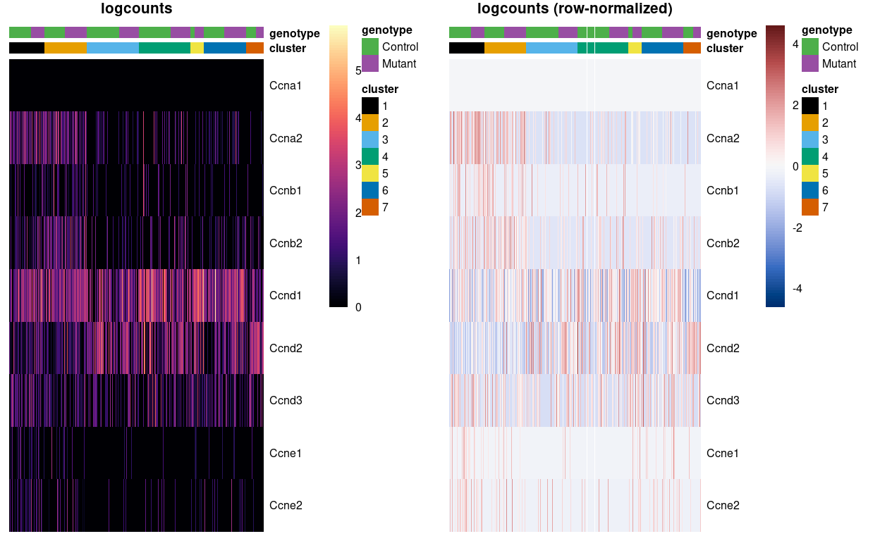
Figure 5: Heatmap of logcounts (left) and row-normalized logcounts values (right) for Zoe’s marker genes. Each column is a sample, each row a gene. Samples are ordered by cluster then by genotype. Row (gene) and column (cell) order are preserved across the two heatmaps.
We can also use standard differential expression methods to look for upregulation of each cyclin, allowing us to determine if there are more cells in the corresponding phase of the cell cycle between subpopulations.
Here we use pairwise Wilcoxon rank sum tests to compute differential expression of cyclin genes between each pair of clusters. The Wilcoxon test estimates effect sizes as overlap proportions (overlap in the tables below). The overlap proportion is defined as the probability that a randomly selected cell in \(A\) has a greater expression value of \(X\) than a randomly selected cell in \(B\). Overlap proportions near 0 (\(A\) is lower than \(B\)) or 1 (\(A\) is higher than \(B\)) indicate that the expression distributions are well-separated. The Wilcoxon rank sum test effectively tests for significant deviations from an overlap proportion of 0.5.
We can infer that clusters 1 and 2 likely have more cells in S, G2, and M phases than the other clusters, based on higher expression of some of the cyclin A and B genes.
Direct examination of cyclin expression is easily understood, interpreted and validated with other technologies. However, it is best suited for statements about relative cell cycle activity; for example, we would find it difficult to assign cell cycle phase in Figure 5 without the presence of clusters spanning all phases to provide benchmarks for “high” and “low” expression of each cyclin. We also assume that cyclin expression is not affected by biological processes other than the cell cycle, which may be a strong assumption in some cases, e.g., malignant cells.
Using reference profiles
Cell cycle assignment can be considered a specialized case of cell annotation, which suggests that we can use the SingleR package with an appropriate reference dataset. For example, given a reference dataset containing mouse ESCs with known cell cycle phases7, we could use SingleR to determine the phase of each cell in a test dataset.
We use the reference dataset to identify phase-specific markers from genes with annotated roles in cell cycle. The use of prior annotation aims to avoid detecting markers for other biological processes that happen to be correlated with the cell cycle in the reference dataset, which would reduce classification performance if those processes are absent or uncorrelated in the test dataset.
Unlike the cyclin-based analysis, this approach yields “absolute” assignments of cell cycle phase that do not need to be interpreted relative to other cells in the same dataset.
| cluster | G1 | G2M | S |
|---|---|---|---|
| 1 | 64 | 110 | 19 |
| 2 | 157 | 51 | 24 |
| 3 | 263 | 1 | 22 |
| 4 | 238 | 16 | 27 |
| 5 | 70 | 0 | 4 |
| 6 | 210 | 1 | 19 |
| 7 | 78 | 4 | 15 |
The key assumption here is that the cell cycle is orthogonal to cell type and other aspects of cell behaviour. This justifies the use of a reference involving cell types that are quite different from the cells in the test dataset, provided that the cell cycle transcriptional program is conserved across datasets8. However, it is not difficult to find routine violations of this assumption9.
Thus, a healthy dose of scepticism is required when interpreting these assignments. Our hope is that any systematic assignment error is consistent across clusters and conditions such that they cancel out in comparisons of phase frequencies, which is the more interesting analysis anyway. Indeed, while the availability of absolute phase calls may be more appealing, it may not make much practical difference to the conclusions if the frequencies are ultimately interpreted in a relative sense (e.g., using a chi-squared test).
Using the cyclone() classifier
The prediction method described by (Scialdone et al. 2015) is another approach for classifying cells into cell cycle phases. Using a reference dataset, we first compute the sign of the difference in expression between each pair of genes. Pairs with changes in the sign across cell cycle phases are chosen as markers. Cells in a test dataset can then be classified into the appropriate phase, based on whether the observed sign for each marker pair is consistent with one phase or another. This approach is implemented in the cyclone() function from the R BiocStyle::Biocpkg("scran") package.
The phase assignment result for each cell in the dataset is shown in Figure 6. For each cell, a higher score for a phase corresponds to a higher probability that the cell is in that phase. We recommend focusing on the G1 and G2/M scores as these are the most informative for classification.
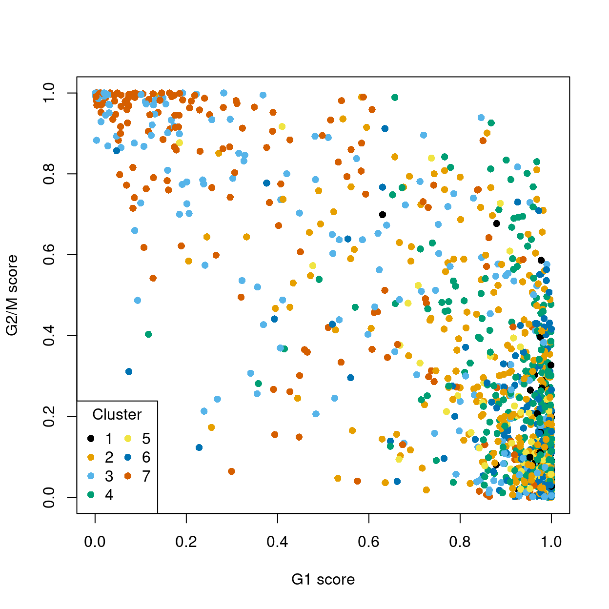
Figure 6: Cell cycle phase scores from applying the pair-based classifier on the dataset. Each point represents a cell, plotted according to its scores for G1 and G2/M phases, and coloured according to cluster.
Cells are classified as being in G1 phase if the G1 score is above 0.5 and greater than the G2/M score; in G2/M phase if the G2/M score is above 0.5 and greater than the G1 score; and in S phase if neither score is above 0.5.
Figure 7 shows most cells are estimated as being in G1 phase.
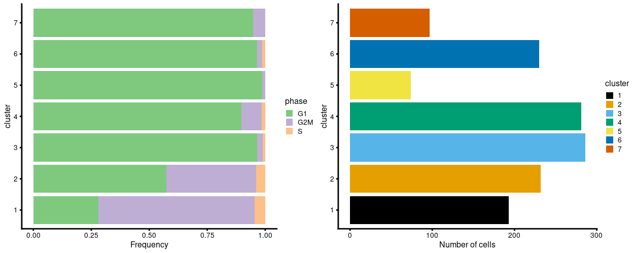
Figure 7: Breakdown of clusters by phase (as predicted using cyclone).
The data used to generate Figure 7 are also given in the table below.
| cluster | G1 | G2M | S |
|---|---|---|---|
| 1 | 54 | 130 | 9 |
| 2 | 133 | 90 | 9 |
| 3 | 276 | 7 | 3 |
| 4 | 252 | 25 | 4 |
| 5 | 73 | 1 | 0 |
| 6 | 222 | 5 | 3 |
| 7 | 92 | 5 | 0 |
The same considerations and caveats described for the ‘reference profiles’ approach are also applicable here.
Summary
We can conclude that clusters 1 and 2 likely have more cells in S, G2, and M phases than the other clusters and that the remaining clusters are likely in G1 (based on fairly ubiquitous expression of cyclin D genes and no strong upregulation of the other cyclins).
For some time, it was popular to regress out the cell cycle phase prior to downstream analyses. The aim was to remove uninteresting variation due to cell cycle, thus improving resolution of other biological processes of interest. However, we do not consider adjusting for cell cycle to be a necessary step in routine scRNA-seq analyses.
Any attempt at removal would need to assume that the cell cycle effect is orthogonal to other biological processes. If this was violated (i.e. the cell cycle effect was associated with other biological processes), then the regression would potentially remove interesting signal if cell cycle activity varied across clusters or conditions.
Visualization
For each marker gene strategy (e.g. t_up_all) we provide PDF heatmaps of selected marker genes for each cluster in output/cluster_marker_genes/.
In this section we describe the rationale behind choices made in creating these heatmaps, namely:
- The considerations behind the Choice of expression values:
logcountsvs.correctedused for visualization. - The Exclusion of certain types of genes from the provided heatmaps.
We also use the heatmaps to illustrate the Limitations of the t_up_all strategy to further motivate the need for the other marker gene lists.
Choice of expression values: logcounts vs. corrected
A reminder that the logcounts (log-transformed normalized expression values) are the basis for any and all gene-based analyses, like DE-based marker gene detection. However, we can visualize the results of such an analysis using either the logcounts or the reconstructed values (batch-corrected logcounts). The advantage of using the reconstructed values for visualization is that these will generally eliminate some of the visual differences between the batches (in this case, between the plates), which can result in ‘cleaner’ figures. As always, however, it is essential to also examine the ‘raw data’ (in this case the logcounts) to ensure that the ‘cleaner’ figures do not belie the truth. If you opt to use the reconstructed data for a figure it is vital that you make note of this (e.g., in the figure caption).
To give some examples of the difference between visualizing logcounts and reconstructed values, Figure 8 illustrates this with a violin plot of Sox17 expression while Figure 9 illustrates this with a heatmap of ribosomal protein gene expression. Together these figures demonstrate that:
- An arbitrary correction algorithm, such as MNN, is not obliged to preserve the magnitude (or even direction) of differences in per-gene expression when attempting to align multiple batches. This can lead to ‘exaggerated’ differences (Figure 8) or, conversely, artificial agreement across batches (Figure 9).
- This means that absolute values (like zero) lose their meaning, i.e.
reconstructed= 0 does not mean anything special. In contrast,logcounts= 0 means that there were zerocounts, i.e. the gene was not detected in that sample.
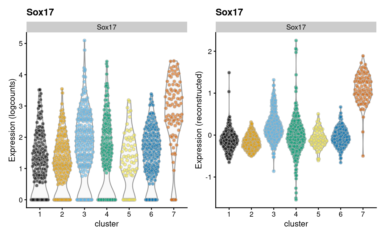
Figure 8: Violin plot of Sox17 gene expression using the logcounts (left) and the reconstructed values (right) for cells in each cluster.
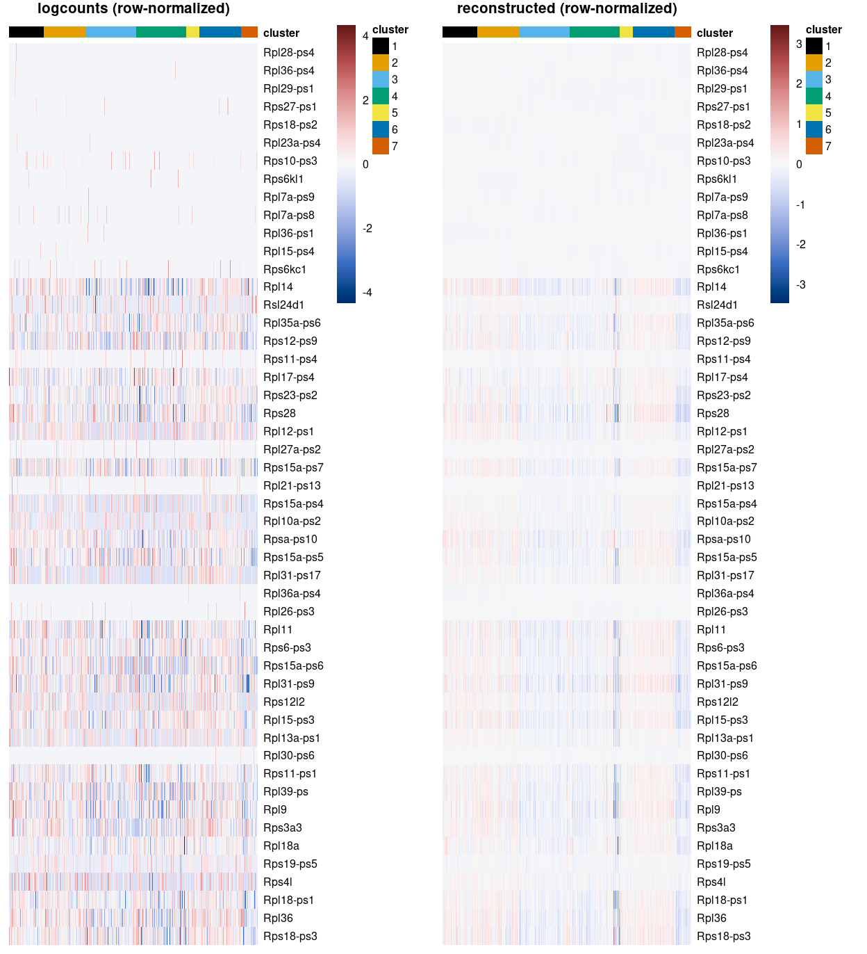
Figure 9: Heatmap of some ribosomoal protein gene expression using the logcounts (left) and the reconstructed values (right) for cells in each cluster. Row (gene) and column (cell) order are preserved across the two heatmaps.
Limitations of the t_up_all strategy
Figure 10 is a heatmap showing the expression of the top-10 marker genes (\(FDR < 0.05\)) for each cluster from the t_up_all analysis. From this figure we can observe that some clusters do not have any marker genes, and some other clusters only have a small number of marker genes, using the t_up_all strategy. The lack of marker genes for some clusters under the t_up_all strategy necessitates the other strategies (t_up_some and t_any_any).
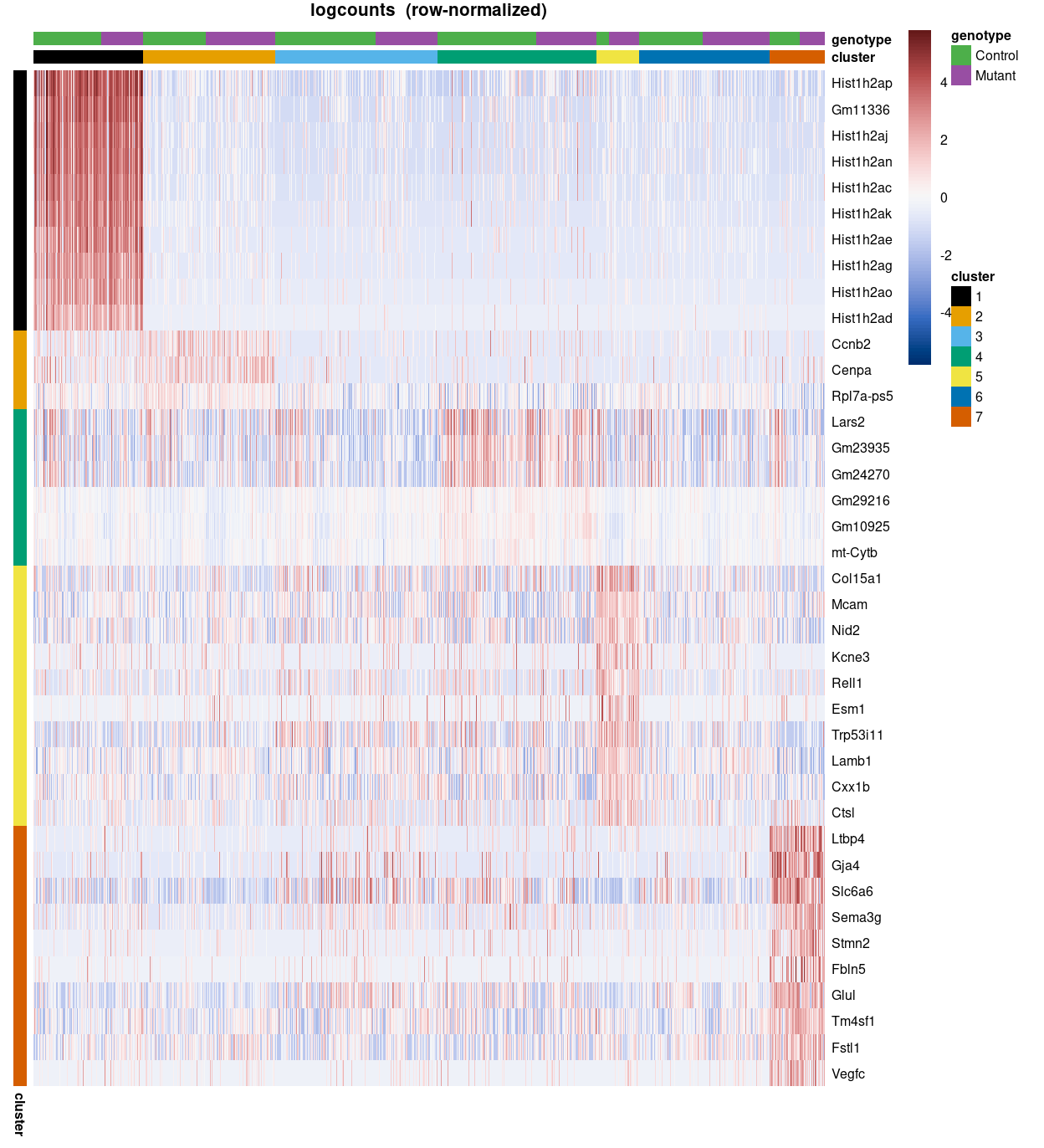
Figure 10: Heatmap of top-10 t_up_all marker genes (FDR < 0.05) using the row-normalized logcounts for cells in each cluster. Each column is a sample, each row a gene. Note that some clusters have as few as zero upregulated cluster-specific marker genes.
Exclusion of certain types of genes
Figure 11 is a heatmap showing the expression of the top-50 marker genes for cluster 2 from the t_up_some analysis. From this figure we can observe that many of the cluster 2 t_up_some marker genes are pseudogenes, while several others are ribosomal protein genes and sex chromosome genes. This prompted Zoe and Anne to request heatmaps that exclude mitochondrial genes, ribosomal protein genes, sex chromosome genes, and pseudogenes.
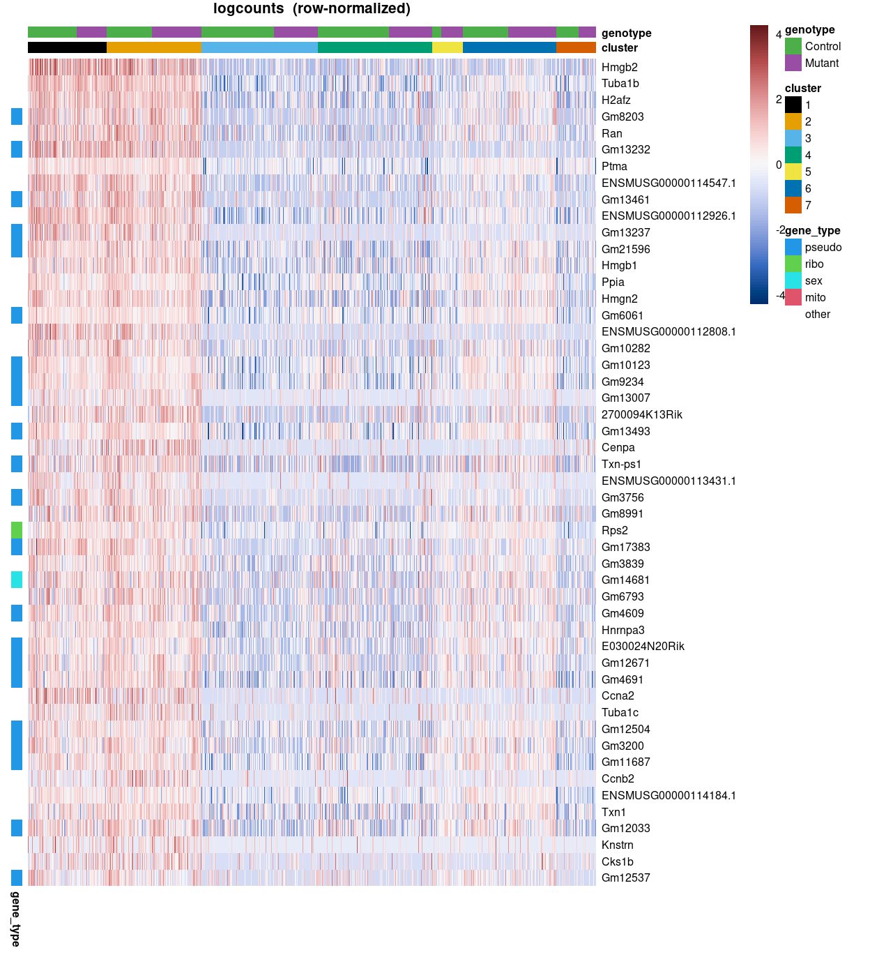
Figure 11: Heatmap of top-50 t_up_all marker genes for cluster 2 using the row-normalized logcounts for cells in each cluster. Each column is a sample, each row a gene. Genes are annotated according to gene_type.
Choice of gradient colour scale
A commonly used plot is a UMAP plot overlaid with the expression of a selected gene using a gradient colour scale. For example, Figure 12 shows this for Sox17.
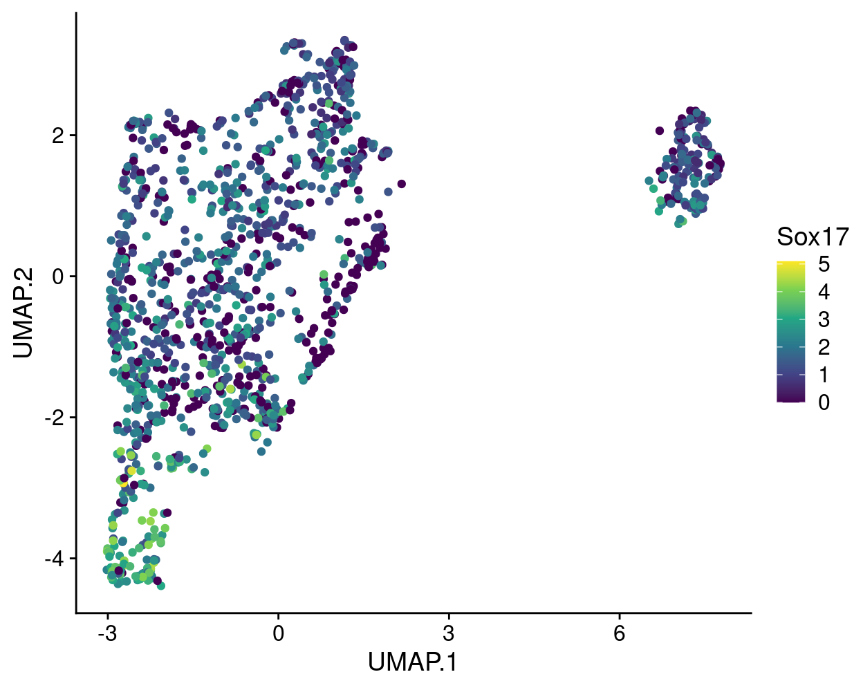
Figure 12: UMAP plot with points coloured by Sox17 expression using the viridis colour gradient.
The gene expression measurements are shown using the ‘viridis’ colour gradient, which is one of the five viridis colour palettes (‘viridis’, ‘magma’, ‘plasma’, ‘inferno’, and ‘cividis’).
I strongly recommend using one of the viridis colour palettes to show the expression values because they are designed to be10:
- Colourful, spanning as wide a palette as possible so as to make differences easy to see
- Perceptually uniform, meaning that values close to each other have similar-appearing colours and values far away from each other have more different-appearing colours, consistently across the range of values
- Robust to colour blindness, so that the above properties hold true for people with common forms of colourblindness, as well as in grey scale printing
Figure 13 compares the viridis palette to the commonly used lightblue-red colour gradient for these same data, revealing that the lightblue-red colour gradient is not perceptually uniform, e.g.,:
- The bottom half of the lightblue-red colour gradient is perceptually ‘compressed’
- It is hard to distinguish values between 3–5 using the lightblue-red gradient
- The perceptual midpoint of the viridis colour gradient matches the midpoint of the 0–5 range of expression values whereas the perceptual midpoint of the lightblue-red colour gradient occurs somewhere below 1
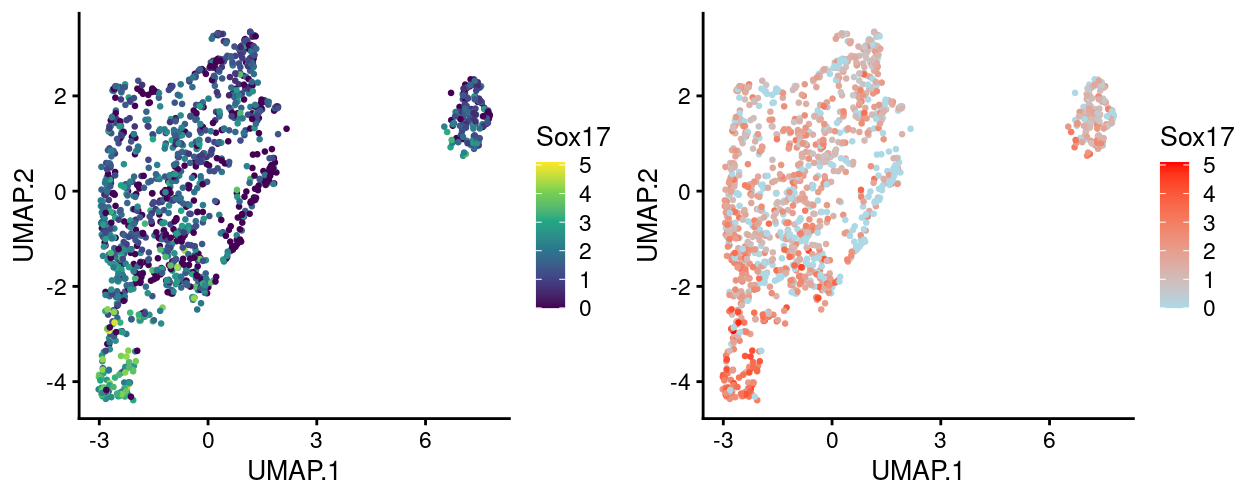
Figure 13: UMAP plot with points coloured by Sox17 expression using the lightblue-red colour gradient.
Figure 14 to 18 simulate what this same plot would like to people with various common colour-deficiencies using each of the viridis palettes and shows that the data are still very much interpretable in all cases using any of these palettes.
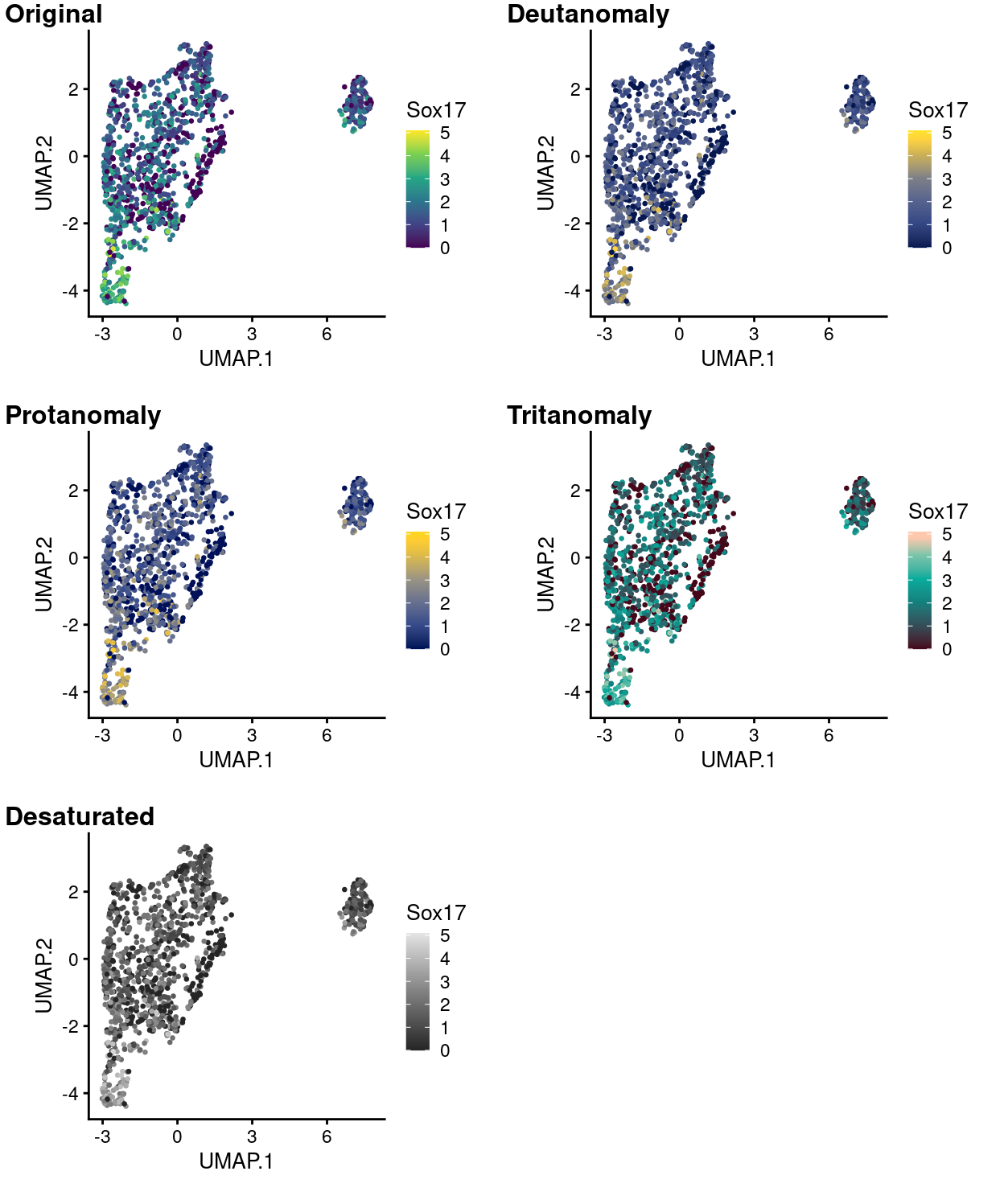
Figure 14: UMAP plot with points coloured by Sox17 expression using the viridis colour gradient and simulating various common colour deficiencies.
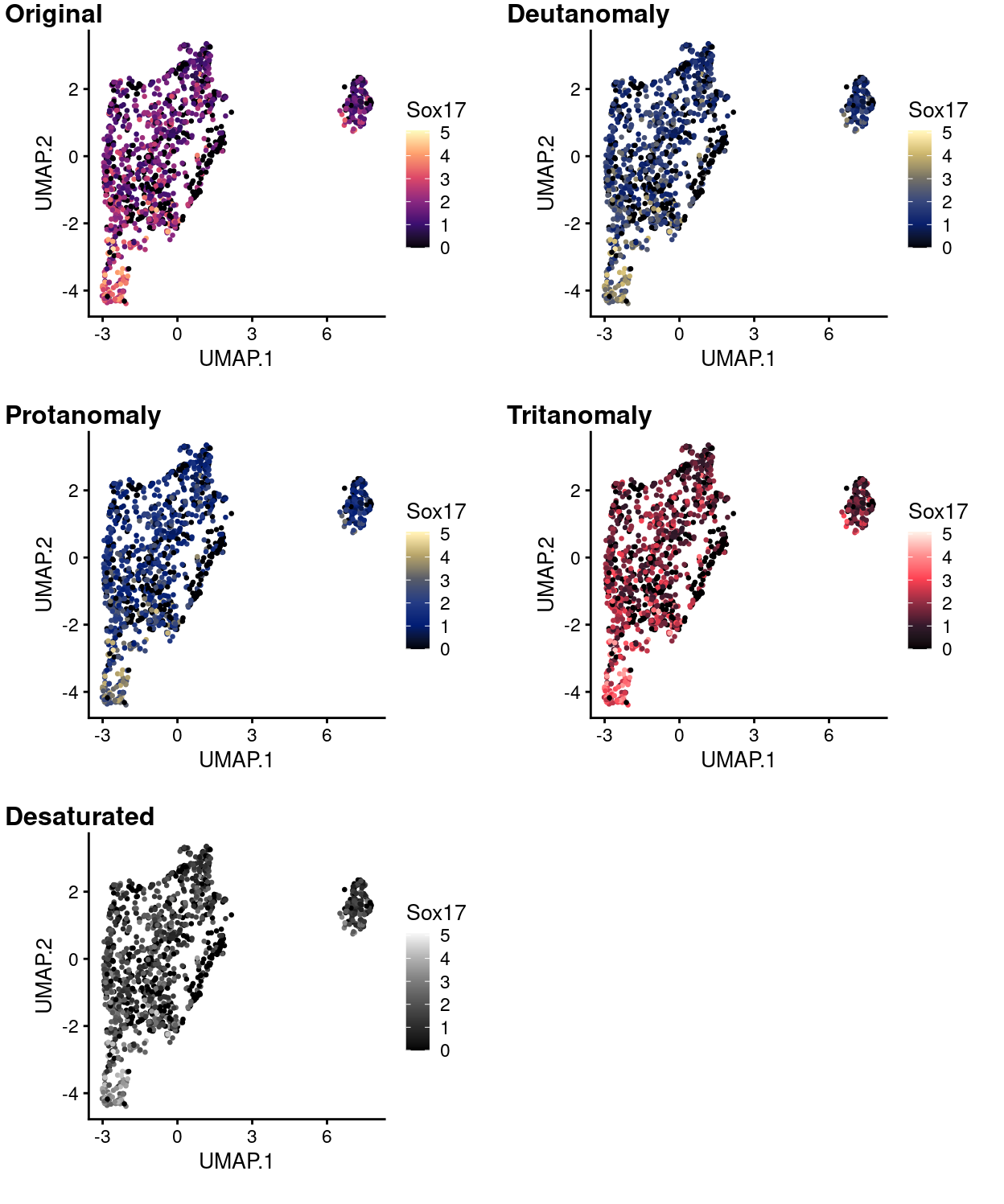
Figure 15: UMAP plot with points coloured by Sox17 expression using the magma colour gradient and simulating various common colour deficiencies.
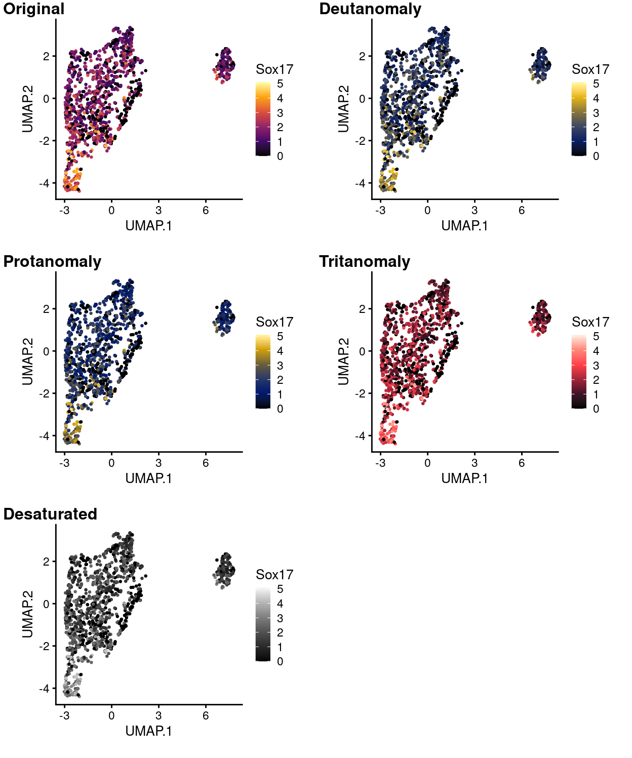
Figure 16: UMAP plot with points coloured by Sox17 expression using the inferno colour gradient and simulating various common colour deficiencies.
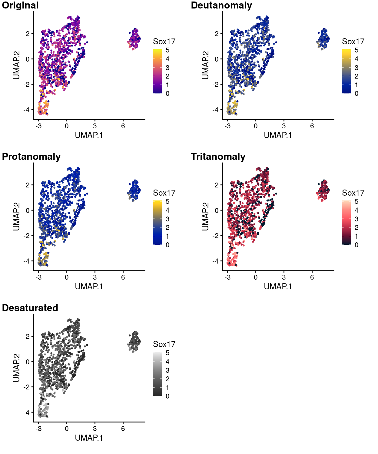
Figure 17: UMAP plot with points coloured by Sox17 expression using the plasma colour gradient and simulating various common colour deficiencies.
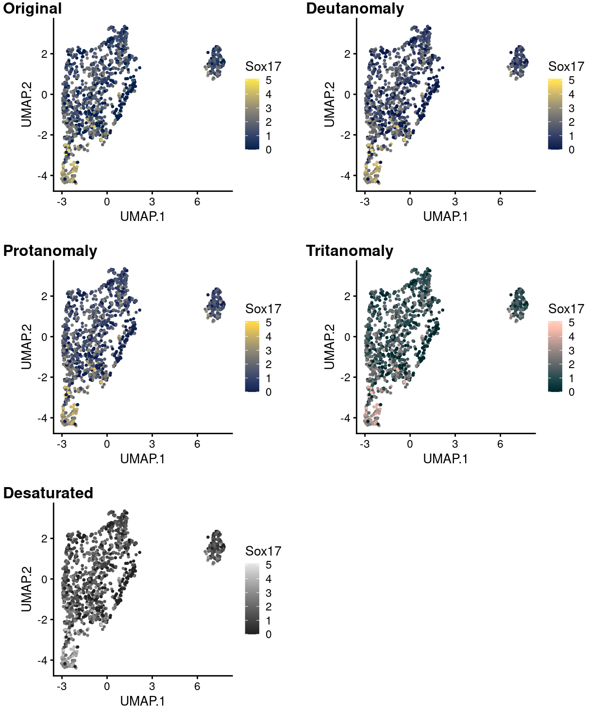
Figure 18: UMAP plot with points coloured by Sox17 expression using the cividis colour gradient and simulating various common colour deficiencies.
Finally, if a greyscale version of the plot is required then it may be preferable to reverse the direction of the colour gradient (i.e. low is lightgrey, high is black). Figure 19 shows both options.
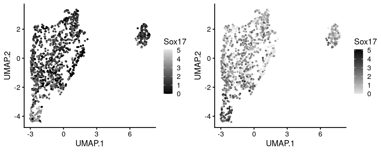
Figure 19: UMAP plot with points coloured by Sox17 expression using a greyscale colour gradient running in each direction.
Making your own UMAP plot coloured by gene expression
To make your own UMAP plot coloured by gene expression is fairly straightforward. Here I give some example code demonstrating how I made the UMAP plot showing Sox17 expression and how you might extend this. Each plot can be saved as a PDF within RStudio (see the ‘Export’ tab in the ‘Plots’ pane.)
To run these examples you will need R version 4.0 and I also recommend using RStudio. You will first need to install a few R packages (if they are not already installed). These packages can be installed and loaded as follows:
if (!requireNamespace("BiocManager", quietly = TRUE)) {
    install.packages("BiocManager")
}

if (!requireNamespace("scater", quietly = TRUE)) {
    BiocManager::install("scater")
}

if (!requireNamespace("cowplot", quietly = TRUE)) {
    BiocManager::install("cowplot")
}
Once these are installed, you can load the required packages into the R session as follows:
You will then need to load the data/SCEs/C075_Grant_Coultas.cells_selected.SCE.rds SingleCellExperiment object into your R session. One way of doing this is to adapt the following code:
# NOTE: You will need to modify this to where the object is saved on your
#       computer.
path_to_se <- "data/SCEs/C075_Grant_Coultas.annotated.SCE.rds"

sce <- readRDS(path_to_se)
You can then create a plot in your R session. Let’s re-make the the UMAP plot showing Sox17 expression with the viridis colour palette:
ggcells(sce, features = "Sox17") +
  geom_point(aes(x = UMAP.1, y = UMAP.2, colour = Sox17)) +
  theme_cowplot() +
  scale_colour_viridis_c(option = "viridis")
To make a version of that plot using the greyscale colour palette requires us to change just the final line of that command:
ggcells(sce, features = "Sox17") +
  geom_point(aes(x = UMAP.1, y = UMAP.2, colour = Sox17)) +
  theme_cowplot() +
  scale_colour_gradient(low = "grey90", high = "black")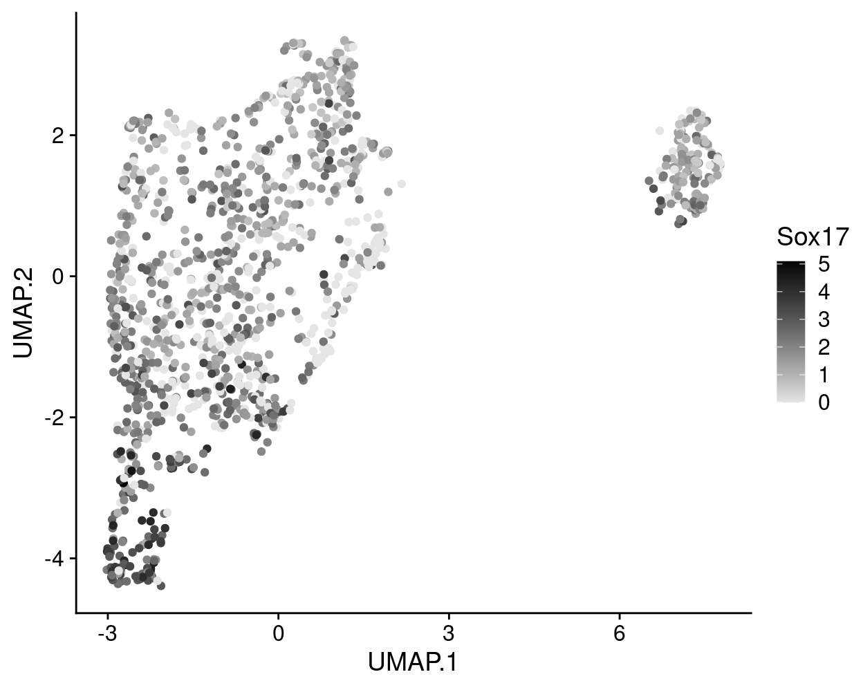
To plot a different gene requires just two small changes, e.g., to plot Hist1h2ap expression:
ggcells(sce, features = "Hist1h2ap") +
  geom_point(aes(x = UMAP.1, y = UMAP.2, colour = Hist1h2ap)) +
  theme_cowplot() +
  scale_colour_viridis_c(option = "viridis")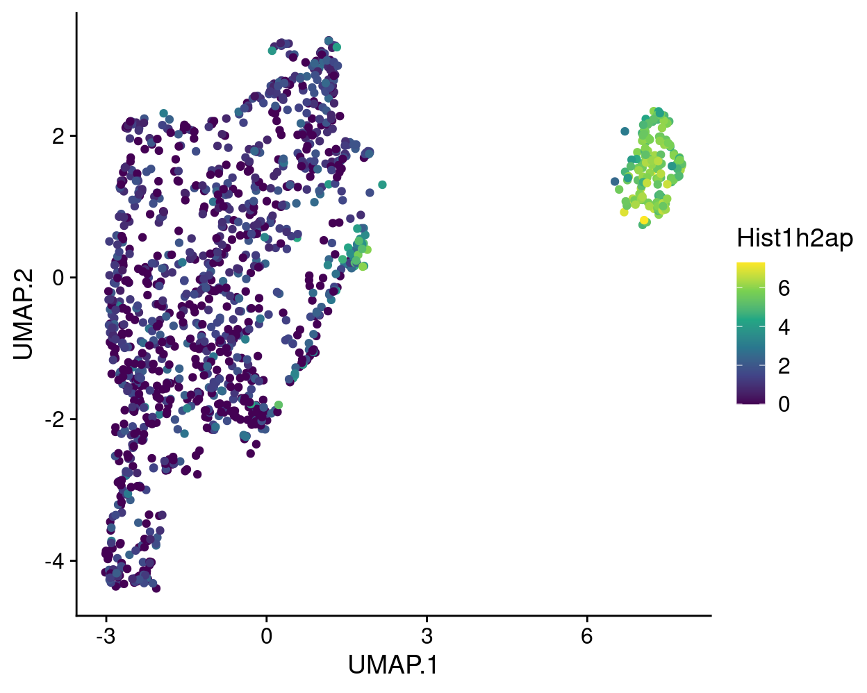
Summary
We have performed a focused analysis using Zoe’s marker genes and the cyclin genes, and identified cluster marker genes for each cluster using several strategies. Some preliminary high-level summaries of the clusters are as follows:
- Clusters 1, 5, and 7 can be readily distinguished from the other clusters (
t_up_allanalysis).- Cluster 1 has very high and distinct expression of many genes, most obviously including Hist1h2 genes.
- Cluster 5 has high and fairly distinct expression of Zoe’s
Artery, TipandTipmarker genes. - Cluster 7 has very high and distinct expression of many genes, including Zoe’s
Arterymarker genes.
- Cluster 2 shares many marker genes with cluster 1 (
t_up_someanalysis). - Clusters 3, 4, and 6 are perhaps less distinct than the other clusters and share some marker genes with each other and also with clusters 1, 2, 5, and 7 (
t_up_allandt_up_someanalyses).- Cluster 3 shares some markers with clusters \(4 - 7\).
- Cluster 4 is perhaps the least distinct cluster in terms of marker genes.
- Cluster 6 shares some markers with clusters 1 and 2 and others with clusters 3, 4, and 7.
As mentioned, cluster 4 is perhaps the least distinct cluster in terms of marker genes. Cluster 4 contains the fewest cells of all the clusters, with these cells coming from all plates, but is is also the cluster most enriched for Mutant cells (in terms of the percentage of cells in that cluster with each genotype; Figure 2). Figure 20 shows that cells in this cluster have on average poorer QC metrics than cells in most other clusters, perhaps meaning that this cluster is comprised of a ‘mixed bag’ of cells that are hard to place with their ‘correct’ cluster.
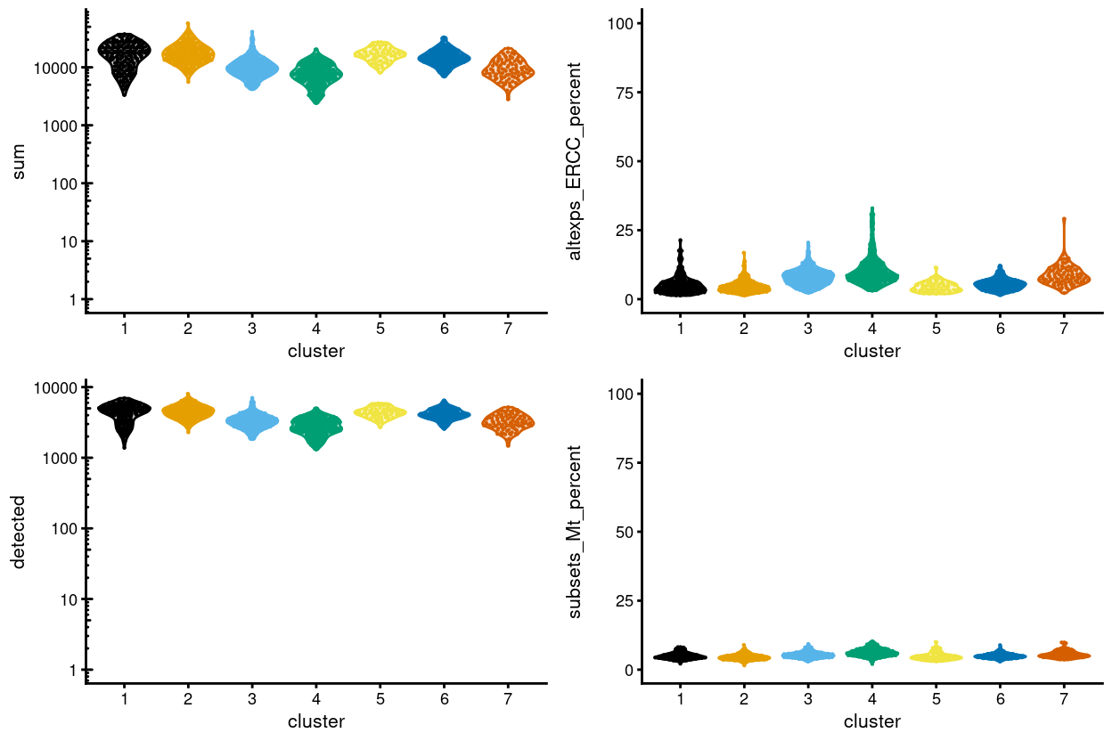
Figure 20: Distributions of various QC metrics for all cells in the data set. This includes the library sizes, number of expressed genes, and proportion of reads mapped to spike-in transcripts or mitochondrial genes.
This preliminary summary is just that, preliminary. The cluster marker gene lists can be analysed like any other gene list, such as by using gene set enrichment analysis against the Gene Ontology (GO) or Kyoto Encyclopedia of Genes and Genomes (KEGG) databases. Used this way, the provided cluster marker gene lists can help develop biologically relevant, meaningful, and useful labels for cells/clusters in this dataset.
Heatmaps
Zoe went through the above gene lists to arrive at a gene list that characterises the clusters.
Figures 21 and 22 are heatmaps of this gene list (with and without duplicate genes).
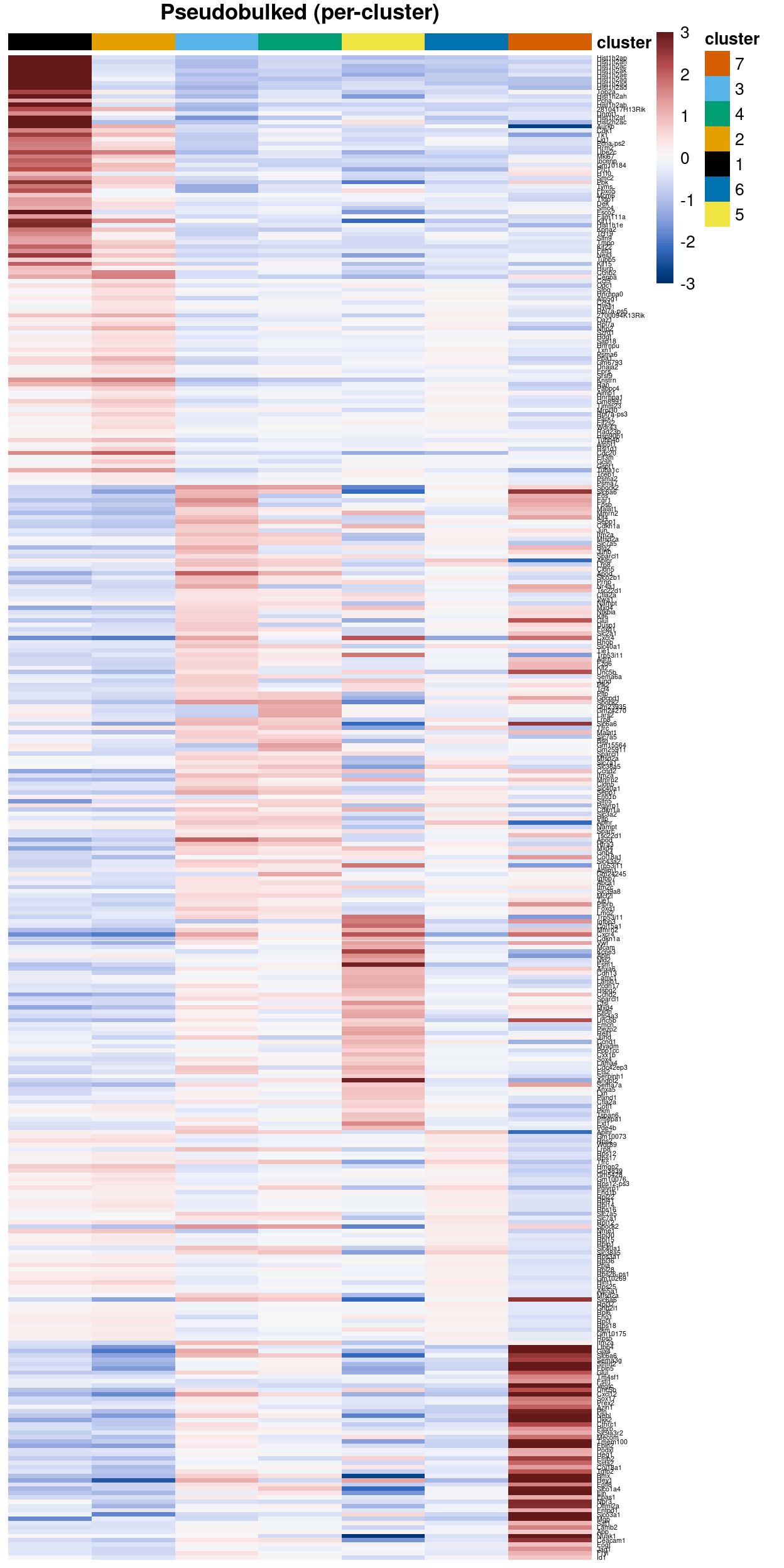
Figure 21: Heatmap of Zoe’s cluster marker gene list.
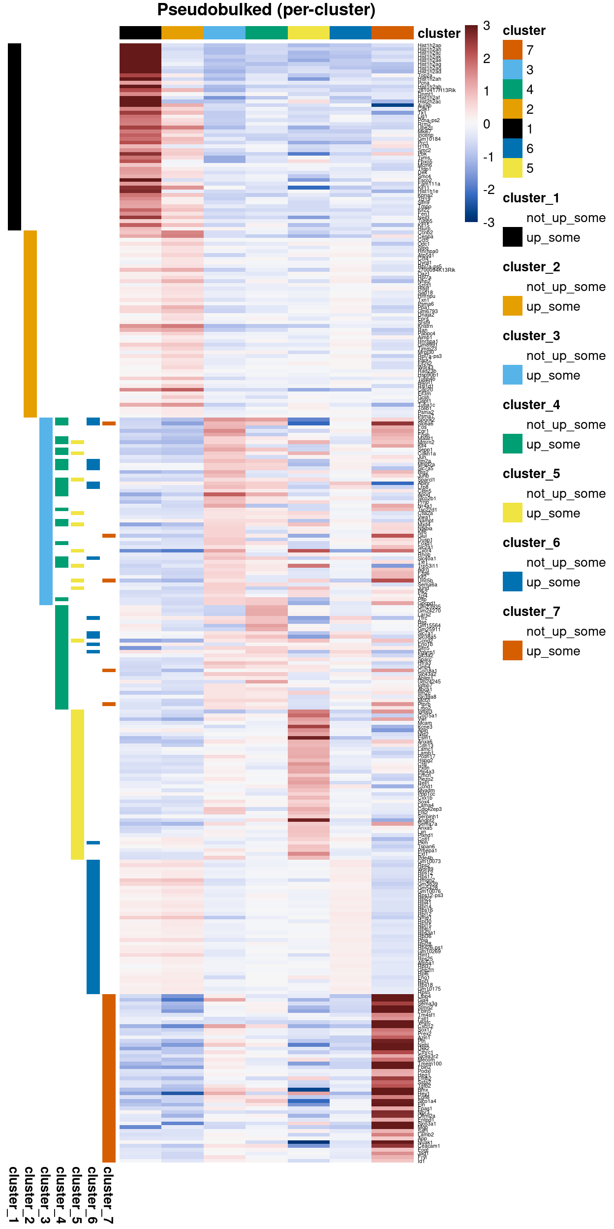
Figure 22: Heatmap of Zoe’s cluster marker gene list without duplicate genes.
Concluding remarks
Zoe requested that clusters 3, 4, and 6 be aggregated for the purposes of differential analyses.
The processed SingleCellExperiment object is available (see data/SCEs/C075_Grant_Coultas.annotated.SCE.rds). This will be used in downstream analyses, e.g., differential expression analysis between conditions within each cluster and differential abundance analyses between conditions for each cluster.
Additional information
The following are available on request:
- Full CSV tables of any data presented.
- PDF/PNG files of any static plots.
Session info
─ Session info ─────────────────────────────────────────────────────
 setting  value
 version  R version 4.0.0 (2020-04-24)
 os       CentOS Linux 7 (Core)
 system   x86_64, linux-gnu
 ui       X11
 language (EN)
 collate  en_US.UTF-8
 ctype    en_US.UTF-8
 tz       Australia/Melbourne
 date     2020-10-01

─ Packages ─────────────────────────────────────────────────────────
 ! package                * version  date       lib
 P AnnotationDbi          * 1.50.1   2020-06-29 [?]
 P AnnotationFilter       * 1.12.0   2020-04-27 [?]
 P AnnotationHub            2.20.0   2020-04-27 [?]
 P askpass                  1.1      2019-01-13 [?]
 P assertthat               0.2.1    2019-03-21 [?]
 P backports                1.1.8    2020-06-17 [?]
 P beeswarm                 0.2.3    2016-04-25 [?]
 P Biobase                * 2.48.0   2020-04-27 [?]
 P BiocFileCache            1.12.0   2020-04-27 [?]
 P BiocGenerics           * 0.34.0   2020-04-27 [?]
 P BiocManager              1.30.10  2019-11-16 [?]
 P BiocNeighbors            1.6.0    2020-04-27 [?]
 P BiocParallel           * 1.22.0   2020-04-27 [?]
 P BiocSingular             1.4.0    2020-04-27 [?]
 P BiocStyle                2.16.0   2020-04-27 [?]
 P BiocVersion              3.11.1   2019-11-13 [?]
 P biomaRt                  2.44.1   2020-06-17 [?]
 P Biostrings               2.56.0   2020-04-27 [?]
 P bit                      1.1-15.2 2020-02-10 [?]
 P bit64                    0.9-7.1  2020-07-15 [?]
 P bitops                   1.0-6    2013-08-17 [?]
 P blob                     1.2.1    2020-01-20 [?]
 P cellranger               1.1.0    2016-07-27 [?]
 P cli                      2.0.2    2020-02-28 [?]
 P colorblindr              0.1.0    2020-08-13 [?]
 P colorspace               1.4-1    2019-03-18 [?]
 P cowplot                * 1.0.0    2019-07-11 [?]
 P crayon                   1.3.4    2017-09-16 [?]
 P crosstalk                1.1.0.1  2020-03-13 [?]
 P curl                     4.3      2019-12-02 [?]
 P DBI                      1.1.0    2019-12-15 [?]
 P dbplyr                   1.4.4    2020-05-27 [?]
 P DelayedArray           * 0.14.1   2020-07-14 [?]
 P DelayedMatrixStats       1.10.1   2020-07-03 [?]
 P digest                   0.6.25   2020-02-23 [?]
 P distill                  0.8      2020-06-04 [?]
 P dplyr                    1.0.0    2020-05-29 [?]
 P dqrng                    0.2.1    2019-05-17 [?]
 P DT                       0.14     2020-06-24 [?]
 P edgeR                  * 3.30.3   2020-06-02 [?]
 P ellipsis                 0.3.1    2020-05-15 [?]
 P ensembldb              * 2.12.1   2020-05-06 [?]
 P evaluate                 0.14     2019-05-28 [?]
 P ExperimentHub            1.14.0   2020-04-27 [?]
 P fansi                    0.4.1    2020-01-08 [?]
 P farver                   2.0.3    2020-01-16 [?]
 P fastmap                  1.0.1    2019-10-08 [?]
 P generics                 0.0.2    2018-11-29 [?]
 P GenomeInfoDb           * 1.24.2   2020-06-15 [?]
 P GenomeInfoDbData         1.2.3    2020-05-18 [?]
 P GenomicAlignments        1.24.0   2020-04-27 [?]
 P GenomicFeatures        * 1.40.1   2020-07-08 [?]
 P GenomicRanges          * 1.40.0   2020-04-27 [?]
 P ggbeeswarm               0.6.0    2017-08-07 [?]
 P ggplot2                * 3.3.2    2020-06-19 [?]
 P Glimma                 * 1.16.0   2020-04-27 [?]
 P glue                     1.4.1    2020-05-13 [?]
 P gridExtra                2.3      2017-09-09 [?]
 P gtable                   0.3.0    2019-03-25 [?]
 P here                   * 0.1      2017-05-28 [?]
 P highr                    0.8      2019-03-20 [?]
 P hms                      0.5.3    2020-01-08 [?]
 P htmltools                0.5.0    2020-06-16 [?]
 P htmlwidgets              1.5.1    2019-10-08 [?]
 P httpuv                   1.5.4    2020-06-06 [?]
 P httr                     1.4.1    2019-08-05 [?]
 P igraph                   1.2.5    2020-03-19 [?]
 P interactiveDisplayBase   1.26.3   2020-06-02 [?]
 P IRanges                * 2.22.2   2020-05-21 [?]
 P irlba                    2.3.3    2019-02-05 [?]
 P janitor                  2.0.1    2020-04-12 [?]
 P jsonlite                 1.7.0    2020-06-25 [?]
 P knitr                    1.29     2020-06-23 [?]
 P labeling                 0.3      2014-08-23 [?]
 P later                    1.1.0.1  2020-06-05 [?]
 P lattice                  0.20-41  2020-04-02 [?]
 P lazyeval                 0.2.2    2019-03-15 [?]
 P lifecycle                0.2.0    2020-03-06 [?]
 P limma                  * 3.44.3   2020-06-12 [?]
 P locfit                   1.5-9.4  2020-03-25 [?]
 P lubridate                1.7.9    2020-06-08 [?]
 P magrittr                 1.5      2014-11-22 [?]
 P Matrix                   1.2-18   2019-11-27 [?]
 P matrixStats            * 0.56.0   2020-03-13 [?]
 P memoise                  1.1.0    2017-04-21 [?]
 P mime                     0.9      2020-02-04 [?]
 P msigdbr                * 7.1.1    2020-05-14 [?]
 P munsell                  0.5.0    2018-06-12 [?]
 P openssl                  1.4.2    2020-06-27 [?]
 P org.Mm.eg.db           * 3.11.4   2020-06-02 [?]
 P patchwork              * 1.0.1    2020-06-22 [?]
 P pheatmap               * 1.0.12   2019-01-04 [?]
 P pillar                   1.4.6    2020-07-10 [?]
 P pkgconfig                2.0.3    2019-09-22 [?]
 P prettyunits              1.1.1    2020-01-24 [?]
 P progress                 1.2.2    2019-05-16 [?]
 P promises                 1.1.1    2020-06-09 [?]
 P ProtGenerics             1.20.0   2020-04-27 [?]
 P purrr                    0.3.4    2020-04-17 [?]
 P R6                       2.4.1    2019-11-12 [?]
 P rappdirs                 0.3.1    2016-03-28 [?]
 P RColorBrewer             1.1-2    2014-12-07 [?]
 P Rcpp                     1.0.5    2020-07-06 [?]
 P RCurl                    1.98-1.2 2020-04-18 [?]
 P readxl                   1.3.1    2019-03-13 [?]
 P rlang                    0.4.7    2020-07-09 [?]
 P rmarkdown                2.3      2020-06-18 [?]
 P rprojroot                1.3-2    2018-01-03 [?]
 P Rsamtools                2.4.0    2020-04-27 [?]
 P RSQLite                  2.2.0    2020-01-07 [?]
 P rsvd                     1.0.3    2020-02-17 [?]
 P rtracklayer              1.48.0   2020-04-27 [?]
 P S4Vectors              * 0.26.1   2020-05-16 [?]
 P scales                   1.1.1    2020-05-11 [?]
 P scater                 * 1.16.2   2020-06-26 [?]
 P scran                  * 1.16.0   2020-04-27 [?]
 P scRNAseq               * 2.2.0    2020-05-07 [?]
 P sessioninfo              1.1.1    2018-11-05 [?]
 P shiny                    1.5.0    2020-06-23 [?]
 P SingleCellExperiment   * 1.10.1   2020-04-28 [?]
 P SingleR                * 1.2.4    2020-05-25 [?]
 P snakecase                0.11.0   2019-05-25 [?]
 P statmod                  1.4.34   2020-02-17 [?]
 P stringi                  1.4.6    2020-02-17 [?]
 P stringr                  1.4.0    2019-02-10 [?]
 P SummarizedExperiment   * 1.18.2   2020-07-09 [?]
 P tibble                   3.0.3    2020-07-10 [?]
 P tidyr                    1.1.0    2020-05-20 [?]
 P tidyselect               1.1.0    2020-05-11 [?]
 P vctrs                    0.3.2    2020-07-15 [?]
 P vipor                    0.4.5    2017-03-22 [?]
 P viridis                  0.5.1    2018-03-29 [?]
 P viridisLite              0.3.0    2018-02-01 [?]
 P withr                    2.2.0    2020-04-20 [?]
 P xfun                     0.15     2020-06-21 [?]
 P XML                      3.99-0.4 2020-07-05 [?]
 P xtable                   1.8-4    2019-04-21 [?]
 P XVector                  0.28.0   2020-04-27 [?]
 P yaml                     2.2.1    2020-02-01 [?]
 P zlibbioc                 1.34.0   2020-04-27 [?]
 source
 Bioconductor
 Bioconductor
 Bioconductor
 CRAN (R 4.0.0)
 CRAN (R 4.0.0)
 CRAN (R 4.0.0)
 CRAN (R 4.0.0)
 Bioconductor
 Bioconductor
 Bioconductor
 CRAN (R 4.0.0)
 Bioconductor
 Bioconductor
 Bioconductor
 Bioconductor
 Bioconductor
 Bioconductor
 Bioconductor
 CRAN (R 4.0.0)
 CRAN (R 4.0.0)
 CRAN (R 4.0.0)
 CRAN (R 4.0.0)
 CRAN (R 4.0.0)
 CRAN (R 4.0.0)
 Github (clauswilke/colorblindr@1d0d5af)
 CRAN (R 4.0.0)
 CRAN (R 4.0.0)
 CRAN (R 4.0.0)
 CRAN (R 4.0.0)
 CRAN (R 4.0.0)
 CRAN (R 4.0.0)
 CRAN (R 4.0.0)
 Bioconductor
 Bioconductor
 CRAN (R 4.0.0)
 CRAN (R 4.0.0)
 CRAN (R 4.0.0)
 CRAN (R 4.0.0)
 CRAN (R 4.0.0)
 Bioconductor
 CRAN (R 4.0.0)
 Bioconductor
 CRAN (R 4.0.0)
 Bioconductor
 CRAN (R 4.0.0)
 CRAN (R 4.0.0)
 CRAN (R 4.0.0)
 CRAN (R 4.0.0)
 Bioconductor
 Bioconductor
 Bioconductor
 Bioconductor
 Bioconductor
 CRAN (R 4.0.0)
 CRAN (R 4.0.0)
 Bioconductor
 CRAN (R 4.0.0)
 CRAN (R 4.0.0)
 CRAN (R 4.0.0)
 CRAN (R 4.0.0)
 CRAN (R 4.0.0)
 CRAN (R 4.0.0)
 CRAN (R 4.0.0)
 CRAN (R 4.0.0)
 CRAN (R 4.0.0)
 CRAN (R 4.0.0)
 CRAN (R 4.0.0)
 Bioconductor
 Bioconductor
 CRAN (R 4.0.0)
 CRAN (R 4.0.0)
 CRAN (R 4.0.0)
 CRAN (R 4.0.0)
 CRAN (R 4.0.0)
 CRAN (R 4.0.0)
 CRAN (R 4.0.0)
 CRAN (R 4.0.0)
 CRAN (R 4.0.0)
 Bioconductor
 CRAN (R 4.0.0)
 CRAN (R 4.0.0)
 CRAN (R 4.0.0)
 CRAN (R 4.0.0)
 CRAN (R 4.0.0)
 CRAN (R 4.0.0)
 CRAN (R 4.0.0)
 CRAN (R 4.0.0)
 CRAN (R 4.0.0)
 CRAN (R 4.0.0)
 Bioconductor
 CRAN (R 4.0.0)
 CRAN (R 4.0.0)
 CRAN (R 4.0.0)
 CRAN (R 4.0.0)
 CRAN (R 4.0.0)
 CRAN (R 4.0.0)
 CRAN (R 4.0.0)
 Bioconductor
 CRAN (R 4.0.0)
 CRAN (R 4.0.0)
 CRAN (R 4.0.0)
 CRAN (R 4.0.0)
 CRAN (R 4.0.0)
 CRAN (R 4.0.0)
 CRAN (R 4.0.0)
 CRAN (R 4.0.0)
 CRAN (R 4.0.0)
 CRAN (R 4.0.0)
 Bioconductor
 CRAN (R 4.0.0)
 CRAN (R 4.0.0)
 Bioconductor
 Bioconductor
 CRAN (R 4.0.0)
 Bioconductor
 Bioconductor
 Bioconductor
 CRAN (R 4.0.0)
 CRAN (R 4.0.0)
 Bioconductor
 Bioconductor
 CRAN (R 4.0.0)
 CRAN (R 4.0.0)
 CRAN (R 4.0.0)
 CRAN (R 4.0.0)
 Bioconductor
 CRAN (R 4.0.0)
 CRAN (R 4.0.0)
 CRAN (R 4.0.0)
 CRAN (R 4.0.0)
 CRAN (R 4.0.0)
 CRAN (R 4.0.0)
 CRAN (R 4.0.0)
 CRAN (R 4.0.0)
 CRAN (R 4.0.0)
 CRAN (R 4.0.0)
 CRAN (R 4.0.0)
 Bioconductor
 CRAN (R 4.0.0)
 Bioconductor

[1] /stornext/General/data/user_managed/grpu_mritchie_1/hickey/SCORE/C075_Grant_Coultas/renv/library/R-4.0/x86_64-pc-linux-gnu
[2] /tmp/RtmpImljK7/renv-system-library
[3] /stornext/System/data/apps/R/R-4.0.0/lib64/R/library

 P ── Loaded and on-disk path mismatch.
Scialdone, A., K. N. Natarajan, L. R. Saraiva, V. Proserpio, S. A. Teichmann, O. Stegle, J. C. Marioni, and F. Buettner. 2015. “Computational Assignment of Cell-Cycle Stage from Single-Cell Transcriptome Data.” Methods 85 (September): 54–61. https://www.ncbi.nlm.nih.gov/pubmed/26142758.
Soneson, C., and M. D. Robinson. 2018. “Bias, Robustness and Scalability in Single-Cell Differential Expression Analysis.” Nat. Methods 15 (4): 255–61. https://www.ncbi.nlm.nih.gov/pubmed/29481549.
Email 2020-05-06.↩︎
E.g., different machines and reagents↩︎
Differential expression analyses is performed on the original log-expression values.↩︎
It must be stressed that the (adjusted) p-values computed here cannot be properly interpreted as measures of significance because the clusters have been empirically identified from the data. Nonetheless, they can still be used as way to rank ‘interesting’ genes.↩︎
Intra-plate comparisons are robust to differences between libraries but assume that each pair of clusters is present in at least one library. When this is not the case, we cannot commute a logFC for that pair of clusters.↩︎
For the purposes of this test, a cell is considered to express a gene simply if it has one or more counts for that gene.↩︎
Buettner et al. 2015↩︎
Bertoli, Skotheim, and Bruin 2013; Conboy et al. 2007↩︎
see https://osca.bioconductor.org/cell-cycle-assignment.html#using-reference-profiles for an illustration↩︎
See https://cran.r-project.org/web/packages/viridis/vignettes/intro-to-viridis.html for details.↩︎