Table of Contents
Setting up the data
The count data were processed using scPipe and available in a SingleCellExperiment object, along with their metadata (see data/SCEs/C075_Grant_Coultas.scPipe.SCE.rds).
Incorporating cell-based annotation
Cell-based annotations are included in the colData of the SingleCellExperiment. For our analysis, we will only retain relevant metadata fields.
In particular, we keep the plate number (plate_number), well position (well_position), the sample type (sample_type), the genotype (genotype), and the mouse (mouse), the sex of the mouse (sex), and the sequencing run (sequencing_run).
We also include the FACS data used for gating and index sorting.
Summarising the data
This dataset contains samples from 7 384-well plates. Figure 1 shows that most plates have cells from a knockout and a wildtype mouse with each pair of mice on a plate are from the same sibship1. The exception is the initial pilot plate, LC279, which has cells from a single control mouse.
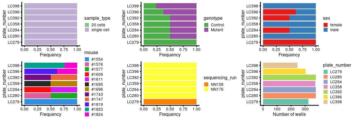
Figure 1: Breakdown of of the samples by plate.
The complete metadata table (excluding FACS data) is shown below.
Incorporating gene-based annotation
I used the Mus.musculus and EnsDb.Mmusculus.v79 packages, which respectively cover the NCBI/RefSeq and Ensembl databases, to obtain gene-based annotations, such as the chromosome and gene symbol.
Having quantified gene expression against the GENCODE gene annotation, we have Ensembl-style identifiers for the genes. These identifiers are used as they are unambiguous and highly stable. However, they are difficult to interpret compared to the gene symbols which are more commonly used in the literature. Henceforth, we will use gene symbols (where available) to refer to genes in our analysis and otherwise use the Ensembl-style gene identifiers2.
Quality control of cells
Defining the quality control metrics
Low-quality cells need to be removed to ensure that technical effects do not distort downstream analysis results. We use several quality control (QC) metrics to measure the quality of the cells:
sum: This measures the library size of the cells, which is the total sum of counts across both genes and spike-in transcripts. We want cells to have high library sizes as this means more RNA has been successfully captured during library preparation.detected: This is the number of expressed features3 in each cell. Cells with few expressed features are likely to be of poor quality, as the diverse transcript population has not been successful captured.altexps_ERCC_detected: This measures the proportion of reads which are mapped to spike-in transcripts relative to the library size of each cell. High proportions are indicative of poor-quality cells, where endogenous RNA has been lost during processing (e.g., due to cell lysis or RNA degradation). The same amount of spike-in RNA to each cell, so an enrichment in spike-in counts is symptomatic of loss of endogenous RNA.subsets_Mt_percent: This measures the proportion of reads which are mapped to mitochondrial RNA. If there is a higher than expected proportion of mitochondrial RNA this is often symptomatic of a cell which is under stress and is therefore of low quality and will not be used for the analysis.
For CEL-Seq2 data, we typically observe library sizes that are in the tens of thousands4 and several thousand expressed genes per cell.
The aim is to remove putative low-quality cells that have low library sizes, low numbers of expressed features, and high spike-in (or mitochondrial) proportions. Such cells can interfere with downstream analyses, e.g., by forming distinct clusters that complicate interpretation of the results.
Visualizing the QC metrics
The plate-level summaries of selected QC metrics are given in the table below.
| plate_number | median_sum | mean_sum | median_detected | mean_detected |
|---|---|---|---|---|
| LC279 | 8710.0 | 10087.41 | 2976.0 | 3032.666 |
| LC280 | 12534.0 | 15580.59 | 3693.0 | 3760.372 |
| LC294 | 11148.5 | 12731.91 | 3519.0 | 3603.109 |
| LC358 | 15565.5 | 16878.27 | 4105.0 | 4095.272 |
| LC392 | 12384.5 | 13682.66 | 3919.0 | 3956.351 |
| LC396 | 11935.0 | 14663.24 | 3682.5 | 3760.493 |
| LC398 | 8642.0 | 12098.46 | 3060.0 | 3169.820 |
| overall | 11787.0 | 13805.72 | 3628.5 | 3658.871 |
The distributions of these metrics are shown in Figure 2, stratified by plate and mouse.
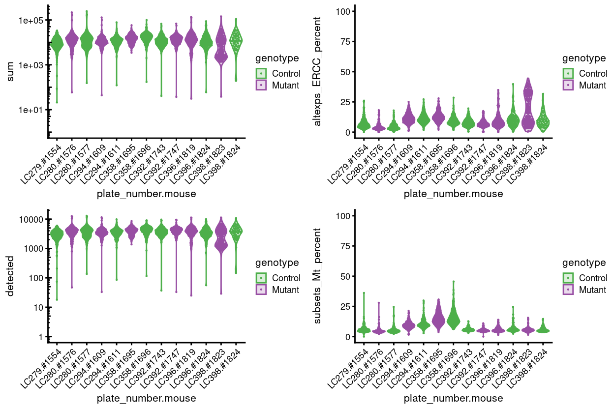
Figure 2: Distributions of various QC metrics for all cells in the data set. This includes the library sizes, number of expressed genes, and proportion of reads mapped to spike-in transcripts or mitochondrial genes.
Figure 3 breaks the data down by whether a sample is a ‘20 cells’ or a ‘single cell’.
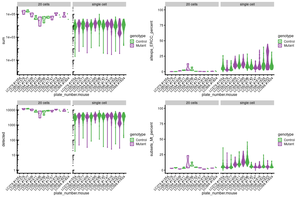
Figure 3: Distributions of various QC metrics for all cells in the data set. This includes the library sizes, number of expressed genes, and proportion of reads mapped to spike-in transcripts or mitochondrial genes.
It is also valuable to examine how the QC metrics behave with respect to each other (Figure 4). Generally, they will be in rough agreement, i.e., cells with low total counts will also have low numbers of expressed features and high ERCC/mitochondrial proportions. Clear discrepancies may correspond to technical differences between batches of cells or genuine biological differences in RNA content.
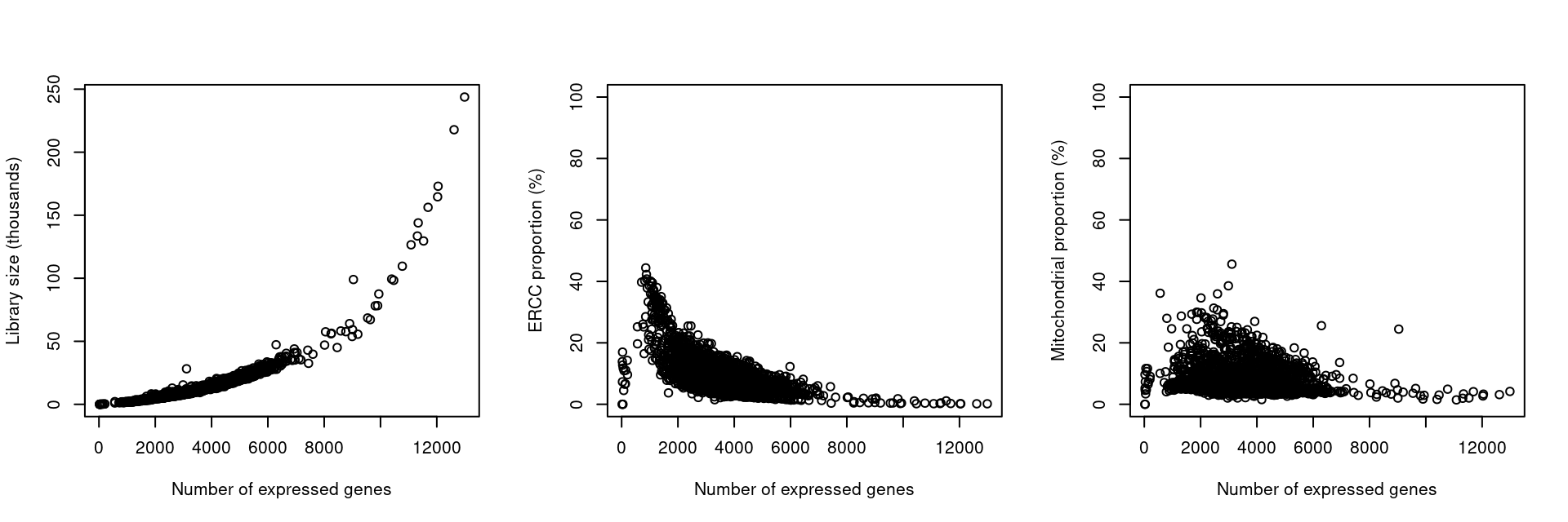
Figure 4: Behaviour of each QC metric compared to the total number of expressed features. Each point represents a cell in the data set.
Overall, most single-cell samples have performed similarly in terms of library size, number of genes detected, and percentage of reads coming from the ERCC spike-ins and mitochondria transcripts. As expected, the 20 cell samples typically have larger library sizes, more genes detected, and a lower percentage of reads coming from ERCC spike-ins and mitochondrial transcripts. For now, however, we focus on the single cell data and remove the 20-cell samples.
There are some plates with a higher average percentage of reads coming from the ERCC spike-ins (LC294 and LC358) or with a subset of samples with notably larger values (LC398). Similarly, there are some plates with a higher average percentage of reads coming from the mitochondrial transcripts (LC294 and LC358). We will investigate these further in [Investigating plates with large ERCC percentages].
Investigating plates with large ERCC and mitochondrial percentages
Figure 5 shows the percentage of reads coming from the ERCC spike-ins by plate position, which can sometimes help identify whether a plate has come out of alignment during the sort.
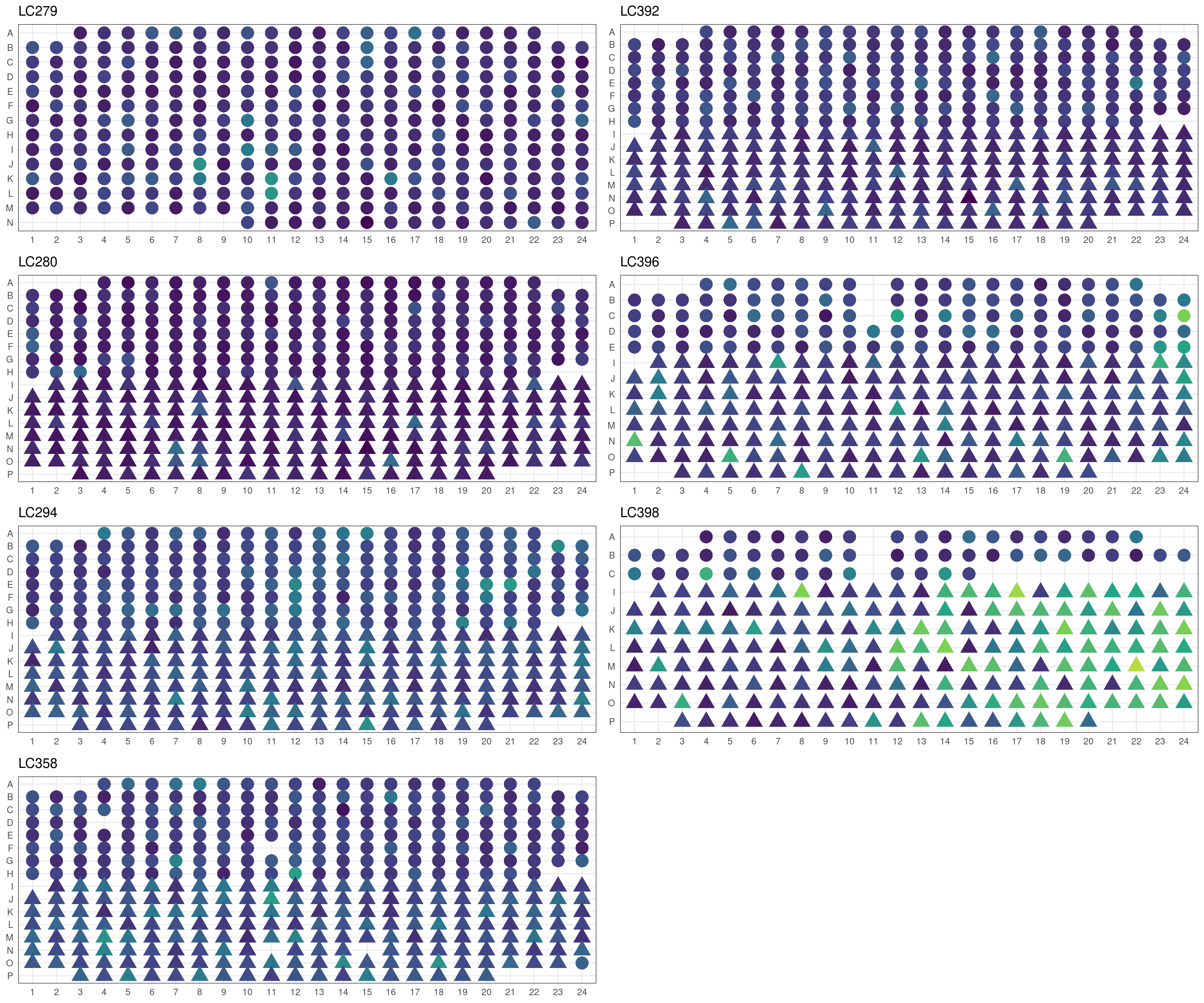
Figure 5: Percentage of reads coming from ERCC spike-ins for all single-cell samples in the dataset plotted by plate position. The colour scale runs from dark blue (0% of reads coming from ERCC spike-ins) to bright yellow (50% of reads coming from ERCC spike-ins) with mutant cells drawn as triangles and control cells as circles.
For plate LC398, we see that there is a systematic trend of mutant cells on the right hand side of the plate having higher percentage of reads coming from the ERCC spike-ins. This may be due to the plate coming out of alignment and means that caution is warranted when interpreting mutant cells from this plate.
Figure 6 shows the percentage of reads coming from mitochondrial transcripts by plate position.
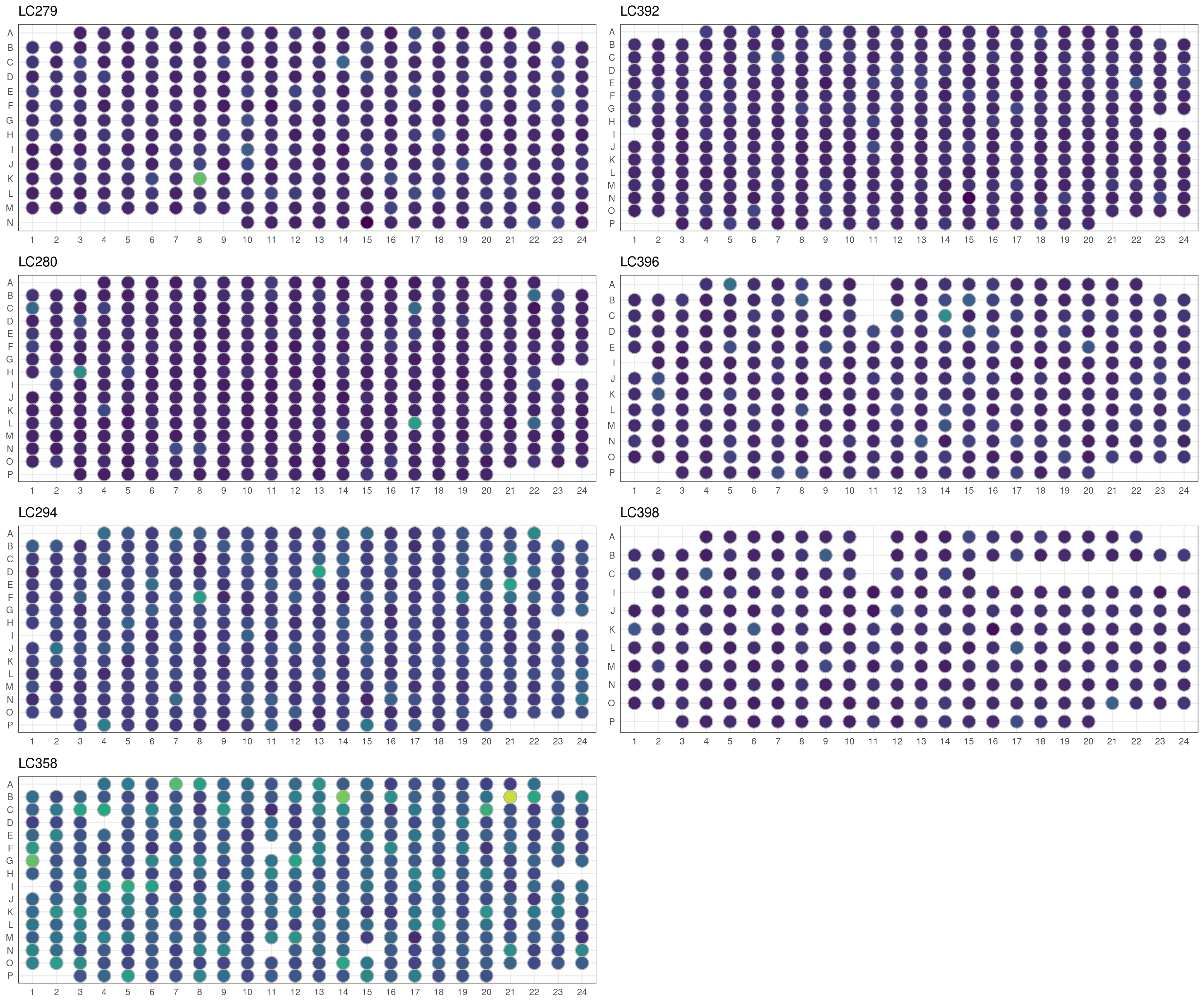
Figure 6: Percentage of reads coming from mitochondrial transcripts for all single-cell samples in the dataset plotted by plate position. The colour scale runs from dark blue (0% of reads coming from mitochondrial transcripts) to bright yellow (50% of reads coming from mitochondrial transcripts) with mutant cells drawn as triangles and control cells as circles.
There is no systematic trend by plate position for the percentage of reads coming from mitochondrial transcripts.
Identifying outliers by each metric
Outliers are defined based on the median absolute deviation (MADs) from the median value of each metric across all cells. We remove small and large outliers for the library size and the number of expressed features, and large outliers for the spike-in proportions. Removal of low-quality cells is then performed by combining the filters for all of the metrics.
Due to the differences in the QC metrics by plate, we will compute our outlier thresholds at the plate-level. However, if an entire plate failed, outlier detection will not be able to act as an appropriate QC filter for that plate. In this case, it is generally better to compute a shared median and MAD from the other plates and use those estimates to obtain an appropriate filter threshold for cells in the problematic plates.
The following plates are excluded when computing the relevant QC metric thresholds:
sum: LC398detected: LC398altexps_ERCC_percent: Nonesubsets_Mt_percent: None
The following table summarises the QC cutoffs:
| batch | total counts | total features | %ERCC | %mito |
|---|---|---|---|---|
| LC279 | 1732.4 | 1099.3 | 15.3 | 10.3 |
| LC280 | 2094.3 | 1263.5 | 9.3 | 7.9 |
| LC294 | 3100.2 | 1538.7 | 22.1 | 17.1 |
| LC358 | 4036.9 | 1730.3 | 23.4 | 28.4 |
| LC392 | 2991.7 | 1699.9 | 15.3 | 8.7 |
| LC396 | 1763.7 | 1220.7 | 21.7 | 10.2 |
| LC398 | 2617.8 | 1450.4 | 42.1 | 9.3 |
The table below summarises the number of cells per plate left following removal of outliers based on the QC metrics. The vast majority of cells are retained for most plates, with the exception of plate LC398. More cells are removed based high percentages of ERCC transcripts or mitochondrial RNA than on low library size and number of expressed genes. In total, we remove 250 cells based on these QC metrics, and retain 2086 cells.
| batch | ByLibSize | ByFeature | BySpike | ByMito | Remaining | PercRemaining |
|---|---|---|---|---|---|---|
| LC358 | 3 | 7 | 4 | 12 | 346 | 94.5 |
| LC294 | 4 | 6 | 7 | 16 | 347 | 93.8 |
| LC279 | 6 | 8 | 13 | 18 | 297 | 92.0 |
| LC392 | 2 | 4 | 12 | 21 | 339 | 91.6 |
| LC280 | 4 | 7 | 25 | 28 | 329 | 88.9 |
| LC396 | 5 | 10 | 20 | 22 | 258 | 86.9 |
| LC398 | 59 | 63 | 2 | 11 | 170 | 70.8 |
Checking for removal of biologically relevant subpopulations
The biggest practical concern during QC is whether an entire cell type is inadvertently discarded. There is always some risk of this occurring as the QC metrics are never fully independent of biological state. We can diagnose cell type loss by looking for systematic differences in gene expression between the discarded and retained cells.
Figure 7 shows the result of this analysis, highlighting that there are few genes with a large \(logFC\) between ‘lost’ and ‘kept’ cells (those few genes with larger \(logFC\) have low average expression). This suggests that the QC step did not inadvertently filter out an entire biologically relevant subpopulation.
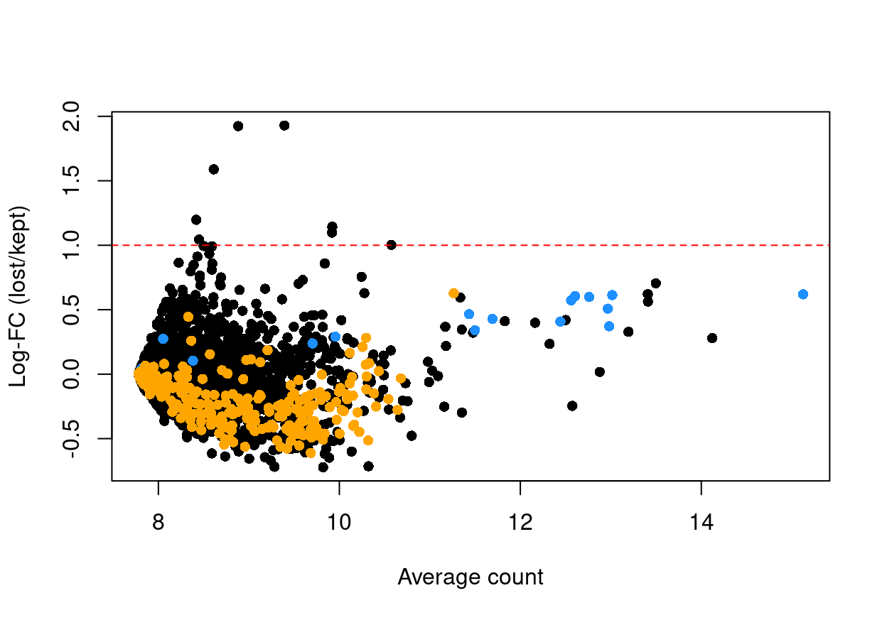
Figure 7: Log-fold change in expression in the discarded cells compared to the retained cells. Each point represents a gene with mitochondrial transcripts in blue and ribosomal protein genes in orange. Dashed red lines indicate $|logFC| = 1
If the discarded pool is enriched for a certain cell type, we should observe increased expression of the corresponding marker genes.
Another concern is whether the cells removed during QC preferentially derive from particular experimental groups. Reassuringly, Figure 8 shows that this is mostly not the case. The exception is plate LC398, which has systematically fewer cells to start with and for which the quality is lower in the part of the plate containing the Mutant cells.
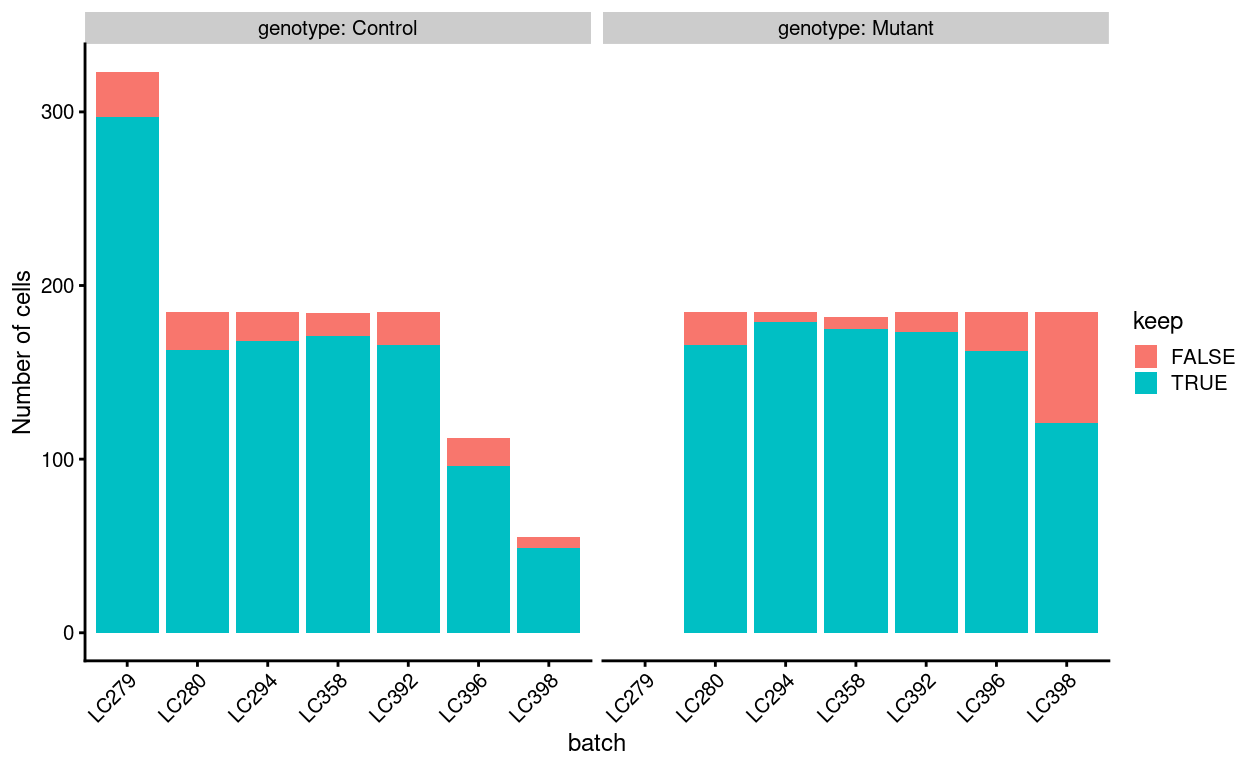
Figure 8: Cells removed during QC, stratified by plate_number and genotype.
Figure 9 compares the QC metrics of the discarded and retained cells
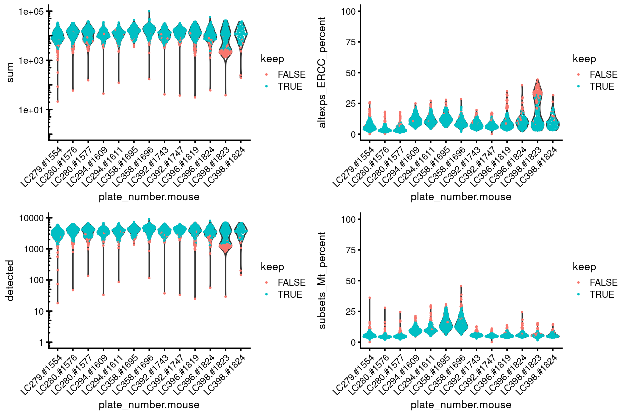
Figure 9: Distribution of QC metrics for each plate in the dataset. Each point represents a cell and is colored according to whether it was discarded during the QC process. Note that a cell will only be kept if it passes the relevant threshold for all four QC metrics.
Summary
To conclude, Figure 10 shows that post-QC that most samples have similar QC metrics, as is to be expected, and Figure 11 summarises the experimental design following QC.
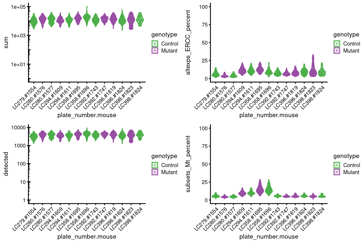
Figure 10: Distributions of various QC metrics for all cells that passed quality control in the data set. This includes the library sizes, number of expressed genes, and proportion of reads mapped to spike-in transcripts or mitochondrial genes.
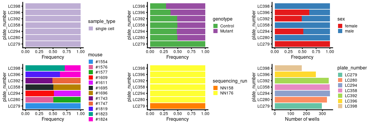
Figure 11: Breakdown of of the samples by plate following QC.
Examining gene-level metrics
Inspecting Kat7 (Hbo) expression
Figure 12 shows that Kat7 is not detected in most samples (89.6% of cells have zero counts) and that there is no striking difference between Control and Mutant samples.
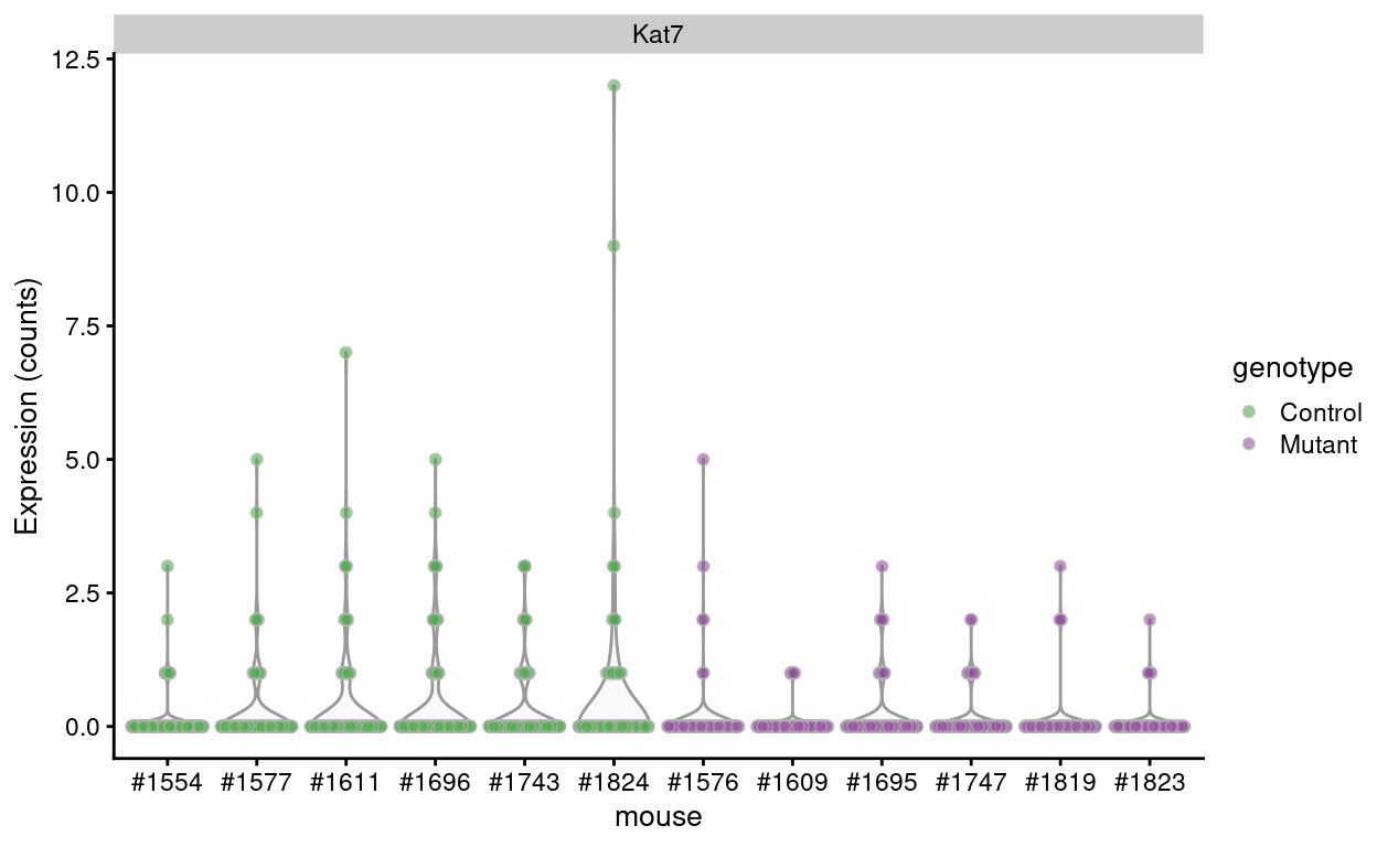
Figure 12: Raw counts of Kat7 in each sample.
Inspecting the most highly expressed genes
Figure 13 shows the most highly expressed genes in the dataset. Many of these genes are mitochondrial genes, ribosomal protein, and pseudogenes.
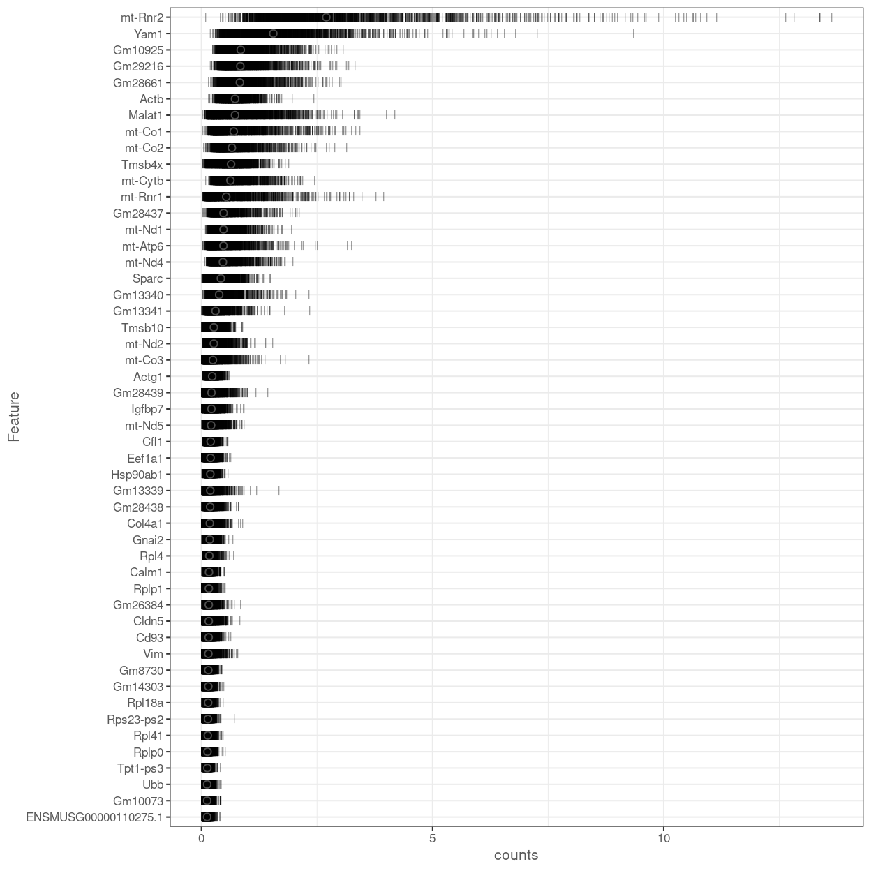
Figure 13: Percentage of total counts assigned to the top 50 most highly-abundant features in the data set. For each feature, each bar represents the percentage assigned to that feature for a single cell, while the circle represents the average across all cells. Bars are coloured by the total number of expressed features in each cell, while circles are coloured according to whether the feature is labelled as a control feature.
Figure 14 shows the most highly expressed after excluding the mitochondrial genes, ribosomal protein, and pseudogenes.
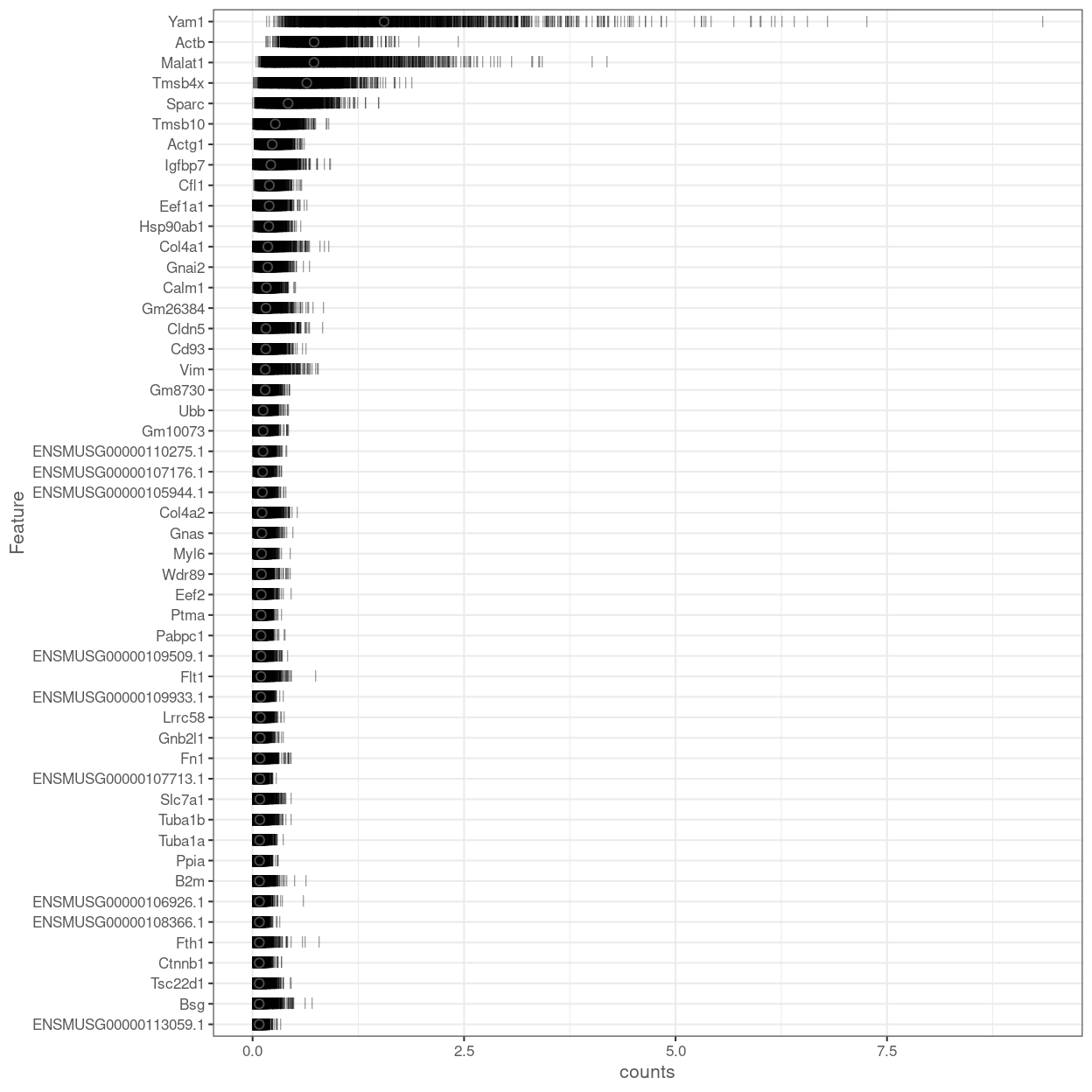
Figure 14: Percentage of total counts assigned to the top 50 most highly-abundant features (after excluding mitochondrial genes, ribosomal protein, and pseudogenes) in the data set. For each feature, each bar represents the percentage assigned to that feature for a single cell, while the circle represents the average across all cells. Bars are coloured by the total number of expressed features in each cell, while circles are coloured according to whether the feature is labelled as a control feature.
Filtering out low-abundance genes
Low-abundance genes are problematic as zero or near-zero counts do not contain much information for reliable statistical inference (Bourgon, Gentleman, and Huber 2010). These genes typically do not provide enough evidence to reject the null hypothesis during testing, yet they still increase the severity of the multiple testing correction. In addition, the discreteness of the counts may interfere with statistical procedures, e.g., by compromising the accuracy of continuous approximations. Thus, low-abundance genes are often removed in many RNA-seq analysis pipelines before the application of downstream methods.
The ‘optimal’ choice of filtering strategy depends on the downstream application. A more aggressive filter is usually required to remove discreteness (e.g., for normalization) compared to that required for removing underpowered tests. For hypothesis testing, the filter statistic should also be independent of the test statistic under the null hypothesis. Thus, we (or the relevant function) will filter at each step as needed, rather than applying a single filter for the entire analysis.
Several metrics can be used to define low-abundance genes. The most obvious is the average count for each gene, computed across all cells in the data set. We typically observe a peak of moderately expressed genes following a plateau of lowly expressed genes (Figure 15).
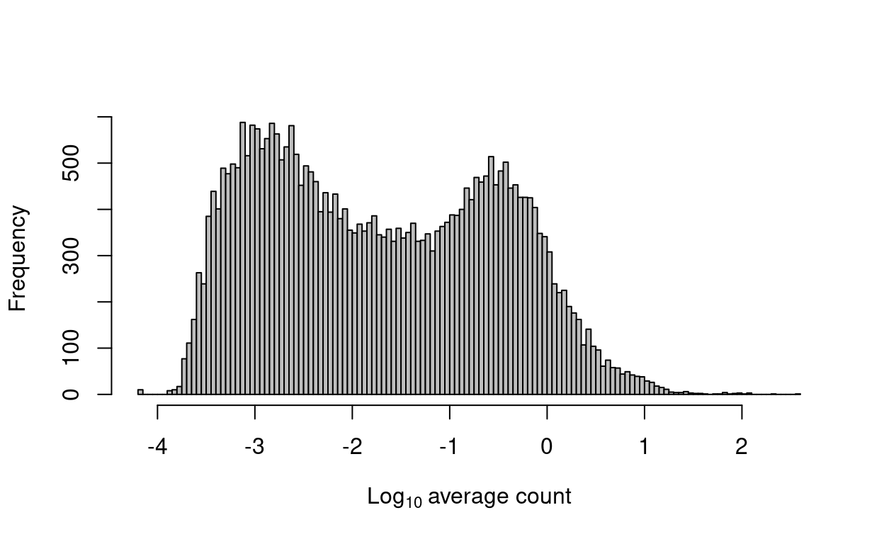
Figure 15: Histogram of log-average counts for all genes in the combined data set.
We remove 607 genes that are not expressed in any cell. Such genes provide no information and would be removed by any filtering strategy. We retain 33655 for downstream analysis.
Normalization
Motivation
Systematic differences in sequencing coverage between libraries are often observed in single-cell RNA sequencing data (Stegle, Teichmann, and Marioni 2015). They typically arise from technical differences in cDNA capture or PCR amplification efficiency across cells, attributable to the difficulty of achieving consistent library preparation with minimal starting material. Normalization aims to remove these differences such that they do not interfere with comparisons of the expression profiles between cells. This ensures that any observed heterogeneity or differential expression within the cell population are driven by biology and not technical biases.
We focus our attention on scaling normalization, which is the simplest and most commonly used class of normalization strategies. This involves dividing all counts for each cell by a cell-specific scaling factor, often called a “size factor” (Anders and Huber 2010). The assumption here is that any cell-specific bias (e.g., in capture or amplification efficiency) affects all genes equally via scaling of the expected mean count for that cell. The size factor for each cell represents the estimate of the relative bias in that cell, so division of its counts by its size factor should remove that bias. The resulting “normalized expression values” can then be used for downstream analyses such as clustering and dimensionality reduction.
For this analysis we consider two forms of scaling normalization:
For most scRNA-seq datasets we use normalization by deconvolution. However, for this dataset there are good reasons for considering normalization by spike-ins.
Reasons for considering normalization by spike-ins
Practically, spike-in normalization should be used if differences in the total RNA content of individual cells are of interest and must be preserved in downstream analyses. In this case, the mutants have defective Kat7 (aka Hbo1) which may lead to the mutant cells having lower total RNA content than the control cells. According to Zoe and Anne5:
HBO1 is required for histone H3 lysine 14 acetylation throughout the genome, in genic and intergenic regions. It is possible that HBO1 is required broadly for gene activity and the very many genes are not expressed at normal levels in its absence. Therefore, the assumption that most genes are equally expressed in mutant and controls may be false. It is possible, that the upregulated genes are actually either not differentially expressed or even downregulated - just not as much as the genes already identified as downregulated.
For this dataset we have ERCC spike-ins, so it is both worthwhile and possible to consider normalization by spike-ins for this dataset.
Normalization by deconvolution
Motivation
Composition biases will be present when any unbalanced differential expression exists between samples (Robinson and Oshlack 2010). Consider the simple example of two cells where a single gene \(X\) is upregulated in one cell \(A\) compared to the other cell \(B\). This upregulation means that either:
- More sequencing resources are devoted to \(X\) in \(A\), thus decreasing coverage of all other non-DE genes when the total library size of each cell is experimentally fixed (e.g., due to library quantification)
- The library size of \(A\) increases when \(X\) is assigned more reads or UMIs, increasing the library size factor and yielding smaller normalized expression values for all non-DE genes.
In both cases, the net effect is that non-DE genes in \(A\) will incorrectly appear to be downregulated compared to \(B\).
The removal of composition biases is a well-studied problem for bulk RNA sequencing data analysis. Normalization can be performed with the estimateSizeFactorsFromMatrix function in the DESeq2 package (Anders and Huber 2010; Love, Huber, and Anders 2014), or with the calcNormFactors function (Robinson and Oshlack 2010) in the edgeR package. These assume that most genes are not DE between cells. Any systematic difference in count size across the non-DE majority of genes between two cells is assumed to represent bias that is used to compute an appropriate size factor for its removal.
However, single-cell data can be problematic for these bulk normalization methods due to the dominance of low and zero counts. To overcome this, we pool counts from many cells to increase the size of the counts for accurate size factor estimation (A. T. Lun, Bach, and Marioni 2016). Pool-based size factors are then “deconvolved” into cell-based factors for normalization of each cell’s expression profile. This is performed using the calculateSumFactors() function from the scran package.
Analysis
We check that the size factors are roughly aligned with the total library sizes (Figure 16). Strong deviations from the diagonal would correspond to composition biases due to differential expression between cell subpopulations.
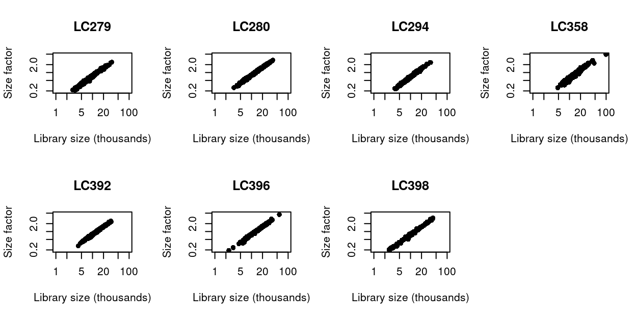
Figure 16: Size factors from deconvolution, plotted against library sizes for all cells in each data set. Axes are shown on a log-scale.
Summary
The assumptions of the deconvolution size factors are satisfied and so we may use deconvolution size factors for normalization.
Normalization by spike-ins
Motivation
Spike-in normalization is based on the assumption that the same amount of spike-in RNA was added to each cell (Lun et al. 2017). Systematic differences in the coverage of the spike-in transcripts can only be due to cell-specific biases, e.g., in capture efficiency or sequencing depth. To remove these biases, we equalize spike-in coverage across cells by scaling with “spike-in size factors”.
Compared to Normalization by deconvolution, spike-in normalization requires no assumption about the biology of the system (i.e. the absence of many DE genes). Instead, it assumes that:
- The spike-in transcripts were added at a constant level to each cell
- The spike-in transcripts respond to biases in the same relative manner as endogenous genes
We can empirically investigate (1), which we do in the next section, whereas (2) is difficult to verify in practice.
Analysis
We can use the percentage of counts coming from the spike-ins to investigate if assumption (1) is met (i.e. were the spike-in transcripts added at a constant level to each cell).
To help understand whether spike-in normalization is appropriate for the current dataset, we make use of two datasets for which the assumptions of spike-in normalization are met6:
- Lun (2017)7
- Richard (2018)8
Figure 17 plots the spike-in counts as a percentage of the library size for each cell in the datasets from Lun (2017) and Richard (2018) alongside the current dataset. We see that for both Lun (2017) and Richard (2018) the assumption that spike-in transcripts added at a constant level appears to be valid. In contrast, for the current dataset there is considerable inter-plate variability of the percentage of counts deriving from the spike-in transcripts.
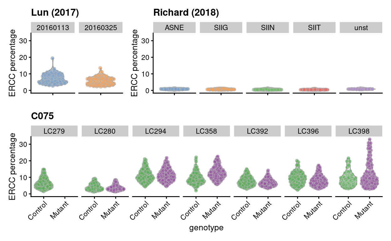
Figure 17: Percentage of counts coming from ERCC spike-in transcripts per sample. On the top is data from Lun (2017) and Richard (2018), two datasets where spike-in normalization was successfully applied, and on the bottom is data from the current experiment. Lun (2017) are stratified by block, Richard (2018) are stratified by stimulus, and C075 by plate_number.
Summary
There is considerable inter-plate variability of the percentage of counts deriving from the spike-in transcripts in the current dataset. This violates assumption (1) (i.e. that the spike-in transcripts were added at a constant level to each cell) and so we may use not spike-in size factors for normalization.
Computing separate size factors for spike-in transcripts
Regardless of the type of size factors we use for the endogenous genes (e.g., deconvolution size factors or spike-in size factors), it is critical that the spike-in transcripts themselves are normalized using the spike-in size factors. Size factors computed from the counts for endogenous genes are usually not appropriate for normalizing the counts for spike-in transcripts. To ensure normalization is performed correctly, we compute a separate set of size factors for the spike-in set. For each cell, the spike-in-specific size factor is defined as the total count across all transcripts in the spike-in set. This assumes that none of the spike-in transcripts are differentially expressed, which is reasonable given that the same amount and composition of spike-in RNA should have been added to each cell (Lun et al. 2017).
Applying the size factors
We can now use the size factors to compute normalized expression values for each cell. This is done by dividing the count for each gene/spike-in transcript with the appropriate size factor for that cell and then taking the logarithm9 of the normalized values10. These are called the logcounts11 and are the basis of much of our downstream analysis.
Inspecting Pglyrp1 expression
Zoe requested a violin plot of Pglyrp1 expression in all cells, which is available as output/violin_plots/Pglyrp1.violin_plot.logcounts.pdf.
Feature selection
Motivation
We often use scRNA-seq data in exploratory analyses to characterize heterogeneity across cells. Procedures like dimensionality reduction and clustering compare cells based on their gene expression profiles, which involves aggregating per-gene differences into a single (dis)similarity metric between a pair of cells. The choice of genes to use in this calculation has a major impact on the behaviour of the metric and the performance of downstream methods. We want to select genes that contain useful information about the biology of the system while removing genes that contain random noise. This aims to preserve interesting biological structure without the variance that obscures that structure. It also reduces the size of the dataset to improve computational efficiency of later steps.
Quantifying per-gene variation
Variance of the log-counts
The simplest approach to quantifying per-gene variation is to simply compute the variance of the log-normalized expression values (referred to as “log-counts” for simplicity) for each gene across all cells in the population (A. T. L. Lun, McCarthy, and Marioni 2016). This has an advantage in that the feature selection is based on the same log-values that are used for later downstream steps. In particular, genes with the largest variances in log-values will contribute the most to the Euclidean distances between cells. By using log-values here, we ensure that our quantitative definition of heterogeneity is consistent throughout the entire analysis.
Calculation of the per-gene variance is simple but feature selection requires modelling of the mean-variance relationship.
Quantifying technical noise
To account for the mean-variance relationship, we fit a trend to the variance with respect to abundance across the ERCC spike-in transcripts. The premise here is that spike-ins should not be affected by biological variation, so the fitted value of the spike-in trend should represent a better estimate of the technical component for each gene.
Accounting for blocking factors
Data containing multiple batches will often exhibit batch effects. We are usually not interested in highly variable genes (HVGs) that are driven by batch effects. Rather, we want to focus on genes that are highly variable within each batch. This is naturally achieved by performing trend fitting and variance decomposition separately for each batch.
The use of a batch-specific trend fit is useful as it accommodates differences in the mean-variance trends between batches. This is especially important if batches exhibit systematic technical differences, e.g., differences in coverage or in the amount of spike-in RNA added.
Figure 18 visualizes the quality of the batch-specific trend fits and Figure 19 highlights the need for batch-specific estimates of these fits. The analysis of each plate yields estimates of the biological and technical components for each gene, which are averaged across plates to take advantage of information from multiple batches.
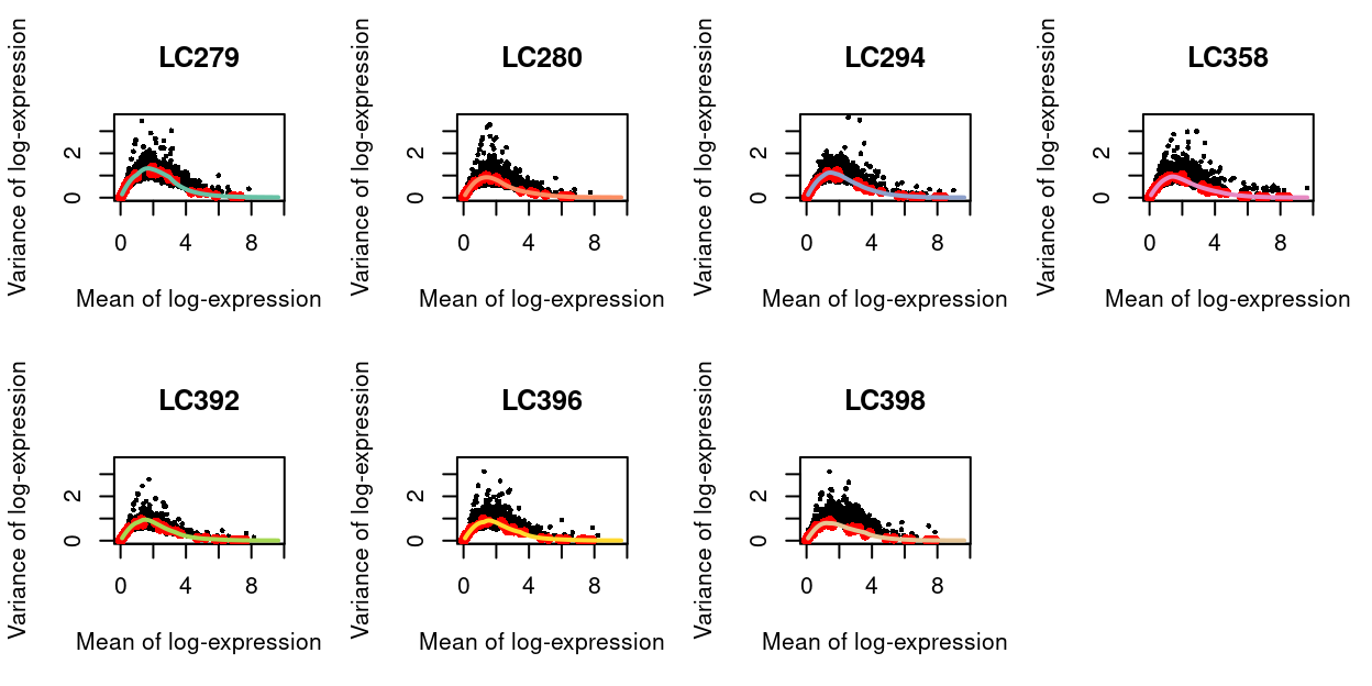
Figure 18: Variance of normalized log-expression values for each gene in each plate, plotted against the mean log-expression. The coloured line represents the mean-dependent trend fitted to the variances of the spike-in transcripts (red).
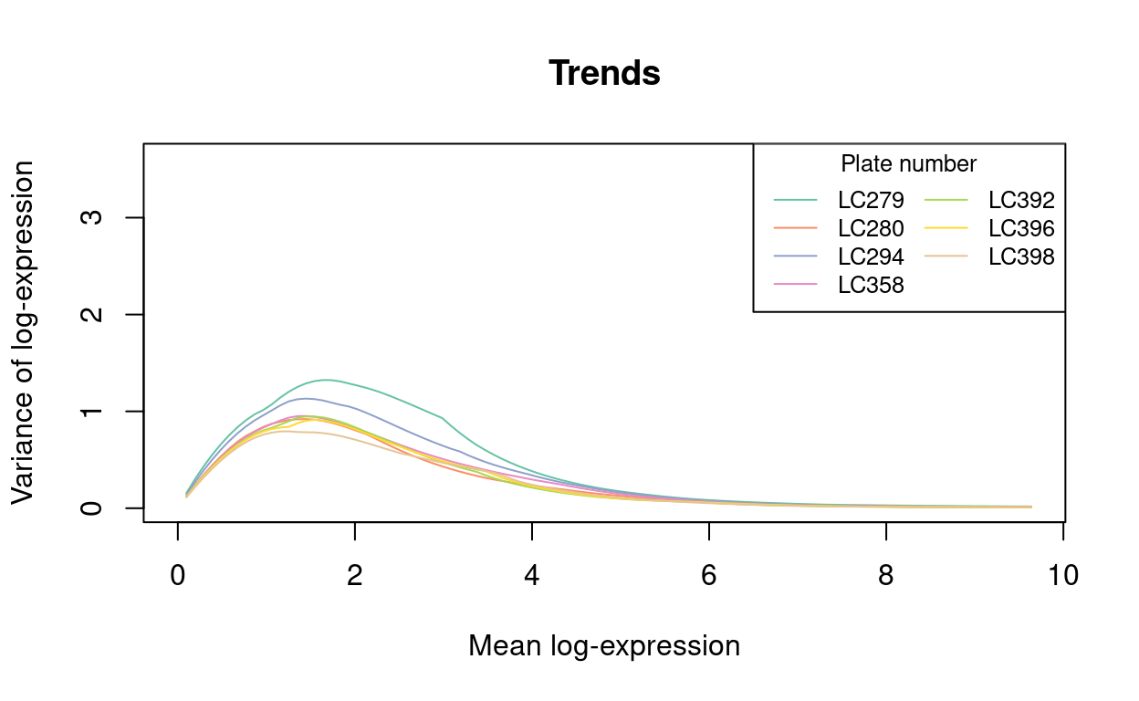
Figure 19: An overlay of the trend fits from the previous figure, highlighting the need for the batch-specific trend fits. Each line is a the trend line for a particular batch (with colours matching the previous plot).
Selecting highly variable genes (HVGs)
Once we have quantified the per-gene variation, the next step is to select the subset of HVGs to use in downstream analyses. A larger subset will reduce the risk of discarding interesting biological signal by retaining more potentially relevant genes, at the cost of increasing noise from irrelevant genes that might obscure said signal. It is difficult to determine the optimal trade-off for any given application as noise in one context may be useful signal in another. For example, heterogeneity in T cell activation responses is an interesting phenomena but may be irrelevant noise in studies that only care about distinguishing the major immunophenotypes.
We opt to only remove the obviously uninteresting genes with variances below the trend. By doing so, we avoid the need to make any judgement calls regarding what level of variation is interesting enough to retain. This approach represents one extreme of the bias-variance trade-off where bias is minimized at the cost of maximizing noise.
Exclusion of gene sets from HVGs
We find that the most highly variable genes in this dataset are somewhat enriched for pseudogenes (n = 1034), with Figure 20 showing more than 20% of the top-250 HVGs are pseudogenes. Figure 20 also shows the percentage of the top-k HVGs that are ribosomal protein genes12 (n = 137), genes on the sex chromosomes (n = 760), and mitochondrial genes (n = 14).
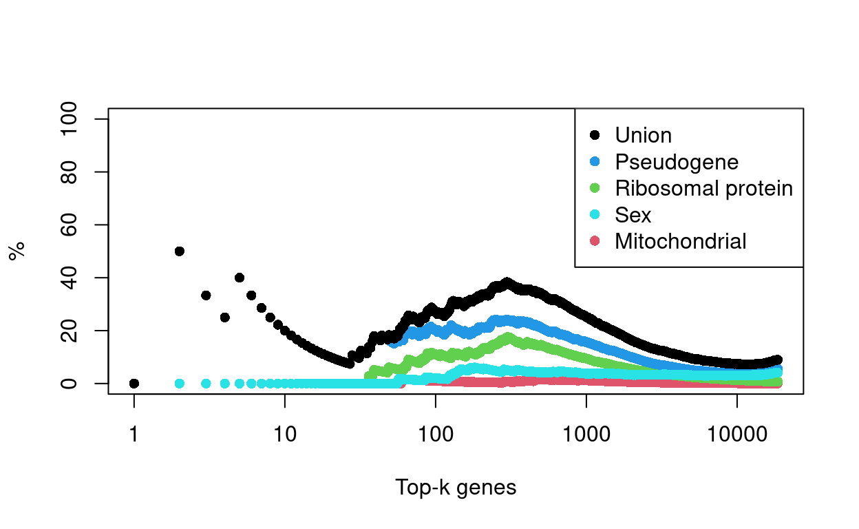
Figure 20: Percentage of top-K HVGs that are genes of a given class.
Zoe and Anne advised that pseudogenes, ribosomal protein genes, genes on the sex chromosomes, and mitochondrial genes are of lesser biological relevance to this study, so it was decided to exclude them from the HVGs. This means that these genes can no longer directly influence some of the subsequent steps in the analysis, including:
- Dimensionality reduction
- Principal component analysis (PCA)
- Uniform manifold approximation and projection (UMAP)
- Data integration
- Mutual nearest neighbours (MNN)
- Clustering
Although the exclusion of these genes from the HVGs prevents them from directly influencing these analyses, they may still indirectly associated with these steps or their outcomes. For example, if there is a set of (non ribosomal protein) genes that are strongly associated with ribosomal protein gene expression, then we may still see a cluster associated with ribosomal protein gene expression.
Finally, and to emphasise, we have only excluded these gene sets from the HVGs, i.e. we have not excluded them entirely from the dataset. In particular, this means that these genes may appear in downstream results (e.g., gene lists resulting from a differential expression analysis between cells in different clusters or with different genotypes).
Summary
We are left with 16927 HVGs by this approach13. Figure 21 shows the expression of the top-10 HVGs.
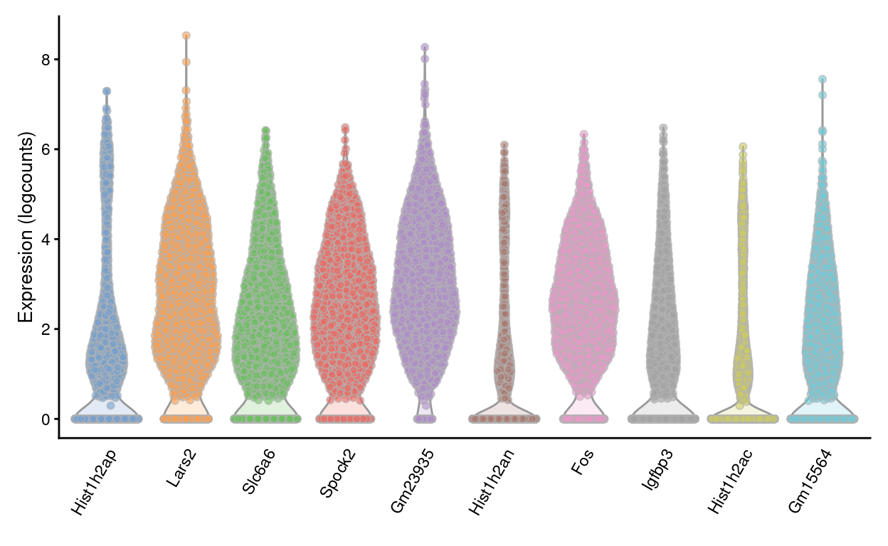
Figure 21: Violin plots of normalized log-expression values for the top-10 HVGs. Each point represents the log-expression value in a single cell.
Dimensionality reduction
Many scRNA-seq analysis procedures involve comparing cells based on their expression values across multiple genes. In these applications, each individual gene represents a dimension of the data. If we had a scRNA-seq data set with two genes, we could make a two-dimensional plot where each axis represents the expression of one gene and each point in the plot represents a cell. Dimensionality reduction extends this idea to data sets with thousands of genes where each cell’s expression profile defines its location in the high-dimensional expression space.
As the name suggests, dimensionality reduction aims to reduce the number of separate dimensions in the data. This is possible because different genes are correlated if they are affected by the same biological process. Thus, we do not need to store separate information for individual genes, but can instead compress multiple features into a single dimension. This reduces computational work in downstream analyses, as calculations only need to be performed for a few dimensions rather than thousands of genes; reduces noise by averaging across multiple genes to obtain a more precise representation of the patterns in the data; and enables effective plotting of the data, for those of us who are not capable of visualizing more than 3 dimensions.
Principal component analysis
Principal components analysis (PCA) discovers axes in high-dimensional space that capture the largest amount of variation. In PCA, the first axis (or “principal component”, PC) is chosen such that it captures the greatest variance across cells. The next PC is chosen such that it is orthogonal to the first and captures the greatest remaining amount of variation, and so on.
By definition, the top PCs capture the dominant factors of heterogeneity in the data set. Thus, we can perform dimensionality reduction by restricting downstream analyses to the top PCs. This strategy is simple, highly effective and widely used throughout the data sciences.
When applying PCA to scRNA-seq data, our assumption is that biological processes affect multiple genes in a coordinated manner. This means that the earlier PCs are likely to represent biological structure as more variation can be captured by considering the correlated behaviour of many genes. By comparison, random technical or biological noise is expected to affect each gene independently. There is unlikely to be an axis that can capture random variation across many genes, meaning that noise should mostly be concentrated in the later PCs. This motivates the use of the earlier PCs in our downstream analyses, which concentrates the biological signal to simultaneously reduce computational work and remove noise.
We perform the PCA on the log-normalized expression values. PCA is generally robust to random noise but an excess of it may cause the earlier PCs to capture noise instead of biological structure. This effect can be avoided - or at least mitigated - by restricting the PCA to a subset of HVGs, as done in Feature selection.
The choice of the number of PCs is a decision that is analogous to the choice of the number of HVGs to use. Using more PCs will avoid discarding biological signal in later PCs, at the cost of retaining more noise.
We use the strategy of retaining all PCs until the percentage of total variation explained reaches some threshold. We derive a suitable value for this threshold by calculating the proportion of variance in the data that is attributed to the biological component. This is done using the the variance modelling results from Quantifying per-gene variation.
This retains 27 dimensions, which represents the lower bound on the number of PCs required to retain all biological variation. Any fewer PCs will definitely discard some aspect of biological signal14. This approach provides a reasonable choice when we want to retain as much signal as possible while still removing some noise.
Dimensionality reduction for visualization
We use the uniform manifold approximation and projection (UMAP) method (McInnes, Healy, and Melville 2018) to perform further dimensionality reduction for visualization.
Figure 22 visualizes the cells using the UMAP co-ordinates.
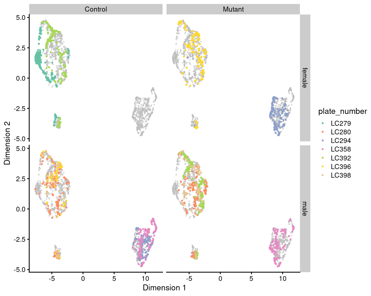
Figure 22: UMAP plot of the dataset. Each point represents a cell and is coloured by plate_number. Each panel highlights cells from a particular combination of genotype and sex.
Summary
Although Figure 22 is only a preliminary summary of the data, there are few points worth highlighting:
- There are strong plate-specific differences (i.e. potential batch effects). In particular, plates
LC294andLC358are very different from the majority of plates. - There are no strong genotype-specific differences within those plates containing cells from mice of each genotype.
- There are no strong sex-specific differences within those plates containing cells from mice of each sex.
We will seek to mitigate the plate-specific differences in downstream analyses so that we might better investigate any genotype-specific differences.
Concluding remarks
The processed SingleCellExperiment object is available (see data/SCEs/C075_Grant_Coultas.preprocessed.SCE.rds). This will be used in downstream analyses, e.g., selecting biologically relevant cells.
Additional information
The following are available on request:
- Full CSV tables of any data presented.
- PDF/PNG files of any static plots.
Session info
─ Session info ─────────────────────────────────────────────────────
 setting  value
 version  R version 4.0.0 (2020-04-24)
 os       CentOS Linux 7 (Core)
 system   x86_64, linux-gnu
 ui       X11
 language (EN)
 collate  en_US.UTF-8
 ctype    en_US.UTF-8
 tz       Australia/Melbourne
 date     2020-10-01

─ Packages ─────────────────────────────────────────────────────────
 ! package                            * version  date       lib
 P AnnotationDbi                      * 1.50.1   2020-06-29 [?]
 P AnnotationFilter                   * 1.12.0   2020-04-27 [?]
 P AnnotationHub                        2.20.0   2020-04-27 [?]
 P askpass                              1.1      2019-01-13 [?]
 P assertthat                           0.2.1    2019-03-21 [?]
 P backports                            1.1.8    2020-06-17 [?]
 P beeswarm                             0.2.3    2016-04-25 [?]
 P Biobase                            * 2.48.0   2020-04-27 [?]
 P BiocFileCache                        1.12.0   2020-04-27 [?]
 P BiocGenerics                       * 0.34.0   2020-04-27 [?]
 P BiocManager                          1.30.10  2019-11-16 [?]
 P BiocNeighbors                        1.6.0    2020-04-27 [?]
 P BiocParallel                       * 1.22.0   2020-04-27 [?]
 P BiocSingular                         1.4.0    2020-04-27 [?]
 P BiocStyle                          * 2.16.0   2020-04-27 [?]
 P BiocVersion                          3.11.1   2019-11-13 [?]
 P biomaRt                              2.44.1   2020-06-17 [?]
 P Biostrings                           2.56.0   2020-04-27 [?]
 P bit                                  1.1-15.2 2020-02-10 [?]
 P bit64                                0.9-7.1  2020-07-15 [?]
 P bitops                               1.0-6    2013-08-17 [?]
 P blob                                 1.2.1    2020-01-20 [?]
 P cli                                  2.0.2    2020-02-28 [?]
 P colorspace                           1.4-1    2019-03-18 [?]
 P cowplot                            * 1.0.0    2019-07-11 [?]
 P crayon                               1.3.4    2017-09-16 [?]
 P curl                                 4.3      2019-12-02 [?]
 P DBI                                  1.1.0    2019-12-15 [?]
 P dbplyr                               1.4.4    2020-05-27 [?]
 P DelayedArray                       * 0.14.1   2020-07-14 [?]
 P DelayedMatrixStats                   1.10.1   2020-07-03 [?]
 P digest                               0.6.25   2020-02-23 [?]
 P distill                              0.8      2020-06-04 [?]
 P dplyr                                1.0.0    2020-05-29 [?]
 P dqrng                                0.2.1    2019-05-17 [?]
 P edgeR                              * 3.30.3   2020-06-02 [?]
 P ellipsis                             0.3.1    2020-05-15 [?]
 P EnsDb.Mmusculus.v79                * 2.99.0   2020-07-15 [?]
 P ensembldb                          * 2.12.1   2020-05-06 [?]
 P evaluate                             0.14     2019-05-28 [?]
 P ExperimentHub                        1.14.0   2020-04-27 [?]
 P fansi                                0.4.1    2020-01-08 [?]
 P farver                               2.0.3    2020-01-16 [?]
 P fastmap                              1.0.1    2019-10-08 [?]
 P FNN                                  1.1.3    2019-02-15 [?]
 P generics                             0.0.2    2018-11-29 [?]
 P GenomeInfoDb                       * 1.24.2   2020-06-15 [?]
 P GenomeInfoDbData                     1.2.3    2020-05-18 [?]
 P GenomicAlignments                    1.24.0   2020-04-27 [?]
 P GenomicFeatures                    * 1.40.1   2020-07-08 [?]
 P GenomicRanges                      * 1.40.0   2020-04-27 [?]
 P ggbeeswarm                           0.6.0    2017-08-07 [?]
 P ggplot2                            * 3.3.2    2020-06-19 [?]
 P Glimma                             * 1.16.0   2020-04-27 [?]
 P glue                                 1.4.1    2020-05-13 [?]
 P GO.db                              * 3.11.4   2020-07-15 [?]
 P graph                                1.66.0   2020-04-27 [?]
 P gridExtra                            2.3      2017-09-09 [?]
 P gtable                               0.3.0    2019-03-25 [?]
 P here                               * 0.1      2017-05-28 [?]
 P highr                                0.8      2019-03-20 [?]
 P hms                                  0.5.3    2020-01-08 [?]
 P htmltools                            0.5.0    2020-06-16 [?]
 P httpuv                               1.5.4    2020-06-06 [?]
 P httr                                 1.4.1    2019-08-05 [?]
 P igraph                               1.2.5    2020-03-19 [?]
 P interactiveDisplayBase               1.26.3   2020-06-02 [?]
 P IRanges                            * 2.22.2   2020-05-21 [?]
 P irlba                                2.3.3    2019-02-05 [?]
 P janitor                            * 2.0.1    2020-04-12 [?]
 P jsonlite                             1.7.0    2020-06-25 [?]
 P knitr                                1.29     2020-06-23 [?]
 P labeling                             0.3      2014-08-23 [?]
 P later                                1.1.0.1  2020-06-05 [?]
 P lattice                              0.20-41  2020-04-02 [?]
 P lazyeval                             0.2.2    2019-03-15 [?]
 P lifecycle                            0.2.0    2020-03-06 [?]
 P limma                              * 3.44.3   2020-06-12 [?]
 P locfit                               1.5-9.4  2020-03-25 [?]
 P lubridate                            1.7.9    2020-06-08 [?]
 P magrittr                             1.5      2014-11-22 [?]
 P Matrix                             * 1.2-18   2019-11-27 [?]
 P matrixStats                        * 0.56.0   2020-03-13 [?]
 P memoise                              1.1.0    2017-04-21 [?]
 P mime                                 0.9      2020-02-04 [?]
 P msigdbr                            * 7.1.1    2020-05-14 [?]
 P munsell                              0.5.0    2018-06-12 [?]
 P Mus.musculus                       * 1.3.1    2020-07-15 [?]
 P openssl                              1.4.2    2020-06-27 [?]
 P org.Mm.eg.db                       * 3.11.4   2020-06-02 [?]
 P OrganismDbi                        * 1.30.0   2020-04-27 [?]
 P patchwork                          * 1.0.1    2020-06-22 [?]
 P pillar                               1.4.6    2020-07-10 [?]
 P pkgconfig                            2.0.3    2019-09-22 [?]
 P png                                  0.1-7    2013-12-03 [?]
 P Polychrome                           1.2.5    2020-03-29 [?]
 P prettyunits                          1.1.1    2020-01-24 [?]
 P progress                             1.2.2    2019-05-16 [?]
 P promises                             1.1.1    2020-06-09 [?]
 P ProtGenerics                         1.20.0   2020-04-27 [?]
 P purrr                                0.3.4    2020-04-17 [?]
 P R6                                   2.4.1    2019-11-12 [?]
 P rappdirs                             0.3.1    2016-03-28 [?]
 P RBGL                                 1.64.0   2020-04-27 [?]
 P RColorBrewer                         1.1-2    2014-12-07 [?]
 P Rcpp                                 1.0.5    2020-07-06 [?]
 P RCurl                                1.98-1.2 2020-04-18 [?]
 P rlang                                0.4.7    2020-07-09 [?]
 P rmarkdown                          * 2.3      2020-06-18 [?]
 P rprojroot                            1.3-2    2018-01-03 [?]
 P Rsamtools                            2.4.0    2020-04-27 [?]
 P RSpectra                             0.16-0   2019-12-01 [?]
 P RSQLite                              2.2.0    2020-01-07 [?]
 P rsvd                                 1.0.3    2020-02-17 [?]
 P rtracklayer                          1.48.0   2020-04-27 [?]
 P S4Vectors                          * 0.26.1   2020-05-16 [?]
 P scales                               1.1.1    2020-05-11 [?]
 P scater                             * 1.16.2   2020-06-26 [?]
 P scatterplot3d                        0.3-41   2018-03-14 [?]
 P scran                              * 1.16.0   2020-04-27 [?]
 P scRNAseq                           * 2.2.0    2020-05-07 [?]
 P sessioninfo                          1.1.1    2018-11-05 [?]
 P shiny                                1.5.0    2020-06-23 [?]
 P SingleCellExperiment               * 1.10.1   2020-04-28 [?]
 P snakecase                            0.11.0   2019-05-25 [?]
 P statmod                              1.4.34   2020-02-17 [?]
 P stringi                              1.4.6    2020-02-17 [?]
 P stringr                              1.4.0    2019-02-10 [?]
 P SummarizedExperiment               * 1.18.2   2020-07-09 [?]
 P tibble                               3.0.3    2020-07-10 [?]
 P tidyselect                           1.1.0    2020-05-11 [?]
 P TxDb.Mmusculus.UCSC.mm10.knownGene * 3.10.0   2020-07-15 [?]
 P uwot                               * 0.1.8    2020-03-16 [?]
 P vctrs                                0.3.2    2020-07-15 [?]
 P vipor                                0.4.5    2017-03-22 [?]
 P viridis                              0.5.1    2018-03-29 [?]
 P viridisLite                          0.3.0    2018-02-01 [?]
 P withr                                2.2.0    2020-04-20 [?]
 P xfun                                 0.15     2020-06-21 [?]
 P XML                                  3.99-0.4 2020-07-05 [?]
 P xtable                               1.8-4    2019-04-21 [?]
 P XVector                              0.28.0   2020-04-27 [?]
 P yaml                                 2.2.1    2020-02-01 [?]
 P zlibbioc                             1.34.0   2020-04-27 [?]
 source
 Bioconductor
 Bioconductor
 Bioconductor
 CRAN (R 4.0.0)
 CRAN (R 4.0.0)
 CRAN (R 4.0.0)
 CRAN (R 4.0.0)
 Bioconductor
 Bioconductor
 Bioconductor
 CRAN (R 4.0.0)
 Bioconductor
 Bioconductor
 Bioconductor
 Bioconductor
 Bioconductor
 Bioconductor
 Bioconductor
 CRAN (R 4.0.0)
 CRAN (R 4.0.0)
 CRAN (R 4.0.0)
 CRAN (R 4.0.0)
 CRAN (R 4.0.0)
 CRAN (R 4.0.0)
 CRAN (R 4.0.0)
 CRAN (R 4.0.0)
 CRAN (R 4.0.0)
 CRAN (R 4.0.0)
 CRAN (R 4.0.0)
 Bioconductor
 Bioconductor
 CRAN (R 4.0.0)
 CRAN (R 4.0.0)
 CRAN (R 4.0.0)
 CRAN (R 4.0.0)
 Bioconductor
 CRAN (R 4.0.0)
 Bioconductor
 Bioconductor
 CRAN (R 4.0.0)
 Bioconductor
 CRAN (R 4.0.0)
 CRAN (R 4.0.0)
 CRAN (R 4.0.0)
 CRAN (R 4.0.0)
 CRAN (R 4.0.0)
 Bioconductor
 Bioconductor
 Bioconductor
 Bioconductor
 Bioconductor
 CRAN (R 4.0.0)
 CRAN (R 4.0.0)
 Bioconductor
 CRAN (R 4.0.0)
 Bioconductor
 Bioconductor
 CRAN (R 4.0.0)
 CRAN (R 4.0.0)
 CRAN (R 4.0.0)
 CRAN (R 4.0.0)
 CRAN (R 4.0.0)
 CRAN (R 4.0.0)
 CRAN (R 4.0.0)
 CRAN (R 4.0.0)
 CRAN (R 4.0.0)
 Bioconductor
 Bioconductor
 CRAN (R 4.0.0)
 CRAN (R 4.0.0)
 CRAN (R 4.0.0)
 CRAN (R 4.0.0)
 CRAN (R 4.0.0)
 CRAN (R 4.0.0)
 CRAN (R 4.0.0)
 CRAN (R 4.0.0)
 CRAN (R 4.0.0)
 Bioconductor
 CRAN (R 4.0.0)
 CRAN (R 4.0.0)
 CRAN (R 4.0.0)
 CRAN (R 4.0.0)
 CRAN (R 4.0.0)
 CRAN (R 4.0.0)
 CRAN (R 4.0.0)
 CRAN (R 4.0.0)
 CRAN (R 4.0.0)
 Bioconductor
 CRAN (R 4.0.0)
 Bioconductor
 Bioconductor
 CRAN (R 4.0.0)
 CRAN (R 4.0.0)
 CRAN (R 4.0.0)
 CRAN (R 4.0.0)
 CRAN (R 4.0.0)
 CRAN (R 4.0.0)
 CRAN (R 4.0.0)
 CRAN (R 4.0.0)
 Bioconductor
 CRAN (R 4.0.0)
 CRAN (R 4.0.0)
 CRAN (R 4.0.0)
 Bioconductor
 CRAN (R 4.0.0)
 CRAN (R 4.0.0)
 CRAN (R 4.0.0)
 CRAN (R 4.0.0)
 CRAN (R 4.0.0)
 CRAN (R 4.0.0)
 Bioconductor
 CRAN (R 4.0.0)
 CRAN (R 4.0.0)
 CRAN (R 4.0.0)
 Bioconductor
 Bioconductor
 CRAN (R 4.0.0)
 Bioconductor
 CRAN (R 4.0.0)
 Bioconductor
 Bioconductor
 CRAN (R 4.0.0)
 CRAN (R 4.0.0)
 Bioconductor
 CRAN (R 4.0.0)
 CRAN (R 4.0.0)
 CRAN (R 4.0.0)
 CRAN (R 4.0.0)
 Bioconductor
 CRAN (R 4.0.0)
 CRAN (R 4.0.0)
 Bioconductor
 CRAN (R 4.0.0)
 CRAN (R 4.0.0)
 CRAN (R 4.0.0)
 CRAN (R 4.0.0)
 CRAN (R 4.0.0)
 CRAN (R 4.0.0)
 CRAN (R 4.0.0)
 CRAN (R 4.0.0)
 CRAN (R 4.0.0)
 Bioconductor
 CRAN (R 4.0.0)
 Bioconductor

[1] /stornext/General/data/user_managed/grpu_mritchie_1/hickey/SCORE/C075_Grant_Coultas/renv/library/R-4.0/x86_64-pc-linux-gnu
[2] /tmp/RtmpImljK7/renv-system-library
[3] /stornext/System/data/apps/R/R-4.0.0/lib64/R/library

 P ── Loaded and on-disk path mismatch.
Anders, S., and W. Huber. 2010. “Differential Expression Analysis for Sequence Count Data.” Genome Biol. 11 (10): R106. https://www.ncbi.nlm.nih.gov/pubmed/20979621.
Bourgon, R., R. Gentleman, and W. Huber. 2010. “Independent Filtering Increases Detection Power for High-Throughput Experiments.” Proc. Natl. Acad. Sci. U.S.A. 107 (21): 9546–51. https://www.ncbi.nlm.nih.gov/pubmed/20460310.
Love, M. I., W. Huber, and S. Anders. 2014. “Moderated Estimation of Fold Change and Dispersion for Rna-Seq Data with Deseq2.” Genome Biol. 15 (12): 550. https://www.ncbi.nlm.nih.gov/pubmed/25516281.
Lun, A. T., K. Bach, and J. C. Marioni. 2016. Genome Biol. 17 (April): 75. https://www.ncbi.nlm.nih.gov/pubmed/27122128.
Lun, A. T. L., F. J. Calero-Nieto, L. Haim-Vilmovsky, B. Gottgens, and J. C. Marioni. 2017. “Assessing the Reliability of Spike-in Normalization for Analyses of Single-Cell Rna Sequencing Data.” Genome Res. 27 (11): 1795–1806.
Lun, A. T. L., D. J. McCarthy, and J. C. Marioni. 2016. “A Step-by-Step Workflow for Low-Level Analysis of Single-Cell RNA-seq Data.” F1000Res. 5 (August).
McInnes, Leland, John Healy, and James Melville. 2018. “UMAP: Uniform Manifold Approximation and Projection for Dimension Reduction,” February. http://arxiv.org/abs/1802.03426.
Robinson, M. D., and A. Oshlack. 2010. “A Scaling Normalization Method for Differential Expression Analysis of Rna-Seq Data.” Genome Biol. 11 (3): R25. https://www.ncbi.nlm.nih.gov/pubmed/20196867.
Stegle, O., S. A. Teichmann, and J. C. Marioni. 2015. “Computational and Analytical Challenges in Single-Cell Transcriptomics.” Nat. Rev. Genet. 16 (3): 133–45. https://www.ncbi.nlm.nih.gov/pubmed/25628217.
Mouse
#1824acts as a control sample on two plates.↩︎Some care is taken to account for missing and duplicate gene symbols; missing symbols are replaced with the Ensembl identifier and duplicated symbols are concatenated with the (unique) Ensembl identifiers.↩︎
The number of expressed genes refers to the number of genes which have non-zero counts (ie. they have been identified in the cell at least once)↩︎
This is consistent with the use of UMI counts rather than read counts, as each transcript molecule can only produce one UMI count but can yield many reads after fragmentation.↩︎
Email 2020-05-06↩︎
These datasets differ to ours because they used the Smart-seq2 scRNA-seq protocol, which generates full-length RNA-seq from single cells, but this does not matter for our current purposes.↩︎
Contains two 96-well plates of 416B cells (an immortalized mouse myeloid progenitor cell line), processed using the Smart-seq2 protocol. A constant amount of spike-in RNA from the External RNA Controls Consortium (ERCC) was also added to each cell’s lysate prior to library preparation. This dataset was used in the paper ‘Assessing the reliability of spike-in normalization for analyses of single-cell RNA sequencing data’ (Lun et al. 2017)↩︎
Contains four 96-well plates of mouse CD8+ T cells, processed using the Smart-seq2 protocol. A constant amount of spike-in RNA from the External RNA Controls Consortium (ERCC) was also added to each cell’s lysate prior to library preparation. This dataset is used to demonstrate spike-in normalization in ‘Orchestrating Single-Cell Analysis with Bioconductor’ book.↩︎
\(log_2\)↩︎
When log-transforming, we typically add a pseudo-count to avoid undefined values at zero. Larger pseudo-counts will effectively shrink the log-fold changes between cells towards zero for low-abundance genes, meaning that downstream high-dimensional analyses will be driven more by differences in expression for high-abundance genes. Conversely, smaller pseudo-counts will increase the relative contribution of low-abundance genes. We use a pseudo-count of 1.↩︎
Technically, these are “log-transformed normalized expression values”, but that’s too much of a mouthful.↩︎
Here, ribosomal protein genes are defined as those gene symbols starting with “Rpl” or “Rps” or otherwise found in the “KEGG_RIBOSOME” gene set published by MSigDB, namely: Fau, Mrpl13, Rpl10, Rpl10-ps1, Rpl10-ps2, Rpl10-ps3, Rpl10-ps4, Rpl10-ps6, Rpl10a, Rpl10a-ps1, Rpl10a-ps2, Rpl10l, Rpl11, Rpl12, Rpl12-ps1, Rpl12-ps2, Rpl13, Rpl13-ps1, Rpl13-ps3, Rpl13-ps5, Rpl13a, Rpl13a-ps1, Rpl14, Rpl14-ps1, Rpl15, Rpl15-ps1, Rpl15-ps2, Rpl15-ps3, Rpl15-ps4, Rpl17, Rpl17-ps1, Rpl17-ps10, Rpl17-ps4, Rpl17-ps5, Rpl17-ps8, Rpl17-ps9, Rpl18, Rpl18-ps1, Rpl18-ps2, Rpl18a, Rpl18a-ps1, Rpl19, Rpl19-ps1, Rpl19-ps11, Rpl19-ps12, Rpl19-ps4, Rpl21, Rpl21-ps12, Rpl21-ps13, Rpl21-ps14, Rpl21-ps15, Rpl21-ps3, Rpl21-ps4, Rpl21-ps5, Rpl21-ps6, Rpl21-ps7, Rpl21-ps8, Rpl21-ps9, Rpl22, Rpl22-ps1, Rpl22l1, Rpl23, Rpl23a, Rpl23a-ps1, Rpl23a-ps11, Rpl23a-ps13, Rpl23a-ps14, Rpl23a-ps2, Rpl23a-ps3, Rpl23a-ps4, Rpl23a-ps5, Rpl23a-ps6, Rpl24, Rpl26, Rpl26-ps2, Rpl26-ps3, Rpl26-ps4, Rpl26-ps5, Rpl27, Rpl27-ps1, Rpl27-ps2, Rpl27-ps3, Rpl27a, Rpl27a-ps1, Rpl27a-ps2, Rpl28, Rpl28-ps1, Rpl28-ps3, Rpl28-ps4, Rpl29, Rpl29-ps1, Rpl29-ps2, Rpl29-ps5, Rpl3, Rpl3-ps1, Rpl3-ps2, Rpl30, Rpl30-ps1, Rpl30-ps10, Rpl30-ps11, Rpl30-ps2, Rpl30-ps3, Rpl30-ps5, Rpl30-ps6, Rpl30-ps8, Rpl30-ps9, Rpl31, Rpl31-ps1, Rpl31-ps10, Rpl31-ps11, Rpl31-ps13, Rpl31-ps14, Rpl31-ps15, Rpl31-ps16, Rpl31-ps17, Rpl31-ps18, Rpl31-ps20, Rpl31-ps21, Rpl31-ps22, Rpl31-ps23, Rpl31-ps24, Rpl31-ps25, Rpl31-ps4, Rpl31-ps5, Rpl31-ps6, Rpl31-ps7, Rpl31-ps8, Rpl31-ps9, Rpl32, Rpl32-ps, Rpl34, Rpl34-ps1, Rpl35, Rpl35-ps1, Rpl35a, Rpl35a-ps2, Rpl35a-ps3, Rpl35a-ps4, Rpl35a-ps5, Rpl35a-ps6, Rpl35a-ps7, Rpl36, Rpl36-ps1, Rpl36-ps10, Rpl36-ps2, Rpl36-ps3, Rpl36-ps4, Rpl36-ps8, Rpl36a, Rpl36a-ps1, Rpl36a-ps3, Rpl36a-ps4, Rpl36al, Rpl37, Rpl37a, Rpl37rt, Rpl38, Rpl38-ps1, Rpl38-ps2, Rpl39, Rpl39-ps, Rpl39l, Rpl3l, Rpl4, Rpl41, Rpl48-ps1, Rpl5, Rpl5-ps1, Rpl5-ps2, Rpl6, Rpl7, Rpl7a, Rpl7a-ps10, Rpl7a-ps11, Rpl7a-ps12, Rpl7a-ps13, Rpl7a-ps3, Rpl7a-ps5, Rpl7a-ps8, Rpl7a-ps9, Rpl7l1, Rpl7l1-ps1, Rpl8, Rpl9, Rpl9-ps1, Rpl9-ps2, Rpl9-ps3, Rpl9-ps4, Rpl9-ps5, Rpl9-ps6, Rpl9-ps7, Rplp0, Rplp0-ps1, Rplp1, Rplp1-ps1, Rplp2, Rps10, Rps10-ps1, Rps10-ps2, Rps10-ps3, Rps10-ps4, Rps11, Rps11-ps1, Rps11-ps2, Rps11-ps3, Rps11-ps4, Rps11-ps5, Rps12, Rps12-ps1, Rps12-ps10, Rps12-ps11, Rps12-ps12, Rps12-ps13, Rps12-ps14, Rps12-ps15, Rps12-ps16, Rps12-ps17, Rps12-ps18, Rps12-ps19, Rps12-ps20, Rps12-ps21, Rps12-ps22, Rps12-ps23, Rps12-ps26, Rps12-ps3, Rps12-ps5, Rps12-ps6, Rps12-ps7, Rps12-ps9, Rps12l1, Rps12l2, Rps13, Rps13-ps1, Rps13-ps2, Rps13-ps4, Rps13-ps5, Rps13-ps6, Rps13-ps7, Rps13-ps8, Rps14, Rps15, Rps15-ps2, Rps15a, Rps15a-ps1, Rps15a-ps2, Rps15a-ps3, Rps15a-ps4, Rps15a-ps5, Rps15a-ps6, Rps15a-ps7, Rps15a-ps8, Rps16, Rps16-ps2, Rps16-ps3, Rps17, Rps18, Rps18-ps1, Rps18-ps2, Rps18-ps3, Rps19, Rps19-ps1, Rps19-ps10, Rps19-ps11, Rps19-ps12, Rps19-ps13, Rps19-ps2, Rps19-ps3, Rps19-ps4, Rps19-ps5, Rps19-ps6, Rps19-ps7, Rps19-ps8, Rps19-ps9, Rps19bp1, Rps2, Rps2-ps10, Rps2-ps11, Rps2-ps13, Rps2-ps4, Rps2-ps5, Rps2-ps6, Rps2-ps9, Rps20, Rps21, Rps23, Rps23-ps, Rps23-ps1, Rps23-ps2, Rps24, Rps24-ps2, Rps24-ps3, Rps25, Rps25-ps1, Rps26, Rps26-ps1, Rps27, Rps27-ps1, Rps27a, Rps27a-ps1, Rps27a-ps2, Rps27l, Rps27rt, Rps28, Rps29, Rps29-ps, Rps3, Rps3a1, Rps3a2, Rps3a3, Rps4l, Rps4l-ps, Rps4x, Rps5, Rps6, Rps6-ps1, Rps6-ps2, Rps6-ps3, Rps6-ps4, Rps6ka1, Rps6ka2, Rps6ka3, Rps6ka4, Rps6ka5, Rps6ka6, Rps6kb1, Rps6kb2, Rps6kc1, Rps6kl1, Rps7, Rps8, Rps8-ps1, Rps8-ps2, Rps8-ps3, Rps9, Rpsa, Rpsa-ps1, Rpsa-ps10, Rpsa-ps11, Rpsa-ps12, Rpsa-ps2, Rpsa-ps3, Rpsa-ps4, Rpsa-ps5, Rpsa-ps9, Rsl24d1, Uba52↩︎
This is a large number of HVGs but the results don’t qualitatively change by reducing this to, say, the top-1000 HVGs.↩︎
Note that the converse is not true, i.e., there is no guarantee that the retained PCs capture all of the signal, which is only generally possible if no dimensionality reduction is performed at all.↩︎