Show code
library(SingleCellExperiment)
library(here)
library(scater)
library(scran)
library(ggplot2)
library(cowplot)
library(edgeR)
library(Glimma)
library(BiocParallel)
library(patchwork)

source(here("code", "helper_functions.R"))

# NOTE: Using multiple cores seizes up my laptop. Can use more on unix box.
options("mc.cores" = ifelse(Sys.info()[["nodename"]] == "PC1331", 2L, 8L))
register(MulticoreParam(workers = getOption("mc.cores")))

knitr::opts_chunk$set(fig.path = "C057_Cooney.cell_selection_files/")
Motivation
scRNA-seq datasets generated with 10X will include droplets that are not relevant to the study, even after the initial quality control, which we don’t want to include in downstream analyses. In this section aim to filter out these ‘unwanted’ droplets and retain only those droplets containing ‘biologically relevant’ cells. Examples of unwanted droplets include:
- Droplets containing stripped nuclei
- Droplets containing more than one cell (‘doublets’)
- Droplets without phenotype data, such as droplets for which we can’t infer the sample identify based on cell hashing or genetic variation data
- Droplets containing unwanted cell types, such as those that might sneak through a FACS or magnetic bead enrichment sample preparation
Once we are confident that we have selected the biologically relevant cells, we will perform data integration (if necessary) and a further round of clustering in preparation for downstream analysis.
The removal of unwanted droplets is an iterative process where at each step we:
- Identify cluster(s) enriched for unwanted droplets. The exact criteria used to define ‘unwanted’ will depend on the type of droplets we are trying to identify at each step.
- Perform diagnostic checks to ensure we aren’t discarding biologically relevant droplets.
- Remove the unwanted cells.
- Re-process the remaining droplets.
- Identify HVGs.
- Perform dimensionality reduction (PCA and UMAP).
- Cluster droplets.
Clustering is a critical component of this process, so we discuss it in further detail in the next subsection.
Clustering
Clustering is an unsupervised learning procedure that is used in scRNA-seq data analysis to empirically define groups of cells with similar expression profiles. Its primary purpose is to summarize the data in a digestible format for human interpretation. This allows us to describe population heterogeneity in terms of discrete labels that are easily understood, rather than attempting to comprehend the high-dimensional manifold on which the cells truly reside. Clustering is thus a critical step for extracting biological insights from scRNA-seq data.
Clustering calculations are usually performed using the top PCs to take advantage of data compression and denoising.
Clusters vs. cell types
It is worth stressing the distinction between clusters and cell types. The former is an empirical construct while the latter is a biological truth (albeit a vaguely defined one). For this reason, questions like “what is the true number of clusters?” are usually meaningless. We can define as many clusters as we like, with whatever algorithm we like - each clustering will represent its own partitioning of the high-dimensional expression space, and is as “real” as any other clustering.
A more relevant question is “how well do the clusters approximate the cell types?” Unfortunately, this is difficult to answer given the context-dependent interpretation of biological truth. Some analysts will be satisfied with resolution of the major cell types; other analysts may want resolution of subtypes; and others still may require resolution of different states (e.g., metabolic activity, stress) within those subtypes. Two clusterings can also be highly inconsistent yet both valid, simply partitioning the cells based on different aspects of biology. Indeed, asking for an unqualified “best” clustering is akin to asking for the best magnification on a microscope without any context.
It is helpful to realize that clustering, like a microscope, is simply a tool to explore the data. We can zoom in and out by changing the resolution of the clustering parameters, and we can experiment with different clustering algorithms to obtain alternative perspectives of the data. This iterative approach is entirely permissible for data exploration, which constitutes the majority of all scRNA-seq data analysis.
Graph-based clustering
We build a shared nearest neighbour graph (Xu and Su 2015) and use the Louvain algorithm to identify clusters. We would build the graph using the principal components.
Preparing the data
We start from the preprocessed SingleCellExperiment object created in ‘Preprocessing the Cooney (C057) memory CD4+ T-cell data set’.
Show code
sce <- readRDS(here("data", "SCEs", "C057_Cooney.preprocessed.SCE.rds"))

# data frames containing co-ordinates and factors for creating reduced
# dimensionality plots.
umap_df <- cbind(
  data.frame(
    x = reducedDim(sce, "UMAP")[, 1],
    y = reducedDim(sce, "UMAP")[, 2]),
  as.data.frame(colData(sce)[, !colnames(colData(sce)) %in% c("TRA", "TRB")]))

# Some useful colours
sample_colours <- setNames(
  unique(sce$sample_colours),
  unique(names(sce$sample_colours)))
treatment_colours <- setNames(
  unique(sce$treatment_colours),
  unique(names(sce$treatment_colours)))

# Some useful gene sets
mito_set <- rownames(sce)[which(rowData(sce)$CHR == "MT")]
ribo_set <- grep("^RP(S|L)", rownames(sce), value = TRUE)
# NOTE: A more curated approach for identifying ribosomal protein genes
#       (https://github.com/Bioconductor/OrchestratingSingleCellAnalysis-base/blob/ae201bf26e3e4fa82d9165d8abf4f4dc4b8e5a68/feature-selection.Rmd#L376-L380)
library(msigdbr)
c2_sets <- msigdbr(species = "Homo sapiens", category = "C2")
ribo_set <- union(
  ribo_set,
  c2_sets[c2_sets$gs_name == "KEGG_RIBOSOME", ]$human_gene_symbol)
Initial clustering
Show code
set.seed(75699)
snn_gr <- buildSNNGraph(sce, use.dimred = "PCA", k = 50)
clusters <- igraph::cluster_louvain(snn_gr)
sce$cluster <- factor(clusters$membership)
stopifnot(nlevels(sce$cluster) == 7)
umap_df$cluster <- sce$cluster
cluster_colours <- setNames(
  Polychrome::glasbey.colors(nlevels(sce$cluster) + 1)[-1],
  levels(sce$cluster))
sce$cluster_colours <- cluster_colours[sce$cluster]
There are 7 clusters detected, shown on the UMAP plot Figure 1 and broken down by experimental factors in Figure 2.
Show code
plot_grid(
  ggplot(aes(x = x, y = y), data = umap_df) +
    geom_point(aes(colour = cluster), size = 0.25) +
    scale_colour_manual(values = cluster_colours) +
    theme_cowplot(font_size = 12) +
    xlab("Dimension 1") +
    ylab("Dimension 2"),
  ggplot(aes(x = x, y = y), data = umap_df) +
    geom_point(aes(colour = Treatment), size = 0.25) +
    theme_cowplot(font_size = 12) +
    xlab("Dimension 1") +
    ylab("Dimension 2") +
    scale_colour_manual(values = treatment_colours),
  ggplot(aes(x = x, y = y), data = umap_df) +
    geom_point(aes(colour = Sample), size = 0.25) +
    theme_cowplot(font_size = 12) +
    xlab("Dimension 1") +
    ylab("Dimension 2") +
    scale_colour_manual(values = sample_colours),
  ncol = 2,
  align = "v")
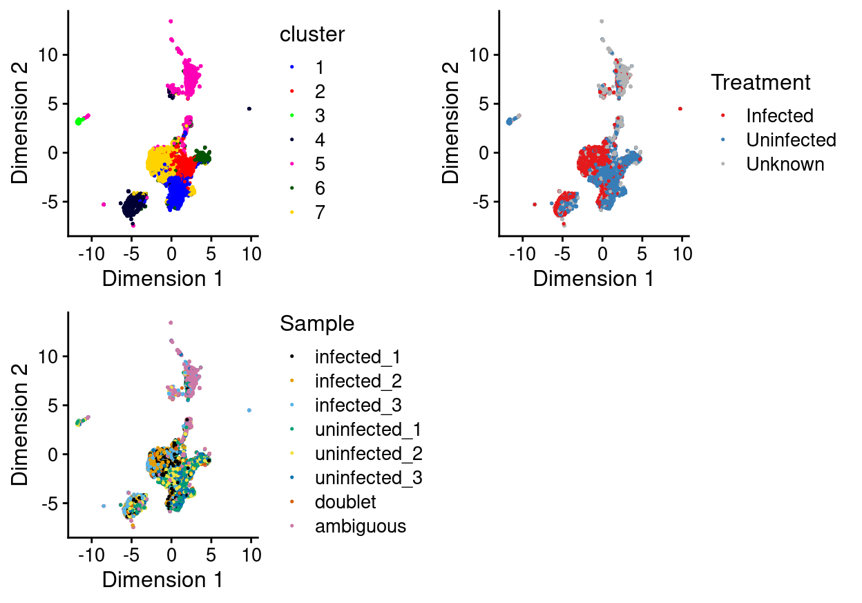
Figure 1: UMAP plot, where each point represents a droplet and is coloured according to the legend.
Show code
plot_grid(
  ggplot(as.data.frame(colData(sce)[, c("cluster", "Sample")])) +
    geom_bar(
      aes(x = cluster, fill = Sample),
      position = position_fill(reverse = TRUE)) +
    coord_flip() +
    ylab("Frequency") +
    scale_fill_manual(values = sample_colours) +
    theme_cowplot(font_size = 8),
  ggplot(as.data.frame(colData(sce)[, c("cluster", "Treatment")])) +
    geom_bar(
      aes(x = cluster, fill = Treatment),
      position = position_fill(reverse = TRUE)) +
    coord_flip() +
    ylab("Frequency") +
    scale_fill_manual(values = treatment_colours) +
    theme_cowplot(font_size = 8),
  ggplot(as.data.frame(colData(sce)[, "cluster", drop = FALSE])) +
    geom_bar(aes(x = cluster, fill = cluster)) +
    coord_flip() +
    ylab("Number of droplets") +
    scale_fill_manual(values = cluster_colours) +
    theme_cowplot(font_size = 8) +
    guides(fill = FALSE),
  align = "h",
  ncol = 3)
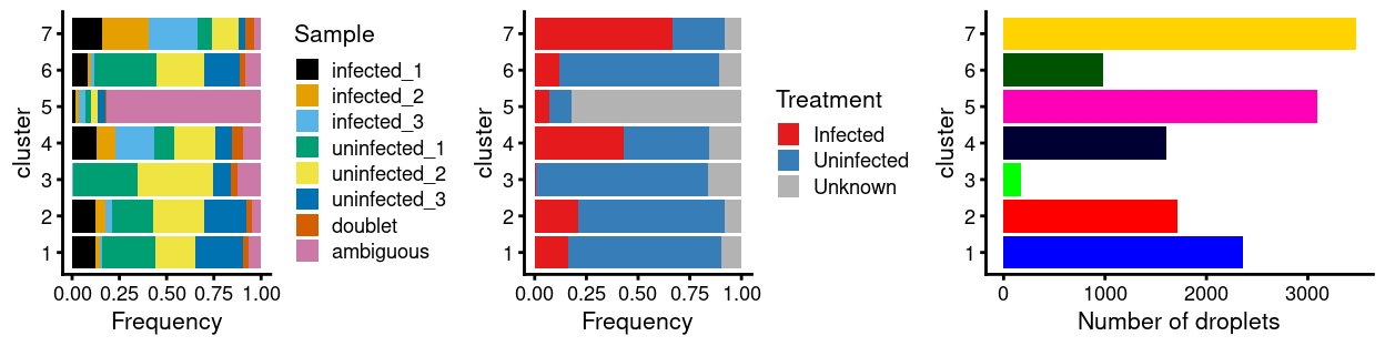
Figure 2: Breakdown of clusters by experimental factors.
Notably:
- Most of the clusters are highly treatment-specific.
- One of the clusters is enriched for
ambiguousdroplets.
ambiguous droplets
Motivation
Show code
prop_ambiguous <- tapply(
  sce$Sample == "ambiguous",
  sce$cluster,
  function(x) sum(x) / length(x))
sort(prop_ambiguous)
prop_ambiguous_outliers <- isOutlier(
  prop_ambiguous,
  type = "higher",
  # NOTE: Want the cluster(s) that are **way** out there.
  nmads = 5)
ambiguous_enriched_clusters <- levels(sce$cluster)[prop_ambiguous_outliers]
stopifnot(identical(ambiguous_enriched_clusters, "5"))
Figure 2 showed that there is one cluster with an unusually large proportion of droplets being of ambiguous origin, namely cluster 5 (proportion = 0.82). These ambiguous droplets cannot be assigned to a sample of origin and so are not useful in downstream analyses. However, before we exclude them, we want to ensure we aren’t systematically excluding a biologically relevant cell population.
We would further like to know that excluding the ambiguous droplets isn’t systematically excluding droplets from a particular sample or treatment group. This is challenging because by definition most of these droplets are of ambiguous origin. However, we can check if the ‘labelled’ droplets in those clusters are enriched for particular samples.
Analysis
Figure 3 highlights droplets from these clusters on the UMAP plot, showing that they are somewhat distinct from the bulk of droplets from the dataset.
Show code
plotUMAP(sce, colour_by = "cluster", point_size = 0.3) +
  scale_colour_manual(values = cluster_colours, name = "cluster") +
  plotUMAP(
    sce,
    colour_by = data.frame(
      `ambiguous enriched cluster` = sce$cluster %in% ambiguous_enriched_clusters),
    text_by = "cluster",
    point_size = 0.3)
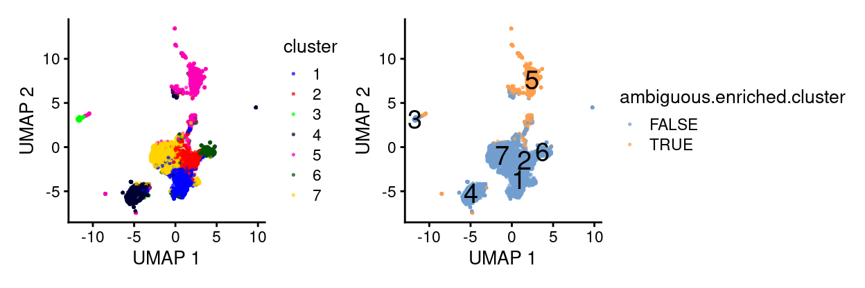
Figure 3: UMAP plot highlighting droplets from clusters that are enriched for ambiguous droplets. Cluster labels are overlaid on cluster centroids.
Figure 4 shows that droplets from cluster 5 have on average very few antibody-derived reads (i.e. HTOs), which is why we were unable to assign them to a Sample when demultiplexing the HTO data.
Show code
plotColData(
  sce,
  "altexps_Antibody Capture_sum",
  x = "cluster",
  colour_by = data.frame(
    `ambiguous enriched cluster` =
      sce$cluster %in% ambiguous_enriched_clusters),
  point_size = 0.3) +
  scale_y_log10() +
  guides(fill = FALSE)
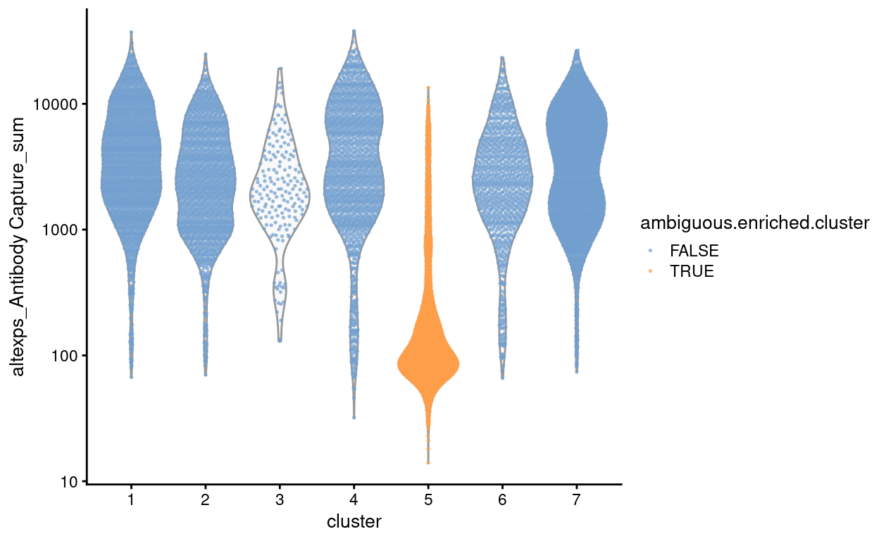
Figure 4: Number of antibody-derived reads by cluster, highlighting droplets from clusters that are enriched for ambiguous droplets (orange).
Figure 5 shows that the QC metrics of droplets from cluster 5 are also distinct from the other clusters, having smaller library sizes and fewer genes detected on average. It is noteworthy that droplets in cluster 5 do not have lower mitochondrial proportions; this is notable because droplets with small library sizes and small mitochondrial proportions are hallmarks of stripped nuclei (cells that have lost their cytoplasm before encapsulation in the droplets of the 10X Chromium machine) (Pijuan-Sala et al. 2019). We therefore conclude that these droplets are unlikely to contain stripped nuclei.
Show code
p1 <- plotColData(
  sce,
  "sum",
  x = "cluster",
  colour_by = data.frame(
    `ambiguous enriched cluster` =
      sce$cluster %in% ambiguous_enriched_clusters),
  point_size = 0.3) +
  scale_y_log10() +
  guides(fill = FALSE)
p2 <- plotColData(
  sce,
  "detected",
  x = "cluster",
  colour_by = data.frame(
    `ambiguous enriched cluster` =
      sce$cluster %in% ambiguous_enriched_clusters),
  point_size = 0.3) +
  guides(fill = FALSE)
p3 <- plotColData(
  sce,
  "subsets_Mito_percent",
  x = "cluster",
  colour_by = data.frame(
    `ambiguous enriched cluster` =
      sce$cluster %in% ambiguous_enriched_clusters),
  point_size = 0.3) +
  guides(fill = FALSE)
p4 <- plotColData(
  sce,
  "subsets_Ribo_percent",
  x = "cluster",
  colour_by = data.frame(
    `ambiguous enriched cluster` =
      sce$cluster %in% ambiguous_enriched_clusters),
  point_size = 0.3) +
  guides(fill = FALSE)
p1 + p2 + p3 + p4 + plot_layout(ncol = 2, guides = "collect")
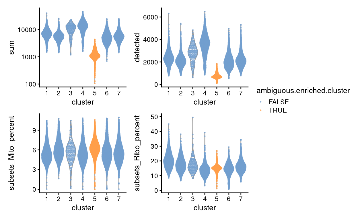
Figure 5: QC metrics of droplets by cluster, highlighting droplets from clusters that are enriched for ambiguous droplets (orange).
Figure 6 shows the top-20 genes more frequently detected in cluster 5 compared to all the other clusters. Aside from that the fact that there aren’t many genes consistently expressed more frequently in droplets from cluster 5, it is notable that all such genes are T cell receptor genes (TRA and TRB).
Show code
markers_up <- findMarkers(
  sce,
  sce$cluster,
  direction = "up",
  pval.type = "all",
  test.type = "binom")
plotHeatmap(
  sce,
  head(rownames(markers_up[[ambiguous_enriched_clusters]]), 20),
  order_columns_by = c("cluster", "Sample"),
  center = TRUE,
  zlim = c(-3, 3),
  color = hcl.colors(101, "Blue-Red 3"),
  cluster_rows = TRUE)
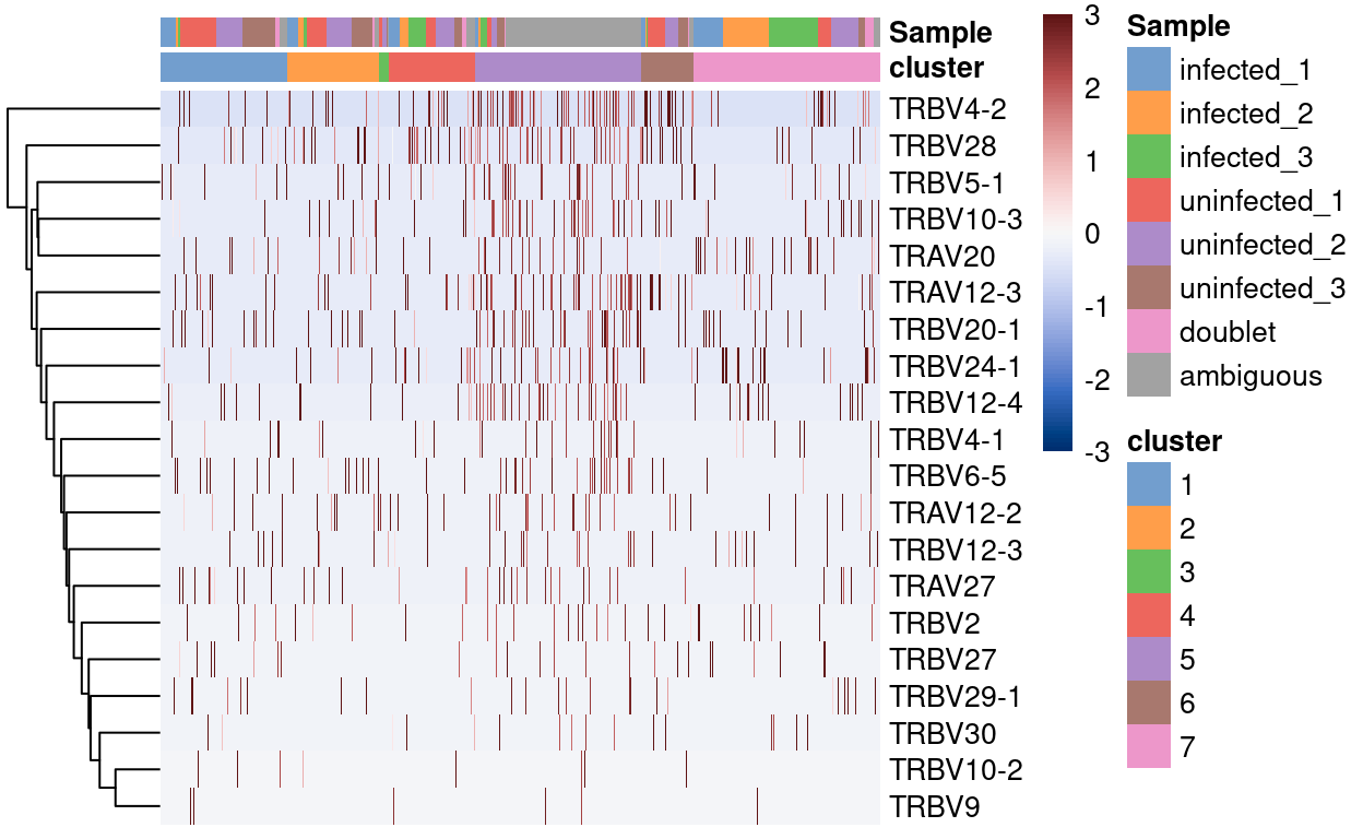
Figure 6: Heatmap of genes more frequently detected in the cluster enriched for ambiguous droplets.
Summary
To summarise, the droplets in cluster 5 are enriched for:
ambiguousdroplets we could not HTO-demultiplex because they had few antibody-derived reads.- Droplets with smaller library sizes and fewer genes detected than the majority of droplets.
- Droplets with higher-than-average expression of a range of T cell receptor genes.
Together, this evidence strongly suggests that cluster 5 mostly comprises droplets containing ambient RNA. We can therefore safely remove all ambiguous droplets from cluster 5 from further analysis (\(n =\) 2,533 droplets).
Show code
remove <- sce$cluster == ambiguous_enriched_clusters & sce$Sample == "ambiguous"
sce <- sce[, !remove]
We also opt to remove the \(n =\) 563 other droplets from cluster 5 (i.e. those that were able be assigned to a sample during HTO-demultiplexing). The rationale for removing these is that the transcriptomes of these droplets are consistent with droplets containing ambient RNA and the ‘HTO signal’ of these droplets may also be an artefact of ambient RNA. These droplets likely do not contain ‘real’ cells and by excluding them we can study the ‘real’ cells of interest.
Show code
remove <- sce$cluster == ambiguous_enriched_clusters & sce$Sample != "ambiguous"
sce <- sce[, !remove]
Figures 7 and 8 show that the remaining ambiguous droplets are scattered across the other clusters. We can conclude that the remaining ambiguous droplets do not comprise a biologically distinct subpopulation but are rather cells that simply failed HTO-labelling or HTO-demultiplexing.
Show code
umap_df <- cbind(
  data.frame(
    x = reducedDim(sce, "UMAP")[, 1],
    y = reducedDim(sce, "UMAP")[, 2]),
  as.data.frame(colData(sce)[, !colnames(colData(sce)) %in% c("TRA", "TRB")]))
bg <- dplyr::select(umap_df, -Sample)
ggplot(aes(x = x, y = y), data = umap_df) +
  geom_point(data = bg, colour = scales::alpha("grey", 0.5), size = 0.125) +
  geom_point(aes(colour = Sample), alpha = 1, size = 0.25) +
  scale_fill_manual(values = sample_colours, name = "HTO") +
  scale_colour_manual(values = sample_colours, name = "HTO") +
  theme_cowplot(font_size = 10) +
  xlab("Dimension 1") +
  ylab("Dimension 2") +
  facet_wrap(~ Sample, ncol = 3) +
  guides(colour = FALSE)
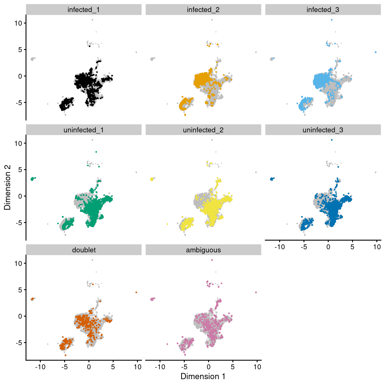
Figure 7: UMAP plot of the dataset. Each point represents a droplets and is coloured by Sample. Each panel highlights droplets from a particular sample.
Show code
plot_grid(
  ggplot(as.data.frame(colData(sce)[, c("cluster", "Sample")])) +
    geom_bar(
      aes(x = cluster, fill = Sample),
      position = position_fill(reverse = TRUE)) +
    coord_flip() +
    ylab("Frequency") +
    scale_fill_manual(values = sample_colours) +
    theme_cowplot(font_size = 8),
  ggplot(as.data.frame(colData(sce)[, c("cluster", "Treatment")])) +
    geom_bar(
      aes(x = cluster, fill = Treatment),
      position = position_fill(reverse = TRUE)) +
    coord_flip() +
    ylab("Frequency") +
    scale_fill_manual(values = treatment_colours) +
    theme_cowplot(font_size = 8),
  ggplot(as.data.frame(colData(sce)[, "cluster", drop = FALSE])) +
    geom_bar(aes(x = cluster, fill = cluster)) +
    coord_flip() +
    ylab("Number of droplets") +
    scale_fill_manual(values = cluster_colours) +
    theme_cowplot(font_size = 8) +
    guides(fill = FALSE),
  align = "h",
  ncol = 3)
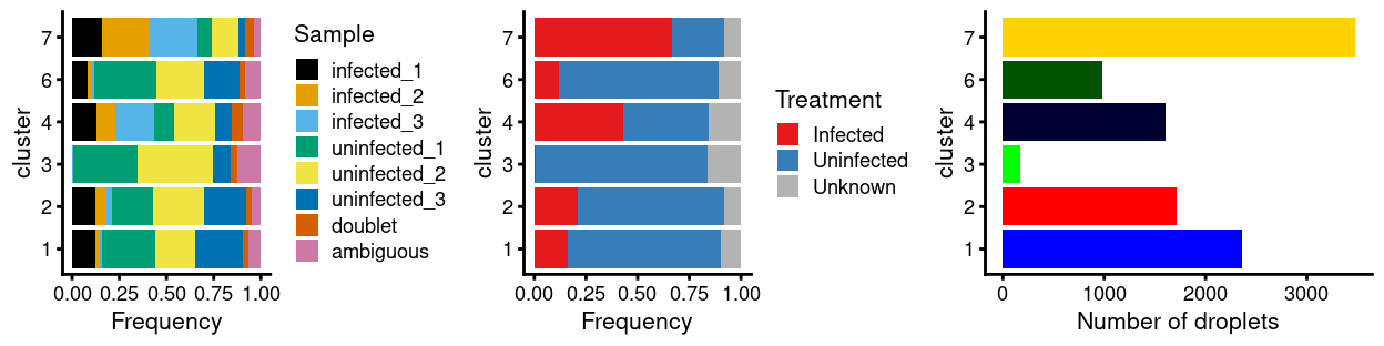
Figure 8: Breakdown of clusters by experimental factors.
These ambiguous droplets cannot be assigned to a sample of origin and so are removed from further analysis.
Show code
Re-processing
Show code
set.seed(623)
var_fit <- modelGeneVarByPoisson(sce, block = sce$batch)
hvg <- getTopHVGs(var_fit, var.threshold = 0)

set.seed(11235)
sce <- denoisePCA(sce, var_fit, subset.row = hvg)

set.seed(8875)
sce <- runUMAP(sce, dimred = "PCA")
umap_df <- cbind(
  data.frame(
    x = reducedDim(sce, "UMAP")[, 1],
    y = reducedDim(sce, "UMAP")[, 2]),
  as.data.frame(colData(sce)[, !colnames(colData(sce)) %in% c("TRA", "TRB")]))

set.seed(8111)
snn_gr <- buildSNNGraph(sce, use.dimred = "PCA")
clusters <- igraph::cluster_louvain(snn_gr)
sce$cluster <- factor(clusters$membership)
umap_df$cluster <- sce$cluster
cluster_colours <- setNames(
  Polychrome::glasbey.colors(nlevels(sce$cluster) + 1)[-1],
  levels(sce$cluster))
sce$cluster_colours <- cluster_colours[sce$cluster]
There are 11 clusters detected, shown on the UMAP plot Figure 9 and broken down by experimental factors in Figure 10.
Show code
plot_grid(
  ggplot(aes(x = x, y = y), data = umap_df) +
    geom_point(aes(colour = cluster), size = 0.25) +
    scale_colour_manual(values = cluster_colours) +
    theme_cowplot(font_size = 12) +
    xlab("Dimension 1") +
    ylab("Dimension 2"),
  ggplot(aes(x = x, y = y), data = umap_df) +
    geom_point(aes(colour = Treatment), size = 0.25) +
    theme_cowplot(font_size = 12) +
    xlab("Dimension 1") +
    ylab("Dimension 2") +
    scale_colour_manual(values = treatment_colours),
  ggplot(aes(x = x, y = y), data = umap_df) +
    geom_point(aes(colour = Sample), size = 0.25) +
    theme_cowplot(font_size = 12) +
    xlab("Dimension 1") +
    ylab("Dimension 2") +
    scale_colour_manual(values = sample_colours),
  ncol = 2,
  align = "v")
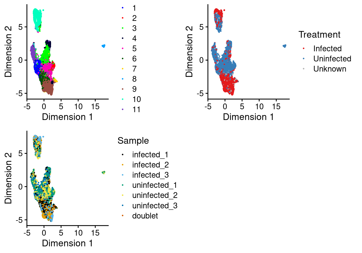
Figure 9: UMAP plot, where each point represents a droplet and is coloured according to the legend.
Show code
plot_grid(
  ggplot(as.data.frame(colData(sce)[, c("cluster", "Sample")])) +
    geom_bar(
      aes(x = cluster, fill = Sample),
      position = position_fill(reverse = TRUE)) +
    coord_flip() +
    ylab("Frequency") +
    scale_fill_manual(values = sample_colours) +
    theme_cowplot(font_size = 8),
  ggplot(as.data.frame(colData(sce)[, c("cluster", "Treatment")])) +
    geom_bar(
      aes(x = cluster, fill = Treatment),
      position = position_fill(reverse = TRUE)) +
    coord_flip() +
    ylab("Frequency") +
    scale_fill_manual(values = treatment_colours) +
    theme_cowplot(font_size = 8),
  ggplot(as.data.frame(colData(sce)[, "cluster", drop = FALSE])) +
    geom_bar(aes(x = cluster, fill = cluster)) +
    coord_flip() +
    ylab("Number of droplets") +
    scale_fill_manual(values = cluster_colours) +
    theme_cowplot(font_size = 8) +
    guides(fill = FALSE),
  align = "h",
  ncol = 3)
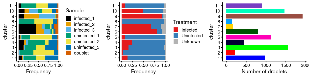
Figure 10: Breakdown of clusters by experimental factors.
Notably:
- Still, most of the clusters are highly treatment-specific.
Doublets
Motivation
For multiplexed samples such as these, we can identify (most of) the doublet cells based on the droplets that have multiple labels. The idea here is that cells from the same sample are labelled in a unique manner and that cells from all samples are then mixed together and the multiplexed pool is subjected to scRNA-seq, avoiding batch effects and simplifying the logistics of processing a large number of samples. Moreover, most per-cell libraries are expected to contain one label that can be used to assign that cell to its sample of origin. Cell libraries containing two labels are thus likely to be doublets of cells from different samples.
Analysis
We first use the HTOs to identify ‘labelled’ doublets and then leverage these in to identify ‘unlabelled’ doublets in the gene expression space.
‘Labelled’ doublets
For this experiment, the sample labelling is done with HTOs. With 5 unique HTOs, there are \({5 \choose 2} = 10\) ways a droplet could be labelled with 2 HTOs. The cell hashing data will not identify all doublets, most obviously those formed between cells from the same sample. It will also be near-impossible to identify those doublets formed between a cell labelled with all 5 HTOs (i.e. a cell from the uninfected_3 sample) and another cell labelled with a single HTO.
We can easily identify the HTO-derived doublets (droplets with Sample labelled as doublet; n = 414, 4.3% of remaining droplets). We term these the ‘labelled’ droplets.
‘Unlabelled’ dropets
One obvious limitation of relying solely on the HTO-derived doublets is that doublets of cells marked with the same HTO or those doublets formed between a cell labelled with all 5 HTOs (i.e. a cell from the uninfected_3 sample) and another cell labelled with a single HTO are not detected1.
To avoid this, we recover the remaining intra-sample doublets based on their similarity with ‘known’ doublets in gene expression space, i.e. ‘guilt by association.’
For each droplet, we calculate the proportion of its nearest neighbours that are ‘labelled’ doublets2. Intra-sample doublets should have values of this metric under the assumption that their gene expression profiles are similar to inter-sample doublets involving the same combination of cell states/types.
Show code
# NOTE: This is a hack to estimate the relative frequency of each
#       (labelled singlet) sample.
sample_freq <- table(sce$Sample)[
  c(paste0("infected_", 1:3), paste0("uninfected_", 1:3))]
library(scDblFinder)
doublets_df <- recoverDoublets(
  sce,
  doublets = sce$Sample == "doublet",
  use.dimred = "PCA",
  samples = sample_freq)
Figure 11 highlights the location of ‘labelled’ doublets and those predicted to be doublets on the UMAP plot.
Show code
umap_df$known_doublet_proportion <- doublets_df$proportion
umap_df$known_doublet <- doublets_df$known
umap_df$predicted_doublet <- doublets_df$predicted
plot_grid(
  ggplot(aes(x = x, y = y), data = umap_df) +
    geom_point(
      aes(
        colour = known_doublet,
        alpha = known_doublet,
        size = known_doublet)) +
    scale_colour_manual(values = c("FALSE" = "grey", "TRUE" = "red")) +
    scale_alpha_manual(values = c("FALSE" = 0.25, "TRUE" = 1)) +
    scale_size_manual(values = c("FALSE" = 0.125, "TRUE" = 0.25)) +
    theme_cowplot(font_size = 8) +
    xlab("Dimension 1") +
    ylab("Dimension 2") +
    guides(colour = FALSE, size = FALSE, alpha = FALSE) +
    ggtitle("Known doublets"),
  ggplot(aes(x = x, y = y), data = umap_df) +
    geom_point(aes(colour = known_doublet_proportion), size = 0.125) +
    theme_cowplot(font_size = 8) +
    xlab("Dimension 1") +
    ylab("Dimension 2") +
    scale_colour_viridis_c(guide = guide_colorbar("")) +
    ggtitle("Doublet proportions") +
    theme(legend.position = c(0.9, 0.9)),
  ggplot(aes(x = x, y = y), data = umap_df) +
    geom_point(
      aes(
        colour = predicted_doublet,
        alpha = predicted_doublet,
        size = predicted_doublet)) +
    scale_colour_manual(values = c("FALSE" = "grey", "TRUE" = "royalblue")) +
    scale_alpha_manual(values = c("FALSE" = 0.25, "TRUE" = 1)) +
    scale_size_manual(values = c("FALSE" = 0.125, "TRUE" = 0.25)) +
    theme_cowplot(font_size = 8) +
    xlab("Dimension 1") +
    ylab("Dimension 2") +
    guides(colour = FALSE, size = FALSE, alpha = FALSE) +
    ggtitle("Predicted doublets"),
  align = "v",
  ncol = 3)
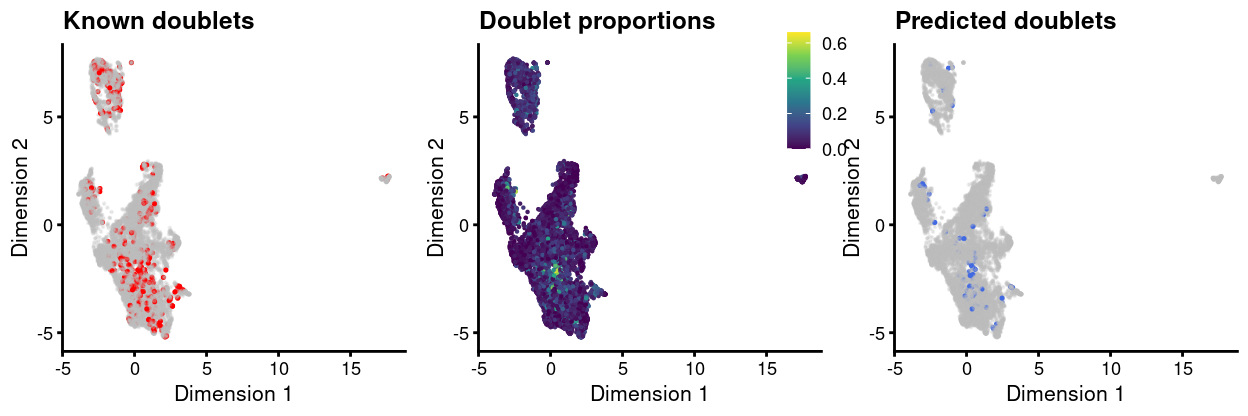
Figure 11: UMAP plot, where each point is a cell and is colored by the whether or not it is a ‘labelled’ doublet (left), by the proportion of neighbouring droplets that are ‘labelled’ droplets (centre), and whether or not it is a predicted ‘unlabelled’ doublet (right).
Reassuringly, more of the ‘unlabelled’ doublets come from the droplets currently labelled as originating from the uninfected_3 sample than any other sample, which was labelled with all 5 HTOs and for which it was correspondingly difficult to identify ‘labelled’ doublets.
Show code
library(janitor)
tabyl(
  data.frame(predicted_doublet = doublets_df$predicted, Sample = sce$Sample),
  Sample, predicted_doublet) %>%
  adorn_totals(c("row", "col")) %>%
  adorn_percentages("row") %>%
  adorn_pct_formatting() %>%
  adorn_ns() %>%
  adorn_title(placement = "combined") %>%
  knitr::kable(caption = "Number of predicted 'unlabelled' doublets (`TRUE` column) that were labelled as coming from each `Sample`. Percentages are with respect to the total number of droplets from eahc `Sample`.")
| Sample/predicted_doublet | FALSE | TRUE | Total |
|---|---|---|---|
| infected_1 | 99.3% (1338) | 0.7% (9) | 100.0% (1347) |
| infected_2 | 99.1% (1165) | 0.9% (10) | 100.0% (1175) |
| infected_3 | 99.0% (1321) | 1.0% (14) | 100.0% (1335) |
| uninfected_1 | 99.3% (1836) | 0.7% (13) | 100.0% (1849) |
| uninfected_2 | 99.3% (2107) | 0.7% (15) | 100.0% (2122) |
| uninfected_3 | 98.2% (1424) | 1.8% (26) | 100.0% (1450) |
| doublet | 100.0% (414) | 0.0% (0) | 100.0% (414) |
| Total | 99.1% (9605) | 0.9% (87) | 100.0% (9692) |
Checking for removal of biologically relevant subpopulations
We check if removing these droplets would remove a biologically relevant subpopulation by looking for systematic differences in gene expression between the ‘known’ or ‘predicted’ doublets and the retained cells. If the discarded pool is enriched for a certain cell type, we should observe increased expression of the corresponding marker genes.
Show code
keep <- !(doublets_df$known | doublets_df$predicted)
lost <- calculateAverage(counts(sce)[, !keep])
kept <- calculateAverage(counts(sce)[, keep])
logged <- cpm(cbind(lost, kept), log = TRUE, prior.count = 2)
logFC <- logged[, 1] - logged[, 2]
abundance <- rowMeans(logged)
Figure 12 shows the result of this analysis, highlighting that there are few genes with a large \(logFC\) between ‘lost’ and ‘kept’ droplets.
Show code
is_mito <- rownames(sce) %in% mito_set
is_ribo <- rownames(sce) %in% ribo_set
plot(
  abundance,
  logFC,
  xlab = "Average count",
  ylab = "Log-FC (lost/kept)",
  pch = 16)
points(
  abundance[is_mito],
  logFC[is_mito],
  col = "dodgerblue",
  pch = 16,
  cex = 1)
points(
  abundance[is_ribo],
  logFC[is_ribo],
  col = "orange",
  pch = 16,
  cex = 1)
abline(h = c(-1, 1), col = "red", lty = 2)
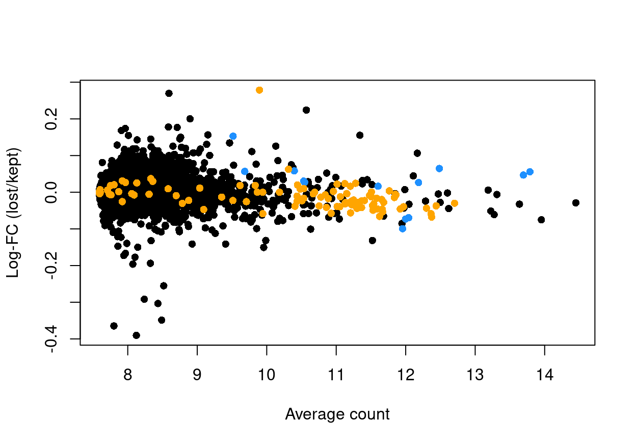
Figure 12: Log-fold change in expression in the discarded cells compared to the retained cells. Each point represents a gene with mitochondrial transcripts in blue and ribosomal protein genes in orange. Dashed red lines indicate \(|logFC| = 1\)
Show code
glMDPlot(
  x = data.frame(abundance = abundance, logFC = logFC),
  xval = "abundance",
  yval = "logFC",
  counts = cbind(lost, kept),
    anno = cbind(
      as.data.frame(rowData(sce)),
      data.frame(GeneID = rownames(sce), stringsAsFactors = FALSE)),
  display.columns = c("Symbol", "ID", "CHR"),
  groups = factor(c("lost", "kept")),
  samples = c("lost", "kept"),
  status = unname(ifelse(is_mito, 1, ifelse(is_ribo, -1, 0))),
  transform = FALSE,
  main = "lost vs. kept",
  side.ylab = "Average count",
  cols = c("orange", "black", "dodgerBlue"),
  path = here("output"),
  html = "doublet-md-plot",
  launch = FALSE)
Another concern is whether the cells removed by this procedure are preferentially derive from particular experimental groups. Reassuringly, Figure 13 shows that this is not the case; most of the removed droplets are ‘labelled’ doublets, as we expect from the above analysis.
Show code
ggplot(
  data.frame(Sample = sce$Sample, keep = keep)) +
  geom_bar(aes(x = Sample, fill = keep)) +
  ylab("Number of droplets") +
  theme_cowplot(font_size = 9) +
  theme(axis.text.x = element_text(angle = 45, hjust = 1))
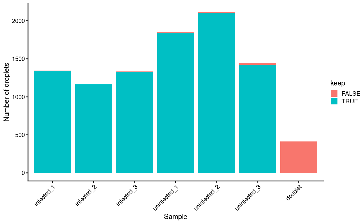
Figure 13: Droplets removed after excluding ‘labelled’ and ‘unlabelled’ predicted doublets, stratified by Sample.
Summary
Show code
keep <- !doublets_df$known
sce <- sce[, keep]
The quality of the doublet predictions is hard to assess in a homogeneous dataset such as this. We therefore opt to remove only the ‘labelled’ known doublets and retain the ‘unlabelled’ predicted doublets in the dataset. The removes 414 droplets, retaining 9,278 for further analysis. The dataset may still contain some ‘unlabelled’ doublets, but their number should be very small owing to the experimental design.
Re-processing
Show code
set.seed(181)
var_fit <- modelGeneVarByPoisson(sce, block = sce$batch)
hvg <- getTopHVGs(var_fit, var.threshold = 0)

set.seed(11235)
sce <- denoisePCA(sce, var_fit, subset.row = hvg)

set.seed(8875)
sce <- runUMAP(sce, dimred = "PCA")
umap_df <- cbind(
  data.frame(
    x = reducedDim(sce, "UMAP")[, 1],
    y = reducedDim(sce, "UMAP")[, 2]),
  as.data.frame(colData(sce)[, !colnames(colData(sce)) %in% c("TRA", "TRB")]))

set.seed(8111)
snn_gr <- buildSNNGraph(sce, use.dimred = "PCA")
clusters <- igraph::cluster_louvain(snn_gr)
sce$cluster <- factor(clusters$membership)
umap_df$cluster <- sce$cluster
cluster_colours <- setNames(
  Polychrome::glasbey.colors(nlevels(sce$cluster) + 1)[-1],
  levels(sce$cluster))
sce$cluster_colours <- cluster_colours[sce$cluster]
There are 11 clusters detected, shown on the UMAP plot Figure 14 and broken down by experimental factors in Figure 15.
Show code
plot_grid(
  ggplot(aes(x = x, y = y), data = umap_df) +
    geom_point(aes(colour = cluster), size = 0.25) +
    scale_colour_manual(values = cluster_colours) +
    theme_cowplot(font_size = 12) +
    xlab("Dimension 1") +
    ylab("Dimension 2"),
  ggplot(aes(x = x, y = y), data = umap_df) +
    geom_point(aes(colour = Treatment), size = 0.25) +
    theme_cowplot(font_size = 12) +
    xlab("Dimension 1") +
    ylab("Dimension 2") +
    scale_colour_manual(values = treatment_colours),
  ggplot(aes(x = x, y = y), data = umap_df) +
    geom_point(aes(colour = Sample), size = 0.25) +
    theme_cowplot(font_size = 12) +
    xlab("Dimension 1") +
    ylab("Dimension 2") +
    scale_colour_manual(values = sample_colours),
  ncol = 2,
  align = "v")
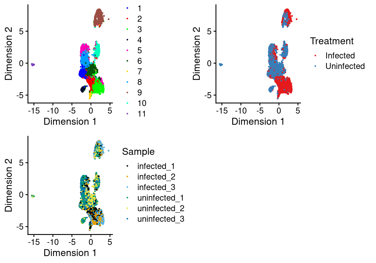
Figure 14: UMAP plot, where each point represents a droplet and is coloured according to the legend.
Show code
plot_grid(
  ggplot(as.data.frame(colData(sce)[, c("cluster", "Sample")])) +
    geom_bar(
      aes(x = cluster, fill = Sample),
      position = position_fill(reverse = TRUE)) +
    coord_flip() +
    ylab("Frequency") +
    scale_fill_manual(values = sample_colours) +
    theme_cowplot(font_size = 8),
  ggplot(as.data.frame(colData(sce)[, c("cluster", "Treatment")])) +
    geom_bar(
      aes(x = cluster, fill = Treatment),
      position = position_fill(reverse = TRUE)) +
    coord_flip() +
    ylab("Frequency") +
    scale_fill_manual(values = treatment_colours) +
    theme_cowplot(font_size = 8),
  ggplot(as.data.frame(colData(sce)[, "cluster", drop = FALSE])) +
    geom_bar(aes(x = cluster, fill = cluster)) +
    coord_flip() +
    ylab("Number of droplets") +
    scale_fill_manual(values = cluster_colours) +
    theme_cowplot(font_size = 8) +
    guides(fill = FALSE),
  align = "h",
  ncol = 3)
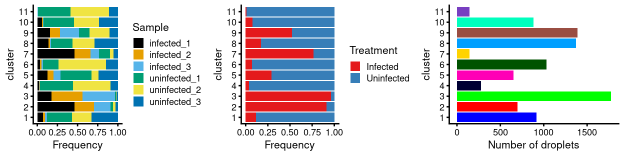
Figure 15: Breakdown of clusters by experimental factors.
Notably:
- Still, most of the clusters are highly treatment-specific.
- There is a small cluster of cells that is very distinct from the majority of cells.
Exclusion of unwanted cell types
Motivation
James enriched for CD4+ T-cells prior to performing scRNA-seq. However, an enrichment procedure is just that and unwanted cell types may sneak through.
We can categorise unwanted cell types as either:
- ‘Known’ unwanted cell types: Unwanted cell types that we did know to look for a priori (i.e. unwanted cell types we know may have snuck through the enrichment process)
- ‘Unknown’ unwanted cell types: Unwanted cell types that we didn’t know to look for a priori (i.e. unwanted cell types that we didn’t may have snuck through the enrichment process).
We will use different analysis strategies to identify the ‘known’ and ‘unknown’ unwanted cell types. Once we have identified the unwanted cell types, we will exclude the unwanted these cells from further analysis.
‘Unknown’ unwanted cell types
Motivation
A conceptually straightforward annotation approach is to compare the single-cell expression profiles with previously annotated reference data sets. Labels can then be assigned to each cell in our uncharacterised test data set based on the most similar reference sample(s), for some definition of “similar.” Any published and labelled RNA-seq data set (bulk or single-cell) can be used as a reference, though its reliability depends greatly on the expertise of the original authors who assigned the labels in the first place.
SingleR is one such automatic annotation method for scRNA-seq data (Aran et al. 2019). Given a reference data set(s) of samples3 with known labels, it labels new cells from a test data set based on similarity to the reference set(s). Specifically, for each test cell:
- We compute the Spearman correlation between its expression profile and that of each reference sample.
- We define the per-label score as a fixed quantile (by default, 0.8) of the distribution of correlations.
- We repeat this for all labels and we take the label with the highest score as the annotation for this cell.
- Finally, we perform a fine-tuning step:
- The reference data set is subsetted to only include labels with scores close to the maximum.
- Scores are recomputed using only marker genes for the subset of labels.
- This is iterated until one label remains.
For visualization purposes we use the normalized scores, which are the scores linearly adjusted for each cell so that the smallest score is 0 and the largest score is 1. This is followed by cubing of the adjusted scores to improve dynamic range near 1. Automatic annotation provides a convenient way of transferring biological knowledge across data sets. In this manner, the burden of interpreting clusters and defining marker genes only has to be done once (i.e. for the reference set).
SingleR can annotate at both the cluster-level and at the cell-level. The trade-off between cluster-level and cell-level annotation is one of increased robustness to noise (cluster-level) vs. increased resolution (cell-level). Poor-quality assignments with ‘low’ scores are labelled as NA.
Available references
SingleR includes several in-built reference data sets, some of which are relevant for this study:
HumanPrimaryCellAtlasData(HPCA): The Human Primary Cell Atlas (Mabbott et al. 2013)BlueprintEncodeData(BE): Blueprint (Martens and Stunnenberg 2013) and Encode (The ENCODE Project Consortium 2012)DatabaseImmuneCellExpressionData(DICE): The Database of Immune Cell Expression (DICE) (Schmiedel et al. 2018)NovershternHematopoieticData(NH): The Novershtern Hematopoietic Cell Data (GSE24759) (Novershtern et al. 2011)MonacoImmuneData(MI): The Monaco Immune Cell Data (GSE107011) (Monaco et al. 2019).
These bulk RNA-seq and microarray data sets were obtained from pre-sorted cell populations, i.e., the cell labels of these samples were mostly derived based on the respective sorting/purification strategy, not via in silico prediction methods.
The characteristics of each data set are summarized below4:
| Reference | Samples | Sample types | No. of main labels | No. of fine labels | Cell type focus |
|---|---|---|---|---|---|
HPCA |
713 | microarrays of sorted cell populations | 37 | 157 | Non-specific |
BE |
259 | RNA-seq | 24 | 43 | Non-specific |
DICE |
1561 | RNA-seq | 5 | 15 | Immune |
NH |
211 | microarrays of sorted cell populations | 17 | 38 | Hematopoietic & Immune |
MI |
114 | RNA-seq | 11 | 29 | Immune |
The available sample types in each set can be viewed in the collapsible sections below.
HumanPrimaryCellAtlasData Labels
Show code
hpca <- HumanPrimaryCellAtlasData()
.adf(colData(hpca)) %>%
  dplyr::count(label.main, label.fine) %>%
  dplyr::arrange(label.main) %>%
  knitr::kable()
| label.main | label.fine | n |
|---|---|---|
| Astrocyte | Astrocyte:Embryonic_stem_cell-derived | 2 |
| B_cell | B_cell | 4 |
| B_cell | B_cell:CXCR4-_centrocyte | 4 |
| B_cell | B_cell:CXCR4+_centroblast | 4 |
| B_cell | B_cell:Germinal_center | 3 |
| B_cell | B_cell:immature | 2 |
| B_cell | B_cell:Memory | 3 |
| B_cell | B_cell:Naive | 3 |
| B_cell | B_cell:Plasma_cell | 3 |
| BM | BM | 7 |
| BM & Prog. | BM | 1 |
| Chondrocytes | Chondrocytes:MSC-derived | 8 |
| CMP | CMP | 2 |
| DC | DC:monocyte-derived | 19 |
| DC | DC:monocyte-derived:A._fumigatus_germ_tubes_6h | 2 |
| DC | DC:monocyte-derived:AEC-conditioned | 5 |
| DC | DC:monocyte-derived:AM580 | 3 |
| DC | DC:monocyte-derived:anti-DC-SIGN_2h | 3 |
| DC | DC:monocyte-derived:antiCD40/VAF347 | 2 |
| DC | DC:monocyte-derived:CD40L | 3 |
| DC | DC:monocyte-derived:Galectin-1 | 3 |
| DC | DC:monocyte-derived:immature | 20 |
| DC | DC:monocyte-derived:LPS | 6 |
| DC | DC:monocyte-derived:mature | 11 |
| DC | DC:monocyte-derived:Poly(IC) | 3 |
| DC | DC:monocyte-derived:rosiglitazone | 3 |
| DC | DC:monocyte-derived:rosiglitazone/AGN193109 | 2 |
| DC | DC:monocyte-derived:Schuler_treatment | 3 |
| Embryonic_stem_cells | Embryonic_stem_cells | 17 |
| Endothelial_cells | Endothelial_cells:blood_vessel | 8 |
| Endothelial_cells | Endothelial_cells:HUVEC | 16 |
| Endothelial_cells | Endothelial_cells:HUVEC:B._anthracis_LT | 2 |
| Endothelial_cells | Endothelial_cells:HUVEC:Borrelia_burgdorferi | 2 |
| Endothelial_cells | Endothelial_cells:HUVEC:FPV-infected | 3 |
| Endothelial_cells | Endothelial_cells:HUVEC:H5N1-infected | 3 |
| Endothelial_cells | Endothelial_cells:HUVEC:IFNg | 1 |
| Endothelial_cells | Endothelial_cells:HUVEC:IL-1b | 3 |
| Endothelial_cells | Endothelial_cells:HUVEC:PR8-infected | 3 |
| Endothelial_cells | Endothelial_cells:HUVEC:Serum_Amyloid_A | 6 |
| Endothelial_cells | Endothelial_cells:HUVEC:VEGF | 3 |
| Endothelial_cells | Endothelial_cells:lymphatic | 7 |
| Endothelial_cells | Endothelial_cells:lymphatic:KSHV | 4 |
| Endothelial_cells | Endothelial_cells:lymphatic:TNFa_48h | 3 |
| Epithelial_cells | Epithelial_cells:bladder | 6 |
| Epithelial_cells | Epithelial_cells:bronchial | 10 |
| Erythroblast | Erythroblast | 8 |
| Fibroblasts | Fibroblasts:breast | 6 |
| Fibroblasts | Fibroblasts:foreskin | 4 |
| Gametocytes | Gametocytes:oocyte | 3 |
| Gametocytes | Gametocytes:spermatocyte | 2 |
| GMP | GMP | 2 |
| Hepatocytes | Hepatocytes | 3 |
| HSC_-G-CSF | HSC_-G-CSF | 10 |
| HSC_CD34+ | HSC_CD34+ | 6 |
| iPS_cells | iPS_cells:adipose_stem_cell-derived:lentiviral | 3 |
| iPS_cells | iPS_cells:adipose_stem_cell-derived:minicircle-derived | 3 |
| iPS_cells | iPS_cells:adipose_stem_cells | 3 |
| iPS_cells | iPS_cells:CRL2097_foreskin | 3 |
| iPS_cells | iPS_cells:CRL2097_foreskin-derived:d20_hepatic_diff | 3 |
| iPS_cells | iPS_cells:CRL2097_foreskin-derived:undiff. | 3 |
| iPS_cells | iPS_cells:fibroblast-derived:Direct_del._reprog | 2 |
| iPS_cells | iPS_cells:fibroblast-derived:Retroviral_transf | 1 |
| iPS_cells | iPS_cells:fibroblasts | 1 |
| iPS_cells | iPS_cells:foreskin_fibrobasts | 1 |
| iPS_cells | iPS_cells:iPS:minicircle-derived | 5 |
| iPS_cells | iPS_cells:PDB_1lox-17Puro-10 | 1 |
| iPS_cells | iPS_cells:PDB_1lox-17Puro-5 | 1 |
| iPS_cells | iPS_cells:PDB_1lox-21Puro-20 | 1 |
| iPS_cells | iPS_cells:PDB_1lox-21Puro-26 | 1 |
| iPS_cells | iPS_cells:PDB_2lox-17 | 1 |
| iPS_cells | iPS_cells:PDB_2lox-21 | 1 |
| iPS_cells | iPS_cells:PDB_2lox-22 | 1 |
| iPS_cells | iPS_cells:PDB_2lox-5 | 1 |
| iPS_cells | iPS_cells:PDB_fibroblasts | 1 |
| iPS_cells | iPS_cells:skin_fibroblast | 2 |
| iPS_cells | iPS_cells:skin_fibroblast-derived | 3 |
| Keratinocytes | Keratinocytes | 3 |
| Keratinocytes | Keratinocytes:IFNg | 2 |
| Keratinocytes | Keratinocytes:IL19 | 3 |
| Keratinocytes | Keratinocytes:IL1b | 2 |
| Keratinocytes | Keratinocytes:IL20 | 3 |
| Keratinocytes | Keratinocytes:IL22 | 3 |
| Keratinocytes | Keratinocytes:IL24 | 3 |
| Keratinocytes | Keratinocytes:IL26 | 3 |
| Keratinocytes | Keratinocytes:KGF | 3 |
| Macrophage | Macrophage:Alveolar | 4 |
| Macrophage | Macrophage:Alveolar:B._anthacis_spores | 3 |
| Macrophage | Macrophage:monocyte-derived | 26 |
| Macrophage | Macrophage:monocyte-derived:IFNa | 9 |
| Macrophage | Macrophage:monocyte-derived:IL-4/cntrl | 5 |
| Macrophage | Macrophage:monocyte-derived:IL-4/Dex/cntrl | 5 |
| Macrophage | Macrophage:monocyte-derived:IL-4/Dex/TGFb | 10 |
| Macrophage | Macrophage:monocyte-derived:IL-4/TGFb | 5 |
| Macrophage | Macrophage:monocyte-derived:M-CSF | 2 |
| Macrophage | Macrophage:monocyte-derived:M-CSF/IFNg | 2 |
| Macrophage | Macrophage:monocyte-derived:M-CSF/IFNg/Pam3Cys | 2 |
| Macrophage | Macrophage:monocyte-derived:M-CSF/Pam3Cys | 2 |
| Macrophage | Macrophage:monocyte-derived:S._aureus | 15 |
| MEP | MEP | 2 |
| Monocyte | Monocyte | 27 |
| Monocyte | Monocyte:anti-FcgRIIB | 2 |
| Monocyte | Monocyte:CD14+ | 3 |
| Monocyte | Monocyte:CD16- | 7 |
| Monocyte | Monocyte:CD16+ | 6 |
| Monocyte | Monocyte:CXCL4 | 2 |
| Monocyte | Monocyte:F._tularensis_novicida | 6 |
| Monocyte | Monocyte:leukotriene_D4 | 4 |
| Monocyte | Monocyte:MCSF | 2 |
| Monocyte | Monocyte:S._typhimurium_flagellin | 1 |
| MSC | MSC | 9 |
| Myelocyte | Myelocyte | 2 |
| Neuroepithelial_cell | Neuroepithelial_cell:ESC-derived | 1 |
| Neurons | Neurons:adrenal_medulla_cell_line | 6 |
| Neurons | Neurons:ES_cell-derived_neural_precursor | 6 |
| Neurons | Neurons:Schwann_cell | 4 |
| Neutrophils | Neutrophil | 6 |
| Neutrophils | Neutrophil:commensal_E._coli_MG1655 | 2 |
| Neutrophils | Neutrophil:GM-CSF_IFNg | 4 |
| Neutrophils | Neutrophil:inflam | 4 |
| Neutrophils | Neutrophil:LPS | 4 |
| Neutrophils | Neutrophil:uropathogenic_E._coli_UTI89 | 1 |
| NK_cell | NK_cell | 1 |
| NK_cell | NK_cell:CD56hiCD62L+ | 1 |
| NK_cell | NK_cell:IL2 | 3 |
| Osteoblasts | Osteoblasts | 9 |
| Osteoblasts | Osteoblasts:BMP2 | 6 |
| Platelets | Platelets | 5 |
| Pre-B_cell_CD34- | Pre-B_cell_CD34- | 2 |
| Pro-B_cell_CD34+ | Pro-B_cell_CD34+ | 2 |
| Pro-Myelocyte | Pro-Myelocyte | 2 |
| Smooth_muscle_cells | Smooth_muscle_cells:bronchial | 3 |
| Smooth_muscle_cells | Smooth_muscle_cells:bronchial:vit_D | 3 |
| Smooth_muscle_cells | Smooth_muscle_cells:umbilical_vein | 2 |
| Smooth_muscle_cells | Smooth_muscle_cells:vascular | 5 |
| Smooth_muscle_cells | Smooth_muscle_cells:vascular:IL-17 | 3 |
| T_cells | T_cell:CCR10-CLA+1,25(OH)2_vit_D3/IL-12 | 1 |
| T_cells | T_cell:CCR10+CLA+1,25(OH)2_vit_D3/IL-12 | 1 |
| T_cells | T_cell:CD4+ | 12 |
| T_cells | T_cell:CD4+_central_memory | 5 |
| T_cells | T_cell:CD4+_effector_memory | 4 |
| T_cells | T_cell:CD4+_Naive | 6 |
| T_cells | T_cell:CD8+ | 16 |
| T_cells | T_cell:CD8+_Central_memory | 3 |
| T_cells | T_cell:CD8+_effector_memory | 4 |
| T_cells | T_cell:CD8+_effector_memory_RA | 4 |
| T_cells | T_cell:CD8+_naive | 4 |
| T_cells | T_cell:effector | 4 |
| T_cells | T_cell:gamma-delta | 2 |
| T_cells | T_cell:Treg:Naive | 2 |
| Tissue_stem_cells | Tissue_stem_cells:adipose-derived_MSC_AM3 | 2 |
| Tissue_stem_cells | Tissue_stem_cells:BM_MSC | 8 |
| Tissue_stem_cells | Tissue_stem_cells:BM_MSC:BMP2 | 12 |
| Tissue_stem_cells | Tissue_stem_cells:BM_MSC:osteogenic | 8 |
| Tissue_stem_cells | Tissue_stem_cells:BM_MSC:TGFb3 | 11 |
| Tissue_stem_cells | Tissue_stem_cells:CD326-CD56+ | 3 |
| Tissue_stem_cells | Tissue_stem_cells:dental_pulp | 6 |
| Tissue_stem_cells | Tissue_stem_cells:iliac_MSC | 3 |
| Tissue_stem_cells | Tissue_stem_cells:lipoma-derived_MSC | 2 |
BlueprintEncodeData Labels
Show code
be <- BlueprintEncodeData()
.adf(colData(be)) %>%
  dplyr::count(label.main, label.fine) %>%
  dplyr::arrange(label.main) %>%
  knitr::kable()
| label.main | label.fine | n |
|---|---|---|
| Adipocytes | Adipocytes | 7 |
| Adipocytes | Preadipocytes | 2 |
| Astrocytes | Astrocytes | 2 |
| B-cells | Class-switched memory B-cells | 1 |
| B-cells | Memory B-cells | 1 |
| B-cells | naive B-cells | 2 |
| B-cells | Plasma cells | 4 |
| CD4+ T-cells | CD4+ T-cells | 11 |
| CD4+ T-cells | CD4+ Tcm | 1 |
| CD4+ T-cells | CD4+ Tem | 1 |
| CD4+ T-cells | Tregs | 1 |
| CD8+ T-cells | CD8+ T-cells | 3 |
| CD8+ T-cells | CD8+ Tcm | 1 |
| CD8+ T-cells | CD8+ Tem | 1 |
| Chondrocytes | Chondrocytes | 2 |
| DC | DC | 1 |
| Endothelial cells | Endothelial cells | 18 |
| Endothelial cells | mv Endothelial cells | 8 |
| Eosinophils | Eosinophils | 1 |
| Epithelial cells | Epithelial cells | 18 |
| Erythrocytes | Erythrocytes | 7 |
| Fibroblasts | Fibroblasts | 20 |
| HSC | CLP | 5 |
| HSC | CMP | 11 |
| HSC | GMP | 3 |
| HSC | HSC | 6 |
| HSC | Megakaryocytes | 5 |
| HSC | MEP | 4 |
| HSC | MPP | 4 |
| Keratinocytes | Keratinocytes | 2 |
| Macrophages | Macrophages | 18 |
| Macrophages | Macrophages M1 | 3 |
| Macrophages | Macrophages M2 | 4 |
| Melanocytes | Melanocytes | 4 |
| Mesangial cells | Mesangial cells | 2 |
| Monocytes | Monocytes | 16 |
| Myocytes | Myocytes | 4 |
| Neurons | Neurons | 4 |
| Neutrophils | Neutrophils | 23 |
| NK cells | NK cells | 3 |
| Pericytes | Pericytes | 2 |
| Skeletal muscle | Skeletal muscle | 7 |
| Smooth muscle | Smooth muscle | 16 |
DatabaseImmuneCellExpressionData Labels
Show code
dice <- DatabaseImmuneCellExpressionData()
.adf(colData(dice)) %>%
  dplyr::count(label.main, label.fine) %>%
  dplyr::arrange(label.main) %>%
  knitr::kable()
| label.main | label.fine | n |
|---|---|---|
| B cells | B cells, naive | 106 |
| Monocytes | Monocytes, CD14+ | 106 |
| Monocytes | Monocytes, CD16+ | 105 |
| NK cells | NK cells | 105 |
| T cells, CD4+ | T cells, CD4+, memory TREG | 104 |
| T cells, CD4+ | T cells, CD4+, naive | 103 |
| T cells, CD4+ | T cells, CD4+, naive TREG | 104 |
| T cells, CD4+ | T cells, CD4+, naive, stimulated | 102 |
| T cells, CD4+ | T cells, CD4+, TFH | 104 |
| T cells, CD4+ | T cells, CD4+, Th1 | 104 |
| T cells, CD4+ | T cells, CD4+, Th1_17 | 104 |
| T cells, CD4+ | T cells, CD4+, Th17 | 104 |
| T cells, CD4+ | T cells, CD4+, Th2 | 104 |
| T cells, CD8+ | T cells, CD8+, naive | 104 |
| T cells, CD8+ | T cells, CD8+, naive, stimulated | 102 |
MonacoImmuneData Labels
Show code
mi <- MonacoImmuneData()
.adf(colData(mi)) %>%
  dplyr::count(label.main, label.fine) %>%
  dplyr::arrange(label.main) %>%
  knitr::kable()
| label.main | label.fine | n |
|---|---|---|
| B cells | Exhausted B cells | 4 |
| B cells | Naive B cells | 4 |
| B cells | Non-switched memory B cells | 4 |
| B cells | Plasmablasts | 4 |
| B cells | Switched memory B cells | 4 |
| Basophils | Low-density basophils | 4 |
| CD4+ T cells | Follicular helper T cells | 4 |
| CD4+ T cells | Naive CD4 T cells | 4 |
| CD4+ T cells | T regulatory cells | 4 |
| CD4+ T cells | Terminal effector CD4 T cells | 2 |
| CD4+ T cells | Th1 cells | 4 |
| CD4+ T cells | Th1/Th17 cells | 4 |
| CD4+ T cells | Th17 cells | 4 |
| CD4+ T cells | Th2 cells | 4 |
| CD8+ T cells | Central memory CD8 T cells | 4 |
| CD8+ T cells | Effector memory CD8 T cells | 4 |
| CD8+ T cells | Naive CD8 T cells | 4 |
| CD8+ T cells | Terminal effector CD8 T cells | 4 |
| Dendritic cells | Myeloid dendritic cells | 4 |
| Dendritic cells | Plasmacytoid dendritic cells | 4 |
| Monocytes | Classical monocytes | 4 |
| Monocytes | Intermediate monocytes | 4 |
| Monocytes | Non classical monocytes | 4 |
| Neutrophils | Low-density neutrophils | 4 |
| NK cells | Natural killer cells | 4 |
| Progenitors | Progenitor cells | 4 |
| T cells | MAIT cells | 4 |
| T cells | Non-Vd2 gd T cells | 4 |
| T cells | Vd2 gd T cells | 4 |
NovershternHematopoieticData Labels
Show code
nh <- NovershternHematopoieticData()
.adf(colData(nh)) %>%
  dplyr::count(label.main, label.fine) %>%
  dplyr::arrange(label.main) %>%
  knitr::kable()
| label.main | label.fine | n |
|---|---|---|
| B cells | Early B cells | 4 |
| B cells | Mature B cells | 5 |
| B cells | Mature B cells class able to switch | 5 |
| B cells | Mature B cells class switched | 5 |
| B cells | Naive B cells | 5 |
| B cells | Pro B cells | 5 |
| Basophils | Basophils | 6 |
| CD4+ T cells | CD4+ Central Memory | 7 |
| CD4+ T cells | CD4+ Effector Memory | 7 |
| CD4+ T cells | Naive CD4+ T cells | 7 |
| CD8+ T cells | CD8+ Central Memory | 7 |
| CD8+ T cells | CD8+ Effector Memory | 6 |
| CD8+ T cells | CD8+ Effector Memory RA | 4 |
| CD8+ T cells | Naive CD8+ T cells | 7 |
| CMPs | Common myeloid progenitors | 4 |
| Dendritic cells | Myeloid Dendritic Cells | 5 |
| Dendritic cells | Plasmacytoid Dendritic Cells | 5 |
| Eosinophils | Eosinophils | 5 |
| Erythroid cells | Erythroid_CD34- CD71- GlyA+ | 6 |
| Erythroid cells | Erythroid_CD34- CD71+ GlyA- | 7 |
| Erythroid cells | Erythroid_CD34- CD71+ GlyA+ | 6 |
| Erythroid cells | Erythroid_CD34- CD71lo GlyA+ | 7 |
| Erythroid cells | Erythroid_CD34+ CD71+ GlyA- | 7 |
| GMPs | Granulocyte/monocyte progenitors | 4 |
| Granulocytes | Colony Forming Unit-Granulocytes | 5 |
| Granulocytes | Granulocytes (Neutrophilic Metamyelocytes) | 4 |
| Granulocytes | Granulocytes (Neutrophils) | 4 |
| HSCs | Hematopoietic stem cells_CD133+ CD34dim | 10 |
| HSCs | Hematopoietic stem cells_CD38- CD34+ | 4 |
| Megakaryocytes | Colony Forming Unit-Megakaryocytic | 5 |
| Megakaryocytes | Megakaryocytes | 7 |
| MEPs | Megakaryocyte/erythroid progenitors | 9 |
| Monocytes | Colony Forming Unit-Monocytes | 4 |
| Monocytes | Monocytes | 5 |
| NK cells | Mature NK cells_CD56- CD16- CD3- | 5 |
| NK cells | Mature NK cells_CD56- CD16+ CD3- | 4 |
| NK cells | Mature NK cells_CD56+ CD16+ CD3- | 5 |
| NK T cells | NK T cells | 4 |
Analysis
For simplicity, I have opted to only use the ‘main’ labels from the DICE reference annotation and annotated the dataset at the cluster-level. The ‘main’ labels provide broad cell type labels appropriate for identifying clusters of an ‘unwanted’ cell type.
Show code
pred_cluster_main <- SingleR(
  test = sce,
  ref = ref,
  labels = labels_main,
  cluster = sce$cluster,
  BPPARAM = bpparam())

sce$label_cluster_main <- factor(pred_cluster_main$pruned.labels[sce$cluster])
sce$label_cluster_main_collapsed <- .collapseLabel(
  sce$label_cluster_main,
  sce$batch)
sce$label_main_collapsed_colours <- label_main_collapsed_colours[
  as.character(sce$label_cluster_main)]
umap_df$label_cluster_main_collapsed <- sce$label_cluster_main_collapsed
The results are summarised in the table below.
Show code
tabyl(
  data.frame(label.main = sce$label_cluster_main, cluster = sce$cluster),
  cluster,
  label.main) %>%
  knitr::kable(
    caption = "Cluster-level assignments using the main labels of the DICE reference.")
| cluster | Monocytes | T cells, CD4+ |
|---|---|---|
| 1 | 0 | 916 |
| 2 | 0 | 699 |
| 3 | 0 | 1775 |
| 4 | 0 | 278 |
| 5 | 0 | 649 |
| 6 | 0 | 1033 |
| 7 | 0 | 142 |
| 8 | 0 | 1371 |
| 9 | 0 | 1388 |
| 10 | 0 | 880 |
| 11 | 147 | 0 |
Figure 16 overlays these cell type labels on the UMAP plot and shows that the aforementioned small, distinct cluster is labelled as Monocytes.
Show code
p1 <- ggplot(aes(x = x, y = y), data = umap_df) +
  geom_point(
    aes(colour = cluster),
    alpha = 1,
    size = 0.25) +
  scale_fill_manual(values = cluster_colours) +
  scale_colour_manual(values = cluster_colours) +
  theme_cowplot(font_size = 10) +
  xlab("Dimension 1") +
  ylab("Dimension 2") +
  ggtitle("Clusters")
bg <- dplyr::select(umap_df, -label_cluster_main_collapsed)
p2 <- ggplot(aes(x = x, y = y), data = umap_df) +
  geom_point(data = bg, colour = scales::alpha("grey", 0.5), size = 0.125) +
  geom_point(
    aes(colour = label_cluster_main_collapsed),
    alpha = 1,
    size = 0.25) +
  scale_fill_manual(values = label_main_collapsed_colours) +
  scale_colour_manual(values = label_main_collapsed_colours) +
  theme_cowplot(font_size = 10) +
  xlab("Dimension 1") +
  ylab("Dimension 2") +
  facet_wrap(~ label_cluster_main_collapsed, ncol = 2) +
  guides(colour = FALSE) +
  ggtitle("'Main' cluster-level label")

p1 + p2 + plot_layout(widths = c(1, 2))
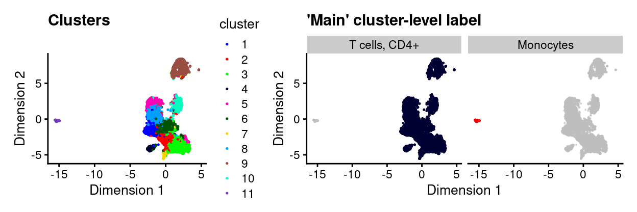
Figure 16: UMAP plot highlighting clusters (left) and ‘main’ cluster-level labels (right) where each panel highlights droplets from a particular label. Labels with < 1% frequency are grouped together as other.
Diagnostic plots
As a sanity check, we can examine the expression of the marker genes for the relevant cell type labels by plotting a heatmap of their expression in:
- The reference dataset
- Our dataset
The value of (1) is that we can assess if we believe the genes are indeed good markers of the relevant cell type in the reference dataset. The value of (2) is that we can check that these genes are useful markers in our dataset (e.g., that they are reasonably well sampled in our data).
Here, we specifically select (some of) the most strongly upregulated genes when comparing the Monocytes to the T cells, CD4+ (dice.Mono_vs_CD4) and vice-versa (dice.CD4_vs_Mono)
Figure 17 confirms that both the dice.Mono_vs_CD4 and dice.CD4_vs_Mono marker genes distinguish these two cell types from one another in the DICE reference dataset. However, the dice.CD4_vs_Mono marker genes are also expressed in T cells, CD8+ samples, highlighting that what are useful marker genes in one comparison are not necessarily in another comparison.
Show code
# NOTE: Have to remove column names from DICE to avoid an error.
tmp <- dice
colnames(tmp) <- seq_len(ncol(tmp))

plotHeatmap(
  tmp,
  features = markers,
  colour_columns_by = "label.main",
  center = TRUE,
  symmetric = TRUE,
  order_columns_by = "label.main",
  cluster_rows = FALSE,
  cluster_cols = FALSE,
  annotation_row = data.frame(
    markers = c(rep("dice.Mono_vs_CD4", 10), rep("dice.CD4_vs_Mono", 10)),
    row.names = markers),
  color = hcl.colors(101, "Blue-Red 3"),
  column_annotation_colors = list(
    label.main = label_main_collapsed_colours[unique(tmp$label.main)]))
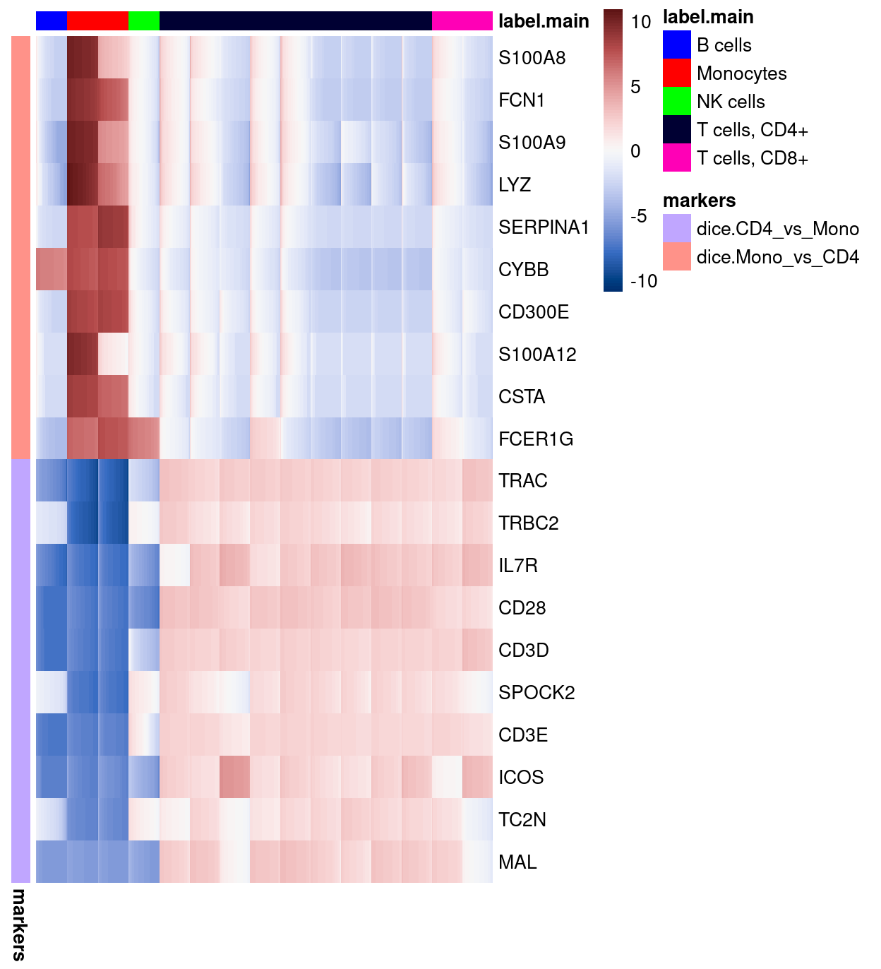
Figure 17: Heatmap of log-expression values in the DICE reference dataset for selected marker genes between the Monocytes and T cells, CD4+ labels. Each column is a sample, each row a gene
Figure 18 shows that both the dice.Mono_vs_CD4 and dice.CD4_vs_Mono marker genes marker genes are indeed very specific to their respective clusters in our dataset.
Show code
# NOTE: Alternatively, could plot the cluster-level data.
# tmp <- logNormCounts(
#   sumCountsAcrossCells(
#     sce,
#     ids = colData(sce)[, c("cluster", "label_cluster_main")],
#     subset_row = markers), exprs_values = 1)

set.seed(561)
tmp <- cbind(
  sce[, sce$label_cluster_main == "Monocytes"],
  sce[, sce$label_cluster_main != "Monocytes"][
    , sample(
      sum(sce$label_cluster_main != "Monocytes"),
      0.1 * sum(sce$label_cluster_main != "Monocytes"))])
plotHeatmap(
  tmp,
  features = markers,
  colour_columns_by = c("label_cluster_main", "cluster"),
  center = TRUE,
  symmetric = TRUE,
  order_columns_by = c("label_cluster_main", "cluster"),
  cluster_rows = FALSE,
  cluster_cols = FALSE,
  annotation_row = data.frame(
    markers = c(rep("dice.Mono_vs_CD4", 10), rep("dice.CD4_vs_Mono", 10)),
    row.names = markers),
  color = hcl.colors(101, "Blue-Red 3"),
  column_annotation_colors = list(
    cluster = cluster_colours,
    label_cluster_main = label_main_collapsed_colours[
      levels(sce$label_cluster_main)]))
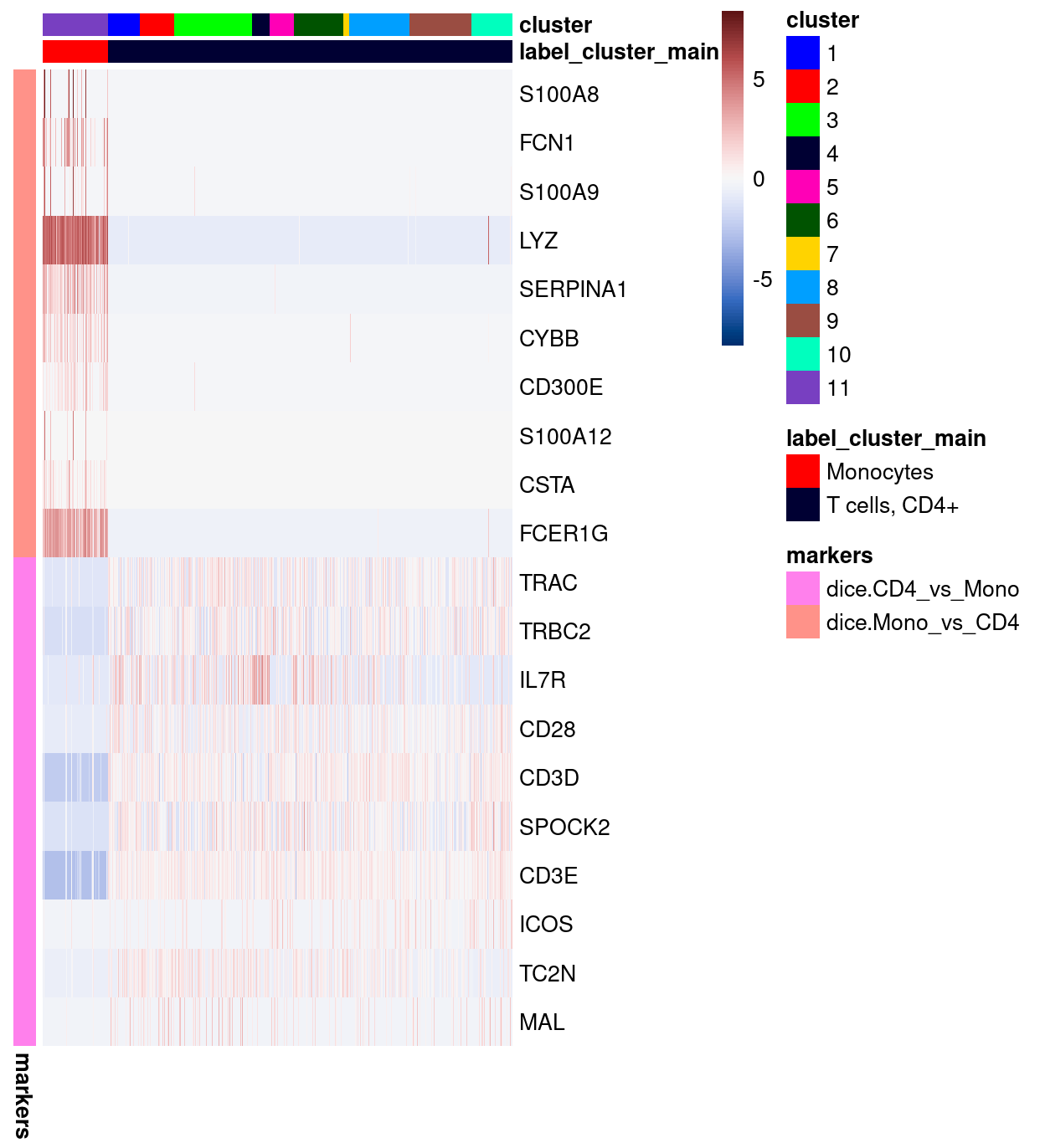
Figure 18: Heatmap of log-expression values in our dataset at the cell-level for selected marker genes between the Monocytes and T cells, CD4+ labels. Each column is a sample, each row a gene. For legibility, only a random 10% of non-Monocytes cells are shown.
Expression of T cell receptor genes
Figure 19 shows that cells in the ‘monocyte’ cluster have few counts from the T cell receptor genes, further evidence that the cells in this cluster are indeed not T cells.
Show code
is_tcr <- any(grepl("T cell receptor", rowData(sce)$NCBI.GENENAME))
# NOTE: Don't add to original sce, otherwise end up with 'duplicate' columns in
#       colData.
tmp <- addPerCellQC(sce, subsets = list(tcr = which(is_tcr)))
plotColData(
  tmp,
  "subsets_tcr_percent",
  x = "cluster",
  colour_by = data.frame(
    Monocyte_cluster = tmp$label_cluster_main == "Monocytes"))
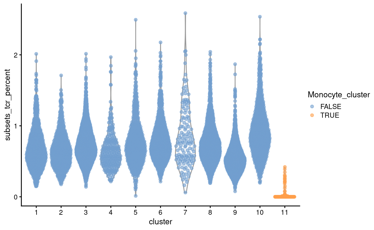
Figure 19: Proportion of counts from T cell receptor genes stratified by cluster.
Checking for enrichment of cells in experimental group
Show code
keep <- sce$label_cluster_main_collapsed != "Monocytes"
We again check whether the cells removed by this procedure are preferentially derive from particular experimental groups. Figure 20 shows that excluding these cells will preferentially exclude cells from the Uninfected samples.
Show code
ggplot(
  data.frame(Sample = sce$Sample, keep = keep)) +
  geom_bar(aes(x = Sample, fill = keep)) +
  ylab("Number of droplets") +
  theme_cowplot(font_size = 9) +
  theme(axis.text.x = element_text(angle = 45, hjust = 1))
Figure 20: Droplets removed after excluding droplets from clusters labelled as Monocytes, stratified by Sample.
Summary
We opt to remove cells from clusters labelled as Monocytes. The removes 147 droplets, retaining 9131 for further analysis. This will provide better resolution for us to analyse the remaining cells, which are nominally the CD4+ T-cells of interest.
Re-processing
Show code
set.seed(120)
var_fit <- modelGeneVarByPoisson(sce, block = sce$batch)
hvg <- getTopHVGs(var_fit, var.threshold = 0)

set.seed(11235)
sce <- denoisePCA(sce, var_fit, subset.row = hvg)

set.seed(8875)
sce <- runUMAP(sce, dimred = "PCA")
umap_df <- cbind(
  data.frame(
    x = reducedDim(sce, "UMAP")[, 1],
    y = reducedDim(sce, "UMAP")[, 2]),
  as.data.frame(colData(sce)[, !colnames(colData(sce)) %in% c("TRA", "TRB")]))

set.seed(8111)
snn_gr <- buildSNNGraph(sce, use.dimred = "PCA")
clusters <- igraph::cluster_louvain(snn_gr)
sce$cluster <- factor(clusters$membership)
umap_df$cluster <- sce$cluster
cluster_colours <- setNames(
  Polychrome::glasbey.colors(nlevels(sce$cluster) + 1)[-1],
  levels(sce$cluster))
sce$cluster_colours <- cluster_colours[sce$cluster]
There are 10 clusters detected, shown on the UMAP plot Figure 21 and broken down by experimental factors in Figure 22.
Show code
plot_grid(
  ggplot(aes(x = x, y = y), data = umap_df) +
    geom_point(aes(colour = cluster), size = 0.25) +
    scale_colour_manual(values = cluster_colours) +
    theme_cowplot(font_size = 12) +
    xlab("Dimension 1") +
    ylab("Dimension 2"),
  ggplot(aes(x = x, y = y), data = umap_df) +
    geom_point(aes(colour = Treatment), size = 0.25) +
    theme_cowplot(font_size = 12) +
    xlab("Dimension 1") +
    ylab("Dimension 2") +
    scale_colour_manual(values = treatment_colours),
  ggplot(aes(x = x, y = y), data = umap_df) +
    geom_point(aes(colour = Sample), size = 0.25) +
    theme_cowplot(font_size = 12) +
    xlab("Dimension 1") +
    ylab("Dimension 2") +
    scale_colour_manual(values = sample_colours),
  ncol = 2,
  align = "v")
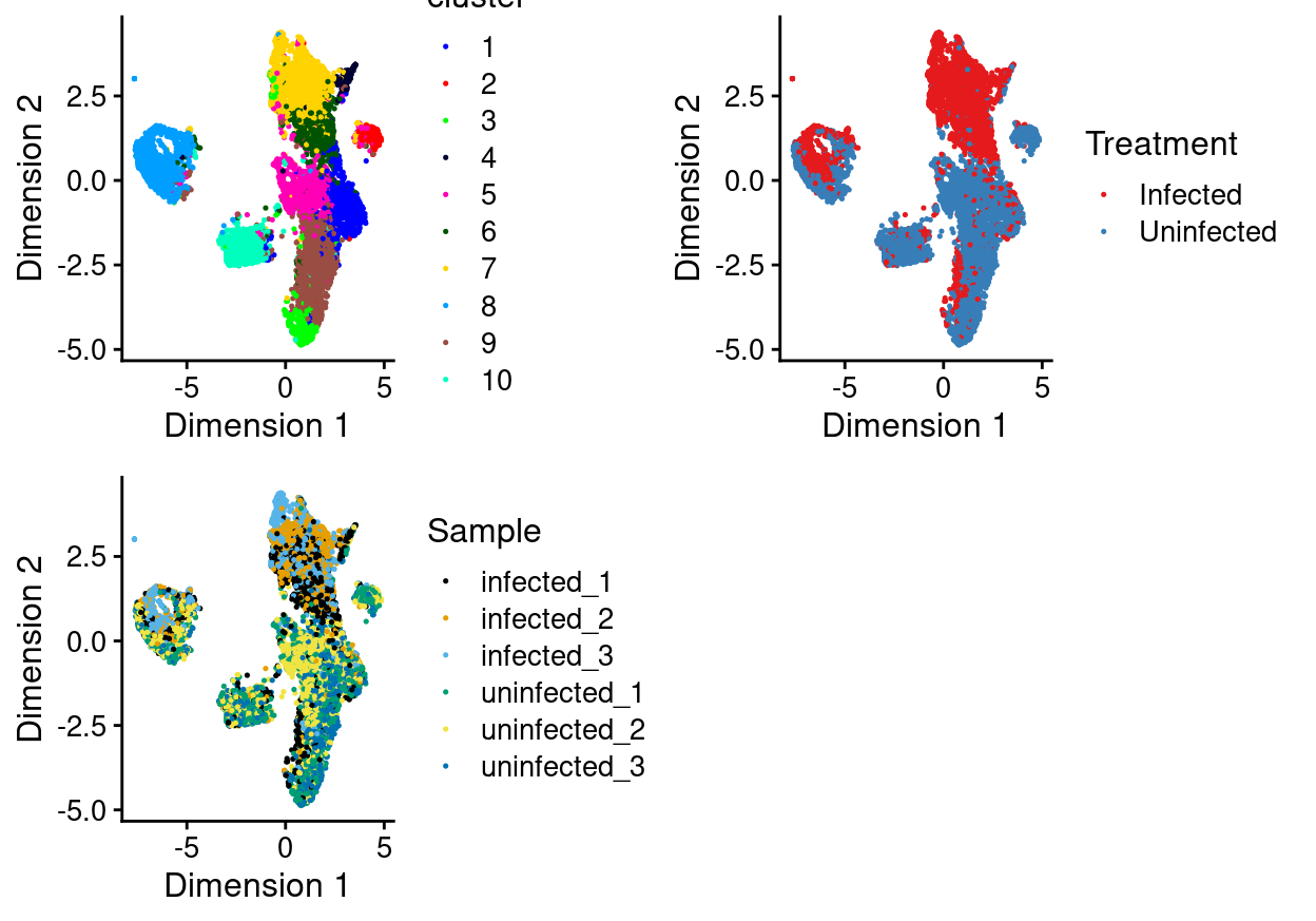
Figure 21: UMAP plot of the updated data, where each point represents a droplet and is coloured according to the legend.
Show code
plot_grid(
  ggplot(as.data.frame(colData(sce)[, c("cluster", "Sample")])) +
    geom_bar(
      aes(x = cluster, fill = Sample),
      position = position_fill(reverse = TRUE)) +
    coord_flip() +
    ylab("Frequency") +
    scale_fill_manual(values = sample_colours) +
    theme_cowplot(font_size = 8),
  ggplot(as.data.frame(colData(sce)[, c("cluster", "Treatment")])) +
    geom_bar(
      aes(x = cluster, fill = Treatment),
      position = position_fill(reverse = TRUE)) +
    coord_flip() +
    ylab("Frequency") +
    scale_fill_manual(values = treatment_colours) +
    theme_cowplot(font_size = 8),
  ggplot(as.data.frame(colData(sce)[, "cluster", drop = FALSE])) +
    geom_bar(aes(x = cluster, fill = cluster)) +
    coord_flip() +
    ylab("Number of droplets") +
    scale_fill_manual(values = cluster_colours) +
    theme_cowplot(font_size = 8) +
    guides(fill = FALSE),
  align = "h",
  ncol = 3)
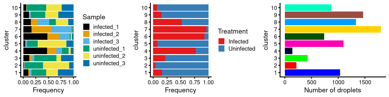
Figure 22: Breakdown of clusters by experimental factors.
Notably:
- Still, most of the clusters are highly treatment-specific.
- Still, none of the clusters are highly sample-specific.
‘Known’ unwanted cell types
Motivation
James indicated that there may be a subpopulation of CD8+ T-cells in this dataset. CD4+ and CD8+ T-cells are notoriously difficult to distinguish from one another using scRNA-seq data5.
Analysis
Supposing that there are CD8+ T-cells in this dataset, then there are several reasons why the approach taken in ‘Unknown’ unwanted cell types did not label any cluster as CD8+ T-cells:
- If the CD8+ T-cells were spread across several clusters, and in a minority within each of those clusters, then a cluster-level analysis would likely not label any cluster as CD8+ T-cells.
- If the marker genes distinguishing CD4+ T-cells and CD8+ T-cells in the reference dataset are poorly chosen
- If these genes can’t even distinguish CD4+ T-cells and CD8+ T-cells in the reference dataset
- If these genes are poorly sampled in our dataset.
We explore these issues in turn.
Cell-level annotations
A cell-level annotation using SingleR may allow us to identify CD8+ T-cells that are clustering with CD4+ T-cells rather than as a distinct cluster. For simplicity, I have again opted to only use the DICE reference annotation but now annotated the dataset at the cell-level using both the ‘main’ and ‘fine’ labels.
Show code
pred_cell_main <- SingleR(
  test = sce,
  ref = ref,
  labels = labels_main,
  BPPARAM = bpparam())
sce$label_cell_main <- factor(pred_cell_main$pruned.labels)
sce$label_cell_main_collapsed <- .collapseLabel(
  sce$label_cell_main,
  sce$batch)
umap_df$label_cell_main_collapsed <- sce$label_cell_main_collapsed

labels_fine <- ref$label.fine
# NOTE: This code doesn't necessarily generalise beyond the DICE main labels.
label_fine_collapsed_colours <- setNames(
  c(
    Polychrome::glasbey.colors(nlevels(factor(labels_fine)) + 1)[-1],
    "orange"),
  c(levels(factor(labels_fine)), "other"))

pred_cell_fine <- SingleR(
  test = sce,
  ref = ref,
  labels = labels_fine,
  BPPARAM = bpparam())
sce$label_cell_fine <- factor(pred_cell_fine$pruned.labels)
sce$label_cell_fine_collapsed <- .collapseLabel(
  sce$label_cell_fine,
  sce$batch)
sce$label_fine_collapsed_colours <- label_fine_collapsed_colours[
  as.character(sce$label_cell_fine_collapsed)]
umap_df$label_cell_fine_collapsed <- sce$label_cell_fine_collapsed
The results using the ‘main’ label is summarised in the table below. Almost all cells are labelled as T cells, CD4+.
Show code
tabyl(
  data.frame(label.main = sce$label_cell_main, cluster = sce$cluster),
  label.main,
  cluster) %>%
  adorn_totals("col") %>%
  adorn_percentages("col") %>%
  adorn_pct_formatting() %>%
  adorn_ns() %>%
  knitr::kable(
    caption = "Cell-level assignments using the 'main' labels of the DICE reference.")
| label.main | 1 | 2 | 3 | 4 | 5 | 6 | 7 | 8 | 9 | 10 | Total |
|---|---|---|---|---|---|---|---|---|---|---|---|
| B cells | 0.0% (0) | 0.0% (0) | 0.0% (0) | 0.0% (0) | 0.0% (0) | 0.0% (0) | 0.0% (0) | 0.0% (0) | 0.1% (1) | 0.0% (0) | 0.0% (1) |
| Monocytes | 0.0% (0) | 0.0% (0) | 0.0% (0) | 0.0% (0) | 0.1% (1) | 0.0% (0) | 0.0% (0) | 0.0% (0) | 0.0% (0) | 0.0% (0) | 0.0% (1) |
| NK cells | 0.0% (0) | 0.0% (0) | 0.2% (1) | 0.0% (0) | 0.7% (8) | 0.0% (0) | 3.4% (62) | 1.7% (23) | 0.0% (0) | 0.0% (0) | 1.0% (94) |
| T cells, CD4+ | 100.0% (1035) | 99.5% (218) | 99.5% (426) | 99.3% (140) | 99.2% (1087) | 100.0% (739) | 96.5% (1736) | 98.1% (1309) | 99.9% (1468) | 100.0% (871) | 98.9% (9029) |
| T cells, CD8+ | 0.0% (0) | 0.5% (1) | 0.2% (1) | 0.7% (1) | 0.0% (0) | 0.0% (0) | 0.1% (1) | 0.1% (1) | 0.0% (0) | 0.0% (0) | 0.1% (5) |
| NA | 0.0% (0) | 0.0% (0) | 0.0% (0) | 0.0% (0) | 0.0% (0) | 0.0% (0) | 0.0% (0) | 0.1% (1) | 0.0% (0) | 0.0% (0) | 0.0% (1) |
The results using the ‘fine’ label is summarised in the table below. Consistent with the ‘main’ labels, almost all cells are labelled as a subtype of T cells, CD4+ cells.
Show code
tabyl(
  data.frame(label.fine = sce$label_cell_fine, cluster = sce$cluster),
  label.fine,
  cluster) %>%
  adorn_totals("col") %>%
  adorn_percentages("col") %>%
  adorn_pct_formatting() %>%
  adorn_ns() %>%
  knitr::kable(
    caption = "Cell-level assignments using the 'fine' labels of the DICE reference.")
| label.fine | 1 | 2 | 3 | 4 | 5 | 6 | 7 | 8 | 9 | 10 | Total |
|---|---|---|---|---|---|---|---|---|---|---|---|
| B cells, naive | 0.0% (0) | 0.0% (0) | 0.0% (0) | 0.0% (0) | 0.0% (0) | 0.0% (0) | 0.0% (0) | 0.0% (0) | 0.1% (1) | 0.0% (0) | 0.0% (1) |
| Monocytes, CD16+ | 0.0% (0) | 0.0% (0) | 0.0% (0) | 0.0% (0) | 0.1% (1) | 0.0% (0) | 0.0% (0) | 0.0% (0) | 0.0% (0) | 0.0% (0) | 0.0% (1) |
| NK cells | 0.0% (0) | 0.0% (0) | 0.2% (1) | 0.0% (0) | 0.3% (3) | 0.0% (0) | 2.1% (38) | 0.7% (10) | 0.0% (0) | 0.0% (0) | 0.6% (52) |
| T cells, CD4+, memory TREG | 23.6% (244) | 4.6% (10) | 32.0% (137) | 46.1% (65) | 44.4% (487) | 68.1% (503) | 48.9% (880) | 80.1% (1068) | 21.1% (310) | 99.0% (862) | 50.0% (4566) |
| T cells, CD4+, naive | 0.1% (1) | 0.0% (0) | 2.1% (9) | 0.0% (0) | 0.0% (0) | 0.0% (0) | 0.0% (0) | 0.1% (1) | 0.5% (7) | 0.0% (0) | 0.2% (18) |
| T cells, CD4+, naive TREG | 0.2% (2) | 0.0% (0) | 0.7% (3) | 0.0% (0) | 0.0% (0) | 0.0% (0) | 0.0% (0) | 0.1% (1) | 0.1% (2) | 0.0% (0) | 0.1% (8) |
| T cells, CD4+, naive, stimulated | 0.0% (0) | 0.0% (0) | 3.5% (15) | 1.4% (2) | 0.0% (0) | 0.0% (0) | 0.0% (0) | 0.1% (1) | 0.1% (2) | 0.0% (0) | 0.2% (20) |
| T cells, CD4+, TFH | 9.3% (96) | 1.8% (4) | 31.1% (133) | 2.1% (3) | 0.4% (4) | 0.1% (1) | 0.1% (1) | 0.7% (9) | 14.8% (217) | 0.1% (1) | 5.1% (469) |
| T cells, CD4+, Th1 | 2.5% (26) | 61.6% (135) | 3.0% (13) | 19.1% (27) | 12.9% (141) | 5.7% (42) | 43.3% (779) | 11.6% (155) | 3.1% (46) | 0.7% (6) | 15.0% (1370) |
| T cells, CD4+, Th1_17 | 0.7% (7) | 31.1% (68) | 0.2% (1) | 2.1% (3) | 8.9% (97) | 0.4% (3) | 0.8% (14) | 0.1% (1) | 0.3% (5) | 0.0% (0) | 2.2% (199) |
| T cells, CD4+, Th17 | 30.2% (313) | 0.9% (2) | 8.2% (35) | 11.3% (16) | 28.7% (315) | 15.0% (111) | 2.6% (46) | 1.9% (26) | 18.4% (271) | 0.0% (0) | 12.4% (1135) |
| T cells, CD4+, Th2 | 32.9% (341) | 0.0% (0) | 16.1% (69) | 17.0% (24) | 4.2% (46) | 10.7% (79) | 2.2% (39) | 4.1% (55) | 40.8% (599) | 0.2% (2) | 13.7% (1254) |
| T cells, CD8+, naive | 0.0% (0) | 0.0% (0) | 0.2% (1) | 0.7% (1) | 0.0% (0) | 0.0% (0) | 0.0% (0) | 0.0% (0) | 0.0% (0) | 0.0% (0) | 0.0% (2) |
| T cells, CD8+, naive, stimulated | 0.0% (0) | 0.0% (0) | 0.2% (1) | 0.0% (0) | 0.0% (0) | 0.0% (0) | 0.0% (0) | 0.1% (1) | 0.0% (0) | 0.0% (0) | 0.0% (2) |
| NA | 0.5% (5) | 0.0% (0) | 2.3% (10) | 0.0% (0) | 0.2% (2) | 0.0% (0) | 0.1% (2) | 0.4% (6) | 0.6% (9) | 0.0% (0) | 0.4% (34) |
This consistency is further emphasised when we cross-tabulate the ‘main’ and ‘fine’ labels.
Show code
tabyl(
  data.frame(
  label.main = sce$label_cell_main,
  label.fine = sce$label_cell_fine,
  cluster = sce$cluster),
  label.fine, label.main) %>%
  adorn_totals("row") %>%
  adorn_percentages("col") %>%
  adorn_pct_formatting() %>%
  adorn_ns() %>%
  knitr::kable(
    caption = "Cross-tabulation of the 'main' and 'fine' assignments using the DICE reference.")
| label.fine | B cells | Monocytes | NK cells | T cells, CD4+ | T cells, CD8+ | NA_ |
|---|---|---|---|---|---|---|
| B cells, naive | 100.0% (1) | 0.0% (0) | 0.0% (0) | 0.0% (0) | 0.0% (0) | 0.0% (0) |
| Monocytes, CD16+ | 0.0% (0) | 100.0% (1) | 0.0% (0) | 0.0% (0) | 0.0% (0) | 0.0% (0) |
| NK cells | 0.0% (0) | 0.0% (0) | 54.3% (51) | 0.0% (1) | 0.0% (0) | 0.0% (0) |
| T cells, CD4+, memory TREG | 0.0% (0) | 0.0% (0) | 2.1% (2) | 50.5% (4564) | 0.0% (0) | 0.0% (0) |
| T cells, CD4+, naive | 0.0% (0) | 0.0% (0) | 0.0% (0) | 0.2% (18) | 0.0% (0) | 0.0% (0) |
| T cells, CD4+, naive TREG | 0.0% (0) | 0.0% (0) | 0.0% (0) | 0.1% (7) | 20.0% (1) | 0.0% (0) |
| T cells, CD4+, naive, stimulated | 0.0% (0) | 0.0% (0) | 0.0% (0) | 0.2% (20) | 0.0% (0) | 0.0% (0) |
| T cells, CD4+, TFH | 0.0% (0) | 0.0% (0) | 0.0% (0) | 5.2% (469) | 0.0% (0) | 0.0% (0) |
| T cells, CD4+, Th1 | 0.0% (0) | 0.0% (0) | 43.6% (41) | 14.7% (1327) | 40.0% (2) | 0.0% (0) |
| T cells, CD4+, Th1_17 | 0.0% (0) | 0.0% (0) | 0.0% (0) | 2.2% (199) | 0.0% (0) | 0.0% (0) |
| T cells, CD4+, Th17 | 0.0% (0) | 0.0% (0) | 0.0% (0) | 12.6% (1135) | 0.0% (0) | 0.0% (0) |
| T cells, CD4+, Th2 | 0.0% (0) | 0.0% (0) | 0.0% (0) | 13.9% (1254) | 0.0% (0) | 0.0% (0) |
| T cells, CD8+, naive | 0.0% (0) | 0.0% (0) | 0.0% (0) | 0.0% (0) | 40.0% (2) | 0.0% (0) |
| T cells, CD8+, naive, stimulated | 0.0% (0) | 0.0% (0) | 0.0% (0) | 0.0% (1) | 0.0% (0) | 100.0% (1) |
| NA | 0.0% (0) | 0.0% (0) | 0.0% (0) | 0.4% (34) | 0.0% (0) | 0.0% (0) |
| Total | 100.0% (1) | 100.0% (1) | 100.0% (94) | 100.0% (9029) | 100.0% (5) | 100.0% (1) |
Figure 23 overlays the ‘fine’ cell type labels on the UMAP plot.
Show code
p1 <- ggplot(aes(x = x, y = y), data = umap_df) +
  geom_point(
    aes(colour = cluster),
    alpha = 1,
    size = 0.25) +
  scale_fill_manual(values = cluster_colours) +
  scale_colour_manual(values = cluster_colours) +
  theme_cowplot(font_size = 12) +
  xlab("Dimension 1") +
  ylab("Dimension 2") +
  ggtitle("Clusters")
bg <- dplyr::select(umap_df, -label_cell_fine_collapsed)
p2 <- ggplot(aes(x = x, y = y), data = umap_df) +
  geom_point(data = bg, colour = scales::alpha("grey", 0.5), size = 0.125) +
  geom_point(
    aes(colour = label_cell_fine_collapsed),
    alpha = 1,
    size = 0.25) +
  scale_fill_manual(values = label_fine_collapsed_colours) +
  scale_colour_manual(values = label_fine_collapsed_colours) +
  theme_cowplot(font_size = 5) +
  xlab("Dimension 1") +
  ylab("Dimension 2") +
  facet_wrap(~ label_cell_fine_collapsed, ncol = 3) +
  guides(colour = FALSE) +
  ggtitle("'Fine' cell-level label")
p1 + p2 + plot_layout(widths = c(1, 1))
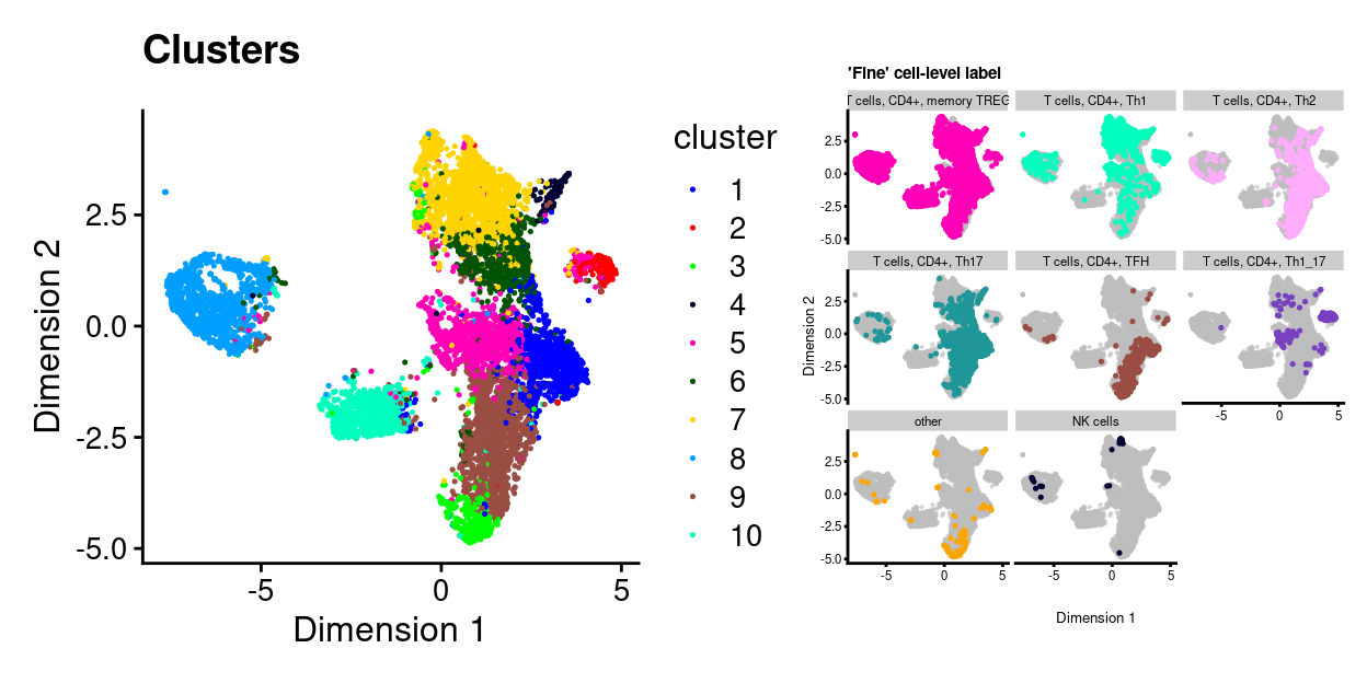
Figure 23: UMAP plot. Each point represents a cluster and is coloured by the ‘fine’ cell-level label. Each panel highlights droplets from a particular predicted cluster type. Cluster labels with < 1% frequency are grouped together as other.
Essentially none of the cells are labelled as CD8+ T-cells by this approach.
Diagnostic plots
Show code
library(tibble)
library(tidyr)

dir.create(here("output", "marker_genes", "SingleR"), recursive = TRUE)

cell_main_de_genes <- SingleRDEGsAsTibble(metadata(pred_cell_main)$de.genes)
write.csv(
    cell_main_de_genes,
    gzfile(
      here(
        "output",
        "marker_genes",
        "SingleR",
        "SingleR_markers.DICE.label_cell_main.csv.gz")),
    row.names = FALSE,
    quote = FALSE)

cell_fine_de_genes <- SingleRDEGsAsTibble(metadata(pred_cell_fine)$de.genes)
write.csv(
    cell_fine_de_genes,
    gzfile(
      here(
        "output",
        "marker_genes",
        "SingleR",
        "SingleR_markers.DICE.label_cell_fine.csv.gz")),
    row.names = FALSE,
    quote = FALSE)
As a sanity check, we again examine the expression of the marker genes for the relevant cell type labels by plotting a heatmap of their expression in:
- The reference dataset
- Our dataset
The value of (1) is that we can assess if we believe the genes are indeed good markers of the relevant cell type in the reference dataset. The value of (2) is that we can check that these genes are useful markers in our dataset (e.g., that they are reasonably well sampled in our data).
Here, we specifically select (some of) the most strongly upregulated genes when comparing the T cells, CD8+ to the T cells, CD4+ (dice.CD8_vs_CD4) and vice-versa (dice.CD4_vs_CD8).
Figure 24 confirms that both the dice.CD8_vs_CD4 and dice.CD4_vs_CD8 marker genes distinguish these two cell types from one another in the DICE reference dataset.
Show code
# NOTE: Have to remove column names from DICE to avoid an error.
tmp <- dice
colnames(tmp) <- seq_len(ncol(tmp))

plotHeatmap(
  tmp,
  features = markers,
  colour_columns_by = c("label.main", "label.fine"),
  center = TRUE,
  symmetric = TRUE,
  order_columns_by = c("label.main", "label.fine"),
  cluster_rows = FALSE,
  cluster_cols = FALSE,
  annotation_row = data.frame(
    markers = c(rep("dice.CD8_vs_CD4", 20), rep("dice.CD4_vs_CD8", 20)),
    row.names = markers),
  color = hcl.colors(101, "Blue-Red 3"),
  column_annotation_colors = list(
    label.main = label_main_collapsed_colours[unique(tmp$label.main)],
    label.fine = label_fine_collapsed_colours[unique(tmp$label.fine)]))
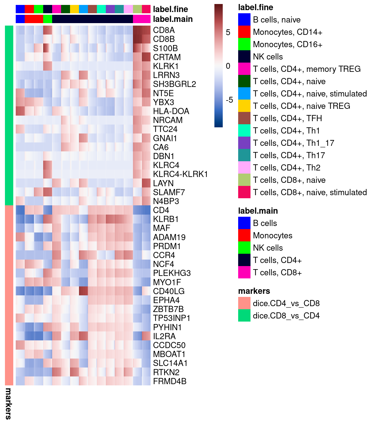
Figure 24: Heatmap of log-expression values in the DICE reference dataset for selected marker genes between the T cells, CD8+ and T cells, CD4+ labels. Each column is a sample, each row a gene
Figure 25 shows that very few of the dice.CD8_vs_CD4 marker genes are expressed in any cells in our dataset. In contrast, many of the cells express several of the dice.CD4_vs_CD8 marker genes.
Show code
plotHeatmap(
  sce,
  features = markers,
  colour_columns_by = c("label_cell_main", "label_cell_fine", "cluster"),
  center = TRUE,
  symmetric = TRUE,
  order_columns_by = c("label_cell_main", "label_cell_fine", "cluster"),
  cluster_rows = FALSE,
  cluster_cols = FALSE,
  annotation_row = data.frame(
    markers = c(rep("dice.CD8_vs_CD4", 20), rep("dice.CD4_vs_CD8", 20)),
    row.names = markers),
  color = hcl.colors(101, "Blue-Red 3"),
  fontsize = 7,
  column_annotation_colors = list(
    label_cell_main = label_main_collapsed_colours[levels(sce$label_cell_main)],
    label.fine = label_fine_collapsed_colours[levels(sce$label_cell_fine)],
    cluster = cluster_colours))
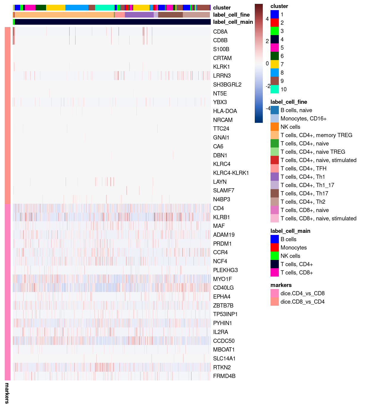
Figure 25: Heatmap of log-expression values in our dataset at the cell-level for selected marker genes between the T cells, CD8+ and T cells, CD4+ labels. Each column is a sample, each row a gene.
Figure 26 shows that even amongst those cells not labelled as T cells, CD4+, very few of the dice.CD8_vs_CD4 marker genes are expressed in our dataset.
Show code
tmp <- sce[, which(sce$label_cell_main != "T cells, CD4+")]
colData(tmp)[, !colnames(colData(tmp)) %in% c("TRA", "TRB")] <-
  droplevels(colData(tmp)[, !colnames(colData(tmp)) %in% c("TRA", "TRB")])
plotHeatmap(
  tmp,
  features = markers,
  colour_columns_by = c("label_cell_main", "label_cell_fine", "cluster"),
  center = TRUE,
  symmetric = TRUE,
  order_columns_by = c("label_cell_main", "label_cell_fine", "cluster"),
  cluster_rows = FALSE,
  cluster_cols = FALSE,
  annotation_row = data.frame(
    markers = c(rep("dice.CD8_vs_CD4", 20), rep("dice.CD4_vs_CD8", 20)),
    row.names = markers),
  color = hcl.colors(101, "Blue-Red 3"),
  fontsize = 7,
  column_annotation_colors = list(
    label_cell_main = label_main_collapsed_colours[levels(tmp$label_cell_main)],
    label.fine = label_fine_collapsed_colours[levels(tmp$label_cell_fine)],
    cluster = cluster_colours[levels(tmp$cluster)]))
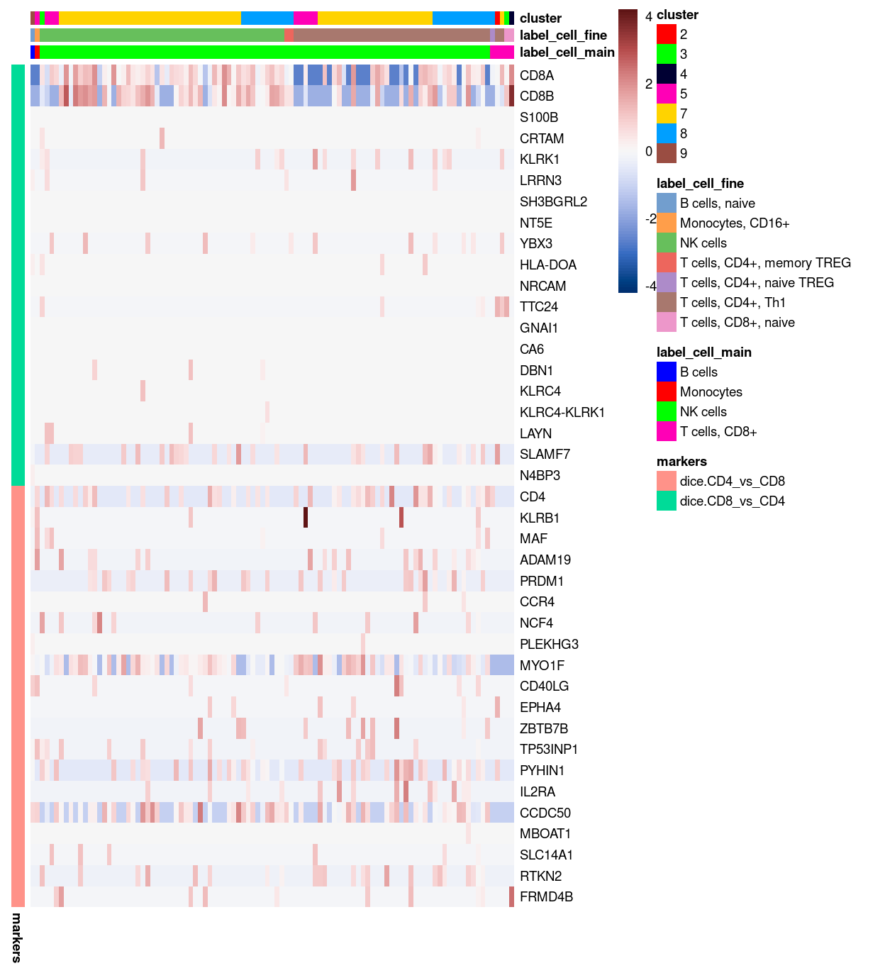
Figure 26: Heatmap of log-expression values in our dataset at the cell-level for selected marker genes between the T cells, CD8+ and T cells, CD4+ labels. Each column is a sample, each row a gene. Only cells not labelled as T cells, CD4+ are shown.
Summary
By performing a cell-level annotation with SingleR, we have ruled out the possibility that the absence of CD8+ T-cells identified in ‘Unknown’ unwanted cell types is due to this analysis being performed at the cluster-level. In fact, the cell-level analysis has provided stronger evidence that these cells are almost all various subtypes of CD4+ T-cells.
However, we also observed that the dice.CD8_vs_CD4 marker genes are poorly sampled in our dataset, leaving open the possibility that a different choice of marker genes would allow us to distinguish the two cell types and identify any stray CD8+ T-cells. We pursue this approach in the next section.
Alternative marker gene lists
Show code
james_cd8_markers <- c("GNLY", "GZMA", "GZMK")
As an alternative to using the DICE-derived marker genes, we could use any other list of putative marker genes. James provided some genes that he believes are markers of the unwanted CD8+ cells, namely GNLY, GZMA, and GZMK. We look at the expression of these in both the DICE reference dataset and in our dataset.
Diagnostic plots
Figure 27 shows that these genes are arguably stronger markers of NK cells than they are of CD8+ cells. More importantly, these genes are highly expressed in several CD4+ T-cell subtypes in the DICE reference dataset.
Show code
# NOTE: Have to remove column names from DICE to avoid an error.
tmp <- dice
colnames(tmp) <- seq_len(ncol(tmp))

plotHeatmap(
  tmp,
  features = james_cd8_markers,
  colour_columns_by = c("label.main", "label.fine"),
  center = TRUE,
  symmetric = TRUE,
  cluster_rows = TRUE,
  cluster_cols = TRUE,
  color = hcl.colors(101, "Blue-Red 3"),
  column_annotation_colors = list(
    label.main = label_main_collapsed_colours[unique(tmp$label.main)],
    label.fine = label_fine_collapsed_colours[unique(tmp$label.fine)]))
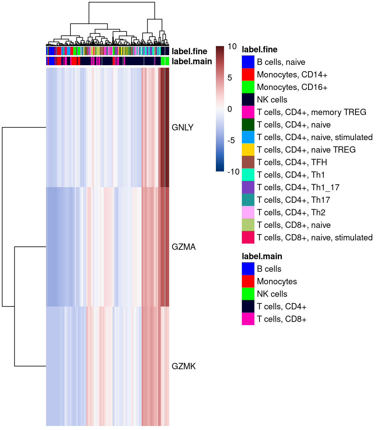
Figure 27: Heatmap of log-expression values in the DICE reference dataset for ‘CD8+ T-cell’ marker genes provided by James. Each column is a sample, each row a gene
Consistent with this, Figure 28 shows high expression of these genes in cells labelled as various subtypes of CD4+ T-cells. Furthermore, Figure 28 shows high expression of these genes for those cells labelled as NK cells and low expression of those same genes in the few cells labelled as T cells, CD8.
Show code
plotHeatmap(
  sce,
  features = james_cd8_markers,
  colour_columns_by = c("label_cell_main", "label_cell_fine", "cluster"),
  center = TRUE,
  symmetric = TRUE,
  order_columns_by = c("label_cell_main", "label_cell_fine", "cluster"),
  cluster_rows = TRUE,
  cluster_cols = TRUE,
  color = hcl.colors(101, "Blue-Red 3"),
  column_annotation_colors = list(
    label_cell_main = label_main_collapsed_colours[levels(sce$label_cell_main)],
    label.fine = label_fine_collapsed_colours[levels(sce$label_cell_fine)],
    cluster = cluster_colours))
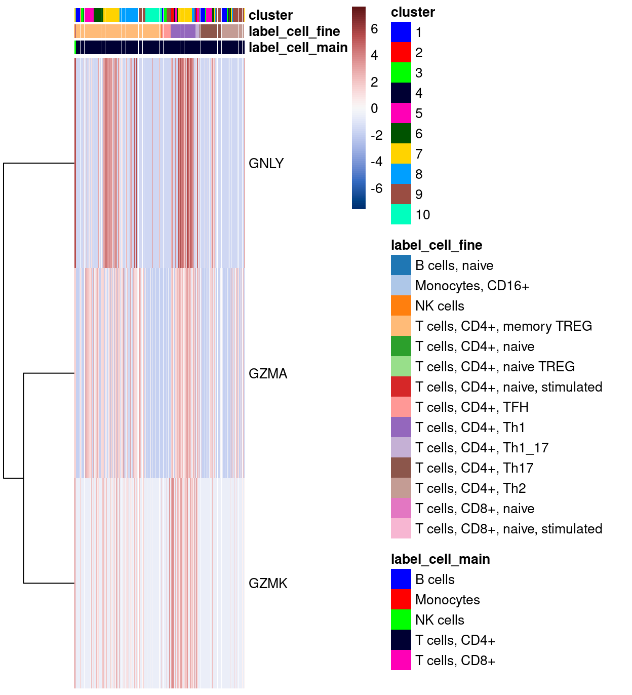
Figure 28: Heatmap of log-expression values in our dataset at the cell-level for ‘CD8+ T-cell’ marker genes provided by James. Each column is a sample, each row a gene.
Summary
There is no evidence in the DICE reference dataset that GNLY, GZMA, and GZMK are markers of CD8+ T-cells. To the contrary, the DICE dataset provides strong evidence that these are markers of various CD4+ T-cell subtypes and NK cells.
Summary
- We identified a small number of
Monocytesthat we excluded from further analysis. - We did not identify any of the suspected CD8+ T-cells.
- Instead, we found strong evidence that almost all the remaining cells are various subtypes of CD4+ T-cells.
Summary
After extensive analysis we have now identified those droplets containing ‘biologically relevant’ cells (n = 9131). Specifically, we have selected for singlets that are CD4+ T-cells. We can verify that we have selected CD4+ T-cells by looking at the expression of known marker genes. Figure 29 gives an example using some marker genes of T cells, CD4+ cells from the DICE reference dataset.
Show code
# NOTE: This code was written before I had SingleRDEGsAsTibble().
all_markers <- metadata(pred_cell_main)$de.genes
cd4_markers <- all_markers[["T cells, CD4+"]]
cd4_markers_t <- table(unlist(cd4_markers))

# Three approaches to selecting markers:
#
# 1. Identify genes occurring in most pairwise comparisons
#      `markers <- names(sort(cd4_markers_t, decreasing = TRUE))`
# 2. Identify the markers genes that are most highly expressed (on average)
#    in our dataset.
#     `markers <- names(sort(rowMeans(logcounts(sce)[names(cd4_markers_t), ]), decreasing = TRUE))`
# 3. A compromise between (1) and (2), here selecting most highly expressed markers that occur in at least X pairwise comparisons
#     `markers <- names(sort(rowMeans(logcounts(sce)[names(cd4_markers_t[cd4_markers_t >= X]), ]), decreasing = TRUE))`

# NOTE: Opted to go with (3) with X = 2
markers <- names(
  sort(
    rowMeans(logcounts(sce)[names(cd4_markers_t[cd4_markers_t >= 2]), ]),
    decreasing = TRUE))

# NOTE: Have to remove `TRA` and `TRB` before create the dataframe.
tmp <- sce
colData(tmp) <- colData(tmp)[!colnames(colData(tmp)) %in% c("TRA", "TRB")]
p <- lapply(head(markers, 9), function(marker) {
  b <- makePerCellDF(tmp, features = marker) %>%
    tidyr::pivot_longer(
      all_of(marker),
      names_to = "feature",
      values_to = "logcounts")
  ggplot(data = b, aes(x = UMAP.1, y = UMAP.2)) +
    geom_point(aes(colour = logcounts), size = 1/9) +
    scale_colour_viridis_c(option = "magma") +
    theme_cowplot(font_size = 8) +
    ggtitle(marker)
})
plot_grid(plotlist = p, ncol = 3)
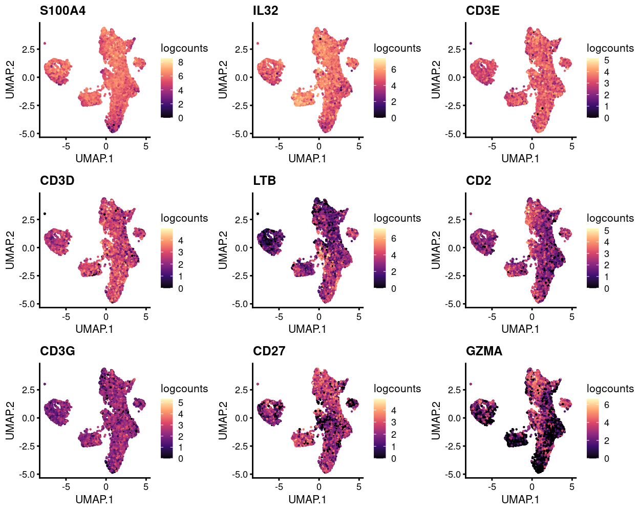
Figure 29: UMAP plot of the updated data, where each point represents a cell and is coloured according to expression of selected genes. The selected genes are markers of the T cells, CD4+ cells in the DICE reference dataset that are also highly expressed in our dataset.
Re-processing
We perform a final re-processing of the ‘biologically relevant’ cells. Notably, we opt at this stage to exclude ribosomal protein and mitochondrial genes from the list of highly variable genes, for reasons explained below.
Exclusion of ribosomal protein and mitochondrial genes from HVGs
Show code
set.seed(1000)
var_fit <- modelGeneVarByPoisson(sce, block = sce$batch)
hvg <- getTopHVGs(var_fit, var.threshold = 0)
We find that the most highly variable genes in this dataset are somewhat enriched for ribosomal protein genes6 (n = 106) and mitochondrial genes (n = 13), with Figure 30 showing that more than 20% of the top-200 HVGs are ribosomal protein or mitochondrial genes.
Show code
is_mito <- hvg %in% mito_set
is_ribo <- hvg %in% ribo_set

plot(
  100 * cumsum(is_mito) / seq_along(hvg),
  log = "x",
  ylim = c(0, 100),
  ylab = "%",
  xlab = "Top-k genes",
  col = "dodgerBlue",
  pch = 16)
points(100 * cumsum(is_ribo) / seq_along(hvg), col = "orange", pch = 16)
points(100 * cumsum(is_mito | is_ribo) / seq_along(hvg), col = "black", pch = 16)
legend(
  "topright",
  pch = 16,
  col = c("black", "orange", "dodgerBlue"),
  legend = c("Both", "Ribosomal protein", "Mitochondrial"))
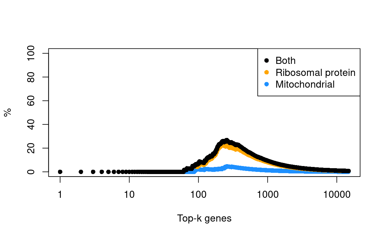
Figure 30: Percentage of top-K HVGs that are mitochondrial or ribosomal protein genes.
Ribosomal protein and mitochondrial genes are of lesser biological relevance to this study, so we it was decided to exclude them from the HVGs. This means that these genes can no longer directly influence some of the subsequent steps in the analysis, including:
- Dimensionality reduction
- Principal component analysis (PCA)
- Uniform manifold approximation and projection (UMAP)
- Data integration
- Mutual nearest neighbours (MNN)
- Clustering
Although the exclusion of these genes from the HVGs prevents them from directly influencing these analyses, they may still indirectly influence these steps or otherwise be associated with their outcomes. For example, if there is a set of (non ribosomal protein) genes that are strongly associated with ribosomal protein gene expression, then we may still see a cluster associated with ribosomal protein gene expression.
Finally, and to emphasise, we have only excluded ribosomal protein and mitochondrial genes from the HVGs, i.e. we have not excluded them entirely from the dataset. In particular, this means that these genes may appear in downstream results (e.g., tables of cluster marker genes and differentially expressed genes).
Show code
hvg <- hvg[!(is_mito | is_ribo)]
Visualisation
Show code
set.seed(11235)
sce <- denoisePCA(sce, var_fit, subset.row = hvg)

set.seed(8875)
sce <- runUMAP(sce, dimred = "PCA")
umap_df <- cbind(
  data.frame(
    x = reducedDim(sce, "UMAP")[, 1],
    y = reducedDim(sce, "UMAP")[, 2]),
  as.data.frame(colData(sce)[, !colnames(colData(sce)) %in% c("TRA", "TRB")]))

set.seed(8111)
snn_gr <- buildSNNGraph(sce, use.dimred = "PCA")
clusters <- igraph::cluster_louvain(snn_gr)
sce$cluster <- factor(clusters$membership)
umap_df$cluster <- sce$cluster
cluster_colours <- setNames(
  Polychrome::glasbey.colors(nlevels(sce$cluster) + 1)[-1],
  levels(sce$cluster))
sce$cluster_colours <- cluster_colours[sce$cluster]
There are 10 clusters detected, shown on the UMAP plot Figure 31 and broken down by experimental factors in Figure 32.
Show code
plot_grid(
  ggplot(aes(x = x, y = y), data = umap_df) +
    geom_point(aes(colour = cluster), size = 0.25) +
    scale_colour_manual(values = cluster_colours) +
    theme_cowplot(font_size = 12) +
    xlab("Dimension 1") +
    ylab("Dimension 2"),
  ggplot(aes(x = x, y = y), data = umap_df) +
    geom_point(aes(colour = Treatment), size = 0.25) +
    theme_cowplot(font_size = 12) +
    xlab("Dimension 1") +
    ylab("Dimension 2") +
    scale_colour_manual(values = treatment_colours),
  ggplot(aes(x = x, y = y), data = umap_df) +
    geom_point(aes(colour = Sample), size = 0.25) +
    theme_cowplot(font_size = 12) +
    xlab("Dimension 1") +
    ylab("Dimension 2") +
    scale_colour_manual(values = sample_colours),
  ncol = 2,
  align = "v")
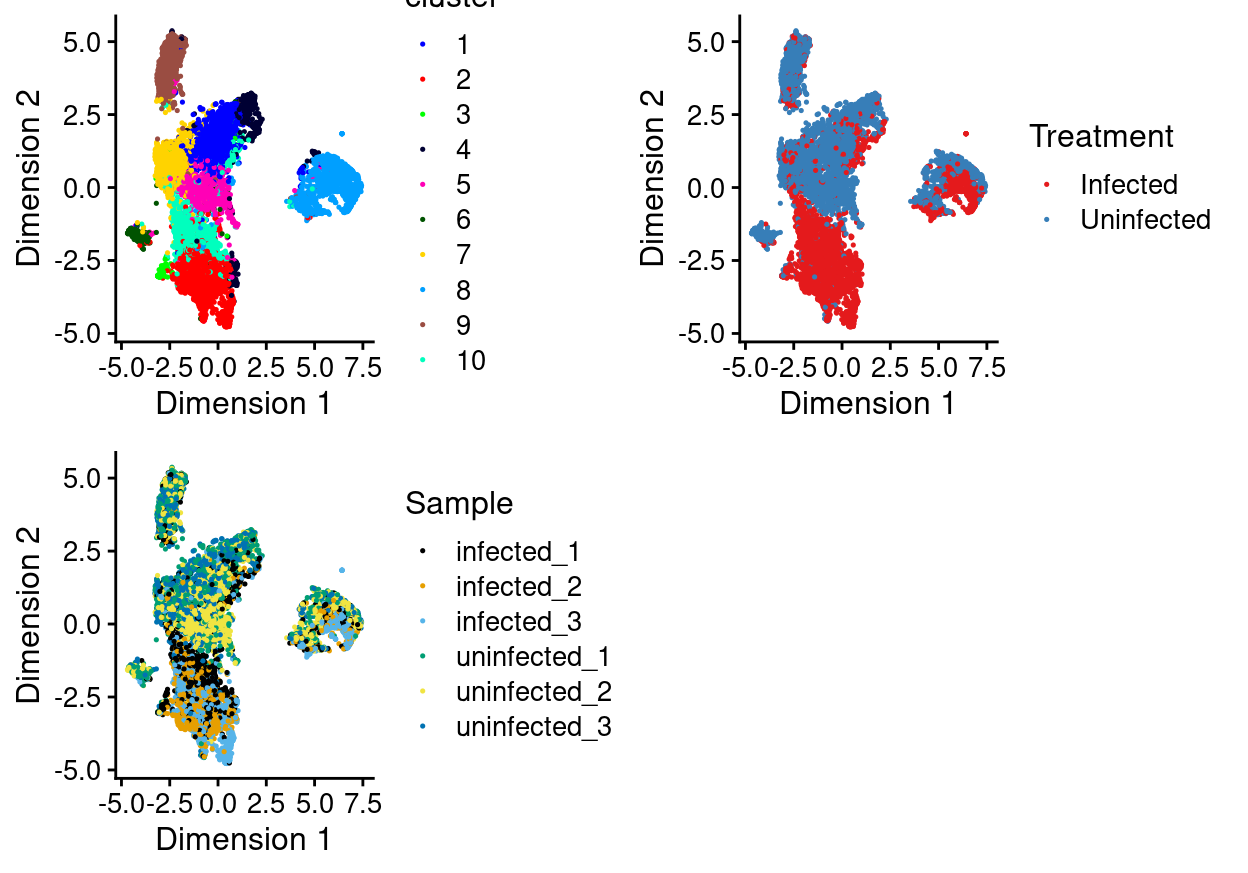
Figure 31: UMAP plot of the updated data, where each point represents a droplet and is coloured according to the legend.
Show code
plot_grid(
  ggplot(as.data.frame(colData(sce)[, c("cluster", "Sample")])) +
    geom_bar(
      aes(x = cluster, fill = Sample),
      position = position_fill(reverse = TRUE)) +
    coord_flip() +
    ylab("Frequency") +
    scale_fill_manual(values = sample_colours) +
    theme_cowplot(font_size = 8),
  ggplot(as.data.frame(colData(sce)[, c("cluster", "Treatment")])) +
    geom_bar(
      aes(x = cluster, fill = Treatment),
      position = position_fill(reverse = TRUE)) +
    coord_flip() +
    ylab("Frequency") +
    scale_fill_manual(values = treatment_colours) +
    theme_cowplot(font_size = 8),
  ggplot(as.data.frame(colData(sce)[, "cluster", drop = FALSE])) +
    geom_bar(aes(x = cluster, fill = cluster)) +
    coord_flip() +
    ylab("Number of droplets") +
    scale_fill_manual(values = cluster_colours) +
    theme_cowplot(font_size = 8) +
    guides(fill = FALSE),
  align = "h",
  ncol = 3)
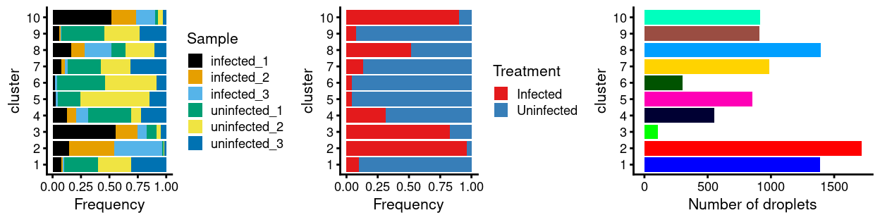
Figure 32: Breakdown of clusters by experimental factors.
Notably:
- Still, most of the clusters are highly treatment-specific.
- Now, some of the clusters are somewhat sample-specific.
Concluding remarks
The processed SingleCellExperiment object is available (see data/SCEs/C057_Cooney.cells_selected.SCE.rds). This will be used in downstream analyses, e.g., identifying cluster marker genes and refining the cell labels.
Additional information
The following are available on request:
- Full CSV tables of any data presented.
- PDF/PNG files of any static plots.
Session info
Show code
sessioninfo::session_info()
─ Session info ─────────────────────────────────────────────────────
 setting  value
 version  R version 4.0.3 (2020-10-10)
 os       CentOS Linux 7 (Core)
 system   x86_64, linux-gnu
 ui       X11
 language (EN)
 collate  en_US.UTF-8
 ctype    en_US.UTF-8
 tz       Australia/Melbourne
 date     2021-05-18

─ Packages ─────────────────────────────────────────────────────────
 ! package                * version  date       lib source
 P annotate                 1.68.0   2020-10-27 [?] Bioconductor
 P AnnotationDbi            1.52.0   2020-10-27 [?] Bioconductor
 P AnnotationHub            2.22.0   2020-10-27 [?] Bioconductor
 P assertthat               0.2.1    2019-03-21 [?] CRAN (R 4.0.0)
 P beachmat                 2.6.4    2020-12-20 [?] Bioconductor
 P beeswarm                 0.2.3    2016-04-25 [?] CRAN (R 4.0.0)
 P Biobase                * 2.50.0   2020-10-27 [?] Bioconductor
   BiocFileCache            1.14.0   2020-10-27 [1] Bioconductor
   BiocGenerics           * 0.36.0   2020-10-27 [1] Bioconductor
 P BiocManager              1.30.10  2019-11-16 [?] CRAN (R 4.0.0)
 P BiocNeighbors            1.8.2    2020-12-07 [?] Bioconductor
   BiocParallel           * 1.24.1   2020-11-06 [1] Bioconductor
 P BiocSingular             1.6.0    2020-10-27 [?] Bioconductor
   BiocStyle                2.18.1   2020-11-24 [1] Bioconductor
   BiocVersion              3.12.0   2020-04-27 [1] Bioconductor
 P bit                      4.0.4    2020-08-04 [?] CRAN (R 4.0.0)
 P bit64                    4.0.5    2020-08-30 [?] CRAN (R 4.0.0)
 P bitops                   1.0-6    2013-08-17 [?] CRAN (R 4.0.0)
 P blob                     1.2.1    2020-01-20 [?] CRAN (R 4.0.0)
 P bluster                  1.0.0    2020-10-27 [?] Bioconductor
 P bslib                    0.2.4    2021-01-25 [?] CRAN (R 4.0.3)
 P cachem                   1.0.4    2021-02-13 [?] CRAN (R 4.0.3)
 P celldex                * 1.0.0    2020-10-29 [?] Bioconductor
 P cli                      2.3.1    2021-02-23 [?] CRAN (R 4.0.3)
 P codetools                0.2-18   2020-11-04 [?] CRAN (R 4.0.3)
 P colorspace               2.0-0    2020-11-11 [?] CRAN (R 4.0.3)
 P cowplot                * 1.1.1    2020-12-30 [?] CRAN (R 4.0.3)
 P crayon                   1.4.1    2021-02-08 [?] CRAN (R 4.0.3)
 P curl                     4.3      2019-12-02 [?] CRAN (R 4.0.0)
 P data.table               1.14.0   2021-02-21 [?] CRAN (R 4.0.3)
 P DBI                      1.1.1    2021-01-15 [?] CRAN (R 4.0.3)
 P dbplyr                   2.1.0    2021-02-03 [?] CRAN (R 4.0.3)
 P DelayedArray             0.16.2   2021-02-26 [?] Bioconductor
 P DelayedMatrixStats       1.12.3   2021-02-03 [?] Bioconductor
 P DESeq2                   1.30.1   2021-02-19 [?] Bioconductor
 P digest                   0.6.27   2020-10-24 [?] CRAN (R 4.0.2)
 P distill                  1.2      2021-01-13 [?] CRAN (R 4.0.3)
 P downlit                  0.2.1    2020-11-04 [?] CRAN (R 4.0.3)
 P dplyr                    1.0.4    2021-02-02 [?] CRAN (R 4.0.3)
 P dqrng                    0.2.1    2019-05-17 [?] CRAN (R 4.0.0)
 P edgeR                  * 3.32.1   2021-01-14 [?] Bioconductor
 P ellipsis                 0.3.1    2020-05-15 [?] CRAN (R 4.0.0)
 P evaluate                 0.14     2019-05-28 [?] CRAN (R 4.0.0)
 P ExperimentHub            1.16.0   2020-10-27 [?] Bioconductor
 P fansi                    0.4.2    2021-01-15 [?] CRAN (R 4.0.3)
 P farver                   2.1.0    2021-02-28 [?] CRAN (R 4.0.3)
 P fastmap                  1.1.0    2021-01-25 [?] CRAN (R 4.0.3)
 P genefilter               1.72.1   2021-01-21 [?] Bioconductor
 P geneplotter              1.68.0   2020-10-27 [?] Bioconductor
 P generics                 0.1.0    2020-10-31 [?] CRAN (R 4.0.3)
 P GenomeInfoDb           * 1.26.2   2020-12-08 [?] Bioconductor
   GenomeInfoDbData         1.2.4    2021-02-04 [1] Bioconductor
 P GenomicRanges          * 1.42.0   2020-10-27 [?] Bioconductor
 P ggbeeswarm               0.6.0    2017-08-07 [?] CRAN (R 4.0.0)
 P ggplot2                * 3.3.3    2020-12-30 [?] CRAN (R 4.0.3)
 P Glimma                 * 2.0.0    2020-10-27 [?] Bioconductor
 P glue                     1.4.2    2020-08-27 [?] CRAN (R 4.0.0)
 P gridExtra                2.3      2017-09-09 [?] CRAN (R 4.0.0)
 P gtable                   0.3.0    2019-03-25 [?] CRAN (R 4.0.0)
 P here                   * 1.0.1    2020-12-13 [?] CRAN (R 4.0.3)
 P highr                    0.8      2019-03-20 [?] CRAN (R 4.0.0)
 P htmltools                0.5.1.1  2021-01-22 [?] CRAN (R 4.0.3)
 P htmlwidgets              1.5.3    2020-12-10 [?] CRAN (R 4.0.3)
 P httpuv                   1.5.5    2021-01-13 [?] CRAN (R 4.0.3)
 P httr                     1.4.2    2020-07-20 [?] CRAN (R 4.0.0)
 P igraph                   1.2.6    2020-10-06 [?] CRAN (R 4.0.2)
 P interactiveDisplayBase   1.28.0   2020-10-27 [?] Bioconductor
 P IRanges                * 2.24.1   2020-12-12 [?] Bioconductor
 P irlba                    2.3.3    2019-02-05 [?] CRAN (R 4.0.0)
 P janitor                * 2.1.0    2021-01-05 [?] CRAN (R 4.0.3)
 P jquerylib                0.1.3    2020-12-17 [?] CRAN (R 4.0.3)
 P jsonlite                 1.7.2    2020-12-09 [?] CRAN (R 4.0.3)
 P knitr                    1.31     2021-01-27 [?] CRAN (R 4.0.3)
 P labeling                 0.4.2    2020-10-20 [?] CRAN (R 4.0.0)
 P later                    1.1.0.1  2020-06-05 [?] CRAN (R 4.0.0)
 P lattice                  0.20-41  2020-04-02 [?] CRAN (R 4.0.0)
 P lifecycle                1.0.0    2021-02-15 [?] CRAN (R 4.0.3)
   limma                  * 3.46.0   2020-10-27 [1] Bioconductor
 P locfit                   1.5-9.4  2020-03-25 [?] CRAN (R 4.0.0)
 P lubridate                1.7.10   2021-02-26 [?] CRAN (R 4.0.3)
 P magrittr               * 2.0.1    2020-11-17 [?] CRAN (R 4.0.3)
 P Matrix                   1.3-2    2021-01-06 [?] CRAN (R 4.0.3)
   MatrixGenerics         * 1.2.1    2021-01-30 [1] Bioconductor
 P matrixStats            * 0.58.0   2021-01-29 [?] CRAN (R 4.0.3)
 P memoise                  2.0.0    2021-01-26 [?] CRAN (R 4.0.3)
 P mime                     0.10     2021-02-13 [?] CRAN (R 4.0.3)
 P msigdbr                * 7.2.1    2020-10-02 [?] CRAN (R 4.0.2)
 P munsell                  0.5.0    2018-06-12 [?] CRAN (R 4.0.0)
 P patchwork              * 1.1.1    2020-12-17 [?] CRAN (R 4.0.3)
 P pheatmap                 1.0.12   2019-01-04 [?] CRAN (R 4.0.0)
 P pillar                   1.5.0    2021-02-22 [?] CRAN (R 4.0.3)
 P pkgconfig                2.0.3    2019-09-22 [?] CRAN (R 4.0.0)
 P Polychrome               1.2.6    2020-11-11 [?] CRAN (R 4.0.3)
 P promises                 1.2.0.1  2021-02-11 [?] CRAN (R 4.0.3)
 P purrr                    0.3.4    2020-04-17 [?] CRAN (R 4.0.0)
 P R6                       2.5.0    2020-10-28 [?] CRAN (R 4.0.2)
 P rappdirs                 0.3.3    2021-01-31 [?] CRAN (R 4.0.3)
 P RColorBrewer             1.1-2    2014-12-07 [?] CRAN (R 4.0.0)
 P Rcpp                     1.0.6    2021-01-15 [?] CRAN (R 4.0.3)
 P RcppAnnoy                0.0.18   2020-12-15 [?] CRAN (R 4.0.3)
 P RCurl                    1.98-1.2 2020-04-18 [?] CRAN (R 4.0.0)
 P rlang                    0.4.10   2020-12-30 [?] CRAN (R 4.0.3)
 P rmarkdown                2.7      2021-02-19 [?] CRAN (R 4.0.3)
 P rprojroot                2.0.2    2020-11-15 [?] CRAN (R 4.0.3)
 P RSpectra                 0.16-0   2019-12-01 [?] CRAN (R 4.0.0)
 P RSQLite                  2.2.3    2021-01-24 [?] CRAN (R 4.0.3)
 P rsvd                     1.0.3    2020-02-17 [?] CRAN (R 4.0.0)
 P S4Vectors              * 0.28.1   2020-12-09 [?] Bioconductor
 P sass                     0.3.1    2021-01-24 [?] CRAN (R 4.0.3)
 P scales                   1.1.1    2020-05-11 [?] CRAN (R 4.0.0)
 P scater                 * 1.18.6   2021-02-26 [?] Bioconductor
 P scatterplot3d            0.3-41   2018-03-14 [?] CRAN (R 4.0.0)
 P scDblFinder            * 1.4.0    2020-10-27 [?] Bioconductor
 P scran                  * 1.18.5   2021-02-04 [?] Bioconductor
 P scuttle                  1.0.4    2020-12-17 [?] Bioconductor
 P sessioninfo              1.1.1    2018-11-05 [?] CRAN (R 4.0.0)
 P shiny                    1.6.0    2021-01-25 [?] CRAN (R 4.0.3)
 P SingleCellExperiment   * 1.12.0   2020-10-27 [?] Bioconductor
 P SingleR                * 1.4.1    2021-02-02 [?] Bioconductor
 P snakecase                0.11.0   2019-05-25 [?] CRAN (R 4.0.0)
 P sparseMatrixStats        1.2.1    2021-02-02 [?] Bioconductor
 P statmod                  1.4.35   2020-10-19 [?] CRAN (R 4.0.2)
 P stringi                  1.5.3    2020-09-09 [?] CRAN (R 4.0.0)
 P stringr                  1.4.0    2019-02-10 [?] CRAN (R 4.0.0)
 P SummarizedExperiment   * 1.20.0   2020-10-27 [?] Bioconductor
 P survival                 3.2-7    2020-09-28 [?] CRAN (R 4.0.2)
 P tibble                 * 3.1.0    2021-02-25 [?] CRAN (R 4.0.3)
 P tidyr                  * 1.1.3    2021-03-03 [?] CRAN (R 4.0.3)
 P tidyselect               1.1.0    2020-05-11 [?] CRAN (R 4.0.0)
 P utf8                     1.1.4    2018-05-24 [?] CRAN (R 4.0.0)
 P uwot                     0.1.10   2020-12-15 [?] CRAN (R 4.0.3)
 P vctrs                    0.3.6    2020-12-17 [?] CRAN (R 4.0.3)
 P vipor                    0.4.5    2017-03-22 [?] CRAN (R 4.0.0)
 P viridis                  0.5.1    2018-03-29 [?] CRAN (R 4.0.0)
 P viridisLite              0.3.0    2018-02-01 [?] CRAN (R 4.0.0)
 P withr                    2.4.1    2021-01-26 [?] CRAN (R 4.0.3)
 P xfun                     0.21     2021-02-10 [?] CRAN (R 4.0.3)
 P xgboost                  1.3.2.1  2021-01-18 [?] CRAN (R 4.0.3)
 P XML                      3.99-0.5 2020-07-23 [?] CRAN (R 4.0.0)
 P xtable                   1.8-4    2019-04-21 [?] CRAN (R 4.0.0)
 P XVector                  0.30.0   2020-10-27 [?] Bioconductor
 P yaml                     2.2.1    2020-02-01 [?] CRAN (R 4.0.0)
 P zlibbioc                 1.36.0   2020-10-27 [?] Bioconductor

[1] /stornext/Projects/score/Analyses/C057_Cooney/renv/library/R-4.0/x86_64-pc-linux-gnu
[2] /tmp/RtmpFp481Q/renv-system-library
[3] /stornext/System/data/apps/R/R-4.0.3/lib64/R/library

P ── Loaded and on-disk path mismatch.In a simple multiplexing experiment involving \(N\) HTOs (here \(N=5\)) with similar numbers of cells, we would expect around \(1 / N = 1 / 5 = 20\%\) of all doublets to involve cells from the same sample. This may still be enough to cause the formation of misleading doublet clusters even after the majority of ‘labelled’ doublets are removed.↩︎
The use of experimentally derived doublet calls avoids any assumptions about the relative quantity of total RNA or the probability of doublet formation across different cell types.↩︎
This can be individual cells or bulk samples.↩︎
Table adapted from https://bioconductor.org/packages/release/bioc/vignettes/SingleR/inst/doc/SingleR.html#5_available_references↩︎
E.g., see https://osca.bioconductor.org/cell-type-annotation.html#assigning-cell-labels-from-reference-data↩︎
Here, ribosomal protein genes are defined as those gene symbols starting with “RPL” or “RPS” or otherwise found in the “KEGG_RIBOSOME” gene set published by MSigDB, namely: FAU, MRPL13, RPL10, RPL10A, RPL10L, RPL11, RPL12, RPL13, RPL13A, RPL14, RPL15, RPL17, RPL17-C18orf32, RPL18, RPL18A, RPL19, RPL21, RPL22, RPL22L1, RPL23, RPL23A, RPL24, RPL26, RPL26L1, RPL27, RPL27A, RPL28, RPL29, RPL3, RPL30, RPL31, RPL32, RPL34, RPL34-AS1, RPL35, RPL35A, RPL36, RPL36A, RPL36A-HNRNPH2, RPL36AL, RPL37, RPL37A, RPL38, RPL39, RPL39L, RPL3L, RPL4, RPL41, RPL5, RPL6, RPL7, RPL7A, RPL7L1, RPL8, RPL9, RPLP0, RPLP1, RPLP2, RPS10, RPS10-NUDT3, RPS11, RPS12, RPS13, RPS14, RPS15, RPS15A, RPS16, RPS17, RPS18, RPS19, RPS19BP1, RPS2, RPS20, RPS21, RPS23, RPS24, RPS25, RPS26, RPS27, RPS27A, RPS27L, RPS28, RPS29, RPS3, RPS3A, RPS4X, RPS4Y1, RPS4Y2, RPS5, RPS6, RPS6KA1, RPS6KA2, RPS6KA3, RPS6KA4, RPS6KA5, RPS6KA6, RPS6KB1, RPS6KB2, RPS6KB2-AS1, RPS6KC1, RPS6KL1, RPS7, RPS8, RPS9, RPSA, RSL24D1, RSL24D1P11, UBA52↩︎