Show code
library(SingleCellExperiment)
library(here)
library(dplyr)
library(BiocParallel)
library(ggplot2)
library(cowplot)
library(scater)

source(here("code", "helper_functions.R"))

# NOTE: Using multiple cores seizes up my laptop. Can use more on unix box.
options("mc.cores" = ifelse(Sys.info()[["nodename"]] == "PC1331", 2L, 8L))
register(MulticoreParam(workers = getOption("mc.cores")))

knitr::opts_chunk$set(fig.path = "C057_Cooney.repertoire-seq_files/")
Introduction
An organism’s immune repertoire is defined as the set of T and B cell subtypes that contain genetic diversity in the T cell receptor (TCR) components or immunoglobin chains, respectively. This diversity is important for ensuring that the adaptive immune system can respond effectively to a wide range of antigens. We can profile the immune repertoire by simply sequencing the relevant transcripts (Georgiou et al. 2014; Rosati et al. 2017), which can be combined with scRNA-seq technologies to achieve single-cell resolution. This data can then be used to characterize an individual’s immune response based on the expansion of T or B cell clones, i.e., multiple cells with the same sequences for each TCR component or immunoglobulin chain.
Here, we have profiled the immune repertoire of the CD4+ T-cells using 10X Genomics’ ‘Single Cell V(D)J + 5′ Gene Expression’ kit. We aim to analyse the immune repertoire and integrate it with the RNA sequencing data.
Preparing the data
RNA-sequencing
For the RNA-sequencing data, we start from the processed SingleCellExperiment object created in ‘Annotating the Cooney (C057) memory CD4+ T-cell data set’.
Show code
sce <- readRDS(here("data", "SCEs", "C057_Cooney.annotated.SCE.rds"))

# data frames containing co-ordinates and factors for creating reduced
# dimensionality plots.
umap_df <- cbind(
  data.frame(
    x = reducedDim(sce, "UMAP")[, 1],
    y = reducedDim(sce, "UMAP")[, 2]),
  as.data.frame(colData(sce)[, !colnames(colData(sce)) %in% c("TRA", "TRB")]))

# Some useful colours
sample_colours <- setNames(
  unique(sce$sample_colours),
  unique(names(sce$sample_colours)))
treatment_colours <- setNames(
  unique(sce$treatment_colours),
  unique(names(sce$treatment_colours)))
cluster_colours <- setNames(
  unique(sce$cluster_colours),
  unique(names(sce$cluster_colours)))
label_main_collapsed_colours <- setNames(
  unique(sce$label_main_collapsed_colours),
  unique(names(sce$label_main_collapsed_colours)))
label_fine_collapsed_colours <- setNames(
  unique(sce$label_fine_collapsed_colours),
  unique(names(sce$label_fine_collapsed_colours)))
TCR-sequencing
CellRanger generates a file containing filtered TCR contig annotations from the set of cells that passed CellRanger’s internal quality controls of the RNA-sequencing data (data/CellRanger/HTLV.filtered_contig_annotations.csv). The results in this file were added to the initial SingleCellExperiment object and so the annotations from the set of cells remaining at the end of ‘Annotating the Cooney (C057) memory CD4+ T-cell data set’ are immediately available.
Each row of the file contains information about a single TCR component sequence in one cell, broken down into the alleles of the V(D)J genes making up that component (v_gene, d_gene, j_gene) where possible. The number of reads and UMIs supporting the set of allele assignments for a cell is also shown, though only the UMI count should be used for quantifying expression of a particular TCR sequence. Each cell is assigned to a clonotype (raw_clonotype_id) based on the combination of the α-chain (TRA) and β-chain (TRB) sequences in that cell. The first few rows of data for the TRA are shown below:
Show code
example_barcode <- "AAACCTGAGCCAACAG-1"
stopifnot(nrow(sce$TRA[[example_barcode]]) == 2)
rmarkdown::paged_table(as.data.frame(unlist(head(sce$TRA), use.names = FALSE)))
Basic diagnostics
Motivation
We start by generating some basic cell-level diagnostics to assess the quality and utility of the TCR sequencing data.
Analysis
Proportion of cells expressing TRA or TRB
Figure 1 plots the proportion of cells that express each of the α-chain and β-chain for each cluster. 94.1% of cells express both the α-chain and β-chain. This is as we expect given we have shown that the selected cells are all likely to be (CD4+) T cells.
Show code
library(tibble)
tra_tbl <- tibble(
  cluster = factor(levels(sce$cluster), levels(sce$cluster)),
  n_cells = as.vector(table(sce$cluster)),
  prop = as.vector(table(sce$cluster[lengths(sce$TRA) > 0]) / n_cells),
  chain = "α")
trb_tbl <- tibble(
  cluster = factor(levels(sce$cluster), levels(sce$cluster)),
  n_cells = as.vector(table(sce$cluster)),
  prop = as.vector(table(sce$cluster[lengths(sce$TRB) > 0]) / n_cells),
  chain = "β")

plot_grid(
  plotUMAP(sce, colour_by = "cluster", point_alpha = 0) +
    geom_point(aes(colour = colour_by), size = 0.05, alpha = 0.5) +
    scale_colour_manual(values = cluster_colours, name = "cluster") +
    guides(colour = FALSE, fill = FALSE) +
    ggtitle("Cluster") +
    theme_cowplot(font_size = 8),
  ggplot(rbind(tra_tbl, trb_tbl)) +
    geom_col(aes(x = cluster, y = prop, fill = cluster)) +
    facet_grid(~ chain) +
    scale_fill_manual(values = cluster_colours, name = "cluster") +
    theme_cowplot(font_size = 8) +
    ylim(0, 1) +
    ylab("Proportion") +
    guides(fill = FALSE) +
    ggtitle("TCR component"),
  rel_widths = c(1, 2),
  nrow = 1)
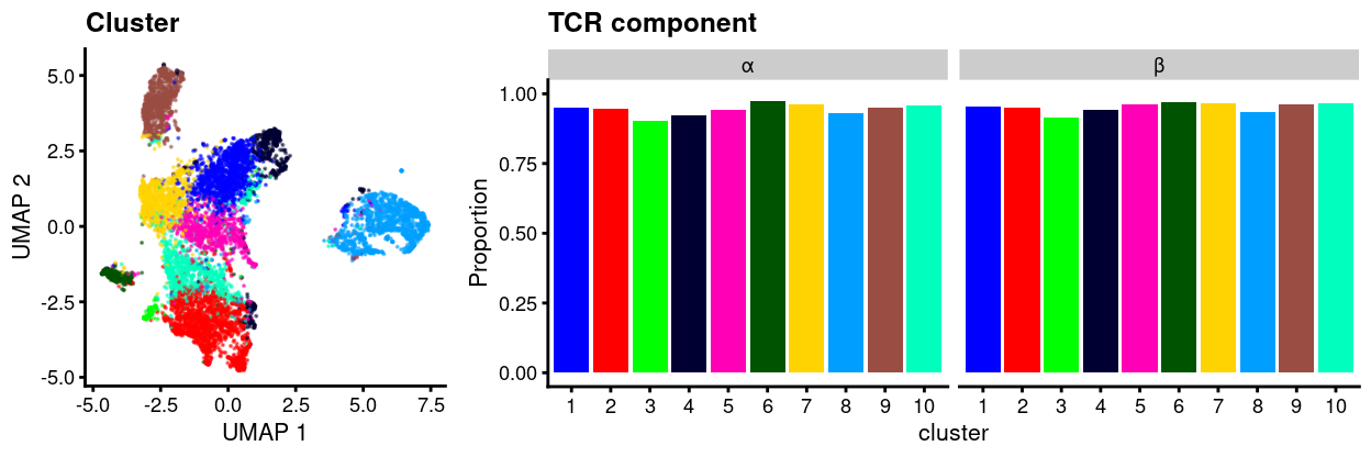
Figure 1: UMAP plot of data with points coloured by cluster (left) and a barplot of the proportion of cells in each cluster that express at least one sequence of the TCR α or β-chains (right).
We can refine this analysis to only consider the productive sequences, i.e., contigs that are likely to produce a functional protein. Figure 2 plots the proportion of cells that express productive versions of each of the α-chain and β-chain for each cluster. 89.9% of cells express productive versions of both the α-chain and β-chain.
Show code
tra_tbl <- tibble(
  cluster = factor(levels(sce$cluster), levels(sce$cluster)),
  n_cells = as.vector(table(sce$cluster)),
  prop = as.vector(
    table(
      sce$cluster[lengths(sce$TRA[sce$TRA[, "productive"] == "True"]) > 0]) /
      n_cells),
  chain = "α")
trb_tbl <- tibble(
  cluster = factor(levels(sce$cluster), levels(sce$cluster)),
  n_cells = as.vector(table(sce$cluster)),
  prop = as.vector(
    table(
      sce$cluster[lengths(sce$TRB[sce$TRB[, "productive"] == "True"]) > 0]) /
      n_cells),
  chain = "β")

plot_grid(
  plotUMAP(sce, colour_by = "cluster", point_alpha = 0) +
    geom_point(aes(colour = colour_by), size = 0.05, alpha = 0.5) +
    scale_colour_manual(values = cluster_colours, name = "cluster") +
    guides(colour = FALSE, fill = FALSE) +
    ggtitle("Cluster") +
    theme_cowplot(font_size = 8),
  ggplot(rbind(tra_tbl, trb_tbl)) +
    geom_col(aes(x = cluster, y = prop, fill = cluster)) +
    facet_grid(~ chain) +
    scale_fill_manual(values = cluster_colours, name = "cluster") +
    theme_cowplot(font_size = 8) +
    ylim(0, 1) +
    ylab("Proportion") +
    guides(fill = FALSE) +
    ggtitle("TCR component"),
  rel_widths = c(1, 2),
  nrow = 1)
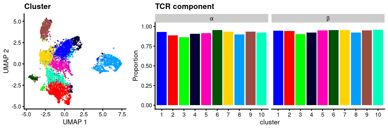
Figure 2: UMAP plot of data with points coloured by cluster (left) and a barplot of the proportion of cells in each cluster that express at least one productive sequence of the TCR α or β-chains (right).
Proportion of cells expression multiple TRA or TRBs
We also count the number of cells in each cluster that have multiple sequences for a component. Figure 3 shows that this is a surprisingly common phenomenon.
Show code
tra_tbl <- tibble(
  cluster = factor(levels(sce$cluster), levels(sce$cluster)),
  n_cells = as.vector(table(sce$cluster)),
  prop = as.vector(table(sce$cluster[lengths(sce$TRA) >= 2]) / n_cells),
  chain = "α")
trb_tbl <- tibble(
  cluster = factor(levels(sce$cluster), levels(sce$cluster)),
  n_cells = as.vector(table(sce$cluster)),
  prop = as.vector(table(sce$cluster[lengths(sce$TRB) >= 2]) / n_cells),
  chain = "β")

plot_grid(
  plotUMAP(sce, colour_by = "cluster", point_alpha = 0) +
    geom_point(aes(colour = colour_by), size = 0.05, alpha = 0.5) +
    scale_colour_manual(values = cluster_colours, name = "cluster") +
    guides(colour = FALSE, fill = FALSE) +
    ggtitle("Cluster") +
    theme_cowplot(font_size = 8),
  ggplot(rbind(tra_tbl, trb_tbl)) +
    geom_col(aes(x = cluster, y = prop, fill = cluster)) +
    facet_grid(~ chain) +
    scale_fill_manual(values = cluster_colours, name = "cluster") +
    theme_cowplot(font_size = 8) +
    ylim(0, 1) +
    ylab("Proportion") +
    guides(fill = FALSE) +
    ggtitle("TCR component"),
  rel_widths = c(1, 2),
  nrow = 1)
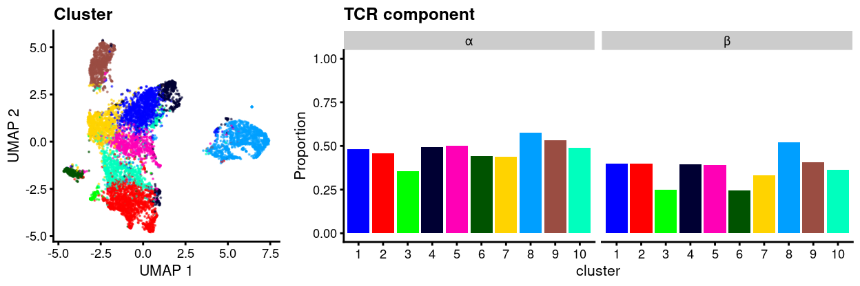
Figure 3: UMAP plot of data with points coloured by cluster (left) and a barplot of the proportion of cells in each cluster that express two or more sequences of the TCR α or β-chains (right).
However, if we focus only those sequences deemed productive, then Figure 4 shows that this proportion drops considerably.
Show code
tra_tbl <- tibble(
  cluster = factor(levels(sce$cluster), levels(sce$cluster)),
  n_cells = as.vector(table(sce$cluster)),
  prop = as.vector(
    table(
      sce$cluster[lengths(sce$TRA[sce$TRA[, "productive"] == "True"]) > 1]) /
      n_cells),
  chain = "α")

trb_tbl <- tibble(
  cluster = factor(levels(sce$cluster), levels(sce$cluster)),
  n_cells = as.vector(table(sce$cluster)),
  prop = as.vector(
    table(
      sce$cluster[lengths(sce$TRB[sce$TRB[, "productive"] == "True"]) > 1]) /
      n_cells),
  chain = "β")

plot_grid(
  plotUMAP(sce, colour_by = "cluster", point_alpha = 0) +
    geom_point(aes(colour = colour_by), size = 0.05, alpha = 0.5) +
    scale_colour_manual(values = cluster_colours, name = "cluster") +
    guides(colour = FALSE, fill = FALSE) +
    ggtitle("Cluster") +
    theme_cowplot(font_size = 8),
  ggplot(rbind(tra_tbl, trb_tbl)) +
    geom_col(aes(x = cluster, y = prop, fill = cluster)) +
    facet_grid(~ chain) +
    scale_fill_manual(values = cluster_colours, name = "cluster") +
    theme_cowplot(font_size = 8) +
    ylim(0, 1) +
    ylab("Proportion") +
    guides(fill = FALSE) +
    ggtitle("TCR component"),
  rel_widths = c(1, 2),
  nrow = 1)
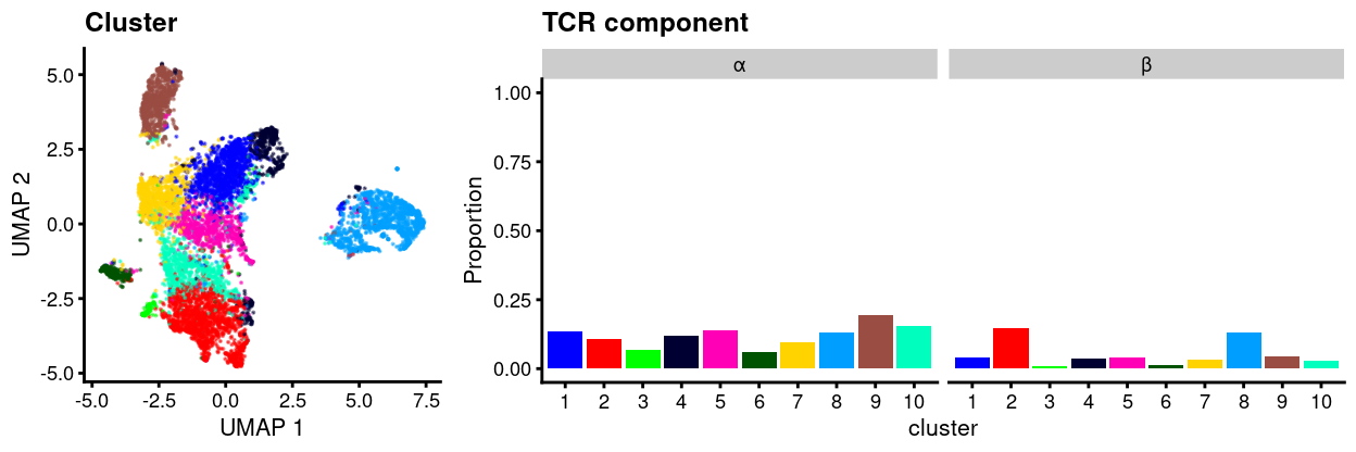
Figure 4: UMAP plot of data with points coloured by cluster (left) and a barplot of the proportion of cells in each cluster that express two or more productive sequences of the TCR α or β-chains (right).
Furthermore, when we focus on productive sequences, we find that cells express at most two productive sequences for a component (i.e. there aren’t any cells expressing 3 or more distinct productive sequences for TRA or TRB; data not shown).
Figure 5 shows that the number of UMIs supporting the most abundant productive sequence for a component is similar (or slightly higher) in cells expressing two productive sequences for a component compared to those cells expressing just one productive sequence for a component. It also shows that there is still a good number of UMIs supporting the second-most abundant productive sequence for a component in those cells expressing multiple productive sequences for a component.
Show code
prod_sequences_per_cell_tbl <- as_tibble(
  rbind(
    unlist(sce$TRA, use.names = FALSE), unlist(sce$TRB, use.names = FALSE))) %>%
  filter(productive == "True") %>%
  group_by(chain, barcode) %>%
  mutate(n = n()) %>%
  group_by(chain, barcode, n) %>%
  summarise(
    `Most abundant` = sort(umis, decreasing = TRUE)[1],
    `Second-most abundant` = sort(umis, decreasing = TRUE)[2]) %>%
  tidyr::pivot_longer(cols = c(`Most abundant`, `Second-most abundant`))

ggplot(
  prod_sequences_per_cell_tbl,
  aes(value, colour = factor(n), fill = factor(n))) +
  geom_density(alpha = 0.1) +
  scale_x_continuous(trans = "log2") +
  theme_cowplot(font_size = 10) +
  guides(
    fill = guide_legend(title = "Number of productive sequences"),
    colour = guide_legend(title = "Number of productive sequences")) +
  facet_grid(name ~ chain) +
  annotation_logticks(sides = "b")
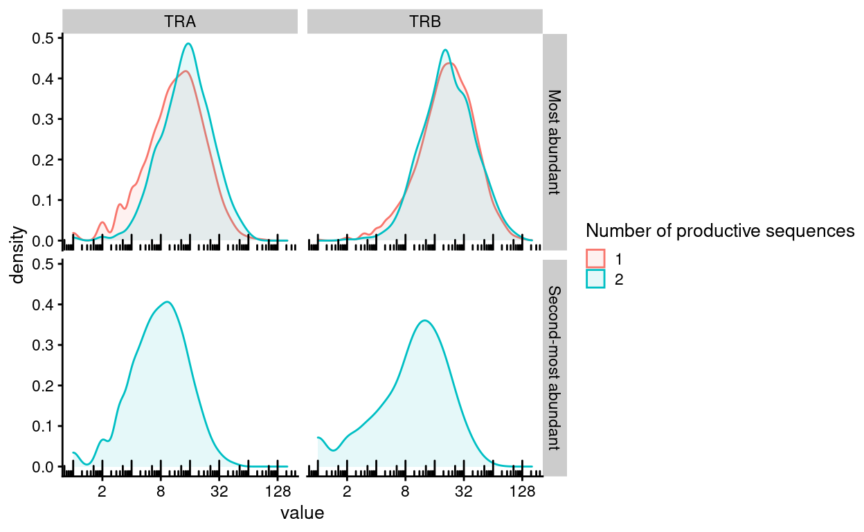
Figure 5: Distribution of the number of UMIs supporting the most abundant and second-most abundance productive sequences for each component. Cells are stratified according to the number of productive sequences for each component.
Summary
As we would expect of (CD4+) T-cells:
- 94.1% of cells express both the α-chain and β-chain.
- 89.9% of cells express productive versions of both the α-chain and β-chain.
Somewhat surprisingly, 13% and 7% of cells express two productive versions of the α-chain and β-chain, respectively. It is still not clear to me if a single T cell can really express multiple productive sequences for a TCR component. However, a quick Google search suggests that it is possible1. An alternative interpretation is that these are really doublets (comprising cells labelled with the same HTO) and hence would likely have multiple distinct TCR components. However, we have performed quite stringent doublet filtering and these percentages are far higher than we would expect for intra-sample doublets, so this interpretation is unlikely.
Quantifying clonotype expansion
Motivation
A distinct TCR sequence is referred to as a clonotype and the number of copies of that particular sequence is referred to as its clone size(Venturi et al. 2007). Cells with the same T cell clonotype are assumed to target the same antigen, and any increase in the frequency of a clonotype provides evidence for T cell activation and proliferation upon stimulation by the corresponding antigen. Thus, we can gain some insights into the immune activity of each sample by counting the frequency of clonotypes in each sample.
Statistical methodology and considerations
To compare the diversity/clonality of two groups of samples, we would typically perform a Wilcoxon rank sum test (also known as the Wilcoxon-Mann-Whitney test, or WMW test) to compare a diversity measure between the two groups. However, with only \(n=6\) samples in total (\(n=3\) Infected and \(n=3\) Uninfected samples), the smallest achievable P-value is 0.1. We therefore limit ourselves to a descriptive analysis of the data.
Analysis
Show code
productive_clonotype_tbl <- as_tibble(
  rbind(unlist(sce$TRA), unlist(sce$TRB))) %>%
  filter(productive == "True") %>%
  mutate(raw_clonotype_id = factor(
    raw_clonotype_id,
    # NOTE: This orders the clonotypes from 1 to ncol(sce).
    paste0("clonotype", seq(1, ncol(sce))),
    ordered = TRUE)) %>%
  select(barcode, raw_clonotype_id) %>%
  distinct() %>%
  inner_join(
    as.data.frame(colData(sce)[, c("Sample", "Treatment", "Barcode")]),
    by = c("barcode" = "Barcode"))
The table below is a high-level a summary of the TCR data.
Show code
| Sample | Number of productive TCR sequences | Number of distinct clonotypes |
|---|---|---|
| infected_1 | 1306 | 373 |
| infected_2 | 1119 | 212 |
| infected_3 | 1284 | 174 |
| uninfected_1 | 1712 | 906 |
| uninfected_2 | 1964 | 707 |
| uninfected_3 | 1377 | 840 |
CellRanger includes a histogram of top-10 clonotypes by frequency in the dataset. Only productive sequences are included in this analysis. This histogram is reproduced in Figure 6 but is of limited use because it does not distinguish which sample each observation came from.
Show code
productive_clonotype_tbl %>%
  count(raw_clonotype_id) %>%
  arrange(desc(n)) %>%
  mutate(prop = n / sum(n)) %>%
  mutate(clonotype = factor(
    gsub("clonotype", "", raw_clonotype_id),
    1:10)) %>%
  filter(clonotype %in% 1:10) %>%
  ggplot(aes(x = clonotype, y = prop)) +
  geom_col() +
  xlab("Clonotype") +
  ylab("Proportion of cells") +
  theme_cowplot()
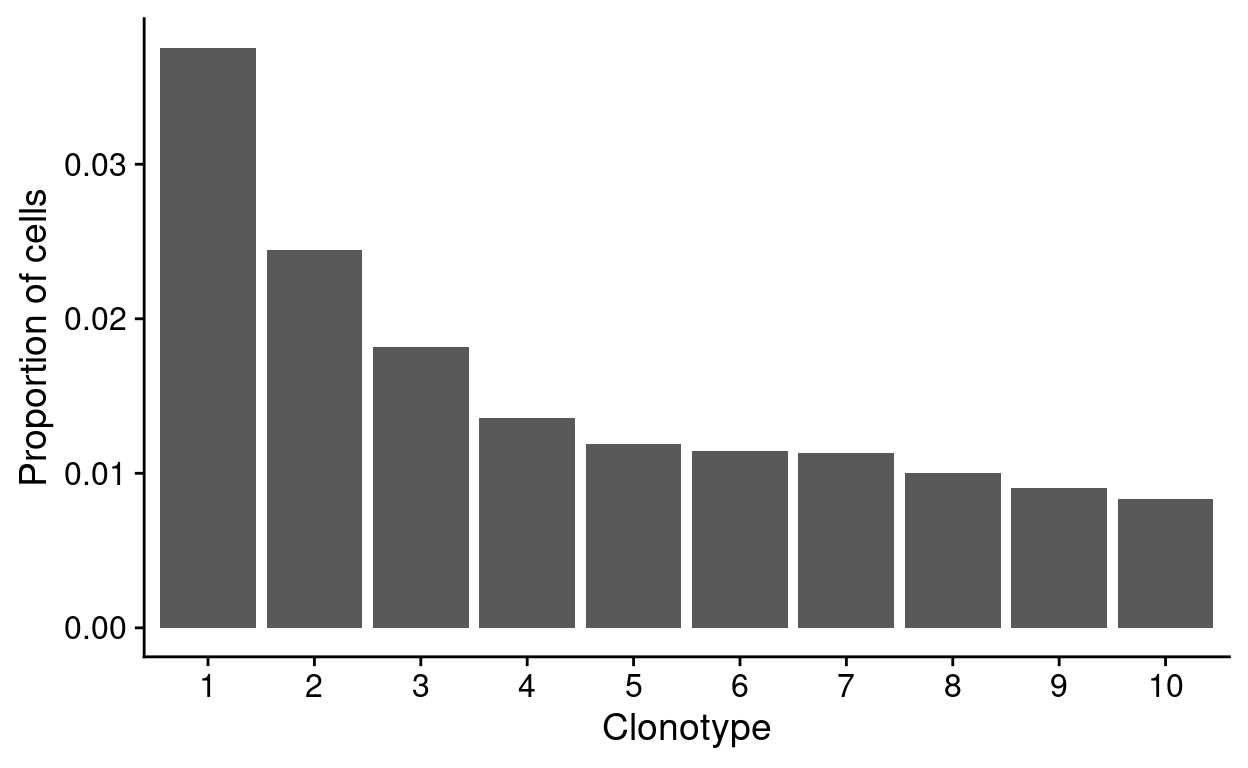
Figure 6: Top-10 clonotype frequencies (all droplets in the ‘cell selected’ dataset). A clonotype is defined as a unique set of CDR3 nucleotide sequences. Only productive sequences are counted.
For this project, we are interested in stratifying the analysis by sample to look clonal expansions associated with the treatment. Figure 7 recapitulates the CellRanger histogram of the top-10 clonotypes by frequency but stratifies by sample. This shows an apparent clonal expansion in the infected_2 and infected_3 samples, which we want to investigate further.
Show code
productive_clonotype_tbl %>%
  count(raw_clonotype_id, Sample, Treatment) %>%
  arrange(desc(n)) %>%
  group_by(Sample) %>%
  mutate(prop = n / sum(n)) %>%
  mutate(
    cumsum_prop = cumsum(prop),
    clonotype = factor(row_number())) %>%
  filter(clonotype %in% 1:10) %>%
  ggplot(aes(x = clonotype, y = prop, fill = Sample)) +
  geom_col() +
  facet_wrap(~Sample, ncol = 3) +
  xlab("Clonotype") +
  ylab("Proportion of cells") +
  theme_cowplot() +
  scale_fill_manual(values = sample_colours) +
  guides(fill = FALSE)
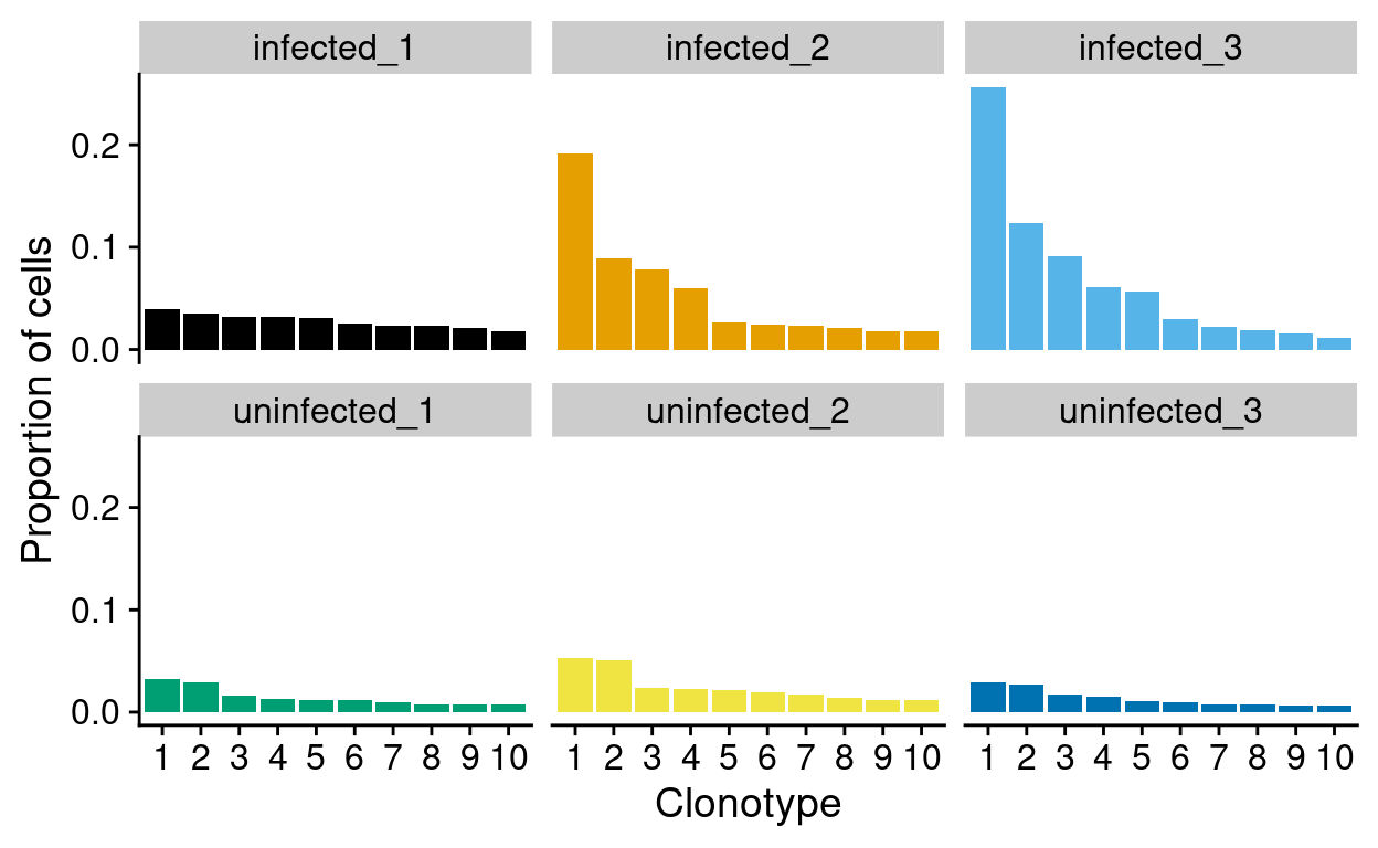
Figure 7: Top-10 clonotype frequencies within each sample. A clonotype is defined as a unique set of CDR3 nucleotide sequences. Only productive sequences are counted.
When I started this analysis, I was not very familiar with the aims of TCR sequencing, the data it generated, nor the methods used for its analysis. I therefore started with a Naive analysis which has subsequently developed into a more Sophisticated analysis of TCR diversity.
Naive analysis
Figure 8 plots the cumulative clonotype frequencies in each sample; this is richer alternative to simply visualising the frequency of the top-10 clonotypes in each sample.
Show code
ggplot(
  clonotype_by_sample_tbl,
  aes(
    x = ranked_clonotype,
    y = cumsum_prop,
    colour = Sample,
    lty = Treatment)) +
  geom_step(lwd = 1) +
  scale_colour_manual(values = sample_colours) +
  xlab("Clonotype") +
  ylab("Proportion of cells") +
  cowplot::theme_cowplot()
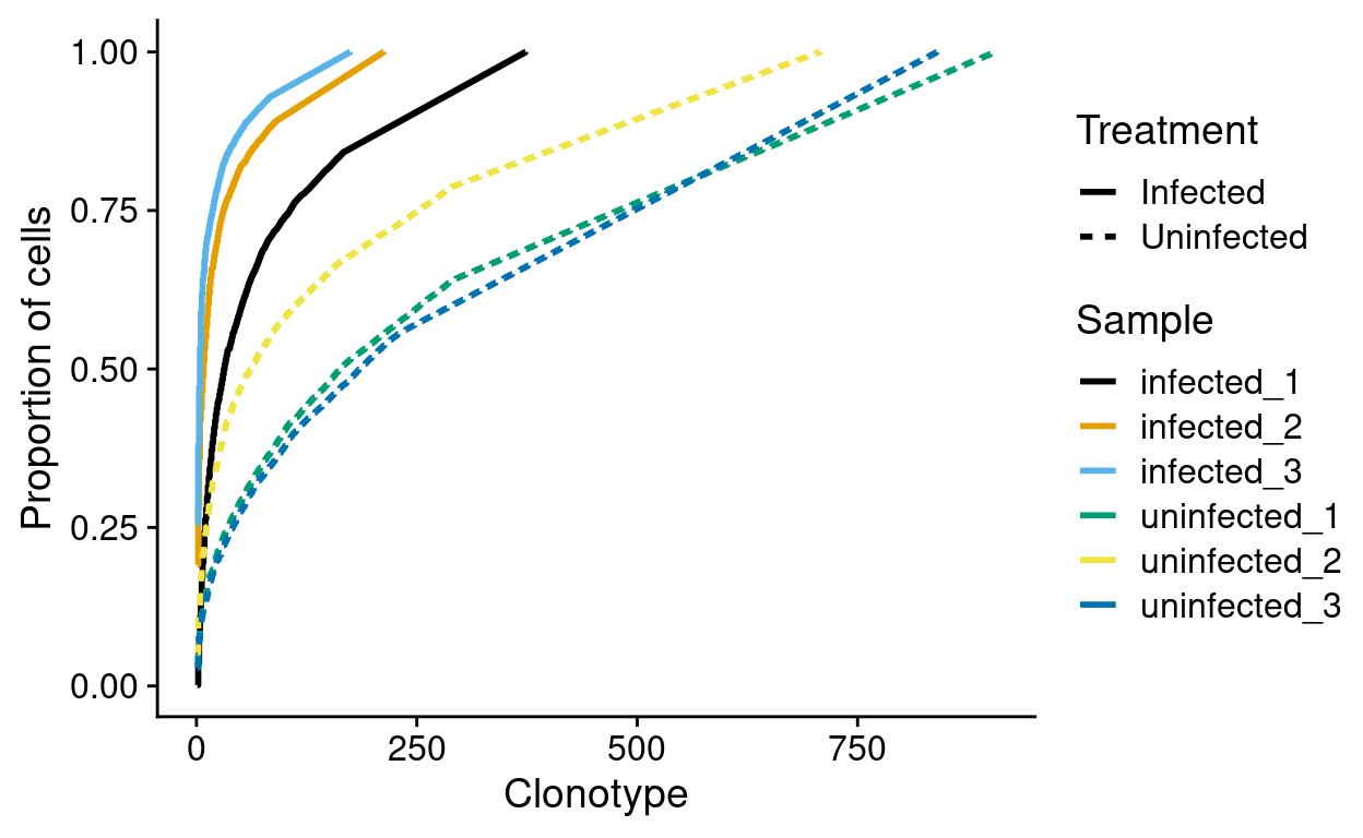
Figure 8: Cumulative clonotype frequencies by sample. Frequencies are computed within each sample.
This shows, for example, that more than 75% of cells from the infected_3 sample share a very small number of clonotypes. This figure also shows that fewer clonotypes are observed in the Infected samples. However, this could arise simply because we sampled fewer infected cells. We therefore need to account for the number of potential clonotypes in each sample, i.e. if we sampled \(n\) cells there would be \(n\) potential clonotypes. We estimate the number of potential clonotypes by the number of cells in each sample with a productive TCR sequence (i.e. the ‘Number of productive TCR sequences’ in the earlier table).
Figure 9 normalises by the number of potential clonotypes in each sample to make the samples comparable. From this we see evidence that fewer clonotypes are found in infected cells than in uninfected cells.
Show code
ggplot(
  clonotype_by_sample_tbl,
  aes(
    x = scaled_ranked_clonotype,
    y = cumsum_prop,
    colour = Sample,
    lty = Treatment)) +
  geom_step(lwd = 1) +
  scale_colour_manual(values = sample_colours) +
  xlab("Proportion of potential clonotypes") +
  ylab("Proportion of cells") +
  cowplot::theme_cowplot() +
  xlim(0, 1)
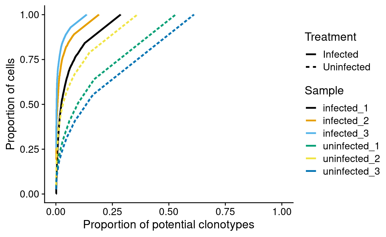
Figure 9: Normalised cumulative potential clonotype frequencies by sample. Frequencies are computed within each sample.
We would like to quantify this result in some way. For example, the table below reports the proportion of potential clonotypes required to ‘cover’ 75% of cells in each sample. This shows that this number is smaller in infected cells than in uninfected cells.
Show code
clonotype_by_sample_tbl %>%
  filter(cumsum_prop > 0.75) %>%
  filter(ranked_clonotype == min(ranked_clonotype)) %>%
  select(Sample, ranked_clonotype, N, cumsum_prop) %>%
  rename(
    "Number of distinct clonotypes" = ranked_clonotype,
    "Number of productive TCR sequences" = N,
    "Proportion of potential clonotypes" = cumsum_prop) %>%
  knitr::kable(caption = "Number of clonotypes, and proportion of potential clonotypes, required to 'cover' 75% of cells in each sample.", digits = 3)
| Treatment | Sample | Number of distinct clonotypes | Number of productive TCR sequences | Proportion of potential clonotypes |
|---|---|---|---|---|
| Infected | infected_1 | 106 | 1306 | 0.751 |
| Infected | infected_2 | 31 | 1119 | 0.753 |
| Infected | infected_3 | 18 | 1284 | 0.751 |
| Uninfected | uninfected_1 | 479 | 1712 | 0.751 |
| Uninfected | uninfected_2 | 252 | 1964 | 0.751 |
| Uninfected | uninfected_3 | 496 | 1377 | 0.750 |
Sophisticated analysis
Following recommendations in (Venturi et al. 2007), along with methods impelemented in the alakazam R package, we perform a more sophisticated diversity analysis.
The authors of alakazam write that:
The clonal diversity of the repertoire can be analysed using the general form of the diversity index, as proposed by Hill(Hill 1973). [This is] coupled with re-sampling strategies to correct for variations in sequencing depth, as well as inference of complete clonal abundance distributions(Chao et al. 2014, @chao2015unveiling).
We start by generating a clonal abundance curve for each Sample and each Treatment (Figure 10).
Show code
sample_curve <- estimateAbundance(
  productive_clonotype_tbl,
  group = "Sample",
  ci = 0.95,
  nboot = 200,
  clone = "raw_clonotype_id")
p1 <- plot(sample_curve, colors = sample_colours, silent = TRUE)

treatment_curve <- estimateAbundance(
  productive_clonotype_tbl,
  group = "Treatment",
  ci = 0.95,
  nboot = 200,
  clone = "raw_clonotype_id")
p2 <- plot(treatment_curve, colors = treatment_colours, silent = TRUE)

plot_grid(p1, p2, ncol = 2)
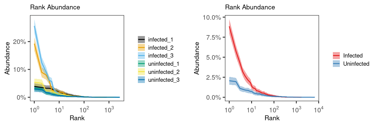
Figure 10: Rank abundance curve (with 95% CI) of the relative clonal abundance for each Sample (left) and Treatment (right). The 95% confidence interval is estimated via bootstrapping (B = 200).
Next, we generate a diversity curve for each Sample and each Treatment. A diversity curve quantifies diversity as a smooth function (\(D\)) of a single parameter \(q\)(Hill 1973). Special cases of the generalized diversity index correspond to the most popular diversity measures in ecology: species richness (\(q = 0\)), the exponential of the Shannon-Weiner index (\(q\) approaches \(1\)), the inverse of the Simpson index (\(q = 2\)), and the reciprocal abundance of the largest clone (\(q\) approaches \(+\infty\)). At \(q = 0\) different clones weight equally, regardless of their size. As the parameter \(q\) increase from \(0\) to \(+\infty\) the diversity index (\(D\)) depends less on rare clones and more on common (abundant) ones, thus encompassing a range of definitions that can be visualized as a single curve2.
Figure 11 plots these diversity curves and shows that the Uninfected samples are ‘more diverse’ for a range of \(q\). From this we see that the uninfected samples are generally more diverse than the infected samples.
Show code
sample_alpha_curve <- alphaDiversity(
  sample_curve,
  min_q = 0,
  max_q = 4,
  step_q = 0.1,
  ci = 0.95,
  nboot = 200)
p1 <- plot(sample_alpha_curve, colors = sample_colours, silent = TRUE)

treatment_alpha_curve <- alphaDiversity(
  treatment_curve,
  min_q = 0,
  max_q = 4,
  step_q = 0.1,
  ci = 0.95,
  nboot = 200)
p2 <- plot(treatment_alpha_curve, colors = treatment_colours, silent = TRUE)

plot_grid(p1, p2, ncol = 2)
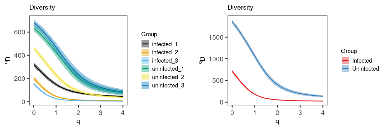
Figure 11: Diveristy curve (with 95% CI) for each Sample (left) and Treatment (right). The 95% confidence interval is estimated via bootstrapping (B = 200).
We would like to quantify this result in some way. For example, in Venturi et al. (2007), the authors chose to use the Simpson’s diversity index, noting that:
This diversity index has the advantages that it has a direct interpretation, is easy to calculate, is not highly sensitive to sample size, and can be used to compare diversities with smaller sample sizes, proportional to the total population size, than required by other methods.
They also write that:
Simpson’s diversity index also tends to be more sensitive to the dominant clonotypes and less sensitive to the number of clonotypes (Magurran, 2004), making it an appropriate measure of diversity if we wish to assess clonal dominance. In the context of TCR repertoire studies, Simpson’s diversity index is the probability that any two TCRs chosen at random from the sample will have different clonotypes (i.e.: distinct CDR3 sequences for the TCR α- or β-chain)
From Figure 11 we can conclude that:
- The number of clonotypes was higher in the
Uninfectedsamples than in theInfectedsamples (medians: 636 vs. 201). - Using the Simpson’s diversity index to account for the clonal dominance hierarchy, the
Uninfectedsamples were more diverse than theInfectedsamples (medians: 208 vs. 16)
Summary
The central limitation of this analysis is that with only \(n=6\) samples we cannot perform any meaningful statistical analysis of the clonal diversity. However, in all the descriptive analyses we have observed that:
Infectedsamples have fewer clonotypes (i.e. have less TCR diversity) thanUninfectedsamples, even after normalising for cell numbers.Infectedsamples show evidence of clonal expansion (alternatively, of reduced polyclonality) compared toUninfectedsamples, as evidenced by moreInfectedcells sharing a smaller number of clonotypes.
Additional information
The following are available on request:
- Full CSV tables of any data presented.
- PDF/PNG files of any static plots.
Session info
Show code
sessioninfo::session_info()
─ Session info ─────────────────────────────────────────────────────
 setting  value
 version  R version 4.0.3 (2020-10-10)
 os       CentOS Linux 7 (Core)
 system   x86_64, linux-gnu
 ui       X11
 language (EN)
 collate  en_US.UTF-8
 ctype    en_US.UTF-8
 tz       Australia/Melbourne
 date     2021-04-08

─ Packages ─────────────────────────────────────────────────────────
 ! package              * version  date       lib source
 P ade4                   1.7-16   2020-10-28 [?] CRAN (R 4.0.3)
 P airr                   1.3.0    2020-05-27 [?] CRAN (R 4.0.3)
 P alakazam             * 1.1.0    2021-02-07 [?] CRAN (R 4.0.3)
 P ape                    5.4-1    2020-08-13 [?] CRAN (R 4.0.0)
 P assertthat             0.2.1    2019-03-21 [?] CRAN (R 4.0.0)
 P beachmat               2.6.4    2020-12-20 [?] Bioconductor
 P beeswarm               0.2.3    2016-04-25 [?] CRAN (R 4.0.0)
 P Biobase              * 2.50.0   2020-10-27 [?] Bioconductor
   BiocGenerics         * 0.36.0   2020-10-27 [1] Bioconductor
 P BiocManager            1.30.10  2019-11-16 [?] CRAN (R 4.0.0)
 P BiocNeighbors          1.8.2    2020-12-07 [?] Bioconductor
   BiocParallel         * 1.24.1   2020-11-06 [1] Bioconductor
 P BiocSingular           1.6.0    2020-10-27 [?] Bioconductor
   BiocStyle              2.18.1   2020-11-24 [1] Bioconductor
 P Biostrings             2.58.0   2020-10-27 [?] Bioconductor
 P bitops                 1.0-6    2013-08-17 [?] CRAN (R 4.0.0)
 P bslib                  0.2.4    2021-01-25 [?] CRAN (R 4.0.3)
 P cli                    2.3.1    2021-02-23 [?] CRAN (R 4.0.3)
 P colorspace             2.0-0    2020-11-11 [?] CRAN (R 4.0.3)
 P cowplot              * 1.1.1    2020-12-30 [?] CRAN (R 4.0.3)
 P crayon                 1.4.1    2021-02-08 [?] CRAN (R 4.0.3)
 P DBI                    1.1.1    2021-01-15 [?] CRAN (R 4.0.3)
 P DelayedArray           0.16.2   2021-02-26 [?] Bioconductor
 P DelayedMatrixStats     1.12.3   2021-02-03 [?] Bioconductor
 P digest                 0.6.27   2020-10-24 [?] CRAN (R 4.0.2)
 P distill                1.2      2021-01-13 [?] CRAN (R 4.0.3)
 P downlit                0.2.1    2020-11-04 [?] CRAN (R 4.0.3)
 P dplyr                * 1.0.4    2021-02-02 [?] CRAN (R 4.0.3)
 P ellipsis               0.3.1    2020-05-15 [?] CRAN (R 4.0.0)
 P evaluate               0.14     2019-05-28 [?] CRAN (R 4.0.0)
 P fansi                  0.4.2    2021-01-15 [?] CRAN (R 4.0.3)
 P farver                 2.1.0    2021-02-28 [?] CRAN (R 4.0.3)
 P generics               0.1.0    2020-10-31 [?] CRAN (R 4.0.3)
 P GenomeInfoDb         * 1.26.2   2020-12-08 [?] Bioconductor
   GenomeInfoDbData       1.2.4    2021-02-04 [1] Bioconductor
 P GenomicAlignments      1.26.0   2020-10-27 [?] Bioconductor
 P GenomicRanges        * 1.42.0   2020-10-27 [?] Bioconductor
 P ggbeeswarm             0.6.0    2017-08-07 [?] CRAN (R 4.0.0)
 P ggplot2              * 3.3.3    2020-12-30 [?] CRAN (R 4.0.3)
 P glue                   1.4.2    2020-08-27 [?] CRAN (R 4.0.0)
 P gridExtra              2.3      2017-09-09 [?] CRAN (R 4.0.0)
 P gtable                 0.3.0    2019-03-25 [?] CRAN (R 4.0.0)
 P here                 * 1.0.1    2020-12-13 [?] CRAN (R 4.0.3)
 P highr                  0.8      2019-03-20 [?] CRAN (R 4.0.0)
 P hms                    1.0.0    2021-01-13 [?] CRAN (R 4.0.3)
 P htmltools              0.5.1.1  2021-01-22 [?] CRAN (R 4.0.3)
 P igraph                 1.2.6    2020-10-06 [?] CRAN (R 4.0.2)
 P IRanges              * 2.24.1   2020-12-12 [?] Bioconductor
 P irlba                  2.3.3    2019-02-05 [?] CRAN (R 4.0.0)
 P jquerylib              0.1.3    2020-12-17 [?] CRAN (R 4.0.3)
 P jsonlite               1.7.2    2020-12-09 [?] CRAN (R 4.0.3)
 P knitr                  1.31     2021-01-27 [?] CRAN (R 4.0.3)
 P labeling               0.4.2    2020-10-20 [?] CRAN (R 4.0.0)
 P lattice                0.20-41  2020-04-02 [?] CRAN (R 4.0.0)
 P lazyeval               0.2.2    2019-03-15 [?] CRAN (R 4.0.0)
 P lifecycle              1.0.0    2021-02-15 [?] CRAN (R 4.0.3)
 P magrittr             * 2.0.1    2020-11-17 [?] CRAN (R 4.0.3)
 P MASS                   7.3-53.1 2021-02-12 [?] CRAN (R 4.0.3)
 P Matrix                 1.3-2    2021-01-06 [?] CRAN (R 4.0.3)
   MatrixGenerics       * 1.2.1    2021-01-30 [1] Bioconductor
 P matrixStats          * 0.58.0   2021-01-29 [?] CRAN (R 4.0.3)
 P munsell                0.5.0    2018-06-12 [?] CRAN (R 4.0.0)
 P nlme                   3.1-152  2021-02-04 [?] CRAN (R 4.0.3)
 P pillar                 1.5.0    2021-02-22 [?] CRAN (R 4.0.3)
 P pkgconfig              2.0.3    2019-09-22 [?] CRAN (R 4.0.0)
 P prettyunits            1.1.1    2020-01-24 [?] CRAN (R 4.0.0)
 P progress               1.2.2    2019-05-16 [?] CRAN (R 4.0.0)
 P purrr                  0.3.4    2020-04-17 [?] CRAN (R 4.0.0)
 P R6                     2.5.0    2020-10-28 [?] CRAN (R 4.0.2)
 P Rcpp                   1.0.6    2021-01-15 [?] CRAN (R 4.0.3)
 P RCurl                  1.98-1.2 2020-04-18 [?] CRAN (R 4.0.0)
 P readr                  1.4.0    2020-10-05 [?] CRAN (R 4.0.2)
 P rlang                  0.4.10   2020-12-30 [?] CRAN (R 4.0.3)
 P rmarkdown              2.7      2021-02-19 [?] CRAN (R 4.0.3)
 P rprojroot              2.0.2    2020-11-15 [?] CRAN (R 4.0.3)
 P Rsamtools              2.6.0    2020-10-27 [?] Bioconductor
 P rsvd                   1.0.3    2020-02-17 [?] CRAN (R 4.0.0)
 P S4Vectors            * 0.28.1   2020-12-09 [?] Bioconductor
 P sass                   0.3.1    2021-01-24 [?] CRAN (R 4.0.3)
 P scales                 1.1.1    2020-05-11 [?] CRAN (R 4.0.0)
 P scater               * 1.18.6   2021-02-26 [?] Bioconductor
 P scuttle                1.0.4    2020-12-17 [?] Bioconductor
 P seqinr                 4.2-5    2020-12-17 [?] CRAN (R 4.0.3)
 P sessioninfo            1.1.1    2018-11-05 [?] CRAN (R 4.0.0)
 P SingleCellExperiment * 1.12.0   2020-10-27 [?] Bioconductor
 P sparseMatrixStats      1.2.1    2021-02-02 [?] Bioconductor
 P stringi                1.5.3    2020-09-09 [?] CRAN (R 4.0.0)
 P stringr                1.4.0    2019-02-10 [?] CRAN (R 4.0.0)
 P SummarizedExperiment * 1.20.0   2020-10-27 [?] Bioconductor
 P tibble               * 3.1.0    2021-02-25 [?] CRAN (R 4.0.3)
 P tidyr                  1.1.3    2021-03-03 [?] CRAN (R 4.0.3)
 P tidyselect             1.1.0    2020-05-11 [?] CRAN (R 4.0.0)
 P utf8                   1.1.4    2018-05-24 [?] CRAN (R 4.0.0)
 P vctrs                  0.3.6    2020-12-17 [?] CRAN (R 4.0.3)
 P vipor                  0.4.5    2017-03-22 [?] CRAN (R 4.0.0)
 P viridis                0.5.1    2018-03-29 [?] CRAN (R 4.0.0)
 P viridisLite            0.3.0    2018-02-01 [?] CRAN (R 4.0.0)
 P withr                  2.4.1    2021-01-26 [?] CRAN (R 4.0.3)
 P xfun                   0.21     2021-02-10 [?] CRAN (R 4.0.3)
 P XVector                0.30.0   2020-10-27 [?] Bioconductor
 P yaml                   2.2.1    2020-02-01 [?] CRAN (R 4.0.0)
 P zlibbioc               1.36.0   2020-10-27 [?] Bioconductor

[1] /stornext/Projects/score/Analyses/C057_Cooney/renv/library/R-4.0/x86_64-pc-linux-gnu
[2] /stornext/System/data/apps/R/R-4.0.3/lib64/R/library

 P ── Loaded and on-disk path mismatch.
Chao, Anne, Nicholas J Gotelli, TC Hsieh, Elizabeth L Sander, KH Ma, Robert K Colwell, and Aaron M Ellison. 2014. “Rarefaction and Extrapolation with Hill Numbers: A Framework for Sampling and Estimation in Species Diversity Studies.” Ecological Monographs 84 (1): 45–67.
Chao, Anne, TC Hsieh, Robin L Chazdon, Robert K Colwell, and Nicholas J Gotelli. 2015. “Unveiling the Species-Rank Abundance Distribution by Generalizing the Good-Turing Sample Coverage Theory.” Ecology 96 (5): 1189–1201.
Georgiou, G., G. C. Ippolito, J. Beausang, C. E. Busse, H. Wardemann, and S. R. Quake. 2014. “The Promise and Challenge of High-Throughput Sequencing of the Antibody Repertoire.” Nat. Biotechnol. 32 (2): 158–68.
Hill, Mark O. 1973. “Diversity and Evenness: A Unifying Notation and Its Consequences.” Ecology 54 (2): 427–32.
Rosati, E., C. M. Dowds, E. Liaskou, E. K. K. Henriksen, T. H. Karlsen, and A. Franke. 2017. “Overview of Methodologies for T-Cell Receptor Repertoire Analysis.” BMC Biotechnol. 17 (1): 61.
Venturi, Vanessa, Katherine Kedzierska, Stephen J Turner, Peter C Doherty, and Miles P Davenport. 2007. “Methods for Comparing the Diversity of Samples of the T Cell Receptor Repertoire.” Journal of Immunological Methods 321 (1-2): 182–95.
E.g., https://www.ncbi.nlm.nih.gov/pubmed/8211163; https://www.jimmunol.org/content/202/3/637; https://www.ncbi.nlm.nih.gov/pmc/articles/PMC4701647/↩︎
Values of q < 0 are valid, but are generally not meaningful.↩︎