Show code
library(SingleCellExperiment)
library(here)
library(BiocStyle)
library(ggplot2)
library(cowplot)
library(patchwork)
library(scales)

# NOTE: Using >= 4 cores seizes up my laptop. Can use more on unix box.
options("mc.cores" = ifelse(Sys.info()[["nodename"]] == "PC1331", 2L, 3L))

knitr::opts_chunk$set(
  fig.path = "C094_Pellicci.mini-bulk.preprocess_files/")

source(here("code", "helper_functions.R"))
Setting up the data
The count data were processed using scPipe and available in a SingleCellExperiment object, along with their metadata.
Show code
sce_deduped <- readRDS(here("data", "SCEs", "C094_Pellicci.scPipe.SCE.rds"))
sce_not_deduped <- readRDS(
  here("data", "SCEs", "C094_Pellicci.not_UMI_deduped.scPipe.SCE.rds"))

colnames(sce_not_deduped) <- sub(
  "\\.not_UMI_deduped",
  "",
  colnames(sce_not_deduped))
stopifnot(
  identical(rownames(sce_deduped), rownames(sce_not_deduped)),
  identical(colnames(sce_deduped), colnames(sce_not_deduped)))

# Combine UMI and read counts a single SCE.
sce <- sce_deduped
assay(sce, "UMI_counts") <- assay(sce_deduped, "counts")
assay(sce, "read_counts") <- assay(sce_not_deduped, "counts")
# NOTE: Have to reorder ERCCs
assay(altExp(sce, "ERCC"), "UMI_counts") <- assay(
  altExp(sce_deduped, "ERCC"), "counts")[rownames(altExp(sce, "ERCC")), ]
assay(altExp(sce, "ERCC"), "read_counts") <- assay(
  altExp(sce_not_deduped, "ERCC"), "counts")[rownames(altExp(sce, "ERCC")), ]

# Nullify some now-unrequired data.
assay(sce, "counts") <- NULL
assay(altExp(sce, "ERCC"), "counts") <- NULL
sce$UMI_deduped <- NULL
This data was processed to clean up the sample metadata, tidy the FACS index sorting data, and attach the gene metadata.
We then filter the data to only include the mini-bulk samples.
Show code
sce <- sce[, sce$sample_type != "Single cell"]
colData(sce) <- droplevels(colData(sce))

# Only retain genes with non-zero counts in at least 1 cell.
sce <- sce[rowSums(assay(sce, "read_counts")) > 0, ]
Incorporating cell-based annotations
Cell-based annotations are included in the colData of the SingleCellExperiment. Figure 1 is a visual summary of the cell-based metadata.
Show code
p1 <- ggcells(sce) +
  geom_bar(aes(x = plate_number, fill = donor),
    position = position_fill(reverse = TRUE)) +
  coord_flip() +
  ylab("Frequency") +
  theme_cowplot(font_size = 6) +
  scale_fill_manual(values = donor_colours)
p2 <- ggcells(sce) +
  geom_bar(aes(x = plate_number, fill = sample),
    position = position_fill(reverse = TRUE)) +
  coord_flip() +
  ylab("Frequency") +
  theme_cowplot(font_size = 6) +
  scale_fill_manual(values = sample_colours) +
  guides(fill = guide_legend(ncol = 2))
p3 <- ggcells(sce) +
  geom_bar(aes(x = plate_number, fill = sample_gate),
    position = position_fill(reverse = TRUE)) +
  coord_flip() +
  ylab("Frequency") +
  theme_cowplot(font_size = 6) +
  scale_fill_manual(values = sample_gate_colours)
p4 <-  ggcells(sce) +
  geom_bar(aes(x = plate_number, fill = sample_type),
    position = position_fill(reverse = TRUE)) +
  coord_flip() +
  ylab("Frequency") +
  theme_cowplot(font_size = 6) +
  scale_fill_manual(values = sample_type_colours)
p5 <-  ggcells(sce) +
  geom_bar(aes(x = plate_number, fill = sequencing_run),
    position = position_fill(reverse = TRUE)) +
  coord_flip() +
  ylab("Frequency") +
  theme_cowplot(font_size = 6) +
  scale_fill_manual(values = sequencing_run_colours)
p6 <-  ggcells(sce) +
  geom_bar(aes(x = plate_number, fill = stage),
    position = position_fill(reverse = TRUE)) +
  coord_flip() +
  ylab("Frequency") +
  theme_cowplot(font_size = 6) +
  scale_fill_manual(values = stage_colours)
p7 <-  ggcells(sce) +
  geom_bar(aes(x = plate_number, fill = tissue),
    position = position_fill(reverse = TRUE)) +
  coord_flip() +
  ylab("Frequency") +
  theme_cowplot(font_size = 6) +
  scale_fill_manual(values = tissue_colours)
p8 <- ggcells(sce) +
  geom_bar(aes(x = plate_number, fill = plate_number)) +
  coord_flip() +
  ylab("Number of mini-bulk samples") +
  theme_cowplot(font_size = 6) +
  scale_fill_manual(values = plate_number_colours)

p1 + p2 + p3 + p4 + p5 + p6 + p7 + p8 + plot_layout(ncol = 3)
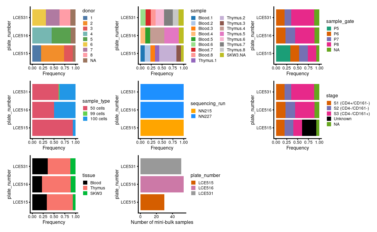
Figure 1: Breakdown of experiment by plate.
Figure 2 highlights that the Blood.1, Blood.2, and Blood.3 samples collected on plate LCE515 were from FACS gate P5 (corresponding to a mixture of stages 1-3) whereas all subsequent Blood samples were from FACS gate P8 (corresponding to stage 3). However, Dan tells me that ~90% of Blood.P5 cells are essentially Blood.P8 (corresponding to stage 3).
Show code
p1 <- ggcells(sce) +
  geom_bar(
    aes(x = donor, fill = sample_gate),
    position = position_fill(reverse = TRUE)) +
  coord_flip() +
  ylab("Frequency") +
  facet_grid(~tissue) +
  theme_cowplot(font_size = 6) +
  scale_fill_manual(values = sample_gate_colours)
p2 <- ggcells(sce) +
  geom_bar(
    aes(x = donor, fill = stage),
    position = position_fill(reverse = TRUE)) +
  coord_flip() +
  ylab("Frequency") +
  facet_grid(~tissue) +
  theme_cowplot(font_size = 6) +
  scale_fill_manual(values = stage_colours)
p3 <- ggcells(sce) +
  geom_bar(aes(x = donor, fill = plate_number)) +
  coord_flip() +
  ylab("Number of mini-bulk samples") +
  theme_cowplot(font_size = 6) +
  facet_grid(~tissue) +
  scale_fill_manual(values = plate_number_colours)

p1 + p2 + p3 + plot_layout(ncol = 3)
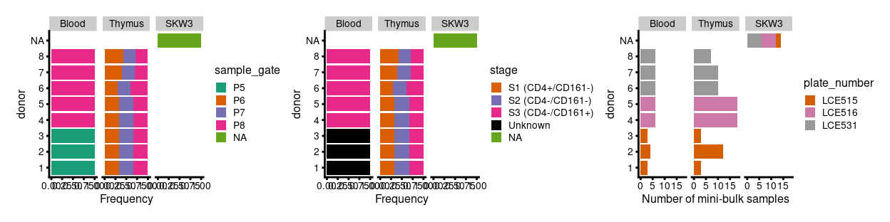
Figure 2: Breakdown of experiment by donor.
Figure 3 shows the design of each plate.
Show code
# TODO: Fix legend
p <- lapply(levels(sce$plate_number), function(p) {
  z <- sce[, sce$plate_number == p]
  plotPlatePosition(
    z,
    as.character(z$well_position),
    point_size = 2,
    point_alpha = 1,
    theme_size = 8,
    colour_by = "donor",
    shape_by = "tissue") +
    scale_colour_manual(values = donor_colours, name = "donor") +
    ggtitle(p) +
    theme(
      legend.text = element_text(size = 6),
      legend.title = element_text(size = 6)) +
    guides(
      colour = guide_legend(override.aes = list(size = 2, alpha = 1)),
      shape = guide_legend(override.aes = list(size = 2, alpha = 1)))
})

wrap_plots(p, ncol = 2)
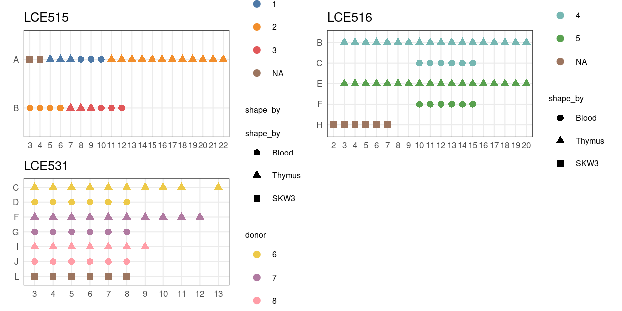
Figure 3: Plate maps.
Incorporating gene-based annotation
I used the Homo.sapiens package and the EnsDb.Hsapiens.v98 resource, which respectively cover the NCBI/RefSeq and Ensembl databases, to obtain gene-based annotations, such as the chromosome and gene symbol.
Having quantified gene expression against the GENCODE gene annotation, we have Ensembl-style identifiers for the genes. These identifiers are used as they are unambiguous and highly stable. However, they are difficult to interpret compared to the gene symbols which are more commonly used in the literature. Henceforth, we will use gene symbols (where available) to refer to genes in our analysis and otherwise use the Ensembl-style gene identifiers1.
We also construct some useful gene sets: mitochondrial genes, ribosomal protein genes, sex chromosome genes, and pseudogenes.
Show code
# Some useful gene sets
mito_set <- rownames(sce)[any(rowData(sce)$ENSEMBL.SEQNAME == "MT")]
ribo_set <- grep("^RP(S|L)", rownames(sce), value = TRUE)
# NOTE: A more curated approach for identifying ribosomal protein genes
#       (https://github.com/Bioconductor/OrchestratingSingleCellAnalysis-base/blob/ae201bf26e3e4fa82d9165d8abf4f4dc4b8e5a68/feature-selection.Rmd#L376-L380)
library(msigdbr)
c2_sets <- msigdbr(species = "Homo sapiens", category = "C2")
ribo_set <- union(
  ribo_set,
  c2_sets[c2_sets$gs_name == "KEGG_RIBOSOME", ]$gene_symbol)
ribo_set <- intersect(ribo_set, rownames(sce))
sex_set <- rownames(sce)[any(rowData(sce)$ENSEMBL.SEQNAME %in% c("X", "Y"))]
pseudogene_set <- rownames(sce)[
  any(grepl("pseudogene", rowData(sce)$ENSEMBL.GENEBIOTYPE))]
Read mapping metrics
Motivation
We aimed to sequence roughly 2 million reads/sample and for the majority of these reads would be exonic.
Analysis
Show code
library(scPipe)
sce$nreads <- apply(QC_metrics(sce_deduped)[colnames(sce), ], 1, sum)
Figure 4 shows that we generated a median of 2.8 million reads per sample with a median 43% of these exonic.
Show code
p1 <- plotColData(
  sce, "nreads",
  x = "sample",
  shape_by = "plate_number",
  colour_by = "sample",
  point_alpha = 1) +
  scale_y_log10() +
  theme(axis.text.x = element_blank()) +
  scale_colour_manual(values = sample_colours, name = "sample") +
  xlab("") +
  geom_hline(yintercept = median(sce$nreads), lty = 2) +
  annotation_logticks(
    sides = "l",
    short = unit(0.06, "cm"),
    mid = unit(0.12, "cm"),
    long = unit(0.18, "cm"))
p2 <- plotColData(
  sce,
  I(sce$mapped_to_exon / sce$nreads),
  x = "sample",
  shape_by = "plate_number",
  colour_by = "sample",
  point_alpha = 1) +
  ylim(0, 1) +
  theme(axis.text.x = element_blank()) +
  scale_colour_manual(values = sample_colours, name = "sample") +
  xlab("") +
  ylab("Prop exonic") +
  geom_hline(yintercept = median(sce$mapped_to_exon / sce$nreads), lty = 2)
p3 <- plotColData(
  sce,
  I(sce$mapped_to_intron / sce$nreads),
  x = "sample",
  shape_by = "plate_number",
  colour_by = "sample",
  point_alpha = 1) +
  ylim(0, 1) +
  theme(axis.text.x = element_blank()) +
  scale_colour_manual(values = sample_colours, name = "sample") +
  xlab("") +
  ylab("Prop intronic") +
  geom_hline(yintercept = median(sce$mapped_to_intron / sce$nreads), lty = 2)

(p1 | (p2 / p3)) + plot_layout(guides = "collect", widths = c(2, 1))
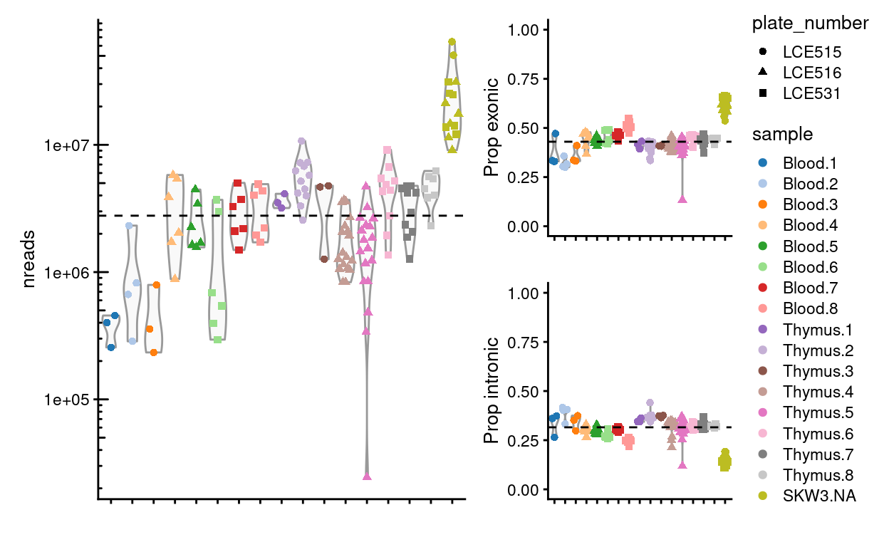
Figure 4: Number of reads generated per sample and the proportion that are exonic and intronic. The dashed horizional line denotes the median across all samples.
We observe that the Blood.1, Blood.2, and Blood.3 have notably fewer reads than other samples
Summary
We roughly achieved our aim of sequencing 2 million reads/sample, although less than 50% of reads are exonic. There is notable plate-specific and sample-specific variation, however, in the number of reads generated.
Henceforth, we only use the exonic reads. Although the intronic reads are potentially useful, to do so would require substantial changes to the data analysis workflow and additional analysis.
We now remove the control samples.
Show code
sce <- sce[, sce$tissue != "SKW3"]
colData(sce) <- droplevels(colData(sce))
Have we sequenced enough?
Motivation
SCORE’s mini-bulk protocol is still being finalised and some technical questions remain. In particular, we want to know if we have sequenced enough to answer the biological questions of interest.
One way of estimating if we have sequenced enough uses a metric called ‘sequencing saturation.’ 10x Genomics have some useful information about sequencing saturation available here. In particular,
Sequencing saturation is a measure of the fraction of library complexity that was sequenced in a given experiment. The inverse of the sequencing saturation can be interpreted as the number of additional reads it would take to detect a new transcript. … Sequencing saturation is dependent on the library complexity and sequencing depth. Different cell types will have different amounts of RNA and thus will differ in the total number of different transcripts in the final library (also known as library complexity). … As sequencing depth increases, more genes are detected, but this reaches saturation at different sequencing depths depending on cell type. … Sequencing depth also affects sequencing saturation; generally, the more sequencing reads, the more additional unique transcripts you can detect. However, this is limited by the library complexity.
This naturally leads to the question of ‘how much sequencing saturation should I aim for?’, which very much depends on the goals of the experiment.
For this experiment, where we wish to assess differential expression between experimental groups, we will likely want quite high sequencing saturation.
Analysis
To begin, we simply examine the number of reads sequenced/sample.
Figure 5 plots the distribution of the number of reads mapped to exons in each sample2.
Show code
plot(
  density(reads_ls),
  xlab = expression(log[10](n[reads])),
  ylab = "density",
  xlim = range(reads_ls),
  main = "")
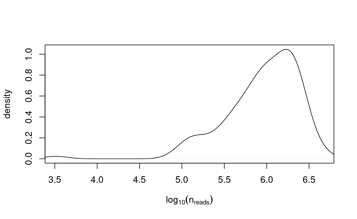
Figure 5: Distribution of the number of reads mapped to exons in each sample.
We estimate the sequencing saturation using 10x Genomics’ formula,
\[ 1 - (n_{deduped reads} / n_{reads}) \] where:
- \(n_{deduped reads}\) = Number of unique (valid cell-barcode, valid UMI, gene)-combinations among confidently mapped reads
- \(n_{reads}\) = Total number of confidently mapped, valid cell-barcode, valid UMI reads
Figure 6 shows that almost all samples are sequenced to near-total saturation.
Show code
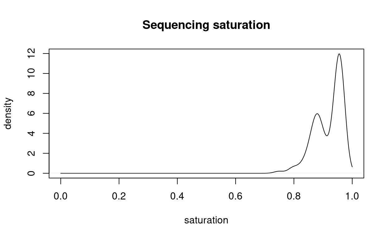
Figure 6: Distribution of the sequencing saturation.
Summary
These results show that the libraries are sequenced to near-saturation.
One way to think of sequencing saturation is provided by 10x Genomics:
The inverse of the sequencing saturation can be interpreted as roughly the number of new transcripts you expect to find with one new read. If sequencing saturation is at 50%, it means that every 2 new reads will result in 1 new UMI count (unique transcript) detected. In contrast, 90% sequencing saturation means that 10 new reads are necessary to obtain one new UMI count. If the sequencing saturation is high, additional sequencing would not recover much new information for the library.
At this stage, it is not necessary to perform additional sequencing of the library. We considered additional sequencing of the Blood.1, Blood.2, and Blood.3 samples. However, these samples are already pooled with the corresponding Thymus.1, Thymus.2, andThymus.3samples, which means we would also have to sequence these samples. Furthermore, since theBlood.1,Blood.2, andBlood.3used theP5gate rather thanP8gate of the otherBlood` samples, and we were getting reasonable DE results with the existing data, it was decided not to do any additional sequencing.
UMI counts vs. read counts
Motivation
A unique feature of SCORE’s ‘mini-bulk’ RNA-sequencing protocol is the incorporation of unique molecular identifiers (UMIs) into the library preparation; an ordinary bulk RNA-seq protocol does not incorporate UMIs.
UMIs are commonly used in single-cell RNA-sequencing protocols, such as the CEL-Seq2 protocol from which the mini-bulk protocol is adapted. UMIs are molecular tags that are used to detect and quantify unique mRNA transcripts. In this method, mRNA libraries are generated by fragmentation and reverse-transcribed to cDNA. Oligo(dT) primers with specific sequencing linkers are added to the cDNA. Another sequencing linker with a 6 bp random label and an index sequence is added to the 5’ end of the template, which is amplified and sequenced.
The UMI count is always less than or equal to the read count and a UMI count of zero also implies a read count of zero.
Pros of using UMIs:
- Can sequence unique mRNA transcripts
- Can detect transcripts occurring at low frequencies
- Transcripts can be quantified based on sequencing reads specific to each barcode
Cons of using UMIs:
- SCORE’s mini-bulk protocol uses a \(k=6\) bp UMI3 and so (theoretically) the maximum UMI count for each gene is \(4^6 = 4096\).
- There is therefore a risk that highly expressed genes may have their expression measurements artificially truncated, particularly if the sample is deeply sequenced.
To investigate whether expression measurements are being ‘truncated’ in this dataset, and decide whether to use the UMI counts or the read counts, we generated and now analyse two count matrices:
- UMI counts (i.e. deduplicating UMI counts)
- Read counts (i.e. not deduplicating UMI counts, equivalent to ignoring the UMIs)
Analysis
Figure 7 plots the distribution of the logarithm of the read counts. From this we see that the vast majority of read counts are small. In fact:
- 67.9% of read counts are 0
- 95% of the read counts are no greater than 137
- 99% of the read counts are no greater than 535
- 99.9% of the read counts are no greater than 3,175
Show code
x <- as.vector(assay(sce, "read_counts")) + 1L
par(mfrow = c(1, 2), cex = 0.5)
plot(
  density(log2(x), from = min(log2(x)), to = max(log2(x))),
  xlab = expression(log[2](reads + 1)),
  main = "",
  ylab = "density")
abline(v = log2(4 ^ 6), col = "orange")
plot(
  ecdf(log2(x)),
  xlim = range(log2(x)),
  main = "",
  xlab = expression(log[2](reads + 1)),
  ylab = "cumulative density")
abline(v = log2(4 ^ 6), col = "orange")
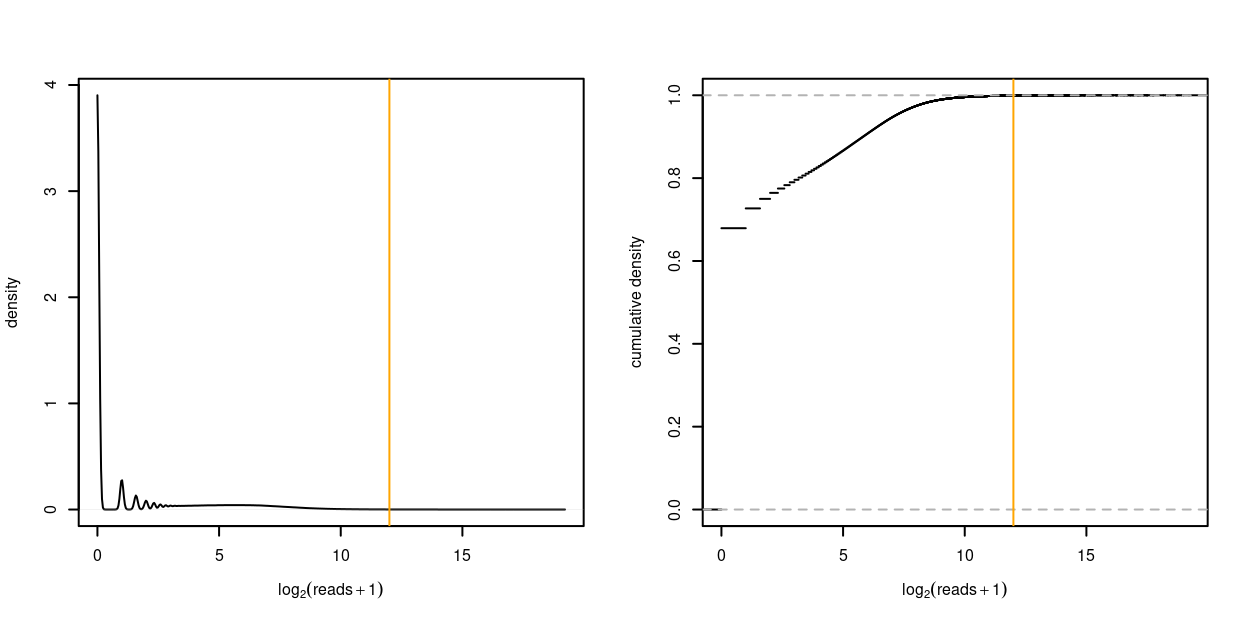
Figure 7: Distribution of the logarithm of the read counts as density plot (left) and empirical cumulative distribution function (right). A count of 1 is added to each UMI count to avoid taking the logarithm of zero. The orange vertical line denotes \(4^6 = 4096\).
Only 0.072% of read counts exceed the \(4^6 = 4096\) threshold. However there are 138 genes for which at least one sample exceeds the \(4^6=4096\) threshold; these genes are shown in the table below. If we were to use the UMI counts, the genes in this list may have their expression measurements artificially truncated in those samples where the number of copies of the transcript exceed the \(4^6=4096\) threshold.
This table shows that many of these genes are mitochondrial and ribosomal protein genes.
Show code
read_e <- as.matrix(assay(sce, "read_counts")[g, ])
umi_e <- as.matrix(assay(sce, "UMI_counts")[g, ])
high_count_tbl <- tibble::tibble(
  gene = g,
  read_median_count = matrixStats::rowMedians(read_e),
  read_exceed_sum = matrixStats::rowSums2(read_e > 4 ^ 6),
  read_exceed_percent = read_exceed_sum / ncol(sce),
  umi_median_count = matrixStats::rowMedians(umi_e),
  umi_exceed_sum = matrixStats::rowSums2(umi_e > 4 ^ 6),
  umi_exceed_percent = umi_exceed_sum / ncol(sce)) %>%
  dplyr::arrange(desc(read_exceed_sum))
sketch <- htmltools::withTags(table(
  class = "display",
  thead(
    tr(
      th(rowspan = 2, "gene"),
      th(colspan = 3, "reads"),
      th(colspan = 3, "UMIs")
    ),
    tr(
      lapply(rep(c("median count", "N > 4096", "% > 4096"), 2), th)
    )
  )
))
DT::datatable(
  high_count_tbl,
  caption = "Genes for which any sample has a read count exceeding the 4096 threshold and summaries of the corresponding read and UMI counts, namely: the median count ('median count'); the number of samples for which the counts exceed the threshold ('N > 4096'); and the percentage of samples for which the counts exceed the threshold ('% > 4096').",
  container = sketch,
  rownames = FALSE) %>%
  DT::formatPercentage(
    columns = c("read_exceed_percent", "umi_exceed_percent"),
    digits = 1) %>%
  DT::formatRound(
    columns = c("read_median_count", "umi_median_count"),
    digits = 0)
We can investigate this list more formally using a statistical test for over-representation of gene ontology (GO) terms in this gene set. This is done using the goana() function from the limma package. These results are shown in the table below and confirm that these genes are enriched for GO terms related to ribosomal and mitochondrial processes. This is something we frequently see with the mini-bulk protocol and the CEL-Seq protocol from which it is derived.
Show code
library(limma)
go <- goana(unlist(rowData(sce[g, ])$NCBI.ENTREZID), species = "Hs")
tg <- topGO(go, number = Inf)
DT::datatable(
  tg[tg$P.DE < 0.05, ],
  caption = "Most significant GO terms for genes with read counts that exceed the 4096 threshold. Report columns are the ontology that the GO term belongs to ('Ont'); the number of genes in the GO term ('N'); the number of genes in the DE set ('DE'); and the p-value for over-representation of the GO term in the set ('P.DE'). The p-values returned are unadjusted for multiple testing because GO terms are often overlapping, so standard methods of p-value adjustment may be very conservative. This means that only very small p-values should be used for published results.") %>%
  DT::formatRound(columns = "P.DE", digits = 9)
Figure 8 plots the relationship between UMI counts and read counts for all genes and samples. There are a few notable points about this figure:
- The UMI counts and read counts are very strongly associated.
- The log-fold change between the read counts and the UMI counts can be large, indicating the UMI counts are likely removing substantial PCR amplification noise.
- The log-fold changes between the read counts and the UMI counts are larger on average for more highly expressed genes. The variation in the log-fold change is larger for the lowly expressed genes.
- The hemoglobin genes stand out. These genes are extremely highly expressed, meaning that they likely saturate the 6 bp UMIs and which leads to the strange relationship between the UMI counts and the read counts for these genes.
Show code
x <- log2(as.vector(assay(sce, "UMI_counts")) + 1)
y <- log2(as.vector(assay(sce, "read_counts")) + 1)
m <- (x + y) / 2
d <- y - x
g <- rep(rownames(sce), ncol(sce))
# NOTE: Only showing unique points for plotting speed.
i <- !duplicated(paste0(x, ".", y))
X <- edgeR::cpm(assay(sce, "UMI_counts"), log = TRUE)
Y <- edgeR::cpm(assay(sce, "read_counts"), log = TRUE)
M <- (X + Y) / 2
D <- y - x
G <- g
# NOTE: Only showing unique points for plotting speed.
I <- !duplicated(paste0(x, ".", y))
par(mfrow = c(2, 2))
plotWithHighlights(
  x = x[i],
  y = y[i],
  status = ifelse(g[i] %in% ribo_set, 1, ifelse(g[i] %in% mito_set, -1, 0)),
  legend = FALSE,
  bg.pch = ".",
  hl.pch = ".",
  hl.col = c("orange", "dodgerBlue"),
  hl.cex = 3,
  sub = paste0("r = ", number(cor(x, y), accuracy = 0.001)),
  xlab = expression(log[2](UMIs + 1)),
  ylab = expression(log[2](reads + 1)))
abline(a = 0, b = 1, lty = 2, col = "grey")
plotWithHighlights(
  x = m[i] / 2,
  y = d[i],
  pch = ".",
  status = ifelse(g[i] %in% ribo_set, 1, ifelse(g[i] %in% mito_set, -1, 0)),
  legend = FALSE,
  bg.pch = ".",
  hl.pch = ".",
  hl.col = c("orange", "dodgerBlue"),
  hl.cex = 3,
  xlab = "Average log-(count+1)",
  ylab = "logFC (reads vs. UMIs)",
  ylim = c(-max(abs(c(d, D))), max(abs(c(d, D)))))
abline(h = 0, lty = 2, col = "grey")
l <- lowess(m, d, f = 0.3)
lines(l, col = "red", lwd = 2)
plotWithHighlights(
  x = X[I],
  y = Y[I],
  status = ifelse(G[I] %in% ribo_set, 1, ifelse(G[I] %in% mito_set, -1, 0)),
  legend = FALSE,
  bg.pch = ".",
  hl.pch = ".",
  hl.col = c("orange", "dodgerBlue"),
  hl.cex = 3,
  sub = paste0(
    "r = ",
    number(cor(as.vector(X), as.vector(Y)), accuracy = 0.001)),
  xlab = expression(logCPM(UMIs)),
  ylab = expression(logCPM(reads)))
abline(a = 0, b = 1, lty = 2, col = "grey")
plotWithHighlights(
  x = M[I],
  y = D[i],
  status = ifelse(G[I] %in% ribo_set, 1, ifelse(G[I] %in% mito_set, -1, 0)),
  legend = FALSE,
  bg.pch = ".",
  hl.pch = ".",
  hl.col = c("orange", "dodgerBlue"),
  hl.cex = 3,
  xlab = "Average logCPM",
  ylab = "logFC (reads vs. UMIs)",
  ylim = c(-max(abs(c(d, D))), max(abs(c(d, D)))))
abline(h = 0, lty = 2, col = "grey")
l <- lowess(M, D, f = 0.3)
lines(l, col = "red", lwd = 2)
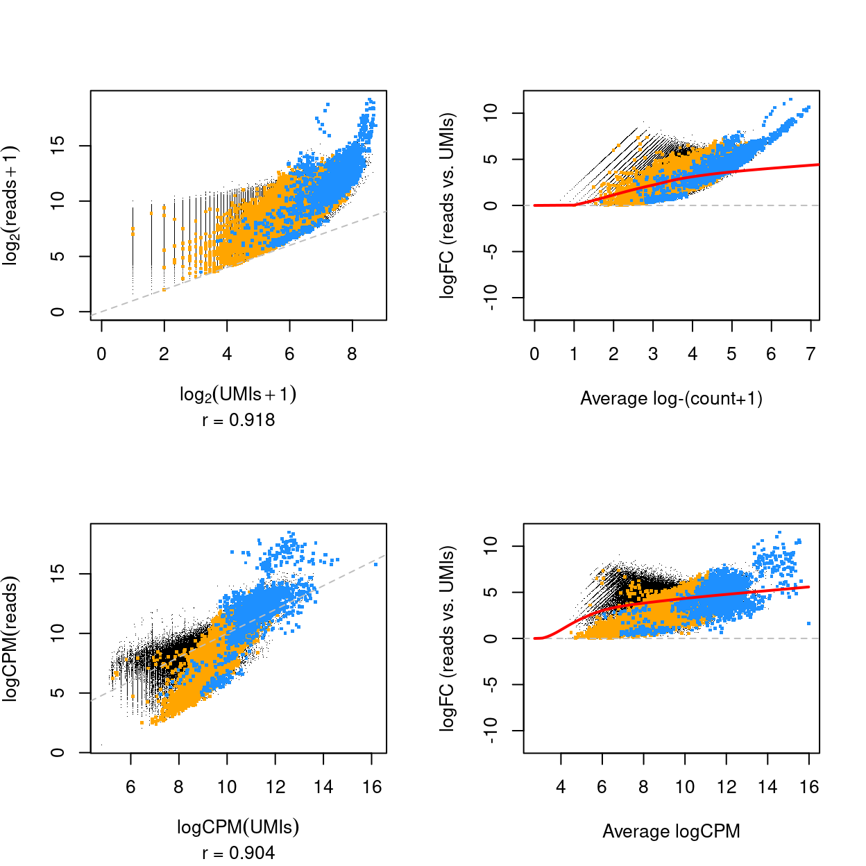
Figure 8: Scatterplot of the logarithm of the UMI and read counts (top) and logCPM of the UMI and read counts (bottom) for all genes and samples (left) and mean-difference plot of the same data (right). The correlation in the scatterplot is reported below the x-axis label. Genes that are ribosomal protein genes subunits are highlighted in orange and mitochondrial genes in blue. The red line is a trend fitted to the mean-differences.
Rather than looking at all samples and all genes at once, can also examine the relationship between UMI counts and read counts within a single sample across genes (Figure 9) and within a single gene across samples (Figure 10).
Show code
X <- edgeR::cpm(assay(sce, "UMI_counts"), log = TRUE)
Y <- edgeR::cpm(assay(sce, "read_counts"), log = TRUE)
cor_j <- diag(cor(X, Y))
# NOTE: Splitting up the cor() computations is a hack to improve speed whilst
#       keeping memory usage somewhat under control.
b <- 1000
s <- seq(1, by = b, to = nrow(sce))
e <- pmin(s + b - 1, nrow(sce))
cor_i <- unlist(
  Map(
    f = function(ss, ee ) diag(cor(t(X[ss:ee, ]), t(Y[ss:ee, ]))),
    ss = s,
    ee = e))
These figures show that the UMI counts and read counts are highly correlated across both samples (median = 0.896, median absolute deviation = 0.026) and genes (median = 0.831, median absolute deviation = 0.136).
Show code
par(mfrow = c(3, 3), cex = 0.5)
jj <- names(sort(cor_j)[c(1:3, 60:61, 119:121)])
for (j in jj) {
  g <- rownames(sce)
  plot(
    x = X[, j],
    y = Y[, j],
    pch = ".",
    cex = ifelse(g %in% c(ribo_set, mito_set), 5, 1),
    col = ifelse(
      g %in% ribo_set, "orange",
      ifelse(g %in% mito_set, "dodgerBlue", "black")),
    sub = paste0("r = ", number(cor_j[j], accuracy = 0.001)),
    xlab = "logCPM(UMIs)",
    ylab = "logCPM(reads)",
    main = j,
    xlim = range(x),
    ylim = range(y))
  abline(a = 0, b = 1, col = "grey", lty = 2)
}
plot(
  density(cor_j, na.rm = TRUE, from = -1, to = 1),
  main = "All samples",
  xlab = expression(r[p]))
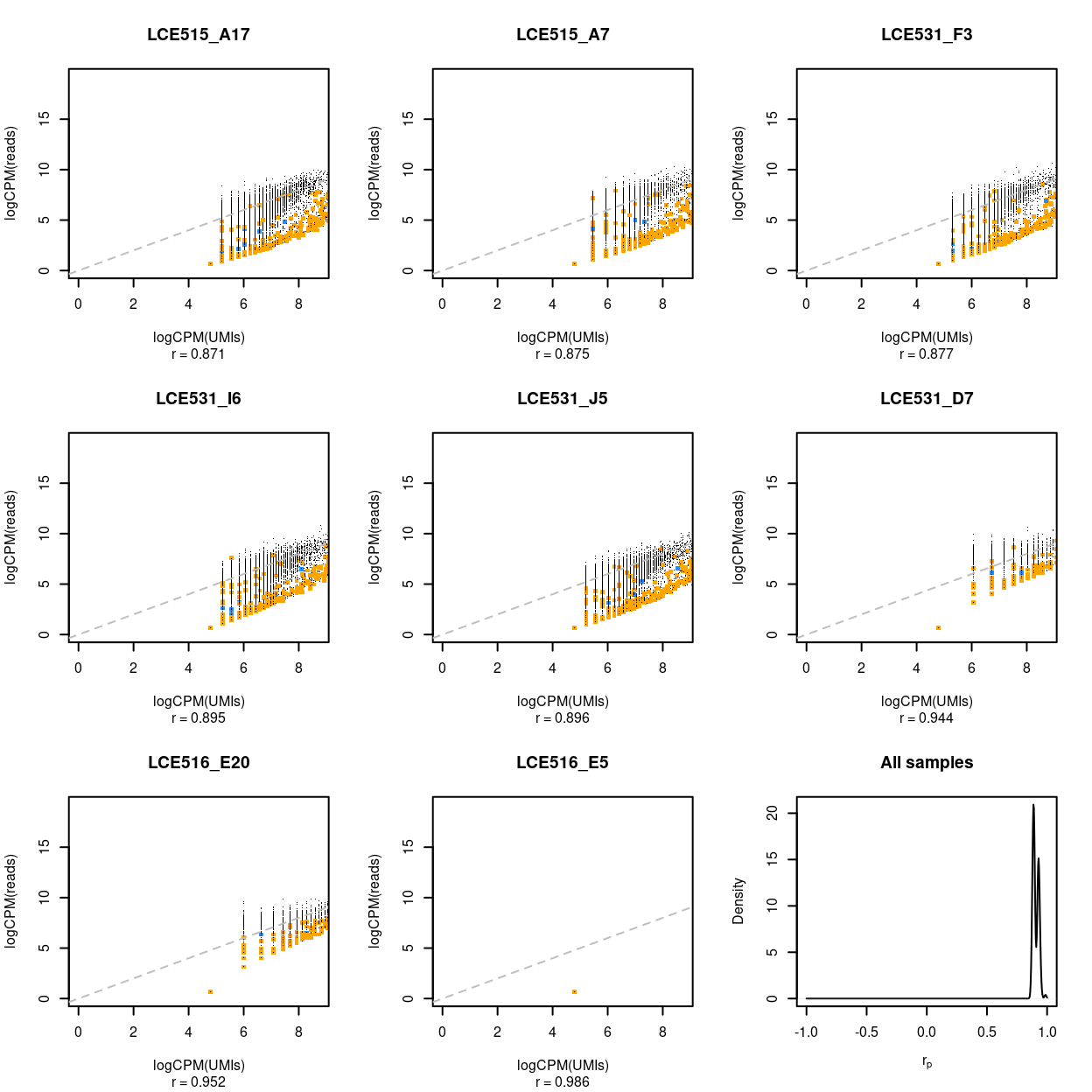
Figure 9: Association between UMI counts and read counts for each gene within each sample. The first 8 panels are scatter plots of the UMI counts and read counts for each gene for the samples with the 3 lowest correlations, 2 middlemost correlations, and 3 highest correlations. The correlation in the scatterplot is reported below each panel. Genes that are ribosomal protein genes subunits are highlighted in orange and mitochondrial genes in blue. The final panel is the distribution of these correlations across all samples.
Show code
par(mfrow = c(3, 3), cex = 0.5)
# NOTE: There are some NA correlations, so this changes ii.
ii <- names(sort(cor_i)[c(1:3, 16506:16507, 33011:33013)])
for (i in ii) {
  g <- i
  plot(
    x = X[i, ],
    y = Y[i, ],
    pch = 16,
    col = ifelse(
      g %in% ribo_set, "orange",
      ifelse(g %in% mito_set, "dodgerBlue", "black")),
    sub = paste0("r = ", number(cor_i[i], accuracy = 0.001)),
    xlab = "logCPM(UMIs)",
    ylab = "logCPM(reads)",
    main = i,
    xlim = range(X),
    ylim = range(Y))
  abline(a = 0, b = 1, col = "grey", lty = 2)
}
plot(
  density(cor_i, na.rm = TRUE, from = -1, to = 1),
  main = "All genes",
  xlab = expression(r[p]))
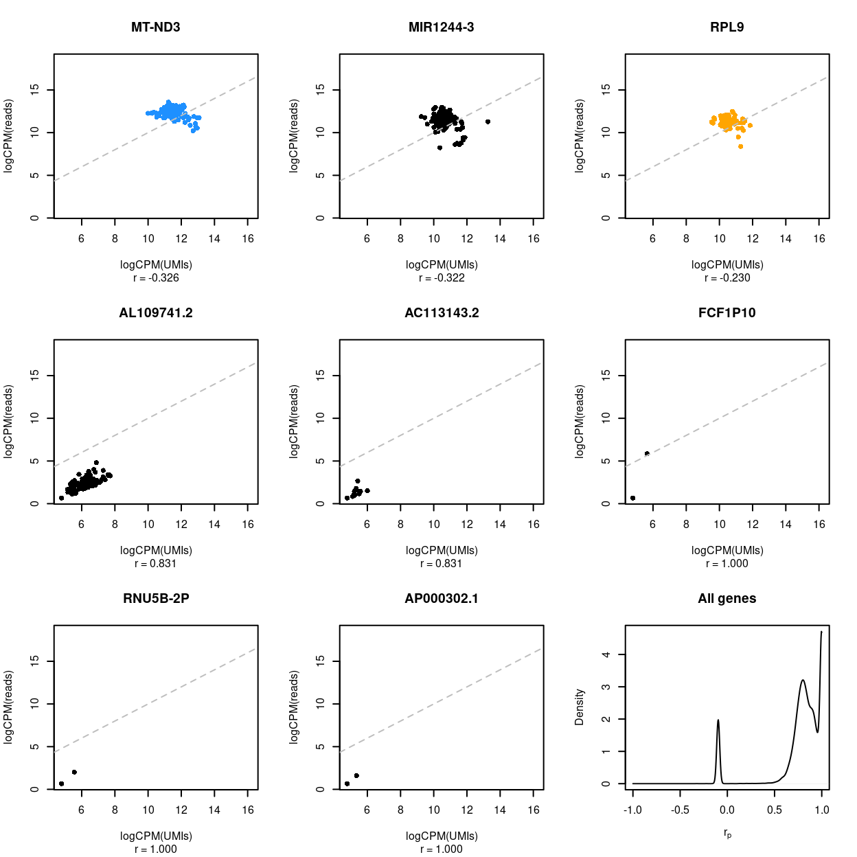
Figure 10: Association between UMI counts and read counts for each sample within each gene. The first 8 panels are scatter plots of the UMI counts and read counts for each sample for the genes with the 3 lowest correlations, 2 middlemost correlations, and 3 highest correlations. The correlation in the scatterplot is reported below each panel. Genes that are ribosomal protein genes subunits are highlighted in orange and mitochondrial genes in blue. The final panel is the distribution of these correlations across all genes.
Summary
The ultimate aim of this analysis is to perform a differential expression (DE) analysis. On the one hand, a DE analysis is more powerful when there are more counts available, which is where the read counts are favoured. On the other hand, a DE analysis may be biased if these counts arise through PCR duplicates, which is where the deduplicated UMI counts are favoured. The choice between using the read counts or the UMI counts in the DE analysis is therefore a trade-off between these two choices.
For now, we defer our choice of read counts vs. UMI counts, but the remainder of this preprocessing report uses (exonic) read counts.
Quality control of cells
Defining the quality control metrics
Low-quality cells need to be removed to ensure that technical effects do not distort downstream analysis results. We use several quality control (QC) metrics to measure the quality of the cells:
sum: This measures the library size of the samples, which is the total sum of counts across genes. We want samples to have high library sizes as this means more RNA has been successfully captured during library preparation.detected: This is the number of expressed features4 in each cell. Cells with few expressed features are likely to be of poor quality, as the diverse transcript population has not been successful captured.altexps_ERCC_detected: This measures the proportion of reads which are mapped to spike-in transcripts relative to the library size of each cell. High proportions are indicative of poor-quality cells, where endogenous RNA has been lost during processing (e.g., due to cell lysis or RNA degradation). The same amount of spike-in RNA to each cell, so an enrichment in spike-in counts is symptomatic of loss of endogenous RNA.subsets_Mito_percent: This measures the proportion of reads which are mapped to mitochondrial RNA. If there is a higher than expected proportion of mitochondrial RNA this is often symptomatic of a cell which is under stress and is therefore of low quality and will not be used for the analysis.subsets_Ribo_percent: This measures the proportion of UMIs which are mapped to ribosomal protein genes. If there is a higher than expected proportion of ribosomal protein gene expression this is often symptomatic of a cell which is of compromised quality and we may want to exclude it from the analysis.
For CEL-Seq2 data, we typically observe library sizes that are in the tens of thousands5 and several thousand expressed genes per cell.
Visualizing the QC metrics
Figure 11 compares the QC metrics of the single-cell samples across the different sample (combination of tissue and donor). The number of UMIs, number of gene detected, and percentage of UMIs that are mapped to ERCC spike-ins are all higher in the ‘experimental’ samples than in the ‘control’ samples This likely reflects that the ‘experimental’ cells, which are γδ T cells, have a ‘smaller’ transcriptome than the ‘control’ cells (rather than this result being due to technical factors, although we cannot rule this out entirely). Together, these figures show that the vast majority of single-cell samples are good-quality6:
- The median library size is around 1,034,000.
- The median number of genes detected is around 11,000.
- The median percentage of reads that are mapped to mitochondrial RNA is around 17%.
- The median percentage of reads that are mapped to ribosomal protein genes is around 11%.
- The median percentage of reads that are mapped to ERCC spike-ins is around 0%.
Figure 11 also highlights that the Blood.1, Blood.2, and Blood.3 samples on plate LCE515 have fewer reads and genes detected than other samples, but that the that QC metrics are otherwise generally consistent across samples (and plates).
Show code
p1 <- plotColData(
  sce,
  "sum",
  x = "donor",
  other_fields = "tissue",
  point_size = 0.5,
  colour_by = "donor",
  shape_by = "plate_number") +
  scale_y_log10() +
  annotation_logticks(
    sides = "l",
    short = unit(0.03, "cm"),
    mid = unit(0.06, "cm"),
    long = unit(0.09, "cm")) +
  theme(axis.text.x = element_blank()) +
  scale_colour_manual(values = donor_colours, name = "donor") +
  xlab("") +
  facet_grid(~tissue) +
  guides(colour = guide_legend(override.aes = list(size = 4, alpha = 1)))
p2 <- plotColData(
  sce,
  "detected",
  x = "donor",
  other_fields = "tissue",
  point_size = 0.5,
  colour_by = "donor",
  shape_by = "plate_number") +
  theme(axis.text.x = element_blank()) +
  scale_colour_manual(values = donor_colours, name = "donor") +
  xlab("") +
  facet_grid(~tissue) +
  guides(colour = guide_legend(override.aes = list(size = 4, alpha = 1)))
p3 <- plotColData(
  sce,
  "subsets_Mito_percent",
  x = "donor",
  other_fields = "tissue",
  point_size = 0.5,
  colour_by = "donor",
  shape_by = "plate_number") +
  ylim(0, NA) +
  theme(axis.text.x = element_blank()) +
  scale_colour_manual(values = donor_colours, name = "donor") +
  xlab("") +
  facet_grid(~tissue) +
  guides(colour = guide_legend(override.aes = list(size = 4, alpha = 1)))
p4 <- plotColData(
  sce,
  "subsets_Ribo_percent",
  x = "donor",
  other_fields = "tissue",
  point_size = 0.5,
  colour_by = "donor",
  shape_by = "plate_number") +
  ylim(0, NA) +
  theme(axis.text.x = element_blank()) +
  scale_colour_manual(values = donor_colours, name = "donor") +
  xlab("") +
  facet_grid(~tissue) +
  guides(colour = guide_legend(override.aes = list(size = 4, alpha = 1)))
p5 <- plotColData(
  sce,
  "altexps_ERCC_percent",
  x = "donor",
  other_fields = "tissue",
  point_size = 0.5,
  colour_by = "donor",
  shape_by = "plate_number") +
  ylim(0, NA) +
  theme(axis.text.x = element_blank()) +
  scale_colour_manual(values = donor_colours, name = "donor") +
  xlab("") +
  facet_grid(~tissue) +
  guides(colour = guide_legend(override.aes = list(size = 4, alpha = 1)))
p1 + p2 + p3 + p4 + p5 +
  plot_layout(ncol = 2, guides = "collect")
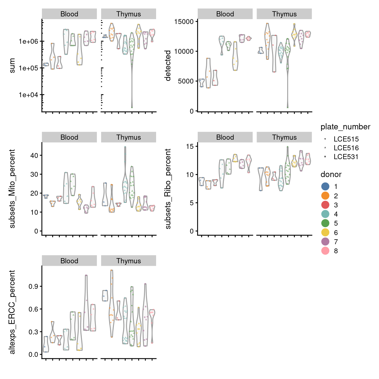
Figure 11: Distributions of various QC metrics for all samples in the dataset.
Identifying outliers by each metric
Outliers are defined based on the median absolute deviation (MADs) from the median value of each metric across all cells. We remove small and large outliers for the library size and the number of expressed features, and large outliers for the spike-in proportions and mitochondrial gene expression proportions. Removal of low-quality cells is then performed by combining the filters for all of the metrics.
Due to the differences in the QC metrics by sample, we will compute the separate outlier thresholds for each sample.
Show code
sce$batch <- sce$sample
libsize_drop <- isOutlier(
  metric = sce$sum,
  nmads = 3,
  type = "lower",
  log = TRUE,
  batch = sce$batch)
feature_drop <- isOutlier(
  metric = sce$detected,
  nmads = 3,
  type = "lower",
  log = TRUE,
  batch = sce$batch)
spike_drop <- isOutlier(
  metric = sce$altexps_ERCC_percent,
  nmads = 3,
  type = "higher",
  batch = sce$batch)
mito_drop <- isOutlier(
  metric = sce$subsets_Mito_percent,
  nmads = 3,
  type = "higher",
  batch = sce$batch)
ribo_drop <- isOutlier(
  metric = sce$subsets_Ribo_percent,
  nmads = 3,
  type = "higher",
  batch = sce$batch)
The following table summarises the QC cutoffs:
Show code
libsize_drop_df <- data.frame(
  batch = colnames(attributes(libsize_drop)$thresholds),
  cutoff = attributes(libsize_drop)$thresholds["lower", ])
feature_drop_df <- data.frame(
  batch = colnames(attributes(feature_drop)$thresholds),
  cutoff = attributes(feature_drop)$thresholds["lower", ])
spike_drop_df <- data.frame(
  batch = colnames(attributes(spike_drop)$thresholds),
  cutoff = attributes(spike_drop)$thresholds["higher", ])
mito_drop_df <- data.frame(
  batch = colnames(attributes(mito_drop)$thresholds),
  cutoff = attributes(mito_drop)$thresholds["higher", ])
ribo_drop_df <- data.frame(
  batch = colnames(attributes(ribo_drop)$thresholds),
  cutoff = attributes(ribo_drop)$thresholds["higher", ])
qc_cutoffs_df <- Reduce(
  function(x, y) inner_join(x, y, by = "batch"),
  list(
    libsize_drop_df,
    feature_drop_df,
    spike_drop_df,
    mito_drop_df,
    ribo_drop_df))
qc_cutoffs_df$batch <- factor(qc_cutoffs_df$batch, levels(sce$batch))
colnames(qc_cutoffs_df) <- c(
  "batch", "total counts", "total features", "%ERCC", "%mito", "%ribo")
qc_cutoffs_df %>%
  arrange(batch) %>%
  knitr::kable(caption = "QC cutoffs", digits = 1)
| batch | total counts | total features | %ERCC | %mito | %ribo |
|---|---|---|---|---|---|
| Blood.1 | 84066.2 | 4162.7 | 0.4 | 19.6 | 11.1 |
| Blood.2 | 23377.7 | 2306.5 | 0.4 | 17.7 | 10.7 |
| Blood.3 | 46396.3 | 2397.6 | 0.3 | 21.0 | 9.6 |
| Blood.4 | 74696.4 | 9801.9 | 0.7 | 41.7 | 15.9 |
| Blood.5 | 332219.7 | 9740.5 | 1.0 | 39.2 | 15.2 |
| Blood.6 | 16362.9 | 4494.8 | 0.3 | 20.9 | 13.9 |
| Blood.7 | 313085.1 | 10542.9 | 1.1 | 16.7 | 13.8 |
| Blood.8 | 309007.5 | 11629.6 | 0.9 | 23.9 | 14.7 |
| Thymus.1 | 1360099.4 | 8918.1 | 1.1 | 23.9 | 11.3 |
| Thymus.2 | 479118.4 | 8922.1 | 1.1 | 15.7 | 13.1 |
| Thymus.3 | 1685651.5 | 5981.0 | 0.6 | 16.0 | 10.5 |
| Thymus.4 | 91965.1 | 7675.5 | 1.1 | 36.6 | 12.4 |
| Thymus.5 | 73788.6 | 7318.9 | 0.8 | 41.3 | 15.5 |
| Thymus.6 | 650569.1 | 10944.6 | 0.6 | 20.5 | 14.0 |
| Thymus.7 | 308618.9 | 9645.2 | 1.2 | 19.6 | 15.4 |
| Thymus.8 | 929835.5 | 11961.8 | 0.7 | 16.0 | 15.8 |
We would typically remove outliers (e.g., small outliers for the library size and the number of expressed features) at this stage. However, we opt to retain all samples for the time being. The following table highlights samples that would typically exclude as outliers by this criteria:
Show code
keep <- !(libsize_drop | libsize_drop | mito_drop)
x <- cbind(
  data.frame(sample = colnames(sce), keep = keep),
  colData(sce)[, c("plate_number", "sample", "sum", "detected")])
row.names(x) <- NULL
DT::datatable(
  x[order(keep), ],
  caption = "Quality control metrics including library size (`sum`) and number of genes detected (`keep`) for each replicate. Each replicate is annotated by whether it would be kept or excluded by the typical quality control procedures (`keep`).",
  rownames = FALSE)
Summary
We have opted not to exclude any replicates at this stage. However, we have identified some replicates with unusually small library sizes and number of genes detected compared to the other samples. We will keep an eye on these replicates and may later remove some of these.
Examining gene-level metrics
Inspecting the most highly expressed genes
Figure 12 shows the most highly expressed genes across the cell population in the combined data set. Some of them are mitochondrial genes, matching what we’ve already seen in the QC metrics, and ribosomal protein genes, which commonly are amongst the most highly expressed genes in scRNA-seq data.
Show code
plotHighestExprs(sce, n = 50, exprs_values = "read_counts")
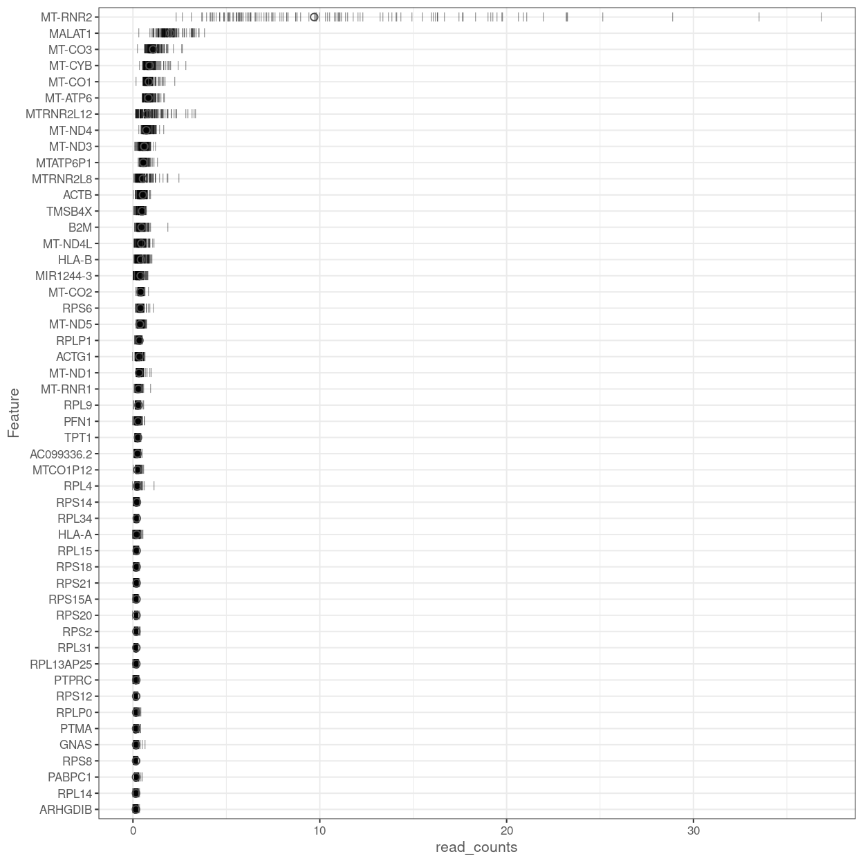
Figure 12: Percentage of total counts assigned to the top 50 most highly-abundant features in the combined data set. For each feature, each bar represents the percentage assigned to that feature for a single cell, while the circle represents the average across all cells.
Figure 13 shows the most highly expressed endogenous genes after excluding the mitochondrial and ribosomal protein genes.
Show code
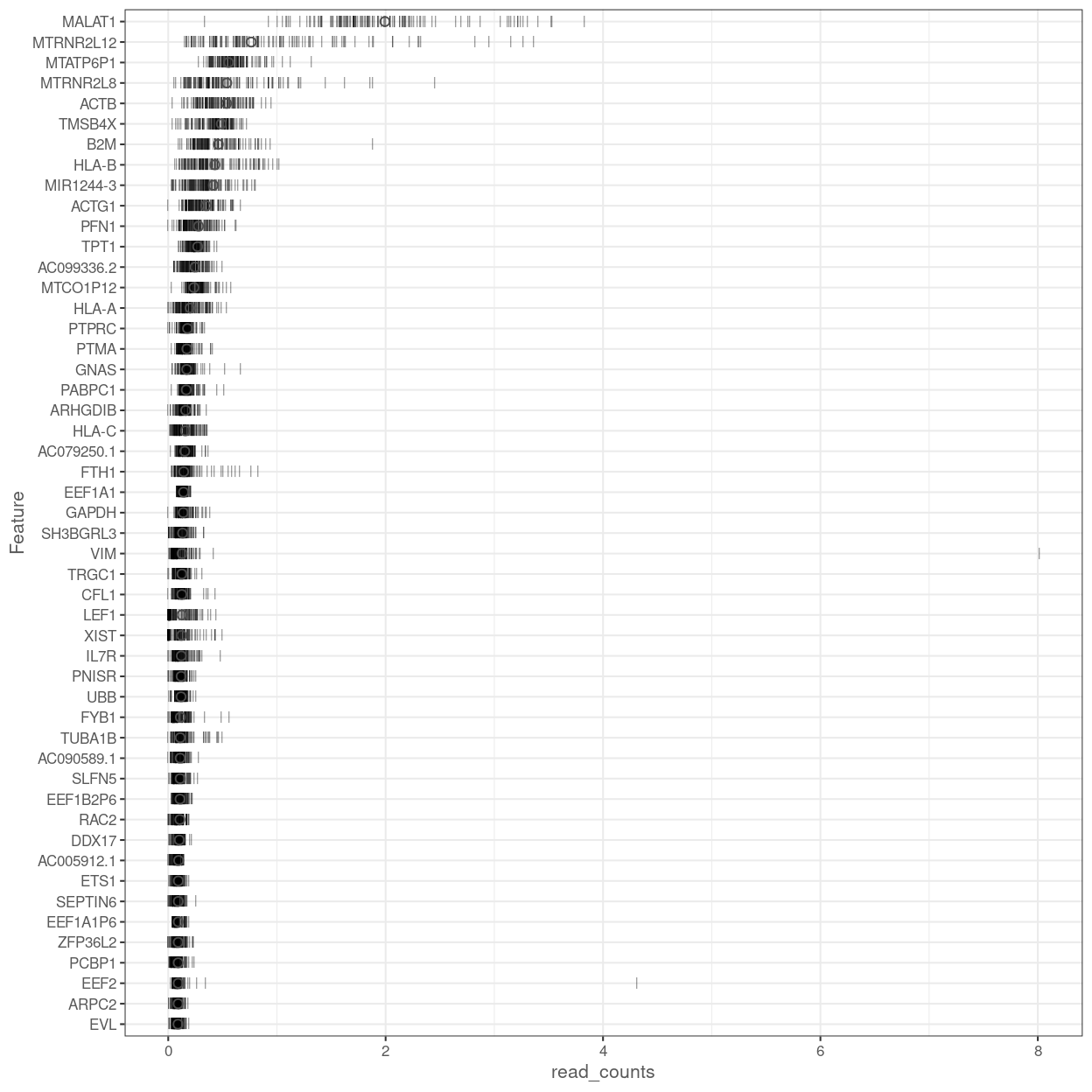
Figure 13: Percentage of total counts assigned to the top 50 most highly-abundant features in the combined data set. For each feature, each bar represents the percentage assigned to that feature for a single cell, while the circle represents the average across all cells. Bars are coloured by the total number of expressed features in each cell, while circles are coloured according to whether the feature is labelled as a control feature.
Sex check
Using XIST expression
Figure 14 visualises the expression of XIST, a female-specific gene. This can be used to confirm the reported sex of the sample and to detect sample mix-ups.
The results are fairly clear for the Thymus samples with donors 3, 4, and 6 having lower XIST expression (i.e. male). There is also one donor 5 replicate with low XIST expression (LCE516_E5), but this is also the technical replicate with the fewest reads (\(n_{reads} =\) 24,379).
The results are less clear for the Blood samples with some of the Blood.3 technical replicates having comparable XIST expression to replicates from nominally female donors 1 and 2.
Show code
plotExpression(
  sce,
  "XIST",
  x = "donor",
  exprs_values = "logCPM_reads",
  colour_by = "donor",
  other_fields = "tissue") +
  scale_colour_manual(values = donor_colours, name = "donor") +
  guides(fill = FALSE) +
  ylab("logCPM(read counts)") +
  ylim(0, NA) +
  facet_grid(~tissue) +
  theme(axis.text.x = element_blank()) +
  xlab("") +
  ggtitle("XIST")
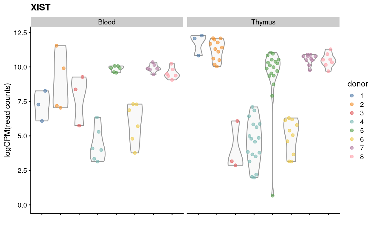
Figure 14: Expression of XIST by donor and tissue on a ‘logCPM’ scale using the read counts.
Using Y chromosome gene expression
Figure 15 visualises the proportion of read counts coming from Y chromosome genes. This can be used to confirm the reported sex of the sample and to detect sample mix-ups. The results in Figure 15 are consistent with those in Figure 14.
Show code
plotColData(
  sce_Y,
  "subsets_Y_percent",
  x = "donor",
  other_fields = "tissue",
  colour_by = "donor",
  point_alpha = 1) +
  ylim(0, NA) +
  theme(axis.text.x = element_blank()) +
  scale_colour_manual(values = donor_colours, name = "donor") +
  xlab("") +
  facet_grid(~tissue) +
  guides(colour = guide_legend(override.aes = list(size = 4, alpha = 1)))
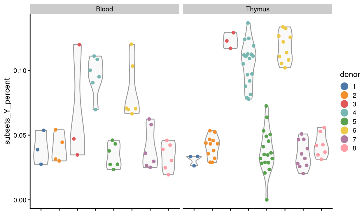
Figure 15: Proportion of read counts coming from Y chromosome genes by donor and tissue.
Concluding remarks
The processed SingleCellExperiment object is available (see data/SCEs/C094_Pellicci.mini-bulk.preprocessed.SCE.rds). This will be used in downstream analyses, i.e. differential expression analysis.
Additional information
The following are available on request:
- Full CSV tables of any data presented.
- PDF/PNG files of any static plots.
Session info
Show code
sessioninfo::session_info()
─ Session info ─────────────────────────────────────────────────────
 setting  value
 version  R version 4.0.3 (2020-10-10)
 os       CentOS Linux 7 (Core)
 system   x86_64, linux-gnu
 ui       X11
 language (EN)
 collate  en_US.UTF-8
 ctype    en_US.UTF-8
 tz       Australia/Melbourne
 date     2021-09-29

─ Packages ─────────────────────────────────────────────────────────
 ! package                           * version  date       lib
 P AnnotationDbi                     * 1.52.0   2020-10-27 [?]
 P AnnotationFilter                  * 1.14.0   2020-10-27 [?]
 P AnnotationHub                     * 2.22.0   2020-10-27 [?]
 P askpass                             1.1      2019-01-13 [?]
 P assertthat                          0.2.1    2019-03-21 [?]
 P beachmat                            2.6.4    2020-12-20 [?]
 P beeswarm                            0.3.1    2021-03-07 [?]
 P Biobase                           * 2.50.0   2020-10-27 [?]
 P BiocFileCache                     * 1.14.0   2020-10-27 [?]
 P BiocGenerics                      * 0.36.0   2020-10-27 [?]
 P BiocManager                         1.30.12  2021-03-28 [?]
 P BiocNeighbors                       1.8.2    2020-12-07 [?]
 P BiocParallel                        1.24.1   2020-11-06 [?]
 P BiocSingular                        1.6.0    2020-10-27 [?]
 P BiocStyle                         * 2.18.1   2020-11-24 [?]
 P BiocVersion                         3.12.0   2020-04-27 [?]
 P biomaRt                             2.46.3   2021-02-09 [?]
 P Biostrings                          2.58.0   2020-10-27 [?]
 P bit                                 4.0.4    2020-08-04 [?]
 P bit64                               4.0.5    2020-08-30 [?]
 P bitops                              1.0-6    2013-08-17 [?]
 P blob                                1.2.1    2020-01-20 [?]
 P bslib                               0.2.4    2021-01-25 [?]
 P cachem                              1.0.4    2021-02-13 [?]
 P cellranger                          1.1.0    2016-07-27 [?]
 P cli                                 2.4.0    2021-04-05 [?]
 P colorspace                          2.0-0    2020-11-11 [?]
 P cowplot                           * 1.1.1    2020-12-30 [?]
 P crayon                              1.4.1    2021-02-08 [?]
 P crosstalk                           1.1.1    2021-01-12 [?]
 P curl                                4.3      2019-12-02 [?]
 P DBI                                 1.1.1    2021-01-15 [?]
 P dbplyr                            * 2.1.0    2021-02-03 [?]
 P DelayedArray                        0.16.3   2021-03-24 [?]
 P DelayedMatrixStats                  1.12.3   2021-02-03 [?]
 P DEoptimR                            1.0-8    2016-11-19 [?]
 P digest                              0.6.27   2020-10-24 [?]
 P distill                             1.2      2021-01-13 [?]
 P downlit                             0.2.1    2020-11-04 [?]
 P dplyr                             * 1.0.5    2021-03-05 [?]
 P DT                                  0.17     2021-01-06 [?]
 P edgeR                               3.32.1   2021-01-14 [?]
 P ellipsis                            0.3.1    2020-05-15 [?]
 P ensembldb                         * 2.14.0   2020-10-27 [?]
 P evaluate                            0.14     2019-05-28 [?]
 P fansi                               0.4.2    2021-01-15 [?]
 P farver                              2.1.0    2021-02-28 [?]
 P fastmap                             1.1.0    2021-01-25 [?]
 P generics                            0.1.0    2020-10-31 [?]
 P GenomeInfoDb                      * 1.26.4   2021-03-10 [?]
 P GenomeInfoDbData                    1.2.4    2020-10-20 [?]
 P GenomicAlignments                   1.26.0   2020-10-27 [?]
 P GenomicFeatures                   * 1.42.3   2021-04-01 [?]
 P GenomicRanges                     * 1.42.0   2020-10-27 [?]
 P GGally                              2.1.1    2021-03-08 [?]
 P ggbeeswarm                          0.6.0    2017-08-07 [?]
 P ggplot2                           * 3.3.3    2020-12-30 [?]
 P glue                                1.4.2    2020-08-27 [?]
 P GO.db                             * 3.12.1   2020-11-04 [?]
 P graph                               1.68.0   2020-10-27 [?]
 P gridExtra                           2.3      2017-09-09 [?]
 P gtable                              0.3.0    2019-03-25 [?]
 P here                              * 1.0.1    2020-12-13 [?]
 P highr                               0.9      2021-04-16 [?]
 P hms                                 1.0.0    2021-01-13 [?]
 P Homo.sapiens                      * 1.3.1    2020-07-25 [?]
 P htmltools                           0.5.1.1  2021-01-22 [?]
 P htmlwidgets                         1.5.3    2020-12-10 [?]
 P httpuv                              1.5.5    2021-01-13 [?]
 P httr                                1.4.2    2020-07-20 [?]
 P interactiveDisplayBase              1.28.0   2020-10-27 [?]
 P IRanges                           * 2.24.1   2020-12-12 [?]
 P irlba                               2.3.3    2019-02-05 [?]
 P janitor                           * 2.1.0    2021-01-05 [?]
 P jquerylib                           0.1.3    2020-12-17 [?]
 P jsonlite                            1.7.2    2020-12-09 [?]
 P knitr                               1.33     2021-04-24 [?]
 P labeling                            0.4.2    2020-10-20 [?]
 P later                               1.1.0.1  2020-06-05 [?]
 P lattice                             0.20-41  2020-04-02 [3]
 P lazyeval                            0.2.2    2019-03-15 [?]
 P lifecycle                           1.0.0    2021-02-15 [?]
 P limma                             * 3.46.0   2020-10-27 [?]
 P locfit                              1.5-9.4  2020-03-25 [?]
 P lubridate                           1.7.10   2021-02-26 [?]
 P magrittr                            2.0.1    2020-11-17 [?]
 P Matrix                              1.2-18   2019-11-27 [3]
 P MatrixGenerics                    * 1.2.1    2021-01-30 [?]
 P matrixStats                       * 0.58.0   2021-01-29 [?]
 P mclust                              5.4.7    2020-11-20 [?]
 P memoise                             2.0.0    2021-01-26 [?]
 P mime                                0.11     2021-06-23 [?]
 P msigdbr                           * 7.2.1    2020-10-02 [?]
 P munsell                             0.5.0    2018-06-12 [?]
 P openssl                             1.4.3    2020-09-18 [?]
 P org.Hs.eg.db                      * 3.12.0   2020-10-20 [?]
 P org.Mm.eg.db                        3.12.0   2020-10-20 [?]
 P OrganismDbi                       * 1.32.0   2020-10-27 [?]
 P patchwork                         * 1.1.1    2020-12-17 [?]
 P pillar                              1.5.1    2021-03-05 [?]
 P pkgconfig                           2.0.3    2019-09-22 [?]
 P plyr                                1.8.6    2020-03-03 [?]
 P prettyunits                         1.1.1    2020-01-24 [?]
 P progress                            1.2.2    2019-05-16 [?]
 P promises                            1.2.0.1  2021-02-11 [?]
 P ProtGenerics                        1.22.0   2020-10-27 [?]
 P purrr                               0.3.4    2020-04-17 [?]
 P R6                                  2.5.0    2020-10-28 [?]
 P rappdirs                            0.3.3    2021-01-31 [?]
 P RBGL                                1.66.0   2020-10-27 [?]
 P RColorBrewer                        1.1-2    2014-12-07 [?]
 P Rcpp                                1.0.6    2021-01-15 [?]
 P RCurl                               1.98-1.3 2021-03-16 [?]
 P readxl                            * 1.3.1    2019-03-13 [?]
 P reshape                             0.8.8    2018-10-23 [?]
 P Rhtslib                             1.22.0   2020-10-27 [?]
 P rlang                               0.4.11   2021-04-30 [?]
 P rmarkdown                           2.7      2021-02-19 [?]
 P robustbase                          0.93-7   2021-01-04 [?]
 P rprojroot                           2.0.2    2020-11-15 [?]
 P Rsamtools                           2.6.0    2020-10-27 [?]
 P RSQLite                             2.2.5    2021-03-27 [?]
 P rstudioapi                          0.13     2020-11-12 [?]
 P rsvd                                1.0.3    2020-02-17 [?]
 P rtracklayer                         1.50.0   2020-10-27 [?]
 P S4Vectors                         * 0.28.1   2020-12-09 [?]
 P sass                                0.3.1    2021-01-24 [?]
 P scales                            * 1.1.1    2020-05-11 [?]
 P scater                            * 1.18.6   2021-02-26 [?]
 P scPipe                            * 1.12.0   2020-10-27 [?]
 P scuttle                             1.0.4    2020-12-17 [?]
 P sessioninfo                         1.1.1    2018-11-05 [?]
 P shiny                               1.6.0    2021-01-25 [?]
 P SingleCellExperiment              * 1.12.0   2020-10-27 [?]
 P snakecase                           0.11.0   2019-05-25 [?]
 P sparseMatrixStats                   1.2.1    2021-02-02 [?]
 P stringi                             1.7.3    2021-07-16 [?]
 P stringr                             1.4.0    2019-02-10 [?]
 P SummarizedExperiment              * 1.20.0   2020-10-27 [?]
 P tibble                              3.1.0    2021-02-25 [?]
 P tidyselect                          1.1.0    2020-05-11 [?]
 P TxDb.Hsapiens.UCSC.hg19.knownGene * 3.2.2    2020-07-25 [?]
 P utf8                                1.2.1    2021-03-12 [?]
 P vctrs                               0.3.7    2021-03-29 [?]
 P vipor                               0.4.5    2017-03-22 [?]
 P viridis                             0.5.1    2018-03-29 [?]
 P viridisLite                         0.3.0    2018-02-01 [?]
 P withr                               2.4.1    2021-01-26 [?]
 P xfun                                0.24     2021-06-15 [?]
 P XML                                 3.99-0.6 2021-03-16 [?]
 P xml2                                1.3.2    2020-04-23 [?]
 P xtable                              1.8-4    2019-04-21 [?]
 P XVector                             0.30.0   2020-10-27 [?]
 P yaml                                2.2.1    2020-02-01 [?]
 P zlibbioc                            1.36.0   2020-10-27 [?]
 source
 Bioconductor
 Bioconductor
 Bioconductor
 CRAN (R 4.0.0)
 CRAN (R 4.0.0)
 Bioconductor
 CRAN (R 4.0.3)
 Bioconductor
 Bioconductor
 Bioconductor
 CRAN (R 4.0.3)
 Bioconductor
 Bioconductor
 Bioconductor
 Bioconductor
 Bioconductor
 Bioconductor
 Bioconductor
 CRAN (R 4.0.0)
 CRAN (R 4.0.0)
 CRAN (R 4.0.0)
 CRAN (R 4.0.0)
 CRAN (R 4.0.3)
 CRAN (R 4.0.3)
 CRAN (R 4.0.0)
 CRAN (R 4.0.3)
 CRAN (R 4.0.3)
 CRAN (R 4.0.3)
 CRAN (R 4.0.3)
 CRAN (R 4.0.3)
 CRAN (R 4.0.0)
 CRAN (R 4.0.3)
 CRAN (R 4.0.3)
 Bioconductor
 Bioconductor
 CRAN (R 4.0.0)
 CRAN (R 4.0.2)
 CRAN (R 4.0.3)
 CRAN (R 4.0.3)
 CRAN (R 4.0.3)
 CRAN (R 4.0.3)
 Bioconductor
 CRAN (R 4.0.0)
 Bioconductor
 CRAN (R 4.0.0)
 CRAN (R 4.0.3)
 CRAN (R 4.0.3)
 CRAN (R 4.0.3)
 CRAN (R 4.0.3)
 Bioconductor
 Bioconductor
 Bioconductor
 Bioconductor
 Bioconductor
 CRAN (R 4.0.3)
 CRAN (R 4.0.0)
 CRAN (R 4.0.3)
 CRAN (R 4.0.0)
 Bioconductor
 Bioconductor
 CRAN (R 4.0.0)
 CRAN (R 4.0.0)
 CRAN (R 4.0.3)
 CRAN (R 4.0.3)
 CRAN (R 4.0.3)
 Bioconductor
 CRAN (R 4.0.3)
 CRAN (R 4.0.3)
 CRAN (R 4.0.3)
 CRAN (R 4.0.0)
 Bioconductor
 Bioconductor
 CRAN (R 4.0.0)
 CRAN (R 4.0.3)
 CRAN (R 4.0.3)
 CRAN (R 4.0.3)
 CRAN (R 4.0.3)
 CRAN (R 4.0.0)
 CRAN (R 4.0.0)
 CRAN (R 4.0.3)
 CRAN (R 4.0.0)
 CRAN (R 4.0.3)
 Bioconductor
 CRAN (R 4.0.0)
 CRAN (R 4.0.3)
 CRAN (R 4.0.3)
 CRAN (R 4.0.3)
 Bioconductor
 CRAN (R 4.0.3)
 CRAN (R 4.0.3)
 CRAN (R 4.0.3)
 CRAN (R 4.0.3)
 CRAN (R 4.0.2)
 CRAN (R 4.0.0)
 CRAN (R 4.0.2)
 Bioconductor
 Bioconductor
 Bioconductor
 CRAN (R 4.0.3)
 CRAN (R 4.0.3)
 CRAN (R 4.0.0)
 CRAN (R 4.0.0)
 CRAN (R 4.0.0)
 CRAN (R 4.0.0)
 CRAN (R 4.0.3)
 Bioconductor
 CRAN (R 4.0.0)
 CRAN (R 4.0.2)
 CRAN (R 4.0.3)
 Bioconductor
 CRAN (R 4.0.0)
 CRAN (R 4.0.3)
 CRAN (R 4.0.3)
 CRAN (R 4.0.0)
 CRAN (R 4.0.0)
 Bioconductor
 CRAN (R 4.0.5)
 CRAN (R 4.0.3)
 CRAN (R 4.0.3)
 CRAN (R 4.0.3)
 Bioconductor
 CRAN (R 4.0.3)
 CRAN (R 4.0.3)
 CRAN (R 4.0.0)
 Bioconductor
 Bioconductor
 CRAN (R 4.0.3)
 CRAN (R 4.0.0)
 Bioconductor
 Bioconductor
 Bioconductor
 CRAN (R 4.0.0)
 CRAN (R 4.0.3)
 Bioconductor
 CRAN (R 4.0.0)
 Bioconductor
 CRAN (R 4.0.3)
 CRAN (R 4.0.0)
 Bioconductor
 CRAN (R 4.0.3)
 CRAN (R 4.0.0)
 Bioconductor
 CRAN (R 4.0.3)
 CRAN (R 4.0.3)
 CRAN (R 4.0.0)
 CRAN (R 4.0.0)
 CRAN (R 4.0.0)
 CRAN (R 4.0.3)
 CRAN (R 4.0.3)
 CRAN (R 4.0.3)
 CRAN (R 4.0.0)
 CRAN (R 4.0.0)
 Bioconductor
 CRAN (R 4.0.0)
 Bioconductor

[1] /stornext/Projects/score/Analyses/C094_Pellicci/renv/library/R-4.0/x86_64-pc-linux-gnu
[2] /tmp/RtmpP41dVI/renv-system-library
[3] /stornext/System/data/apps/R/R-4.0.3/lib64/R/library

 P ── Loaded and on-disk path mismatch.
Some care is taken to account for missing and duplicate gene symbols; missing symbols are replaced with the Ensembl identifier and duplicated symbols are concatenated with the (unique) Ensembl identifiers.↩︎
I.e. the ‘library size’ when using read counts↩︎
The choice of a 6 bp UMI in the mini-bulk protocol is because it is adapted from SCORE’s CEL-Seq2 single-cell RNA-sequencing protocol. With scRNA-seq data it is very rare to observe more than \(4^k = 4^6 = 4096\) unique molecules for any one gene.↩︎
The number of expressed genes refers to the number of genes which have non-zero counts (ie. they have been identified in the cell at least once)↩︎
This is consistent with the use of UMI counts rather than read counts, as each transcript molecule can only produce one UMI count but can yield many reads after fragmentation.↩︎
Bearing in mind that the ‘experimental’ cells, which are γδ T cells, have a ‘smaller’ transcriptome than the ‘control’ cells.↩︎