Show code
library(here)
library(BiocStyle)
library(ggplot2)
library(cowplot)
library(patchwork)
library(scales)

# NOTE: Using >= 4 cores seizes up my laptop. Can use more on unix box.
options("mc.cores" = ifelse(Sys.info()[["nodename"]] == "PC1331", 2L, 3L))

knitr::opts_chunk$set(
  fig.path = "C094_Pellicci.single-cell.preprocess_files/")

source(here("code", "helper_functions.R"))
Setting up the data
The count data were processed using scPipe and available in a SingleCellExperiment object, along with their metadata.
This data was processed to clean up the sample metadata, tidy the FACS index sorting data, and attach the gene metadata.
We then filter the data to only include the single-cells.
Show code
sce <- sce[, sce$sample_type == "Single cell"]
colData(sce) <- droplevels(colData(sce))

# Only retain genes with non-zero counts in at least 1 cell.
sce <- sce[rowSums(counts(sce)) > 0, ]
Post-hoc gating into developmental stages
Gamma-delta T-cells are classified into 3 developmental stages based on the expression of the cell surface markers CD4 and CD161:
S1: CD4+/CD161-S2: CD4-/CD161-S3: CD4-/CD161+
Figure 1 shows the expression of CD4 and CD161, as measured by FACS, for all single-cells.
Show code
x <- makePerCellDF(
  sce,
  features = c("V525_50_A_CD4_BV510", "B530_30_A_CD161_FITC"),
  assay.type = "pseudolog")

ggplot(
  aes(x = V525_50_A_CD4_BV510, y = B530_30_A_CD161_FITC),
  data = x) +
  geom_point(data = x, colour = "black", size = 0.5) +
  theme_cowplot(font_size = 10) +
  xlab("CD4") +
  ylab("CD161") +
  facet_grid(tissue ~ donor, labeller = label_both)
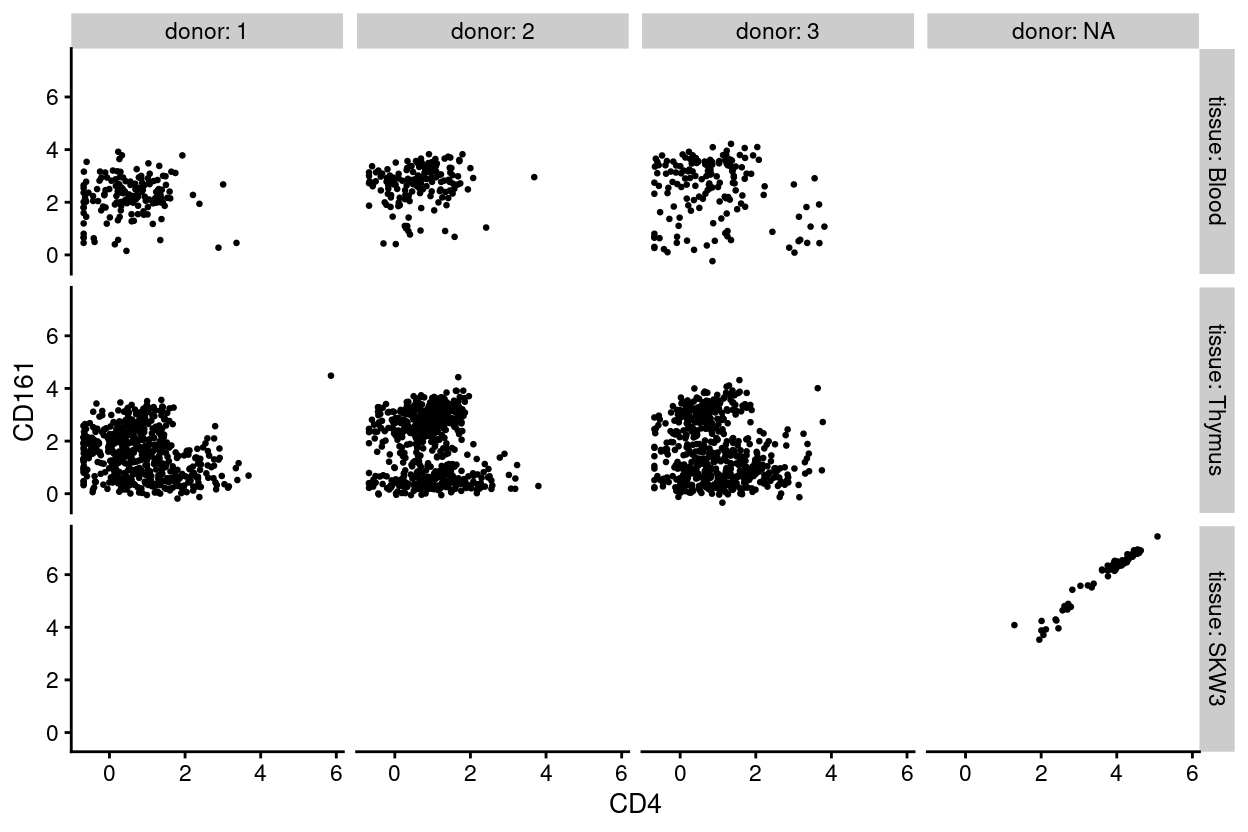
Figure 1: Expression of CD4 and CD161, as measured by FACS, for each sample.
Casey ‘post-hoc gated’ the single-cells into S1, S2, or S3 by transplanting the gating strategy used for the mini-bulk samples to the single-cells. Not all single-cells can be classified using these gates (e.g., some cells are seemingly CD4+/CD161+); these cells are labelled as Unknown.
Figure 2 re-plots the same data and colours each cell according to the post-hoc stage. We observe that boundaries between S1, S2, and S3 appear rather arbitrary1 and that the Unknown cells are a potpourri that includes cells that are intermediate between S1, S2, and S3 as well as a handful of CD4+/CD161+ cells.
Show code
bg <- dplyr::select(x, -donor, -tissue)
ggplot(aes(x = V525_50_A_CD4_BV510, y = B530_30_A_CD161_FITC), data = x) +
  geom_point(data = bg, colour = scales::alpha("grey", 0.5), size = 0.125) +
  geom_point(aes(colour = stage), alpha = 1, size = 0.5) +
  scale_fill_manual(
    values = stage_colours,
    name = "stage") +
  scale_colour_manual(
    values = stage_colours,
    name = "stage") +
  theme_cowplot(font_size = 10) +
  facet_grid(tissue ~ donor, labeller = label_both) +
  guides(colour = guide_legend(override.aes = list(size = 2, alpha = 1))) +
  xlab("CD4") +
  ylab("CD161")
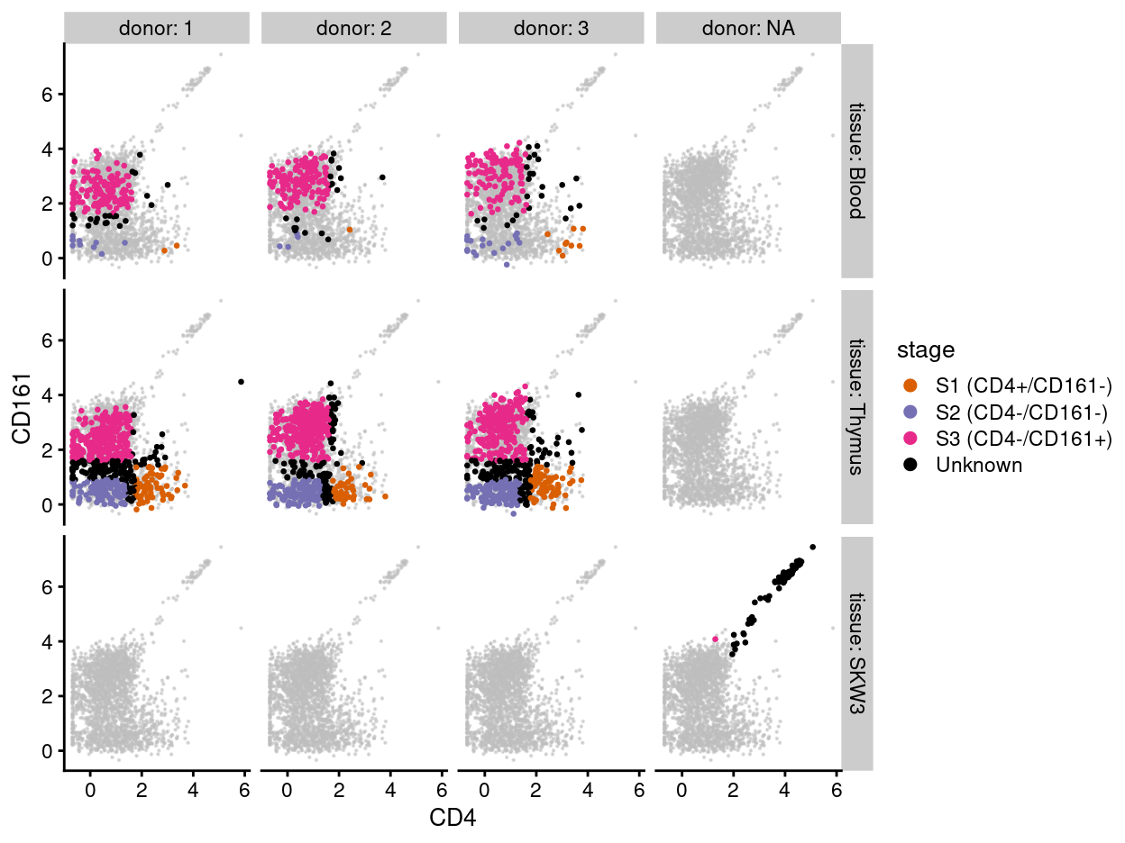
Figure 2: Expression of CD4 and CD161, as measured by FACS, for each sample and colouring each cell by its post-hoc stage.
Incorporating cell-based annotations
Cell-based annotations are included in the colData of the SingleCellExperiment. Figure 3 is a visual summary of the cell-based metadata.
Show code
p1 <- ggcells(sce) +
  geom_bar(aes(x = plate_number, fill = tissue),
    position = position_fill(reverse = TRUE)) +
  coord_flip() +
  ylab("Frequency") +
  theme_cowplot(font_size = 9) +
  scale_fill_manual(values = tissue_colours)
p2 <- ggcells(sce) +
  geom_bar(aes(x = plate_number, fill = donor),
    position = position_fill(reverse = TRUE)) +
  coord_flip() +
  ylab("Frequency") +
  theme_cowplot(font_size = 9) +
  scale_fill_manual(values = donor_colours)
p3 <-  ggcells(sce) +
  geom_bar(aes(x = plate_number, fill = stage),
    position = position_fill(reverse = TRUE)) +
  coord_flip() +
  ylab("Frequency") +
  theme_cowplot(font_size = 9) +
  scale_fill_manual(values = stage_colours)
p4 <- ggcells(sce) +
  geom_bar(aes(x = plate_number, fill = plate_number)) +
  coord_flip() +
  ylab("Number of single cells") +
  theme_cowplot(font_size = 9) +
  scale_fill_manual(values = plate_number_colours)
p1 + p2 + p3 + p4
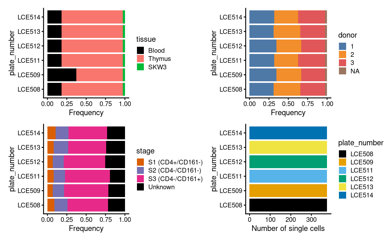
Figure 3: Breakdown of experiment by plate.
Figure 4 shows the design of each plate.
Show code
# TODO: Fix legend
p <- lapply(levels(sce$plate_number), function(p) {
  z <- sce[, sce$plate_number == p]
  plotPlatePosition(
    z,
    as.character(z$well_position),
    point_size = 2,
    point_alpha = 1,
    theme_size = 5,
    colour_by = "donor",
    shape_by = "tissue") +
    scale_colour_manual(values = donor_colours, name = "donor") +
    ggtitle(p) +
    theme(
      legend.text = element_text(size = 6),
      legend.title = element_text(size = 6)) +
    guides(
      colour = guide_legend(override.aes = list(size = 4)),
      shape = guide_legend(override.aes = list(size = 4)))
})

wrap_plots(p, ncol = 3) + plot_layout(guides = "collect")
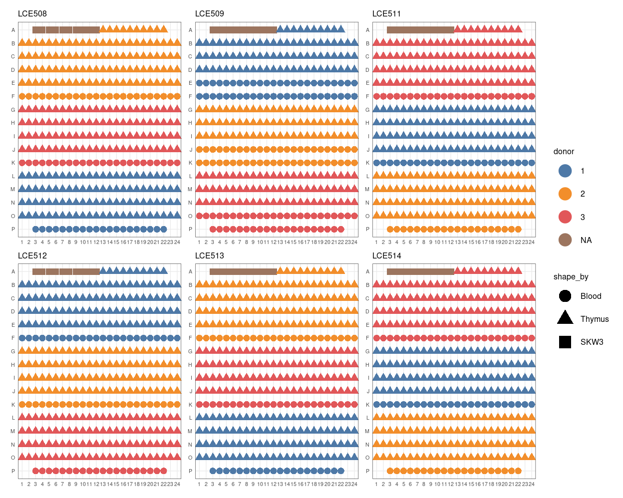
Figure 4: Plate maps.
Incorporating FACS data
We store the values from the FACS measurements as an ‘alternative experiment.’ We store both the ‘raw’ data and the ‘pseudolog-transformed’ data. The table below is a skimr summary of the ‘raw’ FACS measurements.
| Name | Piped data |
| Number of rows | 2256 |
| Number of columns | 11 |
| _______________________ | |
| Column type frequency: | |
| numeric | 11 |
| ________________________ | |
| Group variables | None |
Variable type: numeric
| skim_variable | n_missing | complete_rate | mean | sd | p0 | p25 | p50 | p75 | p100 | hist |
|---|---|---|---|---|---|---|---|---|---|---|
| FSC_A | 2 | 1 | 107758.76 | 17036.49 | 62976.00 | 96960.00 | 106816.01 | 116656.00 | 198080.01 | ▂▇▃▁▁ |
| SSC_A | 2 | 1 | 41675.87 | 16044.46 | 12096.00 | 30528.00 | 38272.00 | 48432.00 | 169344.00 | ▇▃▁▁▁ |
| B530_30_A_CD161_FITC | 2 | 1 | 1901.25 | 7741.33 | -52.01 | 152.49 | 603.57 | 1399.51 | 129036.06 | ▇▁▁▁▁ |
| B576_26_A_CD38_PE | 2 | 1 | 214.45 | 5474.18 | -110.59 | 35.65 | 91.80 | 153.55 | 259922.41 | ▇▁▁▁▁ |
| B710_50_A_CD3_Per_CP | 2 | 1 | 3755.17 | 1768.87 | -110.57 | 2687.26 | 3658.23 | 4702.36 | 40131.52 | ▇▁▁▁▁ |
| B780_60_A_Vd2_PE_Cy7 | 2 | 1 | 9081.48 | 5661.25 | -95.62 | 4950.54 | 7867.58 | 11901.29 | 38459.43 | ▇▆▂▁▁ |
| R780_60_A_L_D_Dump_APC_Cy7 | 2 | 1 | 236.57 | 205.22 | -110.57 | 81.70 | 217.43 | 371.38 | 939.13 | ▆▇▅▂▁ |
| V450_50_A_Vg9_BV421 | 2 | 1 | 980.46 | 1162.30 | -110.60 | 481.31 | 663.11 | 1037.90 | 31046.83 | ▇▁▁▁▁ |
| V525_50_A_CD4_BV510 | 2 | 1 | 327.75 | 967.93 | -110.59 | 42.47 | 136.91 | 279.28 | 26281.07 | ▇▁▁▁▁ |
| V670_40_A_CD45Ra_BV711 | 2 | 1 | 1419.47 | 3656.05 | -110.60 | -110.45 | -110.30 | 632.95 | 23668.12 | ▇▁▁▁▁ |
| V710_50_A_CD1a_BV786 | 2 | 1 | 2705.58 | 5291.19 | -110.59 | 250.10 | 667.30 | 1660.13 | 43694.87 | ▇▁▁▁▁ |
The table below is a skimr summary of the ‘pseudolog-transformed’ FACS measurements.
| Name | Piped data |
| Number of rows | 2256 |
| Number of columns | 11 |
| _______________________ | |
| Column type frequency: | |
| numeric | 11 |
| ________________________ | |
| Group variables | None |
Variable type: numeric
| skim_variable | n_missing | complete_rate | mean | sd | p0 | p25 | p50 | p75 | p100 | hist |
|---|---|---|---|---|---|---|---|---|---|---|
| FSC_A | 2 | 1 | 7.26 | 0.16 | 6.73 | 7.16 | 7.26 | 7.35 | 7.88 | ▁▃▇▂▁ |
| SSC_A | 2 | 1 | 6.26 | 0.35 | 5.08 | 6.01 | 6.23 | 6.47 | 7.72 | ▁▆▇▂▁ |
| B530_30_A_CD161_FITC | 2 | 1 | 2.02 | 1.28 | -0.34 | 0.89 | 2.10 | 2.93 | 7.45 | ▆▇▆▁▁ |
| B576_26_A_CD38_PE | 2 | 1 | 0.56 | 0.52 | -0.68 | 0.24 | 0.58 | 0.90 | 8.15 | ▇▁▁▁▁ |
| B710_50_A_CD3_Per_CP | 2 | 1 | 3.75 | 0.78 | -0.68 | 3.58 | 3.89 | 4.14 | 6.28 | ▁▁▂▇▁ |
| B780_60_A_Vd2_PE_Cy7 | 2 | 1 | 4.55 | 0.89 | -0.60 | 4.19 | 4.65 | 5.07 | 6.24 | ▁▁▁▇▅ |
| R780_60_A_L_D_Dump_APC_Cy7 | 2 | 1 | 1.04 | 0.77 | -0.68 | 0.52 | 1.17 | 1.64 | 2.53 | ▃▃▆▇▃ |
| V450_50_A_Vg9_BV421 | 2 | 1 | 2.27 | 0.79 | -0.68 | 1.88 | 2.19 | 2.63 | 6.03 | ▁▅▇▁▁ |
| V525_50_A_CD4_BV510 | 2 | 1 | 0.92 | 0.96 | -0.68 | 0.28 | 0.82 | 1.38 | 5.86 | ▆▇▂▁▁ |
| V670_40_A_CD45Ra_BV711 | 2 | 1 | 0.81 | 1.97 | -0.68 | -0.68 | -0.68 | 2.15 | 5.75 | ▇▂▂▁▁ |
| V710_50_A_CD1a_BV786 | 2 | 1 | 2.28 | 1.64 | -0.68 | 1.28 | 2.20 | 3.10 | 6.37 | ▅▇▇▃▂ |
Incorporating gene-based annotation
I used the Homo.sapiens package and the EnsDb.Hsapiens.v98 resource, which respectively cover the NCBI/RefSeq and Ensembl databases, to obtain gene-based annotations, such as the chromosome and gene symbol.
Having quantified gene expression against the GENCODE gene annotation, we have Ensembl-style identifiers for the genes. These identifiers are used as they are unambiguous and highly stable. However, they are difficult to interpret compared to the gene symbols which are more commonly used in the literature. Henceforth, we will use gene symbols (where available) to refer to genes in our analysis and otherwise use the Ensembl-style gene identifiers2.
We also construct some useful gene sets: mitochondrial genes, ribosomal protein genes, sex chromosome genes, and pseudogenes.
Show code
# Some useful gene sets
mito_set <- rownames(sce)[any(rowData(sce)$ENSEMBL.SEQNAME == "MT")]
ribo_set <- grep("^RP(S|L)", rownames(sce), value = TRUE)
# NOTE: A more curated approach for identifying ribosomal protein genes
#       (https://github.com/Bioconductor/OrchestratingSingleCellAnalysis-base/blob/ae201bf26e3e4fa82d9165d8abf4f4dc4b8e5a68/feature-selection.Rmd#L376-L380)
library(msigdbr)
c2_sets <- msigdbr(species = "Homo sapiens", category = "C2")
ribo_set <- union(
  ribo_set,
  c2_sets[c2_sets$gs_name == "KEGG_RIBOSOME", ]$gene_symbol)
ribo_set <- intersect(ribo_set, rownames(sce))
sex_set <- rownames(sce)[any(rowData(sce)$ENSEMBL.SEQNAME %in% c("X", "Y"))]
pseudogene_set <- rownames(sce)[
  any(grepl("pseudogene", rowData(sce)$ENSEMBL.GENEBIOTYPE))]
Plate alignment issue (LCE511)
Motivation
Casey and Dan reported that plate LCE511 came out alignment during the sort, specifically while sorting the final row (row P), which contains the Blood 2 cells (see Figure 4). Depending on how exactly the plate came out of alignment, this may have resulted in the wells in the adjacent row (row O) containing 2 cells (i.e. doublets with 1 cell from those intended for row O and 1 cells from those intended for row P).
We want to check:
- Do the wells in row P appear to be missing a cell?
- Do the wells in the previous row (row O) contain 2 cells (i.e. do they contain doublets)?
Analysis
Figure 5 plots the number of UMIs (sum) and number of genes detected (detected) for wells in each row of place LCE511. We observe substantially fewer UMIs and genes detected for the wells in row P, confirming that these wells appear to be missing a cell. However, we do not observe any strong differences in the number of UMIs or genes detected for the wells in row O compared to wells in rows L - N.
Show code
z <- sce[, sce$plate_number == "LCE511"]
z <- addPerCellQC(z, use.altexps = "ERCC")

p1 <- plotColData(
  z,
  y = "sum",
  x = I(
    interaction(
      substr(z$well_position, 1, 1),
      z$tissue,
      z$donor,
      drop = TRUE,
      lex.order = TRUE)),
  colour_by = "donor",
  shape_by = "tissue",
  point_alpha = 1,
  theme_size = 8) +
  scale_y_log10() +
  scale_colour_manual(values = donor_colours, name = "donor") +
  guides(colour = FALSE) +
  xlab("Row.tissue.donor") +
  theme(axis.text.x = element_text(angle = 45, hjust = 1))
p2 <- plotColData(
  z,
  y = "detected",
  x = I(
    interaction(
      substr(z$well_position, 1, 1),
      z$tissue,
      z$donor,
      drop = TRUE,
      lex.order = TRUE)),
  colour_by = "donor",
  shape_by = "tissue",
  point_alpha = 1,
  theme_size = 8) +
  scale_colour_manual(values = donor_colours, name = "donor") +
  guides(colour = FALSE) +
  xlab("Row.tissue.donor") +
  theme(axis.text.x = element_text(angle = 45, hjust = 1))
p1 + p2 +
  plot_layout(ncol = 2, guides = "collect") +
  plot_annotation("LCE511")
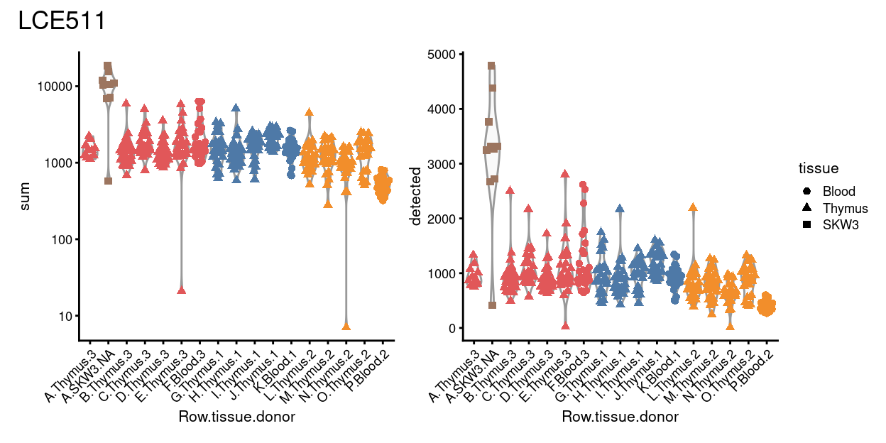
Figure 5: Distributions of various QC metrics for all samples on plate LCE511.
Thus far, we have no strong evidence that row O contains doublets. As another check, we look to see if the samples in these wells co-express mutually-exclusive tissue-marker genes. That is, since row O nominally contains Blood samples and row P nominally contained Thymus samples, we check if the samples in row O co-express Blood and Thymus marker genes3, which would provide evidence that row O wells contain doublets.
Figure 6 is a heatmap of Blood and Thymus marker genes for all wells on plate LCE511. Firstly, it shows that there aren’t any great markers of Blood vs. Thymus single-cells in this data. Secondly, and more importantly, there is some evidence that row O wells express some Blood-specific markers (e.g., NKG7, CCL5, HLA-B, HLA-C). However, these same markers are also expressed by the Thymus 1 samples in row J. There is no strong expression of the Thymus-specific markers in row O wells, but nor is there in any of the Thymus samples on this plate.
Show code
# TODO: Fix figure size and legend size.
library(scran)

tmp <- logNormCounts(
  sce[, sce$plate_number != "LCE511" &
        sce$tissue %in% c("Blood", "Thymus")])
colData(tmp) <- droplevels(colData(tmp))
w <- logNormCounts(
  sce[, sce$plate_number == "LCE511" &
        sce$tissue %in% c("Blood", "Thymus")])
w$row <- substr(w$well_position, 1, 1)
colData(w) <- droplevels(colData(w))

markers <- findMarkers(
  tmp,
  groups = tmp$tissue,
  direction = "up",
  test.type = "wilcox",
  block = tmp$donor)

features <- unlist(
  lapply(markers, function(x) head(rownames(x[x$FDR < 0.05, ]), 10)))
plotHeatmap(
  w,
  features,
  order_columns_by = c("tissue", "row", "donor"),
  center = TRUE,
  cluster_rows = FALSE,
  symmetric = TRUE,
  zlim = c(-3, 3),
  color = hcl.colors(101, "Blue-Red 3"),
  annotation_row = data.frame(
    tissue = sub("[0-9]+", "", names(features)),
    row.names = features),
  column_annotation_colors = list(
    tissue = tissue_colours[levels(w$tissue)],
    donor = donor_colours[levels(w$donor)]),
  main = "LCE511")
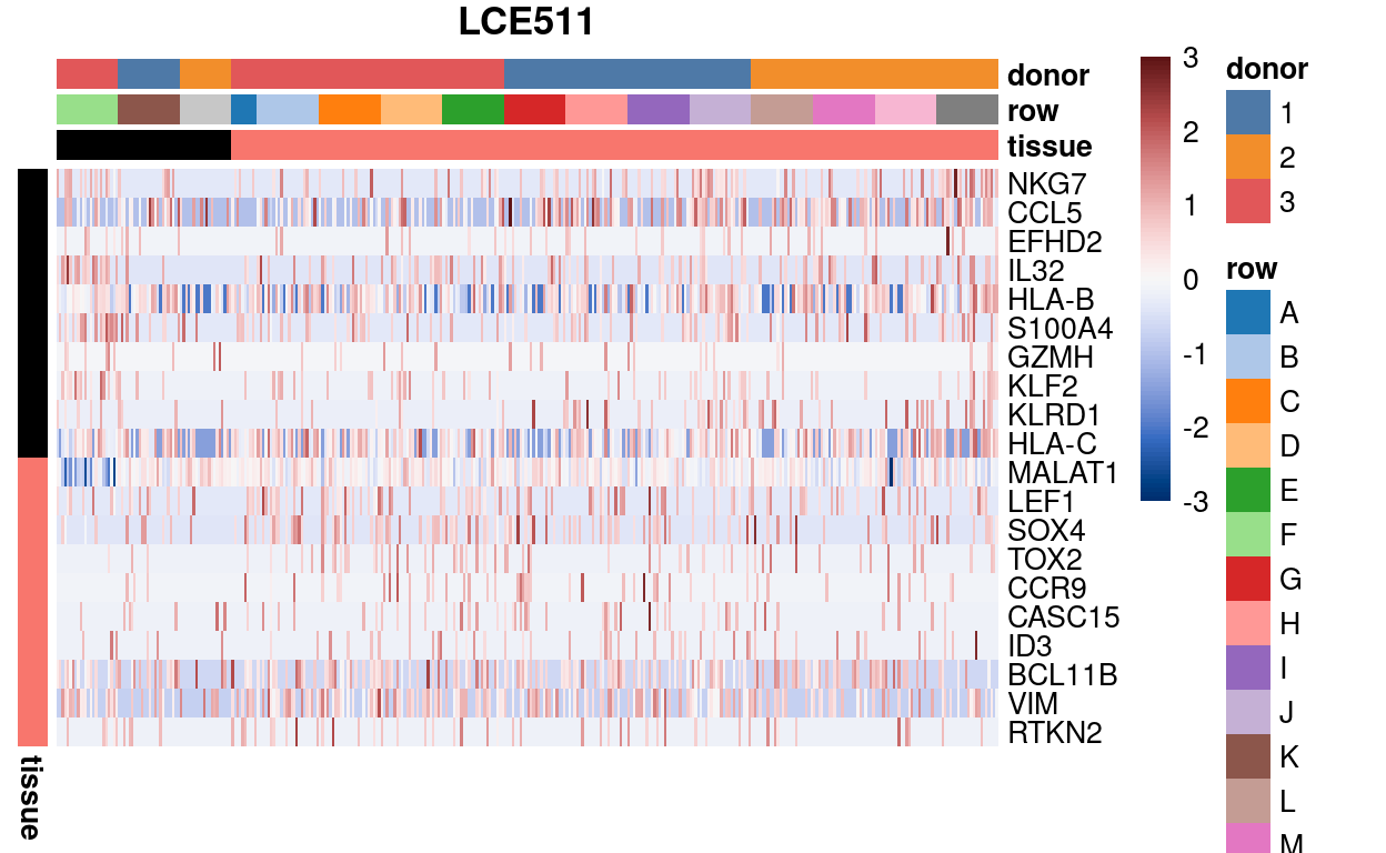
Figure 6: Expression of the top-10 Blood and Thymus marker genes for all wells on plate LCE511 grouped by Tissue then row. We are looking to see if the wells in row O co-express these marker genes.
Summary
Consistent with plate LCE511 having come out of alignment during the sort, specifically while sorting the final row (row P), we find that wells in this row have an unusually small number of UMIs and genes detected. We therefore remove these wells from further analysis. Since row P is the only row on plate LCE511 containing samples from Blood 2, this means that there are are no longer any single-cells from this sample on this plate.
Show code
remove_p <- sce$plate_number == "LCE511" &
  substr(sce$well_position, 1, 1) == "P"
sce <- sce[, !remove_p]
We have not found any strong evidence that the wells in the prior row (row O) have been contaminated by the sample intended for row P. However, since we have many additional single-cells from this sample elsewhere on this plate and on the other plates, we opt to also the row O wells on plate LCE511.
Show code
remove_o <- sce$plate_number == "LCE511" &
  substr(sce$well_position, 1, 1) == "O"
sce <- sce[, !remove_o]
colData(sce) <- droplevels(colData(sce))
Quality control of cells
Defining the quality control metrics
Low-quality cells need to be removed to ensure that technical effects do not distort downstream analysis results. We use several quality control (QC) metrics to measure the quality of the cells:
sum: This measures the library size of the cells, which is the total sum of UMI counts across both genes and spike-in transcripts. We want cells to have high library sizes as this means more RNA has been successfully captured during library preparation.detected: This is the number of expressed features4 in each cell. Cells with few expressed features are likely to be of poor quality, as the diverse transcript population has not been successful captured.altexps_ERCC_detected: This measures the proportion of reads which are mapped to spike-in transcripts relative to the library size of each cell. High proportions are indicative of poor-quality cells, where endogenous RNA has been lost during processing (e.g., due to cell lysis or RNA degradation). The same amount of spike-in RNA to each cell, so an enrichment in spike-in counts is symptomatic of loss of endogenous RNA.subsets_Mito_percent: This measures the proportion of reads which are mapped to mitochondrial RNA. If there is a higher than expected proportion of mitochondrial RNA this is often symptomatic of a cell which is under stress and is therefore of low quality and will not be used for the analysis.subsets_Ribo_percent: This measures the proportion of UMIs which are mapped to ribosomal protein genes. If there is a higher than expected proportion of ribosomal protein gene expression this is often symptomatic of a cell which is of compromised quality and we may want to exclude it from the analysis.
For CEL-Seq2 data, we typically observe library sizes that are in the tens of thousands5 and several thousand expressed genes per cell.
Visualizing the QC metrics
Figure 7 compares the QC metrics of the single-cell samples across the different sample (combination of tissue and donor) and Figure 8 further stratifies by plate_number. The number of UMIs, number of gene detected, and percentage of UMIs that are mapped to ERCC spike-ins are all higher in the ‘experimental’ samples than in the ‘control’ samples This likely reflects that the ‘experimental’ cells, which are γδ T cells, have a ‘smaller’ transcriptome than the ‘control’ cells (rather than this result being due to technical factors, although we cannot rule this out entirely). Together, these figures show that the vast majority of single-cell samples are good-quality6:
- The median library size is around 1,700.
- The median number of genes detected is around 1,000.
- The median percentage of UMIs that are mapped to mitochondrial RNA is around 8%.
- The median percentage of UMIs that are mapped to ribosomal protein genes is around 22%.
- The median percentage of UMIs that are mapped to ERCC spike-ins is around 19%.
Show code
p1 <- plotColData(
  sce,
  "sum",
  x = "sample",
  other_fields = "plate_number",
  point_size = 0.5,
  colour_by = "sample") +
  scale_y_log10() +
  annotation_logticks(
    sides = "l",
    short = unit(0.03, "cm"),
    mid = unit(0.06, "cm"),
    long = unit(0.09, "cm")) +
  theme(axis.text.x = element_blank()) +
  scale_colour_manual(values = sample_colours, name = "sample") +
  xlab("")
p2 <- plotColData(
  sce,
  "detected",
  x = "sample",
  other_fields = "plate_number",
  point_size = 0.5,
  colour_by = "sample") +
  theme(axis.text.x = element_blank()) +
  scale_colour_manual(values = sample_colours, name = "sample") +
  xlab("")
p3 <- plotColData(
  sce,
  "subsets_Mito_percent",
  x = "sample",
  other_fields = "plate_number",
  point_size = 0.5,
  colour_by = "sample") +
  ylim(0, NA) +
  theme(axis.text.x = element_blank()) +
  scale_colour_manual(values = sample_colours, name = "sample") +
  xlab("")
p4 <- plotColData(
  sce,
  "subsets_Ribo_percent",
  x = "sample",
  other_fields = c("plate_number", "sample_type"),
  point_size = 0.5,
  colour_by = "sample") +
  ylim(0, NA) +
  theme(axis.text.x = element_blank()) +
  scale_colour_manual(values = sample_colours, name = "sample") +
  xlab("")
p5 <- plotColData(
  sce,
  "altexps_ERCC_percent",
  x = "sample",
  other_fields = "plate_number",
  point_size = 0.5,
  colour_by = "sample") +
  ylim(0, NA) +
  theme(axis.text.x = element_blank()) +
  scale_colour_manual(values = sample_colours, name = "sample") +
  xlab("")
p1 + p2 + p3 + p4 + p5 +
  plot_layout(ncol = 2, guides = "collect")
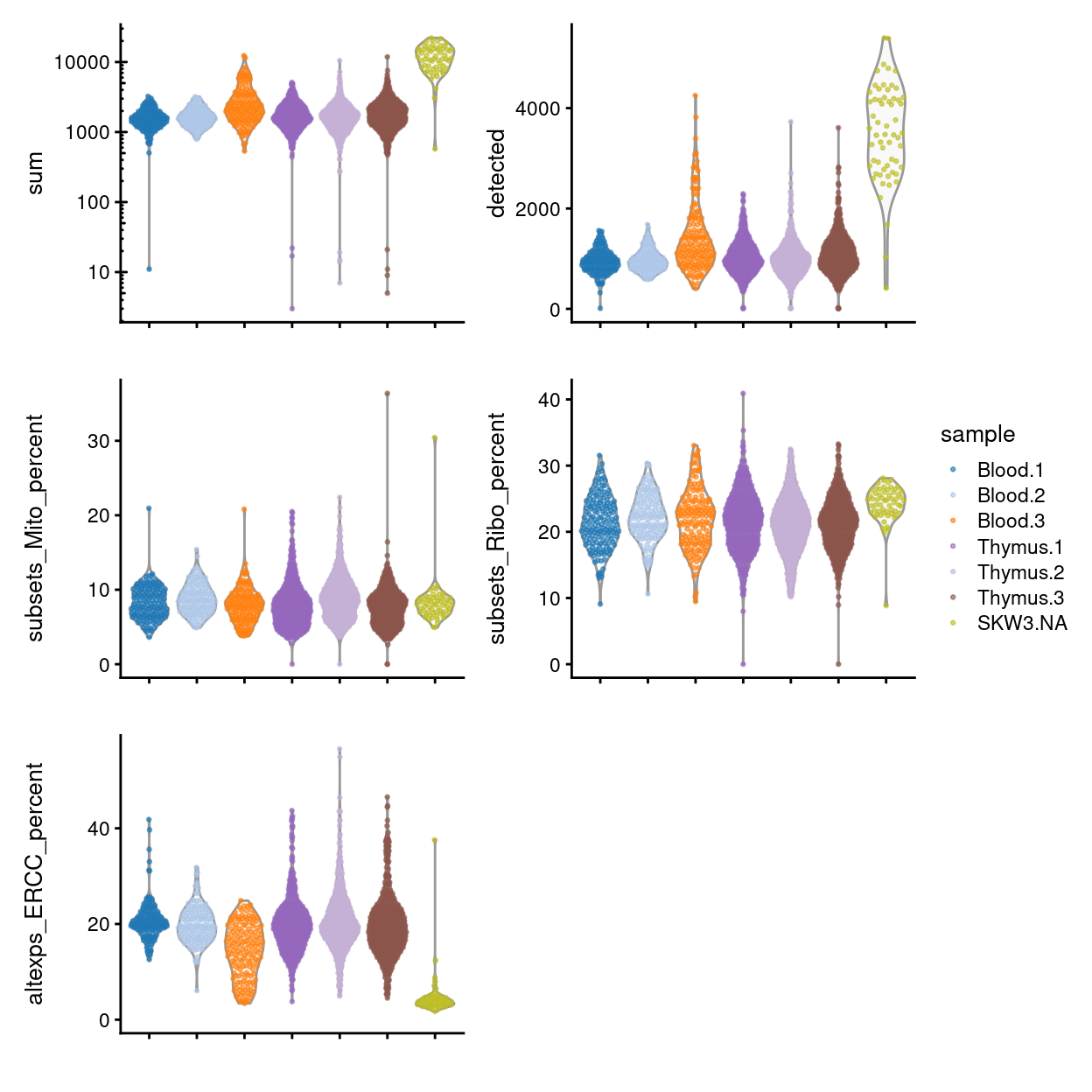
Figure 7: Distributions of various QC metrics for all samples in the dataset.
Figure 8 shows that QC metrics are generally consistent across plates.
Show code
p1 <- p1 + facet_wrap(~plate_number, ncol = 3)
p2 <- p2 + facet_wrap(~plate_number, ncol = 3)
p3 <- p3 + facet_wrap(~plate_number, ncol = 3)
p4 <- p4 + facet_wrap(~plate_number, ncol = 3)
p5 <- p5 + facet_wrap(~plate_number, ncol = 3)
p1 + p2 + p3 + p4 + p5 +
  plot_layout(ncol = 2, guides = "collect")
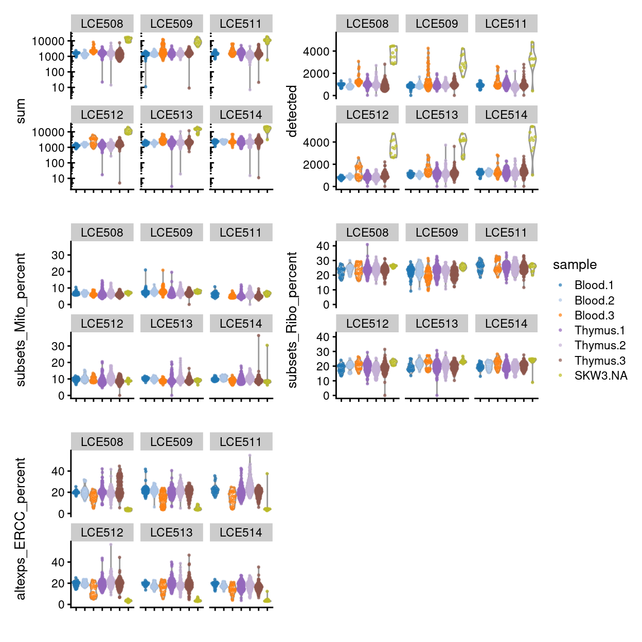
Figure 8: Distributions of various QC metrics for all samples in the dataset, stratified by plate_number.
Identifying outliers by each metric
Outliers are defined based on the median absolute deviation (MADs) from the median value of each metric across all cells. We remove small and large outliers for the library size and the number of expressed features, and large outliers for the spike-in proportions and mitochondrial gene expression proportions. Removal of low-quality cells is then performed by combining the filters for all of the metrics.
Due to the differences in the QC metrics by sample, we will compute the separate outlier thresholds for each sample.
Show code
sce$batch <- sce$sample
libsize_drop <- isOutlier(
  metric = sce$sum,
  nmads = 3,
  type = "lower",
  log = TRUE,
  batch = sce$batch)
feature_drop <- isOutlier(
  metric = sce$detected,
  nmads = 3,
  type = "lower",
  log = TRUE,
  batch = sce$batch)
spike_drop <- isOutlier(
  metric = sce$altexps_ERCC_percent,
  nmads = 3,
  type = "higher",
  batch = sce$batch)
mito_drop <- isOutlier(
  metric = sce$subsets_Mito_percent,
  nmads = 3,
  type = "higher",
  batch = sce$batch)
ribo_drop <- isOutlier(
  metric = sce$subsets_Ribo_percent,
  nmads = 3,
  type = "higher",
  batch = sce$batch)
The following table summarises the QC cutoffs:
Show code
libsize_drop_df <- data.frame(
  batch = colnames(attributes(libsize_drop)$thresholds),
  cutoff = attributes(libsize_drop)$thresholds["lower", ])
feature_drop_df <- data.frame(
  batch = colnames(attributes(feature_drop)$thresholds),
  cutoff = attributes(feature_drop)$thresholds["lower", ])
spike_drop_df <- data.frame(
  batch = colnames(attributes(spike_drop)$thresholds),
  cutoff = attributes(spike_drop)$thresholds["higher", ])
mito_drop_df <- data.frame(
  batch = colnames(attributes(mito_drop)$thresholds),
  cutoff = attributes(mito_drop)$thresholds["higher", ])
ribo_drop_df <- data.frame(
  batch = colnames(attributes(ribo_drop)$thresholds),
  cutoff = attributes(ribo_drop)$thresholds["higher", ])
qc_cutoffs_df <- Reduce(
  function(x, y) inner_join(x, y, by = "batch"),
  list(
    libsize_drop_df,
    feature_drop_df,
    spike_drop_df,
    mito_drop_df,
    ribo_drop_df))
qc_cutoffs_df$batch <- factor(qc_cutoffs_df$batch, levels(sce$batch))
colnames(qc_cutoffs_df) <- c(
  "batch", "total counts", "total features", "%ERCC", "%mito", "%ribo")
qc_cutoffs_df %>%
  arrange(batch) %>%
  knitr::kable(caption = "QC cutoffs", digits = 1)
| batch | total counts | total features | %ERCC | %mito | %ribo |
|---|---|---|---|---|---|
| Blood.1 | 630.5 | 454.8 | 26.9 | 15.1 | 33.4 |
| Blood.2 | 624.0 | 489.4 | 30.5 | 14.6 | 32.5 |
| Blood.3 | 398.5 | 353.4 | 34.1 | 14.1 | 36.2 |
| Thymus.1 | 493.5 | 391.3 | 33.0 | 15.8 | 35.3 |
| Thymus.2 | 510.0 | 385.9 | 33.9 | 17.3 | 33.4 |
| Thymus.3 | 464.1 | 381.5 | 34.7 | 15.0 | 32.8 |
| SKW3.NA | 2766.0 | 1467.2 | 6.7 | 12.3 | 32.0 |
Show code
sce_pre_QC_outlier_removal <- sce
keep <- !(libsize_drop | feature_drop | spike_drop | mito_drop)
sce_pre_QC_outlier_removal$keep <- keep
sce <- sce[, keep]
The table below summarises the number of cells per plate left following removal of outliers based on the QC metrics. The vast majority of cells are retained for all sample.
More cells are removed due to high percentages of ERCC transcripts or mitochondrial RNA than due to low library size and number of expressed genes. In total, we remove 92 cells based on these QC metrics, and retain 2,120 cells.
Show code
inner_join(
  distinct(
    as.data.frame(colData(sce)),
    batch, sample_gate, sample),
  data.frame(
    ByLibSize = tapply(
      libsize_drop,
      sce_pre_QC_outlier_removal$batch,
      sum),
    ByFeature = tapply(
      feature_drop,
      sce_pre_QC_outlier_removal$batch,
      sum),
    BySpike = tapply(
      spike_drop,
      sce_pre_QC_outlier_removal$batch,
      sum,
      na.rm = TRUE),
    ByMito = tapply(
      mito_drop,
      sce_pre_QC_outlier_removal$batch,
      sum,
      na.rm = TRUE),
    Remaining = as.vector(
      unname(table(sce$batch))),
    PercRemaining = round(
      100 * as.vector(unname(table(sce$batch))) /
        as.vector(unname(table(sce_pre_QC_outlier_removal$batch))),
      1)) %>%
    tibble::rownames_to_column("batch")) %>%
  dplyr::select(-batch) %>%
  arrange(desc(PercRemaining)) %>%
  knitr::kable(
    caption = "Number of samples removed by each QC step and the number of samples remaining. Rows are ordered by the percentage of cells remaining in that group.")
| sample_gate | sample | ByLibSize | ByFeature | BySpike | ByMito | Remaining | PercRemaining |
|---|---|---|---|---|---|---|---|
| P5 | Blood.3 | 0 | 0 | 0 | 1 | 159 | 99.4 |
| P5 | Blood.2 | 0 | 0 | 2 | 1 | 137 | 97.9 |
| P5 | Thymus.2 | 8 | 8 | 18 | 6 | 525 | 95.8 |
| P5 | Blood.1 | 2 | 2 | 6 | 1 | 153 | 95.6 |
| P5 | Thymus.1 | 5 | 7 | 18 | 10 | 546 | 95.5 |
| P5 | Thymus.3 | 4 | 6 | 24 | 2 | 545 | 95.3 |
| P5 | SKW3.NA | 1 | 2 | 5 | 1 | 55 | 91.7 |
Checking for removal of biologically relevant subpopulations
The biggest practical concern during QC is whether an entire cell type is inadvertently discarded. There is always some risk of this occurring as the QC metrics are never fully independent of biological state. We can diagnose cell type loss by looking for systematic differences in gene expression between the discarded and retained cells.
If the discarded pool is enriched for a certain cell type, we should observe increased expression of the corresponding marker genes. Figure 9 shows the result of this analysis, highlighting that there are few genes with a large \(logFC\) between ‘lost’ and ‘kept’ cells (those few genes with larger \(logFC\) have low average expression). This suggests that the QC step did not inadvertently filter out an entire biologically relevant subpopulation.
Show code
is_mito <- rownames(sce) %in% mito_set
is_ribo <- rownames(sce) %in% ribo_set
par(mfrow = c(1, 1))
plot(
  abundance,
  logFC,
  xlab = "Average expression",
  ylab = "Log-FC (lost/kept)",
  pch = 16)
points(
  abundance[is_mito],
  logFC[is_mito],
  col = "dodgerblue",
  pch = 16,
  cex = 1)
points(
  abundance[is_ribo],
  logFC[is_ribo],
  col = "orange",
  pch = 16,
  cex = 1)
abline(h = c(-1, 1), col = "red", lty = 2)
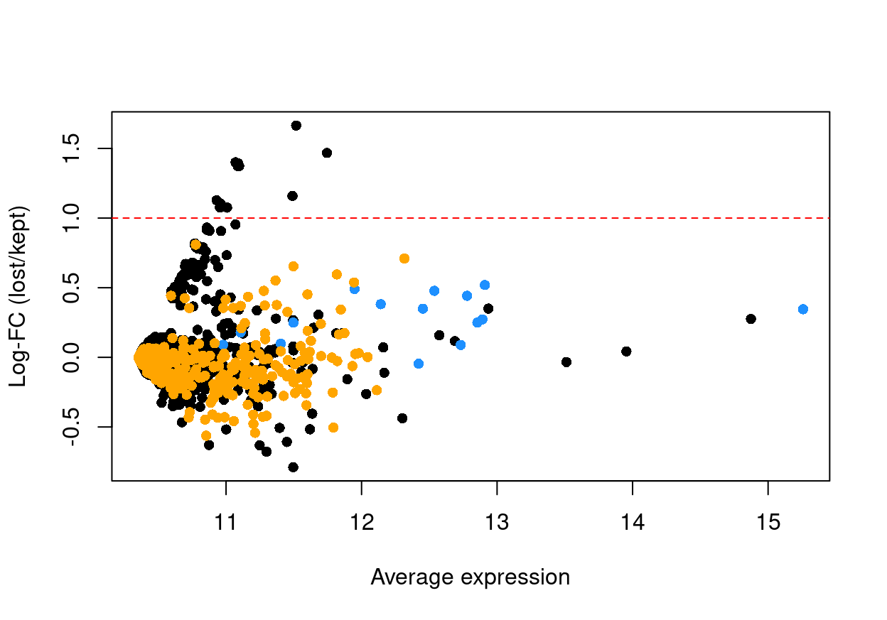
Figure 9: Log-fold change in expression in the discarded cells compared to the retained cells. Each point represents a gene with mitochondrial transcripts in blue and ribosomal protein genes in orange. Dashed red lines indicate $|logFC| = 1
Show code
library(Glimma)
glMDPlot(
  x = data.frame(abundance = abundance, logFC = logFC),
  xval = "abundance",
  yval = "logFC",
  counts = cbind(lost, kept),
    anno = cbind(
      flattenDF(rowData(sce_pre_QC_outlier_removal)),
      DataFrame(
        GeneID = rownames(sce_pre_QC_outlier_removal))),
  display.columns = c("ENSEMBL.SYMBOL", "ENSEMBL.GENEID", "ENSEMBL.SEQNAME"),
  groups = factor(c("lost", "kept")),
  samples = c("lost", "kept"),
  status = unname(ifelse(is_mito, 1, ifelse(is_ribo, -1, 0))),
  transform = FALSE,
  main = "lost vs. kept",
  side.ylab = "Average count",
  cols = c("orange", "black", "dodgerBlue"),
  path = here("output"),
  html = "qc-md-plot",
  launch = FALSE)
Another concern is whether the cells removed during QC preferentially derive from particular experimental groups. Figure 10 shows that we exclude more Thymus than Blood samples, although this is roughly proportional to the abundance of samples from each tissue.
Show code
ggcells(sce_pre_QC_outlier_removal, exprs_values = "counts") +
  geom_bar(aes(x = batch, fill = keep)) +
  ylab("Number of cells") +
  theme_cowplot(font_size = 6) +
  theme(axis.text.x = element_text(angle = 45, hjust = 1))
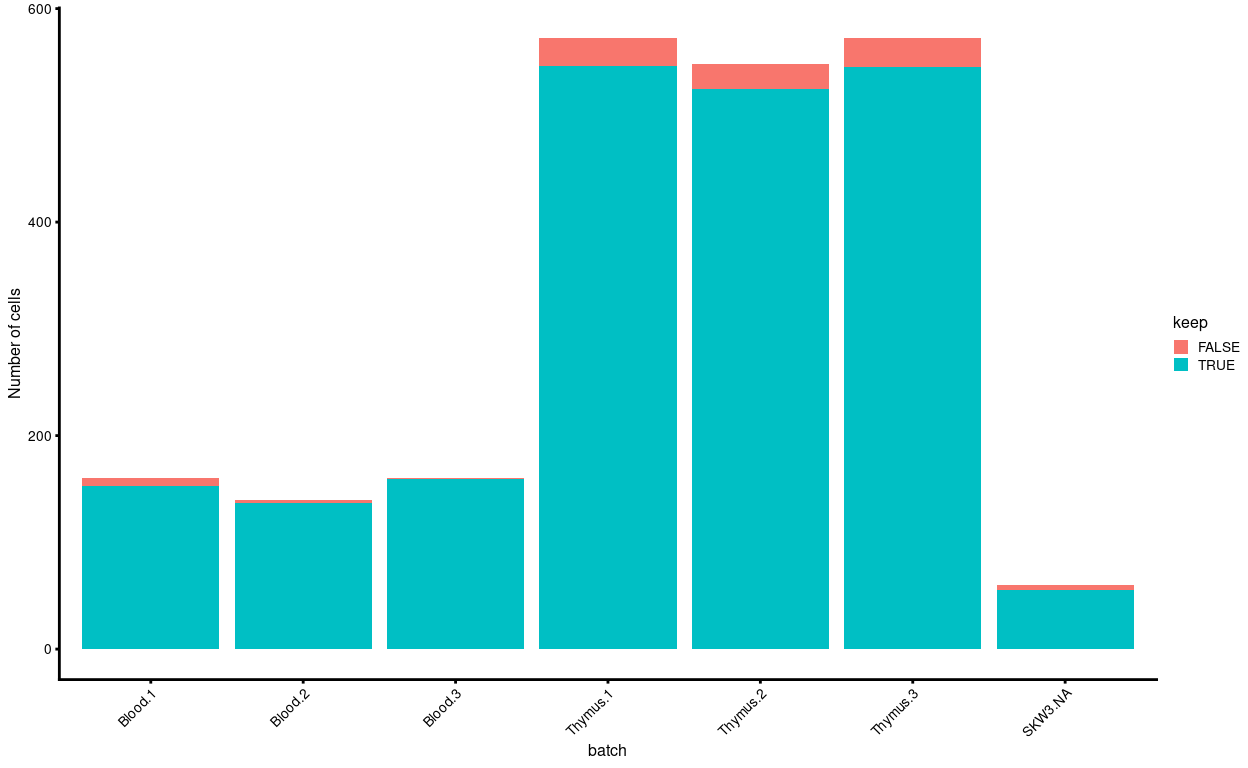
Figure 10: Cells removed during QC, stratified by experimental group.
Finally, Figure 11 compares the QC metrics of the discarded and retained cells.
Show code
p1 <- plotColData(
  sce_pre_QC_outlier_removal,
  "sum",
  x = "sample",
  colour_by = "keep",
  point_size = 0.5) +
  scale_y_log10() +
  theme(axis.text.x = element_text(angle = 45, hjust = 1)) +
  annotation_logticks(
    sides = "l",
    short = unit(0.03, "cm"),
    mid = unit(0.06, "cm"),
    long = unit(0.09, "cm"))
p2 <- plotColData(
  sce_pre_QC_outlier_removal,
  "detected",
  x = "sample",
  colour_by = "keep",
  point_size = 0.5) +
  theme(axis.text.x = element_text(angle = 45, hjust = 1))
p3 <- plotColData(
  sce_pre_QC_outlier_removal,
  "subsets_Mito_percent",
  x = "sample",
  colour_by = "keep",
  point_size = 0.5) +
  theme(axis.text.x = element_text(angle = 45, hjust = 1))
p4 <- plotColData(
  sce_pre_QC_outlier_removal,
  "subsets_Ribo_percent",
  x = "sample",
  colour_by = "keep",
  point_size = 0.5) +
  theme(axis.text.x = element_text(angle = 45, hjust = 1))
p1 + p2 + p3 + p4 + plot_layout(guides = "collect")
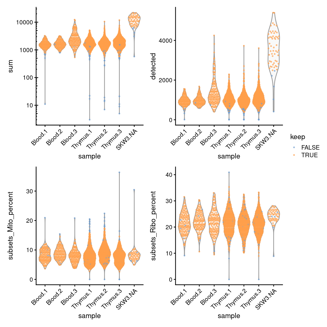
Figure 11: Distribution of QC metrics for each plate in the dataset. Each point represents a cell and is colored according to whether it was discarded during the QC process. Note that a cell will only be kept if it passes the relevant threshold for all QC metrics.
Summary
To conclude, Figures 12 and 13 shows that following QC that most samples have similar QC metrics, as is to be expected.
Show code
p1 <- plotColData(
  sce,
  "sum",
  x = "sample",
  other_fields = "plate_number",
  point_size = 0.5,
  colour_by = "sample") +
  scale_y_log10() +
  annotation_logticks(
    sides = "l",
    short = unit(0.03, "cm"),
    mid = unit(0.06, "cm"),
    long = unit(0.09, "cm")) +
  theme(axis.text.x = element_blank()) +
  scale_colour_manual(values = sample_colours, name = "sample") +
  xlab("")
p2 <- plotColData(
  sce,
  "detected",
  x = "sample",
  other_fields = "plate_number",
  point_size = 0.5,
  colour_by = "sample") +
  theme(axis.text.x = element_blank()) +
  xlab("")
p3 <- plotColData(
  sce,
  "subsets_Mito_percent",
  x = "sample",
  other_fields = "plate_number",
  point_size = 0.5,
  colour_by = "sample") +
  scale_y_log10() +
  ylim(0, NA) +
  theme(axis.text.x = element_blank()) +
  xlab("")
p4 <- plotColData(
  sce,
  "subsets_Ribo_percent",
  x = "sample",
  other_fields = c("plate_number", "sample_type"),
  point_size = 0.5,
  colour_by = "sample") +
  scale_y_log10() +
  ylim(0, NA) +
  theme(axis.text.x = element_blank()) +
  xlab("")
p5 <- plotColData(
  sce,
  "altexps_ERCC_percent",
  x = "sample",
  other_fields = "plate_number",
  point_size = 0.5,
  colour_by = "sample") +
  scale_y_log10() +
  ylim(0, NA) +
  theme(axis.text.x = element_blank()) +
  xlab("")

p1 + p2 + p3 + p4 + p5 +
  plot_layout(ncol = 2, guides = "collect")
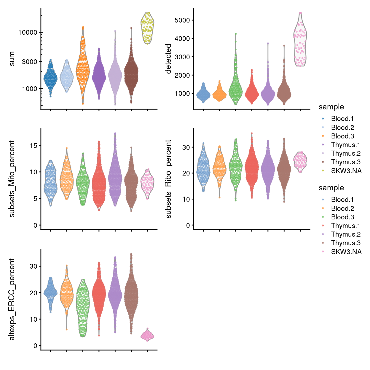
Figure 12: Distributions of various QC metrics for all samples in the dataset post-QC.
Show code
p1 <- p1 + facet_wrap(~plate_number, ncol = 3)
p2 <- p2 + facet_wrap(~plate_number, ncol = 3)
p3 <- p3 + facet_wrap(~plate_number, ncol = 3)
p4 <- p4 + facet_wrap(~plate_number, ncol = 3)
p5 <- p5 + facet_wrap(~plate_number, ncol = 3)

p1 + p2 + p3 + p4 + p5 +
  plot_layout(ncol = 2, guides = "collect")
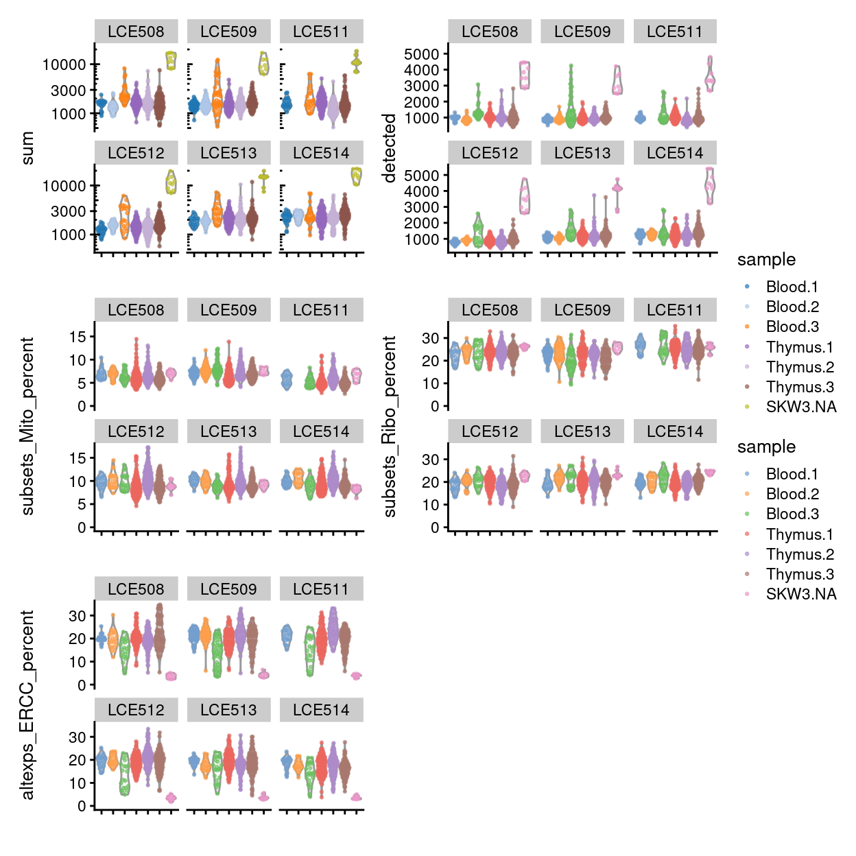
Figure 13: Distributions of various QC metrics for all single-cell samples in the dataset, stratified by plate_number.
Figure 14 summarises the experimental design following QC. We remind ourself that all Blood 2 samples on plate number LCE511 were excluded in Plate alignment issue (LCE511).
Show code
p1 <- ggcells(sce) +
  geom_bar(
    aes(x = plate_number, fill = sample),
    position = position_fill(reverse = TRUE)) +
  coord_flip() +
  ylab("Frequency") +
  theme_cowplot(font_size = 10) +
  scale_fill_manual(values = sample_colours)
p2 <- ggcells(sce) +
  geom_bar(aes(x = plate_number, fill = plate_number)) +
  coord_flip() +
  ylab("Number of samples") +
  theme_cowplot(font_size = 10) +
  scale_fill_manual(values = plate_number_colours)
p1 | p2
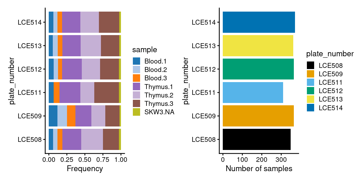
Figure 14: Breakdown of experiment by plate.
Examining gene-level metrics
Inspecting the most highly expressed genes
Figure 15 shows the most highly expressed genes across the cell population in the combined data set. Some of them are mitochondrial genes, matching what we’ve already seen in the QC metrics, and ribosomal protein genes, which commonly are amongst the most highly expressed genes in scRNA-seq data.
Show code
plotHighestExprs(sce, n = 50)
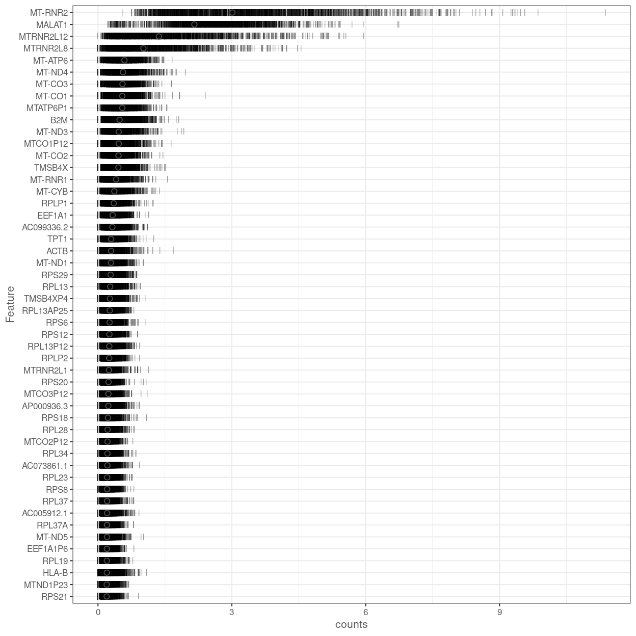
Figure 15: Percentage of total counts assigned to the top 50 most highly-abundant features in the combined data set. For each feature, each bar represents the percentage assigned to that feature for a single cell, while the circle represents the average across all cells.
Figure 16 shows the most highly expressed endogenous genes after excluding the mitochondrial and ribosomal protein genes.
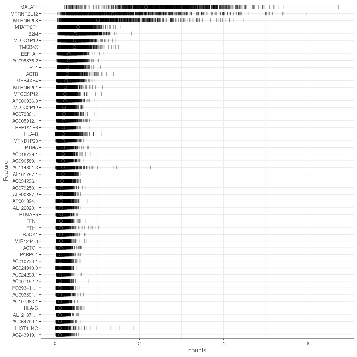
Figure 16: Percentage of total counts assigned to the top 50 most highly-abundant features in the combined data set. For each feature, each bar represents the percentage assigned to that feature for a single cell, while the circle represents the average across all cells. Bars are coloured by the total number of expressed features in each cell, while circles are coloured according to whether the feature is labelled as a control feature.
Filtering out low-abundance genes
Low-abundance genes are problematic as zero or near-zero counts do not contain much information for reliable statistical inference (Bourgon, Gentleman, and Huber 2010). These genes typically do not provide enough evidence to reject the null hypothesis during testing, yet they still increase the severity of the multiple testing correction. In addition, the discreteness of the counts may interfere with statistical procedures, e.g., by compromising the accuracy of continuous approximations. Thus, low-abundance genes are often removed in many RNA-seq analysis pipelines before the application of downstream methods.
The ‘optimal’ choice of filtering strategy depends on the downstream application. A more aggressive filter is usually required to remove discreteness (e.g., for normalization) compared to that required for removing underpowered tests. For hypothesis testing, the filter statistic should also be independent of the test statistic under the null hypothesis. Thus, we (or the relevant function) will filter at each step as needed, rather than applying a single filter for the entire analysis.
Several metrics can be used to define low-abundance genes. The most obvious is the average count for each gene, computed across all cells in the data set. We typically observe a peak of moderately expressed genes following a plateau of lowly expressed genes (Figure 17).
Show code
ave_counts <- calculateAverage(sce)
par(mfrow = c(1, 1))
hist(
  x = log10(ave_counts),
  breaks = 100,
  main = "",
  col = "grey",
  xlab = expression(Log[10] ~ "average count"))
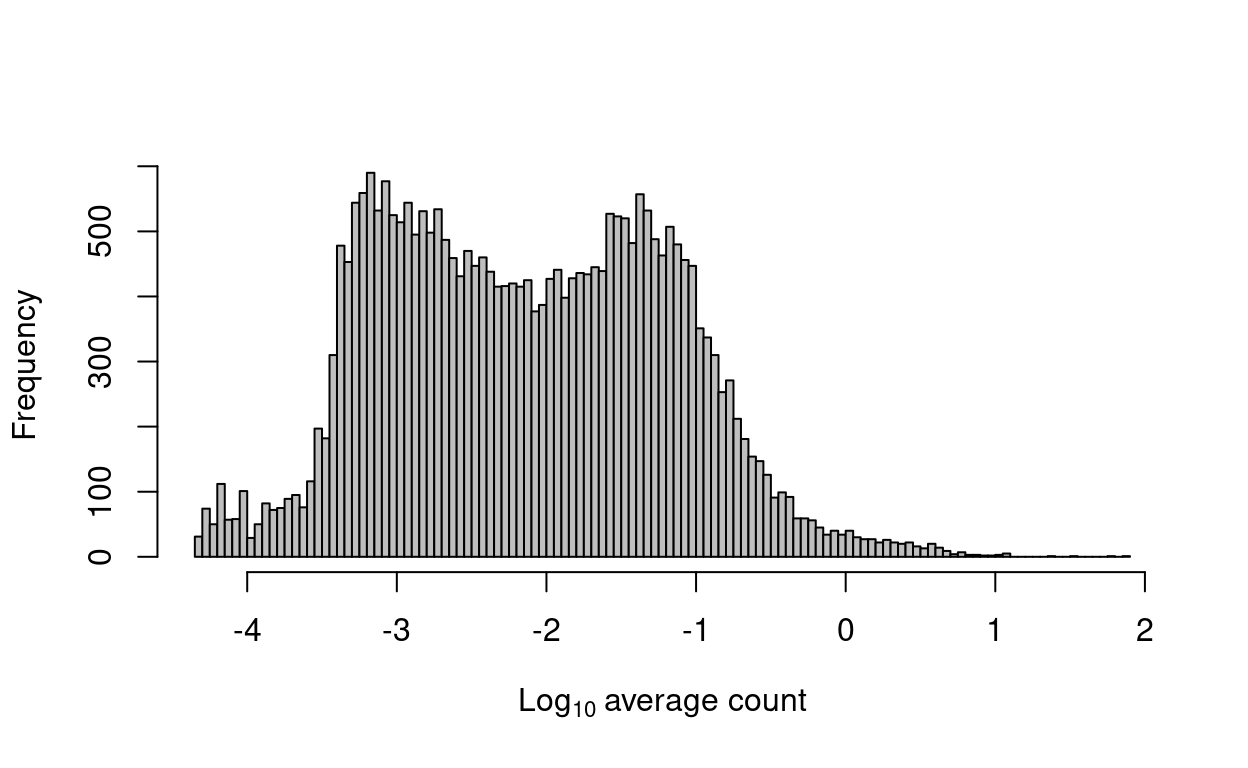
Figure 17: Histogram of log-average counts for all genes in the combined data set.
Show code
to_keep <- ave_counts > 0
sce <- sce[to_keep, ]
We remove 139 genes that are not expressed in any cell. Such genes provide no information and would be removed by any filtering strategy. We retain 27,999 for downstream analysis.
Normalization
UMI counts are subject to differences in capture efficiency and sequencing depth between cells (Stegle, Teichmann, and Marioni 2015). Normalization is required to eliminate these cell-specific biases prior to downstream quantitative analyses. This is often done by assuming that most genes are not differentially expressed (DE) between cells. Any systematic difference in count size across the non-DE majority of genes between two cells is assumed to represent bias and is removed by scaling. More specifically, ‘size factors’ are calculated that represent the extent to which counts should be scaled in each library.
Using the deconvolution method to deal with zero counts
Size factors can be computed with several different approaches, e.g., using the estimateSizeFactorsFromMatrix function in the DESeq2 package (Anders and Huber 2010; Love, Huber, and Anders 2014), or with the calcNormFactors function (Robinson and Oshlack 2010) in the edgeR package. However, single-cell data can be problematic for these bulk data-based methods due to the dominance of low and zero counts. To overcome this, we pool counts from many cells to increase the count size for accurate size factor estimation (A. T. Lun, Bach, and Marioni 2016). Pool-based size factors are then ‘deconvolved’ into cell-based factors for cell-specific normalization. This removes scaling biases associated with cell-specific differences in capture efficiency, sequencing depth and composition biases.
Show code
library(scran)
set.seed(9434887)
clusters <- quickCluster(sce)
round(prop.table(table(clusters, sce$batch), 1), 2)
sce <- computeSumFactors(sce, clusters = clusters, min.mean = 0.1)
summary(sizeFactors(sce))
We check that the size factors are roughly aligned with the total library sizes (Figure 18). Deviations from the diagonal correspond to composition biases due to differential expression between cell subpopulations.
Show code
xlim <- c(0.1, max(sce$sum) / 1e3)
ylim <- range(sizeFactors(sce))
par(mfrow = c(3, 3))
lapply(levels(sce$batch), function(b) {
  sce <- sce[, sce$batch == b]
  plot(
    x = sce$sum / 1e3,
    y = sizeFactors(sce),
    log = "xy",
    xlab = "Library size (thousands)",
    ylab = "Size factor",
    xlim = xlim,
    ylim = ylim,
    main = b,
    pch = 16,
    cex = 0.5)
})
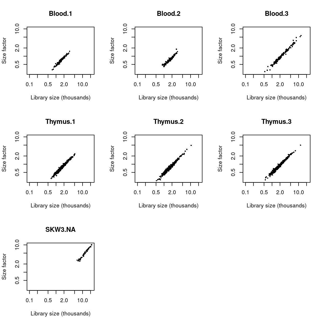
Figure 18: Size factors from deconvolution, plotted against library sizes for all cells in each dataset. Axes are shown on a log-scale.
Applying the size factors to normalize gene expression
The count data are used to compute normalized log-expression values for use in downstream analyses. Each value is defined as the log2-ratio of each count to the size factor for the corresponding cell, after adding a prior count of 1 to avoid undefined values at zero counts. Division by the size factor ensures that any cell-specific biases are removed.
Show code
# NOTE: No need for multiBatchNorm() since the size factors were computed
#       jointly using all samples.
sce <- logNormCounts(sce)
Computing separate size factors for spike-in transcripts
Size factors computed from the counts for endogenous genes are usually not appropriate for normalizing the counts for spike-in transcripts. To ensure normalization is performed correctly, we compute a separate set of size factors for the spike-in set. For each cell, the spike-in-specific size factor is defined as the total count across all transcripts in the spike-in set. This assumes that none of the spike-in transcripts are differentially expressed, which is reasonable given that the same amount and composition of spike-in RNA should have been added to each cell (A. T. L. Lun et al. 2017).
Show code
sizeFactors(altExp(sce, "ERCC")) <- librarySizeFactors(altExp(sce, "ERCC"))
Feature selection
Motivation
We often use scRNA-seq data in exploratory analyses to characterize heterogeneity across cells. Procedures like dimensionality reduction and clustering compare cells based on their gene expression profiles, which involves aggregating per-gene differences into a single (dis)similarity metric between a pair of cells. The choice of genes to use in this calculation has a major impact on the behaviour of the metric and the performance of downstream methods. We want to select genes that contain useful information about the biology of the system while removing genes that contain random noise. This aims to preserve interesting biological structure without the variance that obscures that structure. It also reduces the size of the dataset to improve computational efficiency of later steps.
Quantifying per-gene variation
Variance of the log-counts
The simplest approach to quantifying per-gene variation is to simply compute the variance of the log-normalized expression values (referred to as “log-counts” for simplicity) for each gene across all cells in the population (A. T. L. Lun, McCarthy, and Marioni 2016). This has an advantage in that the feature selection is based on the same log-values that are used for later downstream steps. In particular, genes with the largest variances in log-values will contribute the most to the Euclidean distances between cells. By using log-values here, we ensure that our quantitative definition of heterogeneity is consistent throughout the entire analysis.
Calculation of the per-gene variance is simple but feature selection requires modelling of the mean-variance relationship.
Quantifying technical noise
To account for the mean-variance relationship, we fit a trend to the variance with respect to abundance across the ERCC spike-in transcripts. The premise here is that spike-ins should not be affected by biological variation, so the fitted value of the spike-in trend should represent a better estimate of the technical component for each gene.
Accounting for blocking factors
Data containing multiple batches will often exhibit batch effects. We are usually not interested in highly variable genes (HVGs) that are driven by batch effects. Rather, we want to focus on genes that are highly variable within each batch. This is naturally achieved by performing trend fitting and variance decomposition separately for each batch. Here we treat each plate as a separate batch.
Show code
sce$batch <- sce$plate_number
batch_colours <- plate_number_colours
var_fit <- modelGeneVarWithSpikes(sce, "ERCC", block = sce$batch)
The use of a batch-specific trend fit is useful as it accommodates differences in the mean-variance trends between batches. This is especially important if batches exhibit systematic technical differences, e.g., differences in coverage or in the amount of spike-in RNA added.
Figure 19 visualizes the quality of the batch-specific trend fits and Figure 20 highlights the need for batch-specific estimates of these fits. The analysis of each plate yields estimates of the biological and technical components for each gene, which are averaged across plates to take advantage of information from multiple batches.
Show code
xlim <- c(0, max(sapply(var_fit$per.block, function(x) max(x$mean))))
ylim <- c(0, max(sapply(var_fit$per.block, function(x) max(x$total))))
par(mfrow = c(2, 3))
blocked_stats <- var_fit$per.block
for (i in colnames(blocked_stats)) {
  current <- blocked_stats[[i]]
  plot(
    current$mean,
    current$total,
    main = i,
    pch = 16,
    cex = 0.5,
    xlab = "Mean of log-expression",
    ylab = "Variance of log-expression",
    xlim = xlim,
    ylim = ylim)
  curfit <- metadata(current)
  points(curfit$mean, curfit$var, col = "red", pch = 16)
  curve(curfit$trend(x), col = batch_colours[[i]], add = TRUE, lwd = 2)
}
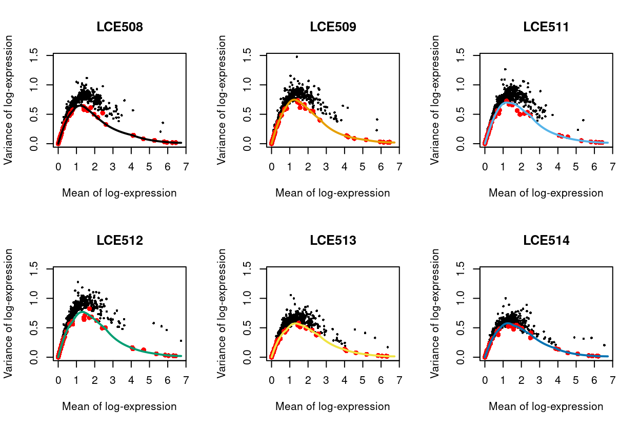
Figure 19: Variance of normalized log-expression values for each gene in each plate, plotted against the mean log-expression. The coloured line represents the mean-dependent trend fitted to the variances of the spike-in transcripts (red).
Show code
par(mfrow = c(1, 1))
# NOTE: 'Fake' plot with right dimensions to overlay trends.
plot(
  x = current$mean,
  y = current$total,
  pch = 0,
  cex = 0.6,
  xlab = "Mean log-expression",
  ylab = "Variance of log-expression",
  main = "Trends",
  xlim = xlim,
  ylim = ylim,
  col = "white")
lapply(colnames(blocked_stats), function(b) {
  curve(
    metadata(var_fit$per.block[[b]])$trend(x),
    col = batch_colours[b],
    lwd = 1,
    add = TRUE)
})
legend(
  "topright",
  legend = levels(sce$batch),
  col = batch_colours,
  lwd = 2,
  title = "Plate number",
  ncol = 2,
  cex = 0.8)
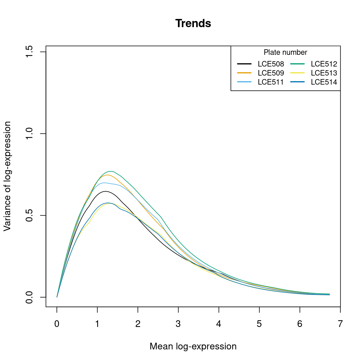
Figure 20: An overlay of the trend fits from the previous figure, highlighting the need for the batch-specific trend fits. Each line is a the trend line for a particular batch (with colours matching the previous plot).
Selecting highly variable genes (HVGs)
Once we have quantified the per-gene variation, the next step is to select the subset of HVGs to use in downstream analyses. A larger subset will reduce the risk of discarding interesting biological signal by retaining more potentially relevant genes, at the cost of increasing noise from irrelevant genes that might obscure said signal. It is difficult to determine the optimal trade-off for any given application as noise in one context may be useful signal in another. For example, heterogeneity in T cell activation responses is an interesting phenomena but may be irrelevant noise in studies that only care about distinguishing the major immunophenotypes.
We opt to only remove the obviously uninteresting genes with variances below the trend. By doing so, we avoid the need to make any judgement calls regarding what level of variation is interesting enough to retain. This approach represents one extreme of the bias-variance trade-off where bias is minimized at the cost of maximizing noise.
Show code
hvg <- getTopHVGs(var_fit, var.threshold = 0)
Exclusion of gene sets from HVGs
Show code
is_mito <- hvg %in% mito_set
is_ribo <- hvg %in% ribo_set
is_pseudogene <- hvg %in% pseudogene_set
is_sex <- hvg %in% sex_set
We find that the most highly variable genes in this dataset are somewhat enriched for pseudogenes (n = 4543), with Figure 21 showing around 1/3 of the top-500 HVGs are pseudogenes. Figure 21 also shows the percentage of the top-k HVGs that are ribosomal protein genes7 (n = 859), genes on the sex chromosomes (n = 873), and mitochondrial genes (n = 27).
Show code
plot(
  100 * cumsum(is_mito) / seq_along(hvg),
  log = "x",
  ylim = c(0, 100),
  ylab = "%",
  xlab = "Top-k genes",
  col = "#DF536B",
  pch = 16)
points(100 * cumsum(is_ribo) / seq_along(hvg), col = "#61D04F", pch = 16)
points(100 * cumsum(is_pseudogene) / seq_along(hvg), col = "#2297E6", pch = 16)
points(100 * cumsum(is_sex) / seq_along(hvg), col = "#28E2E5", pch = 16)
points(
  100 * cumsum(is_mito | is_ribo | is_pseudogene | is_sex) / seq_along(hvg),
  col = "black",
  pch = 16)
legend(
  "topright",
  pch = 16,
  col = c("black",  "#2297E6", "#61D04F", "#28E2E5", "#DF536B"),
  legend = c("Union", "Pseudogene", "Ribosomal protein", "Sex", "Mitochondrial"))
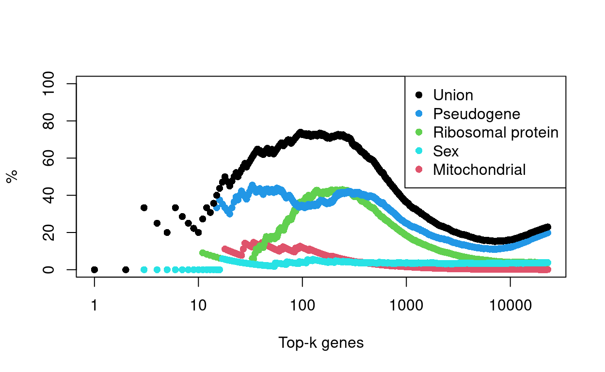
Figure 21: Percentage of top-K HVGs that are genes of a given class.
Generally speaking, pseudogenes, ribosomal protein genes, and mitochondrial genes are of lesser biological relevance, so we tend may exclude them from the HVGs. This means that these genes can no longer directly influence some of the subsequent steps in the analysis, including:
- Dimensionality reduction
- Principal component analysis (PCA)
- Uniform manifold approximation and projection (UMAP)
- Data integration
- Mutual nearest neighbours (MNN)
- Clustering
Although the exclusion of these genes from the HVGs prevents them from directly influencing these analyses, they may still indirectly associated with these steps or their outcomes. For example, if there is a set of (non ribosomal protein) genes that are strongly associated with ribosomal protein gene expression, then we may still see a cluster associated with ribosomal protein gene expression.
Finally, and to emphasise, we have only excluded these gene sets from the HVGs, i.e. we have not excluded them entirely from the dataset. In particular, this means that these genes may appear in downstream results (e.g., gene lists resulting from a differential expression analysis between cells in different clusters or with different genotypes).
Show code
hvg <- hvg[!(is_mito | is_ribo | is_pseudogene)]
Summary
We are left with 18,248 HVGs by this approach8. Figure 22 shows the expression of the top-10 HVGs.
Show code
plotExpression(object = sce, features = hvg[1:10])
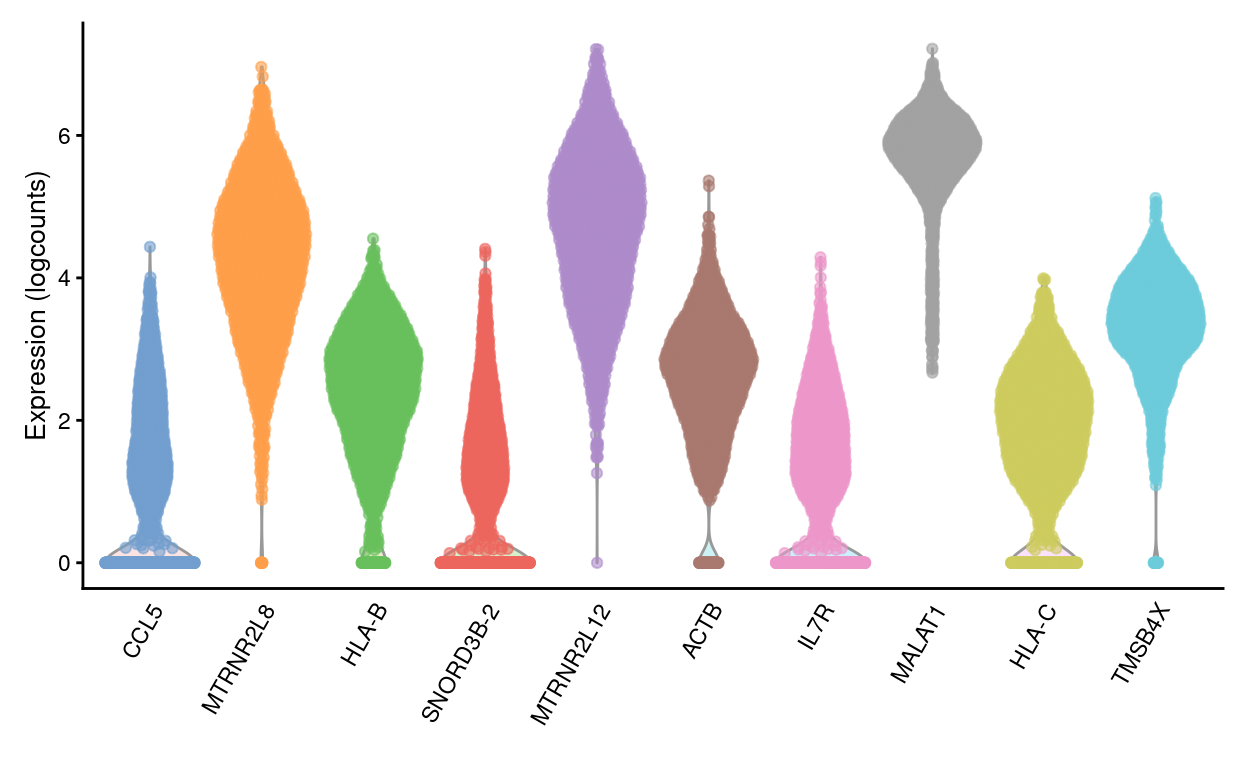
Figure 22: Violin plots of normalized log-expression values for the top-10 HVGs. Each point represents the log-expression value in a single cell.
Dimensionality reduction
Many scRNA-seq analysis procedures involve comparing cells based on their expression values across multiple genes. In these applications, each individual gene represents a dimension of the data. If we had a scRNA-seq data set with two genes, we could make a two-dimensional plot where each axis represents the expression of one gene and each point in the plot represents a cell. Dimensionality reduction extends this idea to data sets with thousands of genes where each cell’s expression profile defines its location in the high-dimensional expression space.
As the name suggests, dimensionality reduction aims to reduce the number of separate dimensions in the data. This is possible because different genes are correlated if they are affected by the same biological process. Thus, we do not need to store separate information for individual genes, but can instead compress multiple features into a single dimension. This reduces computational work in downstream analyses, as calculations only need to be performed for a few dimensions rather than thousands of genes; reduces noise by averaging across multiple genes to obtain a more precise representation of the patterns in the data; and enables effective plotting of the data, for those of us who are not capable of visualizing more than 3 dimensions.
Principal component analysis
Principal components analysis (PCA) discovers axes in high-dimensional space that capture the largest amount of variation. In PCA, the first axis (or “principal component,” PC) is chosen such that it captures the greatest variance across cells. The next PC is chosen such that it is orthogonal to the first and captures the greatest remaining amount of variation, and so on.
By definition, the top PCs capture the dominant factors of heterogeneity in the data set. Thus, we can perform dimensionality reduction by restricting downstream analyses to the top PCs. This strategy is simple, highly effective and widely used throughout the data sciences.
When applying PCA to scRNA-seq data, our assumption is that biological processes affect multiple genes in a coordinated manner. This means that the earlier PCs are likely to represent biological structure as more variation can be captured by considering the correlated behaviour of many genes. By comparison, random technical or biological noise is expected to affect each gene independently. There is unlikely to be an axis that can capture random variation across many genes, meaning that noise should mostly be concentrated in the later PCs. This motivates the use of the earlier PCs in our downstream analyses, which concentrates the biological signal to simultaneously reduce computational work and remove noise.
We perform the PCA on the log-normalized expression values. PCA is generally robust to random noise but an excess of it may cause the earlier PCs to capture noise instead of biological structure. This effect can be avoided - or at least mitigated - by restricting the PCA to a subset of HVGs, as done in Feature selection.
The choice of the number of PCs is a decision that is analogous to the choice of the number of HVGs to use. Using more PCs will avoid discarding biological signal in later PCs, at the cost of retaining more noise.
We use the strategy of retaining all PCs until the percentage of total variation explained reaches some threshold. We derive a suitable value for this threshold by calculating the proportion of variance in the data that is attributed to the biological component. This is done using the the variance modelling results from Quantifying per-gene variation.
Show code
set.seed(557)
sce <- denoisePCA(sce, var_fit, subset.row = hvg)
This retains 50 dimensions, which represents the lower bound on the number of PCs required to retain all biological variation. Any fewer PCs will definitely discard some aspect of biological signal9. This approach provides a reasonable choice when we want to retain as much signal as possible while still removing some noise.
Dimensionality reduction for visualization
We use the uniform manifold approximation and projection (UMAP) method (McInnes, Healy, and Melville 2018) to perform further dimensionality reduction for visualization.
Figure 23 visualizes the cells using the UMAP co-ordinates, colouring the cells by key experimental factors, and Figures 28 use facetting to further tease out associations between UMAP co-ordinates and experimental factors.
Show code
p1 <- plotUMAP(sce, colour_by = "donor", point_size = 0.5, point_alpha = 1) +
  scale_colour_manual(values = donor_colours, name = "donor") +
  theme_cowplot(font_size = 10)
p2 <- plotUMAP(
  sce,
  colour_by = "plate_number",
  point_size = 0.5,
  point_alpha = 1) +
  scale_colour_manual(values = plate_number_colours, name = "plate_number") +
  theme_cowplot(font_size = 10)
p3 <- plotUMAP(
  sce,
  colour_by = "stage",
  point_size = 0.5,
  point_alpha = 1) +
  scale_colour_manual(
    values = stage_colours,
    name = "stage") +
  theme_cowplot(font_size = 10)
p4 <- plotUMAP(sce, colour_by = "tissue", point_size = 0.5, point_alpha = 1) +
  scale_colour_manual(values = tissue_colours, name = "tissue") +
  theme_cowplot(font_size = 10)
p5 <- plotUMAP(
  sce,
  colour_by = data.frame(`log10(sum)` = log10(sce$sum), check.names = FALSE),
  point_size = 0.5,
  point_alpha = 1) +
  theme_cowplot(font_size = 10)

p1 + p2 + p3 + p4 + p5 + plot_layout(ncol = 2)
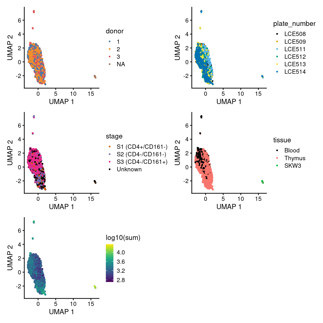
Figure 23: UMAP plot of the dataset. Each point represents a cell and is coloured according to the legend.
Show code
umap_df <- makePerCellDF(sce)
bg <- dplyr::select(umap_df, -donor)
ggplot(aes(x = UMAP.1, y = UMAP.2), data = umap_df) +
  geom_point(data = bg, colour = scales::alpha("grey", 0.5), size = 0.125) +
  geom_point(aes(colour = donor), alpha = 1, size = 0.5) +
  scale_fill_manual(values = donor_colours, name = "donor") +
  scale_colour_manual(values = donor_colours, name = "donor") +
  theme_cowplot(font_size = 10) +
  xlab("UMAP 1") +
  ylab("UMAP 2") +
  facet_wrap(~donor, ncol = 2, labeller = label_both) +
  guides(colour = guide_legend(override.aes = list(size = 2, alpha = 1))) +
  guides(colour = FALSE)
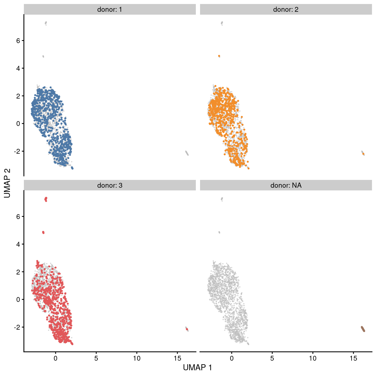
Figure 24: UMAP plot of the dataset. Each point represents a cell and each panel highlights cells from a particular donor.
Show code
umap_df <- makePerCellDF(sce)
bg <- dplyr::select(umap_df, -plate_number)
ggplot(aes(x = UMAP.1, y = UMAP.2), data = umap_df) +
  geom_point(data = bg, colour = scales::alpha("grey", 0.5), size = 0.125) +
  geom_point(aes(colour = plate_number), alpha = 1, size = 0.5) +
  scale_fill_manual(values = plate_number_colours, name = "plate_number") +
  scale_colour_manual(values = plate_number_colours, name = "plate_number") +
  theme_cowplot(font_size = 10) +
  xlab("UMAP 1") +
  ylab("UMAP 2") +
  facet_wrap(~plate_number, ncol = 3) +
  guides(colour = guide_legend(override.aes = list(size = 2, alpha = 1))) +
  guides(colour = FALSE)
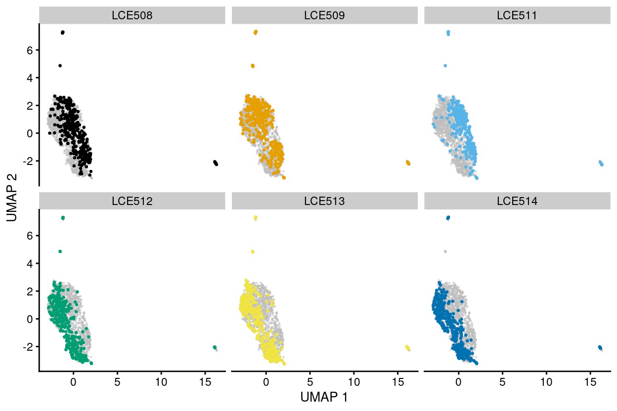
Figure 25: UMAP plot of the dataset. Each point represents a cell and each panel highlights cells from a particular plate_number.
Show code
umap_df <- makePerCellDF(sce)
bg <- dplyr::select(umap_df, -stage)
ggplot(aes(x = UMAP.1, y = UMAP.2), data = umap_df) +
  geom_point(data = bg, colour = scales::alpha("grey", 0.5), size = 0.125) +
  geom_point(aes(colour = stage), alpha = 1, size = 0.5) +
  scale_fill_manual(
    values = stage_colours,
    name = "stage") +
  scale_colour_manual(
    values = stage_colours,
    name = "stage") +
  theme_cowplot(font_size = 10) +
  xlab("UMAP 1") +
  ylab("UMAP 2") +
  facet_wrap(~stage, ncol = 2) +
  guides(colour = guide_legend(override.aes = list(size = 2, alpha = 1))) +
  guides(colour = FALSE)
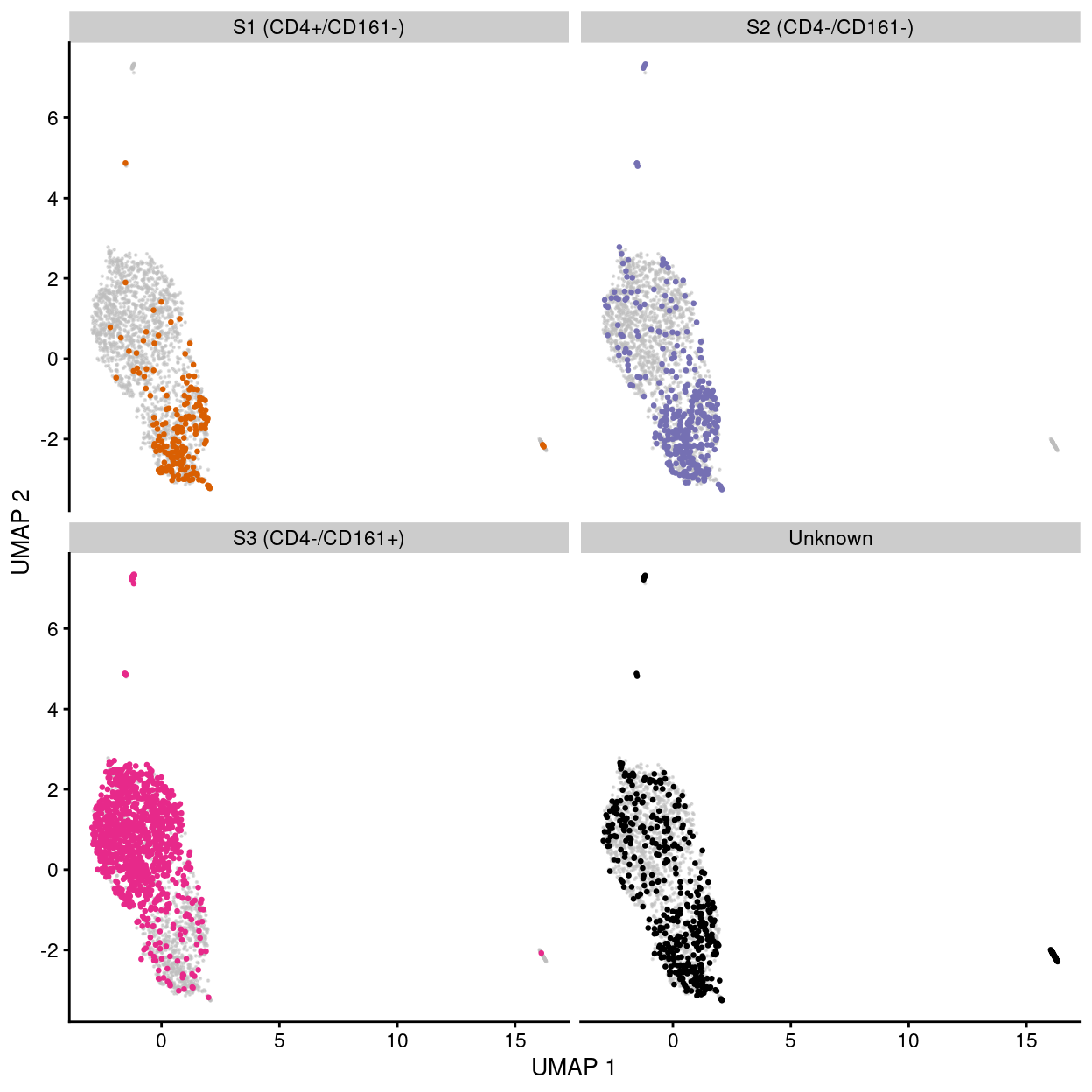
Figure 26: UMAP plot of the dataset. Each point represents a cell and each panel highlights cells from a particular stage.
Show code
umap_df <- makePerCellDF(sce)
bg <- dplyr::select(umap_df, -tissue)
ggplot(aes(x = UMAP.1, y = UMAP.2), data = umap_df) +
  geom_point(data = bg, colour = scales::alpha("grey", 0.5), size = 0.125) +
  geom_point(aes(colour = tissue), alpha = 1, size = 0.5) +
  scale_fill_manual(values = tissue_colours, name = "tissue") +
  scale_colour_manual(values = tissue_colours, name = "tissue") +
  theme_cowplot(font_size = 10) +
  xlab("UMAP 1") +
  ylab("UMAP 2") +
  facet_wrap(~tissue, ncol = 2) +
  guides(colour = guide_legend(override.aes = list(size = 2, alpha = 1))) +
  guides(colour = FALSE)
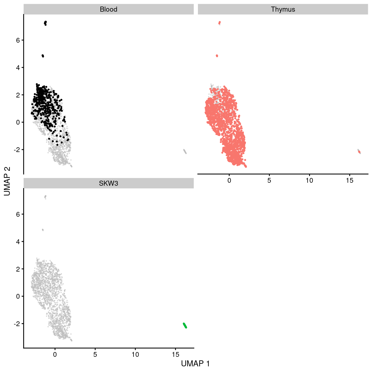
Figure 27: UMAP plot of the dataset. Each point represents a cell and each panel highlights cells from a particular tissue.
Show code
umap_df <- makePerCellDF(sce)
bg <- dplyr::select(umap_df, -tissue, -stage)
ggplot(aes(x = UMAP.1, y = UMAP.2), data = umap_df) +
  geom_point(data = bg, colour = scales::alpha("grey", 0.5), size = 0.125) +
  geom_point(aes(colour = plate_number), alpha = 1, size = 0.5) +
  scale_fill_manual(values = plate_number_colours, name = "plate_number") +
  scale_colour_manual(values = plate_number_colours, name = "plate_number") +
  theme_cowplot(font_size = 10) +
  xlab("UMAP 1") +
  ylab("UMAP 2") +
  facet_grid(stage ~ tissue) +
  guides(colour = guide_legend(override.aes = list(size = 2, alpha = 1)))
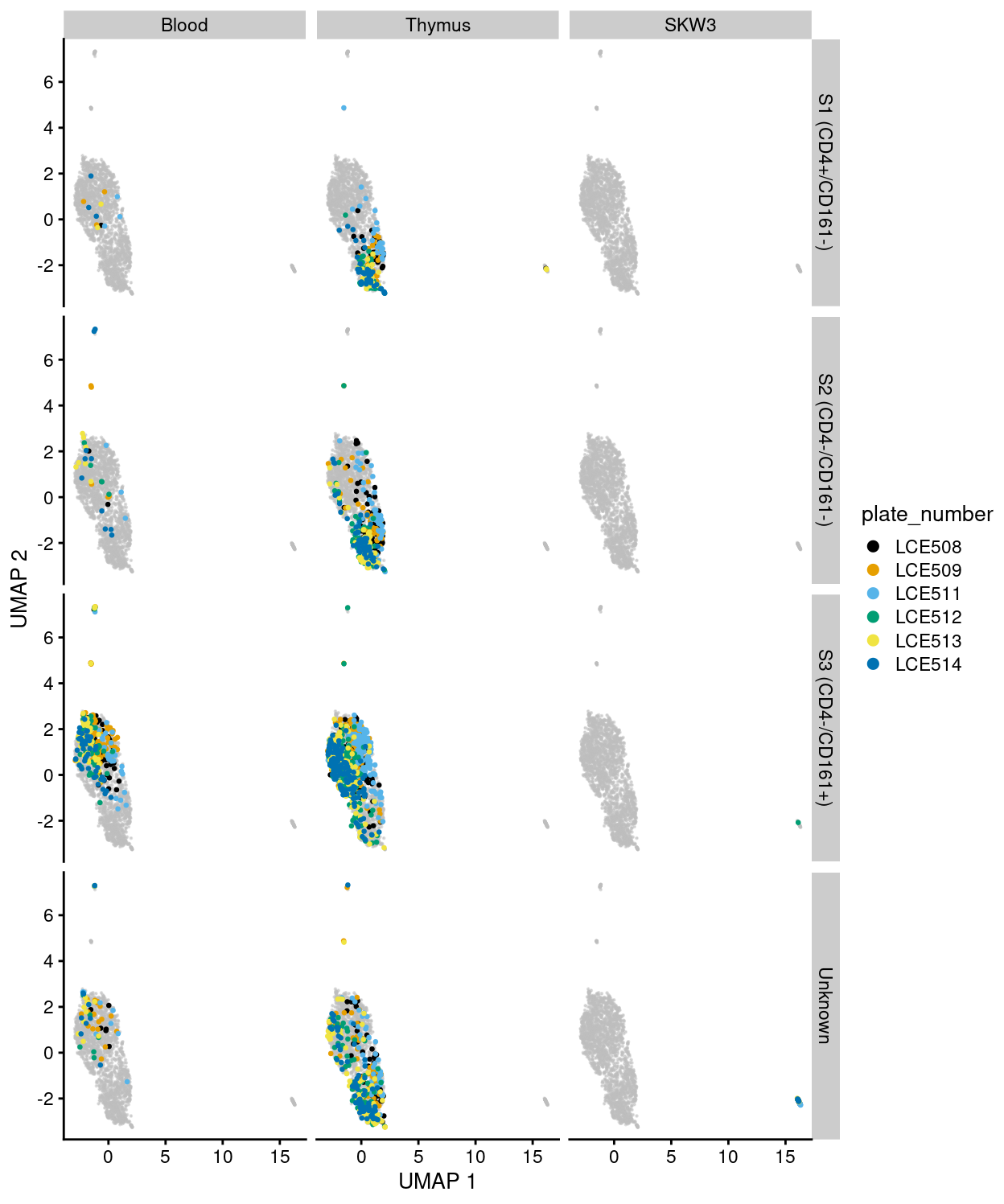
Figure 28: UMAP plot of the dataset. Each point represents a cell and each panel highlights cells from a particular tissue and stage and further coloured by plate_number.
Summary
Although Figures 23 - 28 are only preliminary summaries of the data, there are few points worth highlighting:
- There are no strong
donor-associated differences. - There are strong
plate_number-associated differences. - There are strong
stage-associated differences. - There are strong
tissue-associated differences. - There are library size-associated differences, which is itself largely driven by differences in library size between the
Cell lineand non-Cell linesamples.
However, it is premature to draw any strong conclusions We will seek to mitigate the differences associated with technical factors (e.g., plate_number and library size) in downstream analyses so that we might better investigate the biological factors (i.e. tissue and stage).
Concluding remarks
The processed SingleCellExperiment object is available (see data/SCEs/C094_Pellicci.preprocessed.SCE.rds). This will be used in downstream analyses, e.g., selecting biologically relevant cells.
Additional information
The following are available on request:
- Full CSV tables of any data presented.
- PDF/PNG files of any static plots.
Session info
Show code
sessioninfo::session_info()
─ Session info ─────────────────────────────────────────────────────
setting value
version R version 4.0.3 (2020-10-10)
os CentOS Linux 7 (Core)
system x86_64, linux-gnu
ui X11
language (EN)
collate en_US.UTF-8
ctype en_US.UTF-8
tz Australia/Melbourne
date 2021-09-29
─ Packages ─────────────────────────────────────────────────────────
! package * version date lib
P annotate 1.68.0 2020-10-27 [?]
P AnnotationDbi * 1.52.0 2020-10-27 [?]
P AnnotationFilter * 1.14.0 2020-10-27 [?]
P AnnotationHub * 2.22.0 2020-10-27 [?]
P askpass 1.1 2019-01-13 [?]
P assertthat 0.2.1 2019-03-21 [?]
P base64enc 0.1-3 2015-07-28 [?]
P beachmat 2.6.4 2020-12-20 [?]
P beeswarm 0.3.1 2021-03-07 [?]
P Biobase * 2.50.0 2020-10-27 [?]
P BiocFileCache * 1.14.0 2020-10-27 [?]
P BiocGenerics * 0.36.0 2020-10-27 [?]
P BiocManager 1.30.12 2021-03-28 [?]
P BiocNeighbors 1.8.2 2020-12-07 [?]
P BiocParallel 1.24.1 2020-11-06 [?]
P BiocSingular 1.6.0 2020-10-27 [?]
P BiocStyle * 2.18.1 2020-11-24 [?]
P BiocVersion 3.12.0 2020-04-27 [?]
P biomaRt 2.46.3 2021-02-09 [?]
P Biostrings 2.58.0 2020-10-27 [?]
P bit 4.0.4 2020-08-04 [?]
P bit64 4.0.5 2020-08-30 [?]
P bitops 1.0-6 2013-08-17 [?]
P blob 1.2.1 2020-01-20 [?]
P bluster 1.0.0 2020-10-27 [?]
P bslib 0.2.4 2021-01-25 [?]
P cachem 1.0.4 2021-02-13 [?]
P cellranger 1.1.0 2016-07-27 [?]
P cli 2.4.0 2021-04-05 [?]
P colorspace 2.0-0 2020-11-11 [?]
P cowplot * 1.1.1 2020-12-30 [?]
P crayon 1.4.1 2021-02-08 [?]
P curl 4.3 2019-12-02 [?]
P DBI 1.1.1 2021-01-15 [?]
P dbplyr * 2.1.0 2021-02-03 [?]
P DelayedArray 0.16.3 2021-03-24 [?]
P DelayedMatrixStats 1.12.3 2021-02-03 [?]
P DESeq2 1.30.1 2021-02-19 [?]
P digest 0.6.27 2020-10-24 [?]
P distill 1.2 2021-01-13 [?]
P downlit 0.2.1 2020-11-04 [?]
P dplyr * 1.0.5 2021-03-05 [?]
P dqrng 0.2.1 2019-05-17 [?]
P edgeR * 3.32.1 2021-01-14 [?]
P ellipsis 0.3.1 2020-05-15 [?]
P ensembldb * 2.14.0 2020-10-27 [?]
P evaluate 0.14 2019-05-28 [?]
P fansi 0.4.2 2021-01-15 [?]
P farver 2.1.0 2021-02-28 [?]
P fastmap 1.1.0 2021-01-25 [?]
P FNN 1.1.3 2019-02-15 [?]
P genefilter 1.72.1 2021-01-21 [?]
P geneplotter 1.68.0 2020-10-27 [?]
P generics 0.1.0 2020-10-31 [?]
P GenomeInfoDb * 1.26.4 2021-03-10 [?]
P GenomeInfoDbData 1.2.4 2020-10-20 [?]
P GenomicAlignments 1.26.0 2020-10-27 [?]
P GenomicFeatures * 1.42.3 2021-04-01 [?]
P GenomicRanges * 1.42.0 2020-10-27 [?]
P ggbeeswarm 0.6.0 2017-08-07 [?]
P ggplot2 * 3.3.3 2020-12-30 [?]
P Glimma * 2.0.0 2020-10-27 [?]
P glue 1.4.2 2020-08-27 [?]
P GO.db * 3.12.1 2020-11-04 [?]
P graph 1.68.0 2020-10-27 [?]
P gridExtra 2.3 2017-09-09 [?]
P gtable 0.3.0 2019-03-25 [?]
P here * 1.0.1 2020-12-13 [?]
P highr 0.9 2021-04-16 [?]
P hms 1.0.0 2021-01-13 [?]
P Homo.sapiens * 1.3.1 2020-07-25 [?]
P htmltools 0.5.1.1 2021-01-22 [?]
P htmlwidgets 1.5.3 2020-12-10 [?]
P httpuv 1.5.5 2021-01-13 [?]
P httr 1.4.2 2020-07-20 [?]
P igraph 1.2.6 2020-10-06 [?]
P interactiveDisplayBase 1.28.0 2020-10-27 [?]
P IRanges * 2.24.1 2020-12-12 [?]
P irlba 2.3.3 2019-02-05 [?]
P janitor * 2.1.0 2021-01-05 [?]
P jquerylib 0.1.3 2020-12-17 [?]
P jsonlite 1.7.2 2020-12-09 [?]
P knitr 1.33 2021-04-24 [?]
P labeling 0.4.2 2020-10-20 [?]
P later 1.1.0.1 2020-06-05 [?]
P lattice 0.20-41 2020-04-02 [3]
P lazyeval 0.2.2 2019-03-15 [?]
P lifecycle 1.0.0 2021-02-15 [?]
P limma * 3.46.0 2020-10-27 [?]
P locfit 1.5-9.4 2020-03-25 [?]
P lubridate 1.7.10 2021-02-26 [?]
P magrittr 2.0.1 2020-11-17 [?]
P Matrix * 1.2-18 2019-11-27 [3]
P MatrixGenerics * 1.2.1 2021-01-30 [?]
P matrixStats * 0.58.0 2021-01-29 [?]
P memoise 2.0.0 2021-01-26 [?]
P mime 0.11 2021-06-23 [?]
P msigdbr * 7.2.1 2020-10-02 [?]
P munsell 0.5.0 2018-06-12 [?]
P openssl 1.4.3 2020-09-18 [?]
P org.Hs.eg.db * 3.12.0 2020-10-20 [?]
P OrganismDbi * 1.32.0 2020-10-27 [?]
P patchwork * 1.1.1 2020-12-17 [?]
P pheatmap 1.0.12 2019-01-04 [?]
P pillar 1.5.1 2021-03-05 [?]
P pkgconfig 2.0.3 2019-09-22 [?]
P prettyunits 1.1.1 2020-01-24 [?]
P progress 1.2.2 2019-05-16 [?]
P promises 1.2.0.1 2021-02-11 [?]
P ProtGenerics 1.22.0 2020-10-27 [?]
P purrr 0.3.4 2020-04-17 [?]
P R6 2.5.0 2020-10-28 [?]
P rappdirs 0.3.3 2021-01-31 [?]
P RBGL 1.66.0 2020-10-27 [?]
P RColorBrewer 1.1-2 2014-12-07 [?]
P Rcpp 1.0.6 2021-01-15 [?]
P RCurl 1.98-1.3 2021-03-16 [?]
P readxl * 1.3.1 2019-03-13 [?]
P repr 1.1.3 2021-01-21 [?]
P rlang 0.4.11 2021-04-30 [?]
P rmarkdown 2.7 2021-02-19 [?]
P rprojroot 2.0.2 2020-11-15 [?]
P Rsamtools 2.6.0 2020-10-27 [?]
P RSpectra 0.16-0 2019-12-01 [?]
P RSQLite 2.2.5 2021-03-27 [?]
P rstudioapi 0.13 2020-11-12 [?]
P rsvd 1.0.3 2020-02-17 [?]
P rtracklayer 1.50.0 2020-10-27 [?]
P S4Vectors * 0.28.1 2020-12-09 [?]
P sass 0.3.1 2021-01-24 [?]
P scales * 1.1.1 2020-05-11 [?]
P scater * 1.18.6 2021-02-26 [?]
P scran * 1.18.5 2021-02-04 [?]
P scuttle 1.0.4 2020-12-17 [?]
P sessioninfo 1.1.1 2018-11-05 [?]
P shiny 1.6.0 2021-01-25 [?]
P SingleCellExperiment * 1.12.0 2020-10-27 [?]
P skimr 2.1.3 2021-03-07 [?]
P snakecase 0.11.0 2019-05-25 [?]
P sparseMatrixStats 1.2.1 2021-02-02 [?]
P statmod 1.4.35 2020-10-19 [?]
P stringi 1.7.3 2021-07-16 [?]
P stringr 1.4.0 2019-02-10 [?]
P SummarizedExperiment * 1.20.0 2020-10-27 [?]
P survival 3.2-7 2020-09-28 [3]
P tibble 3.1.0 2021-02-25 [?]
P tidyr 1.1.3 2021-03-03 [?]
P tidyselect 1.1.0 2020-05-11 [?]
P TxDb.Hsapiens.UCSC.hg19.knownGene * 3.2.2 2020-07-25 [?]
P utf8 1.2.1 2021-03-12 [?]
P uwot * 0.1.10 2020-12-15 [?]
P vctrs 0.3.7 2021-03-29 [?]
P vipor 0.4.5 2017-03-22 [?]
P viridis 0.5.1 2018-03-29 [?]
P viridisLite 0.3.0 2018-02-01 [?]
P withr 2.4.1 2021-01-26 [?]
P xfun 0.24 2021-06-15 [?]
P XML 3.99-0.6 2021-03-16 [?]
P xml2 1.3.2 2020-04-23 [?]
P xtable 1.8-4 2019-04-21 [?]
P XVector 0.30.0 2020-10-27 [?]
P yaml 2.2.1 2020-02-01 [?]
P zlibbioc 1.36.0 2020-10-27 [?]
source
Bioconductor
Bioconductor
Bioconductor
Bioconductor
CRAN (R 4.0.0)
CRAN (R 4.0.0)
CRAN (R 4.0.0)
Bioconductor
CRAN (R 4.0.3)
Bioconductor
Bioconductor
Bioconductor
CRAN (R 4.0.3)
Bioconductor
Bioconductor
Bioconductor
Bioconductor
Bioconductor
Bioconductor
Bioconductor
CRAN (R 4.0.0)
CRAN (R 4.0.0)
CRAN (R 4.0.0)
CRAN (R 4.0.0)
Bioconductor
CRAN (R 4.0.3)
CRAN (R 4.0.3)
CRAN (R 4.0.0)
CRAN (R 4.0.3)
CRAN (R 4.0.3)
CRAN (R 4.0.3)
CRAN (R 4.0.3)
CRAN (R 4.0.0)
CRAN (R 4.0.3)
CRAN (R 4.0.3)
Bioconductor
Bioconductor
Bioconductor
CRAN (R 4.0.2)
CRAN (R 4.0.3)
CRAN (R 4.0.3)
CRAN (R 4.0.3)
CRAN (R 4.0.0)
Bioconductor
CRAN (R 4.0.0)
Bioconductor
CRAN (R 4.0.0)
CRAN (R 4.0.3)
CRAN (R 4.0.3)
CRAN (R 4.0.3)
CRAN (R 4.0.0)
Bioconductor
Bioconductor
CRAN (R 4.0.3)
Bioconductor
Bioconductor
Bioconductor
Bioconductor
Bioconductor
CRAN (R 4.0.0)
CRAN (R 4.0.3)
Bioconductor
CRAN (R 4.0.0)
Bioconductor
Bioconductor
CRAN (R 4.0.0)
CRAN (R 4.0.0)
CRAN (R 4.0.3)
CRAN (R 4.0.3)
CRAN (R 4.0.3)
Bioconductor
CRAN (R 4.0.3)
CRAN (R 4.0.3)
CRAN (R 4.0.3)
CRAN (R 4.0.0)
CRAN (R 4.0.2)
Bioconductor
Bioconductor
CRAN (R 4.0.0)
CRAN (R 4.0.3)
CRAN (R 4.0.3)
CRAN (R 4.0.3)
CRAN (R 4.0.3)
CRAN (R 4.0.0)
CRAN (R 4.0.0)
CRAN (R 4.0.3)
CRAN (R 4.0.0)
CRAN (R 4.0.3)
Bioconductor
CRAN (R 4.0.0)
CRAN (R 4.0.3)
CRAN (R 4.0.3)
CRAN (R 4.0.3)
Bioconductor
CRAN (R 4.0.3)
CRAN (R 4.0.3)
CRAN (R 4.0.3)
CRAN (R 4.0.2)
CRAN (R 4.0.0)
CRAN (R 4.0.2)
Bioconductor
Bioconductor
CRAN (R 4.0.3)
CRAN (R 4.0.0)
CRAN (R 4.0.3)
CRAN (R 4.0.0)
CRAN (R 4.0.0)
CRAN (R 4.0.0)
CRAN (R 4.0.3)
Bioconductor
CRAN (R 4.0.0)
CRAN (R 4.0.2)
CRAN (R 4.0.3)
Bioconductor
CRAN (R 4.0.0)
CRAN (R 4.0.3)
CRAN (R 4.0.3)
CRAN (R 4.0.0)
CRAN (R 4.0.3)
CRAN (R 4.0.5)
CRAN (R 4.0.3)
CRAN (R 4.0.3)
Bioconductor
CRAN (R 4.0.0)
CRAN (R 4.0.3)
CRAN (R 4.0.3)
CRAN (R 4.0.0)
Bioconductor
Bioconductor
CRAN (R 4.0.3)
CRAN (R 4.0.0)
Bioconductor
Bioconductor
Bioconductor
CRAN (R 4.0.0)
CRAN (R 4.0.3)
Bioconductor
CRAN (R 4.0.3)
CRAN (R 4.0.0)
Bioconductor
CRAN (R 4.0.2)
CRAN (R 4.0.3)
CRAN (R 4.0.0)
Bioconductor
CRAN (R 4.0.3)
CRAN (R 4.0.3)
CRAN (R 4.0.3)
CRAN (R 4.0.0)
Bioconductor
CRAN (R 4.0.3)
CRAN (R 4.0.3)
CRAN (R 4.0.3)
CRAN (R 4.0.0)
CRAN (R 4.0.0)
CRAN (R 4.0.0)
CRAN (R 4.0.3)
CRAN (R 4.0.3)
CRAN (R 4.0.3)
CRAN (R 4.0.0)
CRAN (R 4.0.0)
Bioconductor
CRAN (R 4.0.0)
Bioconductor
[1] /stornext/Projects/score/Analyses/C094_Pellicci/renv/library/R-4.0/x86_64-pc-linux-gnu
[2] /tmp/RtmpP41dVI/renv-system-library
[3] /stornext/System/data/apps/R/R-4.0.3/lib64/R/library
P ── Loaded and on-disk path mismatch.It should be remembered that the gates are set using more cells than are collected for scRNA-seq and so the boundaries may appear more defined in the original FACS files. Furthermore, the data here are shown on a ‘pseudolog’ scale, which may be different to the scale used when viewing the data in FlowJo.↩︎
Some care is taken to account for missing and duplicate gene symbols; missing symbols are replaced with the Ensembl identifier and duplicated symbols are concatenated with the (unique) Ensembl identifiers.↩︎
These marker genes are identified by a Wilcox test comparing the
BloodandThymussingle-cells on all plates exceptLCE511↩︎The number of expressed genes refers to the number of genes which have non-zero counts (ie. they have been identified in the cell at least once)↩︎
This is consistent with the use of UMI counts rather than read counts, as each transcript molecule can only produce one UMI count but can yield many reads after fragmentation.↩︎
Bearing in mind that the ‘experimental’ cells, which are γδ T cells, have a ‘smaller’ transcriptome than the ‘control’ cells.↩︎
Here, ribosomal protein genes are defined as those gene symbols starting with “Rpl” or “Rps” or otherwise found in the “KEGG_RIBOSOME” gene set published by MSigDB, namely: FAU, MRPL13, RPL10, RPL10A, RPL10AP1, RPL10AP2, RPL10AP3, RPL10AP5, RPL10AP6, RPL10L, RPL10P1, RPL10P10, RPL10P11, RPL10P12, RPL10P13, RPL10P14, RPL10P15, RPL10P16, RPL10P17, RPL10P18, RPL10P19, RPL10P2, RPL10P3, RPL10P4, RPL10P5, RPL10P6, RPL10P7, RPL10P8, RPL10P9, RPL11, RPL11P3, RPL11P4, RPL11P5, RPL12, RPL12P1, RPL12P10, RPL12P11, RPL12P12, RPL12P13, RPL12P14, RPL12P15, RPL12P17, RPL12P18, RPL12P19, RPL12P2, RPL12P21, RPL12P25, RPL12P26, RPL12P27, RPL12P29, RPL12P31, RPL12P32, RPL12P33, RPL12P34, RPL12P35, RPL12P37, RPL12P38, RPL12P39, RPL12P4, RPL12P40, RPL12P41, RPL12P42, RPL12P44, RPL12P45, RPL12P47, RPL12P48, RPL12P50, RPL12P6, RPL12P7, RPL12P8, RPL13, RPL13A, RPL13AP, RPL13AP19, RPL13AP2, RPL13AP20, RPL13AP23, RPL13AP25, RPL13AP3, RPL13AP5, RPL13AP6, RPL13AP7, RPL13P, RPL13P12, RPL13P2, RPL13P5, RPL13P6, RPL14, RPL14P1, RPL14P3, RPL14P5, RPL15, RPL15P1, RPL15P13, RPL15P14, RPL15P18, RPL15P2, RPL15P20, RPL15P21, RPL15P3, RPL17, RPL17P1, RPL17P10, RPL17P11, RPL17P2, RPL17P20, RPL17P22, RPL17P25, RPL17P26, RPL17P3, RPL17P33, RPL17P34, RPL17P36, RPL17P37, RPL17P41, RPL17P43, RPL17P44, RPL17P49, RPL17P50, RPL17P51, RPL18, RPL18A, RPL18AP14, RPL18AP15, RPL18AP16, RPL18AP17, RPL18AP3, RPL18AP7, RPL18AP8, RPL18P10, RPL18P11, RPL18P13, RPL19, RPL19P1, RPL19P11, RPL19P13, RPL19P14, RPL19P16, RPL19P18, RPL19P20, RPL19P21, RPL21, RPL21P1, RPL21P10, RPL21P103, RPL21P104, RPL21P106, RPL21P107, RPL21P108, RPL21P11, RPL21P110, RPL21P111, RPL21P112, RPL21P116, RPL21P119, RPL21P12, RPL21P120, RPL21P121, RPL21P123, RPL21P126, RPL21P127, RPL21P129, RPL21P13, RPL21P131, RPL21P133, RPL21P134, RPL21P135, RPL21P136, RPL21P16, RPL21P17, RPL21P18, RPL21P2, RPL21P23, RPL21P24, RPL21P28, RPL21P3, RPL21P32, RPL21P33, RPL21P38, RPL21P39, RPL21P4, RPL21P40, RPL21P41, RPL21P42, RPL21P43, RPL21P44, RPL21P5, RPL21P50, RPL21P54, RPL21P65, RPL21P66, RPL21P67, RPL21P7, RPL21P75, RPL21P8, RPL21P88, RPL21P9, RPL21P90, RPL21P91, RPL21P92, RPL21P93, RPL21P99, RPL22, RPL22L1, RPL22P1, RPL22P10, RPL22P11, RPL22P12, RPL22P13, RPL22P14, RPL22P16, RPL22P18, RPL22P19, RPL22P2, RPL22P20, RPL22P22, RPL22P23, RPL22P24, RPL22P3, RPL22P5, RPL22P6, RPL22P7, RPL22P8, RPL23, RPL23A, RPL23AP10, RPL23AP11, RPL23AP12, RPL23AP14, RPL23AP15, RPL23AP16, RPL23AP17, RPL23AP18, RPL23AP19, RPL23AP2, RPL23AP20, RPL23AP24, RPL23AP25, RPL23AP26, RPL23AP27, RPL23AP28, RPL23AP3, RPL23AP30, RPL23AP31, RPL23AP32, RPL23AP34, RPL23AP35, RPL23AP37, RPL23AP38, RPL23AP39, RPL23AP4, RPL23AP41, RPL23AP42, RPL23AP43, RPL23AP44, RPL23AP45, RPL23AP46, RPL23AP47, RPL23AP48, RPL23AP49, RPL23AP52, RPL23AP53, RPL23AP55, RPL23AP57, RPL23AP58, RPL23AP59, RPL23AP6, RPL23AP60, RPL23AP61, RPL23AP64, RPL23AP65, RPL23AP67, RPL23AP69, RPL23AP7, RPL23AP71, RPL23AP73, RPL23AP74, RPL23AP75, RPL23AP77, RPL23AP78, RPL23AP8, RPL23AP82, RPL23AP83, RPL23AP84, RPL23AP85, RPL23AP86, RPL23AP87, RPL23AP88, RPL23AP89, RPL23AP94, RPL23AP95, RPL23AP96, RPL23AP97, RPL23P11, RPL23P2, RPL23P4, RPL23P8, RPL24, RPL24P2, RPL24P4, RPL24P7, RPL24P8, RPL26, RPL26L1, RPL26P19, RPL26P26, RPL26P27, RPL26P28, RPL26P29, RPL26P30, RPL26P31, RPL26P35, RPL26P37, RPL26P6, RPL26P9, RPL27, RPL27A, RPL27AP, RPL27AP5, RPL27AP8, RPL27P12, RPL28, RPL29, RPL29P11, RPL29P12, RPL29P14, RPL29P19, RPL29P2, RPL29P22, RPL29P24, RPL29P25, RPL29P28, RPL29P3, RPL29P30, RPL29P33, RPL29P7, RPL3, RPL30, RPL30P1, RPL30P10, RPL30P11, RPL30P12, RPL30P13, RPL30P14, RPL30P15, RPL30P16, RPL30P2, RPL30P3, RPL30P4, RPL30P5, RPL30P7, RPL31, RPL31P1, RPL31P11, RPL31P12, RPL31P2, RPL31P28, RPL31P33, RPL31P35, RPL31P41, RPL31P44, RPL31P45, RPL31P47, RPL31P49, RPL31P50, RPL31P52, RPL31P57, RPL31P58, RPL31P59, RPL31P61, RPL31P63, RPL31P7, RPL31P9, RPL32, RPL32P1, RPL32P26, RPL32P3, RPL32P31, RPL32P33, RPL32P34, RPL32P9, RPL34, RPL34-AS1, RPL34P1, RPL34P17, RPL34P18, RPL34P19, RPL34P20, RPL34P21, RPL34P22, RPL34P23, RPL34P26, RPL34P27, RPL34P3, RPL34P31, RPL34P33, RPL34P34, RPL34P6, RPL35, RPL35A, RPL35AP, RPL35AP15, RPL35AP18, RPL35AP19, RPL35AP21, RPL35AP23, RPL35AP24, RPL35AP26, RPL35AP28, RPL35AP30, RPL35AP31, RPL35AP32, RPL35AP33, RPL35AP35, RPL35AP4, RPL35P1, RPL35P2, RPL35P3, RPL35P4, RPL35P5, RPL35P6, RPL35P8, RPL35P9, RPL36, RPL36A, RPL36AL, RPL36AP10, RPL36AP13, RPL36AP15, RPL36AP21, RPL36AP26, RPL36AP29, RPL36AP33, RPL36AP36, RPL36AP39, RPL36AP40, RPL36AP41, RPL36AP43, RPL36AP45, RPL36AP48, RPL36AP51, RPL36AP53, RPL36AP55, RPL36AP6, RPL36P16, RPL36P18, RPL36P2, RPL36P4, RPL37, RPL37A, RPL37AP1, RPL37AP8, RPL37P1, RPL37P10, RPL37P2, RPL37P23, RPL37P25, RPL37P3, RPL37P4, RPL37P6, RPL38, RPL38P1, RPL38P3, RPL38P4, RPL39, RPL39L, RPL39P, RPL39P18, RPL39P25, RPL39P26, RPL39P29, RPL39P3, RPL39P31, RPL39P33, RPL39P36, RPL39P38, RPL39P39, RPL39P40, RPL39P5, RPL39P6, RPL3L, RPL3P1, RPL3P10, RPL3P11, RPL3P12, RPL3P13, RPL3P2, RPL3P3, RPL3P4, RPL3P5, RPL3P6, RPL3P7, RPL3P8, RPL3P9, RPL4, RPL41, RPL41P1, RPL41P2, RPL41P5, RPL4P1, RPL4P2, RPL4P3, RPL4P4, RPL4P5, RPL4P6, RPL5, RPL5P1, RPL5P10, RPL5P11, RPL5P12, RPL5P14, RPL5P15, RPL5P16, RPL5P17, RPL5P18, RPL5P22, RPL5P23, RPL5P24, RPL5P25, RPL5P26, RPL5P27, RPL5P28, RPL5P29, RPL5P3, RPL5P30, RPL5P32, RPL5P33, RPL5P34, RPL5P35, RPL5P4, RPL5P5, RPL5P6, RPL5P7, RPL5P8, RPL5P9, RPL6, RPL6P2, RPL6P21, RPL6P24, RPL6P25, RPL6P27, RPL6P29, RPL6P30, RPL7, RPL7A, RPL7AP10, RPL7AP11, RPL7AP14, RPL7AP15, RPL7AP23, RPL7AP26, RPL7AP28, RPL7AP3, RPL7AP30, RPL7AP31, RPL7AP33, RPL7AP34, RPL7AP38, RPL7AP4, RPL7AP50, RPL7AP53, RPL7AP57, RPL7AP58, RPL7AP6, RPL7AP60, RPL7AP61, RPL7AP66, RPL7AP7, RPL7AP71, RPL7AP73, RPL7AP8, RPL7AP9, RPL7L1, RPL7L1P1, RPL7L1P12, RPL7L1P2, RPL7L1P3, RPL7L1P8, RPL7L1P9, RPL7P1, RPL7P10, RPL7P11, RPL7P12, RPL7P13, RPL7P15, RPL7P16, RPL7P17, RPL7P18, RPL7P19, RPL7P2, RPL7P20, RPL7P21, RPL7P22, RPL7P23, RPL7P24, RPL7P25, RPL7P26, RPL7P27, RPL7P28, RPL7P31, RPL7P32, RPL7P33, RPL7P36, RPL7P37, RPL7P38, RPL7P39, RPL7P4, RPL7P41, RPL7P44, RPL7P45, RPL7P46, RPL7P47, RPL7P48, RPL7P49, RPL7P5, RPL7P50, RPL7P51, RPL7P52, RPL7P53, RPL7P56, RPL7P57, RPL7P58, RPL7P59, RPL7P6, RPL7P60, RPL7P61, RPL7P7, RPL7P8, RPL7P9, RPL8, RPL8P2, RPL9, RPL9P18, RPL9P2, RPL9P21, RPL9P28, RPL9P3, RPL9P30, RPL9P31, RPL9P32, RPL9P5, RPL9P7, RPLP0, RPLP0P11, RPLP0P2, RPLP0P6, RPLP0P7, RPLP1, RPLP1P10, RPLP1P13, RPLP1P6, RPLP2, RPLP2P1, RPS10, RPS10P14, RPS10P16, RPS10P18, RPS10P2, RPS10P21, RPS10P27, RPS10P28, RPS10P3, RPS10P5, RPS10P7, RPS11, RPS11P1, RPS11P5, RPS11P7, RPS12, RPS12P16, RPS12P17, RPS12P18, RPS12P2, RPS12P20, RPS12P23, RPS12P24, RPS12P26, RPS12P27, RPS12P5, RPS13, RPS13P2, RPS14, RPS14P4, RPS14P8, RPS15, RPS15A, RPS15AP1, RPS15AP10, RPS15AP11, RPS15AP12, RPS15AP16, RPS15AP17, RPS15AP18, RPS15AP24, RPS15AP25, RPS15AP28, RPS15AP29, RPS15AP3, RPS15AP30, RPS15AP36, RPS15AP38, RPS15AP40, RPS15AP5, RPS15AP6, RPS15AP9, RPS15P5, RPS15P9, RPS16, RPS16P5, RPS16P8, RPS16P9, RPS17, RPS17P1, RPS17P13, RPS17P14, RPS17P15, RPS17P2, RPS17P5, RPS17P8, RPS18, RPS18P12, RPS18P13, RPS18P6, RPS18P9, RPS19, RPS19BP1, RPS19P1, RPS19P3, RPS19P7, RPS2, RPS20, RPS20P1, RPS20P10, RPS20P14, RPS20P2, RPS20P22, RPS20P24, RPS20P32, RPS20P33, RPS20P4, RPS20P5, RPS21, RPS21P1, RPS21P4, RPS23, RPS23P1, RPS23P10, RPS23P2, RPS23P3, RPS23P5, RPS23P6, RPS23P7, RPS23P8, RPS23P9, RPS24, RPS24P13, RPS24P16, RPS24P17, RPS24P18, RPS24P6, RPS24P7, RPS24P8, RPS25, RPS25P9, RPS26, RPS26P11, RPS26P13, RPS26P15, RPS26P2, RPS26P21, RPS26P28, RPS26P3, RPS26P31, RPS26P34, RPS26P35, RPS26P38, RPS26P39, RPS26P4, RPS26P40, RPS26P42, RPS26P43, RPS26P45, RPS26P47, RPS26P52, RPS26P55, RPS26P56, RPS26P6, RPS26P8, RPS27, RPS27A, RPS27AP1, RPS27AP11, RPS27AP12, RPS27AP15, RPS27AP16, RPS27AP17, RPS27AP19, RPS27AP2, RPS27AP3, RPS27AP6, RPS27AP7, RPS27AP9, RPS27L, RPS27P14, RPS27P15, RPS27P21, RPS27P23, RPS27P25, RPS27P26, RPS27P27, RPS27P29, RPS28, RPS28P7, RPS29, RPS29P11, RPS29P12, RPS29P14, RPS29P15, RPS29P16, RPS29P17, RPS29P19, RPS29P20, RPS29P27, RPS29P28, RPS29P29, RPS29P3, RPS29P31, RPS29P32, RPS29P5, RPS29P6, RPS29P7, RPS29P8, RPS29P9, RPS2P1, RPS2P2, RPS2P24, RPS2P28, RPS2P32, RPS2P35, RPS2P36, RPS2P39, RPS2P4, RPS2P41, RPS2P44, RPS2P45, RPS2P46, RPS2P48, RPS2P5, RPS2P55, RPS2P6, RPS2P7, RPS3, RPS3A, RPS3AP12, RPS3AP14, RPS3AP15, RPS3AP22, RPS3AP23, RPS3AP25, RPS3AP26, RPS3AP29, RPS3AP3, RPS3AP30, RPS3AP33, RPS3AP34, RPS3AP35, RPS3AP36, RPS3AP37, RPS3AP38, RPS3AP39, RPS3AP4, RPS3AP40, RPS3AP41, RPS3AP42, RPS3AP43, RPS3AP44, RPS3AP47, RPS3AP49, RPS3AP5, RPS3AP53, RPS3AP54, RPS3AP6, RPS3P1, RPS3P2, RPS3P6, RPS3P7, RPS4X, RPS4XP1, RPS4XP10, RPS4XP11, RPS4XP13, RPS4XP14, RPS4XP15, RPS4XP16, RPS4XP17, RPS4XP18, RPS4XP19, RPS4XP2, RPS4XP20, RPS4XP21, RPS4XP22, RPS4XP23, RPS4XP3, RPS4XP4, RPS4XP5, RPS4XP6, RPS4XP7, RPS4XP8, RPS4XP9, RPS4Y1, RPS4Y2, RPS5, RPS5P2, RPS5P3, RPS5P7, RPS6, RPS6KA1, RPS6KA2, RPS6KA3, RPS6KA4, RPS6KA5, RPS6KA6, RPS6KB1, RPS6KB2, RPS6KB2-AS1, RPS6KC1, RPS6KL1, RPS6P15, RPS6P16, RPS6P2, RPS6P20, RPS6P21, RPS6P22, RPS6P25, RPS6P4, RPS7, RPS7P1, RPS7P10, RPS7P11, RPS7P12, RPS7P13, RPS7P14, RPS7P15, RPS7P3, RPS7P4, RPS7P5, RPS7P6, RPS7P7, RPS7P8, RPS8, RPS8P10, RPS8P3, RPS8P4, RPS9, RPS9P1, RPSA, RPSAP1, RPSAP10, RPSAP11, RPSAP12, RPSAP13, RPSAP14, RPSAP15, RPSAP16, RPSAP17, RPSAP18, RPSAP19, RPSAP2, RPSAP20, RPSAP21, RPSAP22, RPSAP23, RPSAP24, RPSAP27, RPSAP28, RPSAP29, RPSAP3, RPSAP31, RPSAP33, RPSAP36, RPSAP38, RPSAP39, RPSAP4, RPSAP40, RPSAP43, RPSAP44, RPSAP45, RPSAP46, RPSAP47, RPSAP49, RPSAP5, RPSAP51, RPSAP52, RPSAP53, RPSAP54, RPSAP55, RPSAP57, RPSAP58, RPSAP59, RPSAP6, RPSAP61, RPSAP63, RPSAP64, RPSAP66, RPSAP69, RPSAP7, RPSAP73, RPSAP74, RPSAP75, RPSAP76, RPSAP8, RPSAP9, RSL24D1, RSL24D1P11, UBA52↩︎
This is a large number of HVGs but the results don’t qualitatively change by reducing this to, say, the top-1000 HVGs.↩︎
Note that the converse is not true, i.e., there is no guarantee that the retained PCs capture all of the signal, which is only generally possible if no dimensionality reduction is performed at all.↩︎