Preparing the data
We start from the preprocessed SingleCellExperiment object created in ‘Selection of biologically relevant cells for Pellicci gamma-delta T-cell single-cell dataset’.
Show code
library(SingleCellExperiment)
library(here)
library(scater)
library(scran)
library(ggplot2)
library(cowplot)
library(edgeR)
library(Glimma)
library(BiocParallel)
library(patchwork)
library(pheatmap)
library(janitor)
library(distill)
source(here("code", "helper_functions.R"))
# NOTE: Using multiple cores seizes up my laptop. Can use more on unix box.
options("mc.cores" = ifelse(Sys.info()[["nodename"]] == "PC1331", 2L, 8L))
register(MulticoreParam(workers = getOption("mc.cores")))
knitr::opts_chunk$set(fig.path = "C094_Pellicci.single-cell.merge.S1_S2_only_files/")
Show code
sce <- readRDS(here("data", "SCEs", "C094_Pellicci.single-cell.cell_selected.SCE.rds"))

# Some useful colours
plate_number_colours <- setNames(
  unique(sce$colours$plate_number_colours),
  unique(names(sce$colours$plate_number_colours)))
plate_number_colours <- plate_number_colours[levels(sce$plate_number)]
tissue_colours <- setNames(
  unique(sce$colours$tissue_colours),
  unique(names(sce$colours$tissue_colours)))
tissue_colours <- tissue_colours[levels(sce$tissue)]
donor_colours <- setNames(
  unique(sce$colours$donor_colours),
  unique(names(sce$colours$donor_colours)))
donor_colours <- donor_colours[levels(sce$donor)]
stage_colours <- setNames(
  unique(sce$colours$stage_colours),
  unique(names(sce$colours$stage_colours)))
stage_colours <- stage_colours[levels(sce$stage)]

# also define group (i.e. tissue.stage)
sce$group <- factor(paste0(sce$tissue, ".", sce$stage))
group_colours <- setNames(
  Polychrome::kelly.colors(nlevels(sce$group) + 1)[-1],
  levels(sce$group))
sce$colours$group_colours <- group_colours[sce$group]

# Some useful gene sets
mito_set <- rownames(sce)[any(rowData(sce)$ENSEMBL.SEQNAME == "MT")]
ribo_set <- grep("^RP(S|L)", rownames(sce), value = TRUE)
# NOTE: A more curated approach for identifying ribosomal protein genes
#       (https://github.com/Bioconductor/OrchestratingSingleCellAnalysis-base/blob/ae201bf26e3e4fa82d9165d8abf4f4dc4b8e5a68/feature-selection.Rmd#L376-L380)
library(msigdbr)
c2_sets <- msigdbr(species = "Homo sapiens", category = "C2")
ribo_set <- union(
  ribo_set,
  c2_sets[c2_sets$gs_name == "KEGG_RIBOSOME", ]$gene_symbol)
ribo_set <- intersect(ribo_set, rownames(sce))
sex_set <- rownames(sce)[any(rowData(sce)$ENSEMBL.SEQNAME %in% c("X", "Y"))]
pseudogene_set <- rownames(sce)[
  any(grepl("pseudogene", rowData(sce)$ENSEMBL.GENEBIOTYPE))]
# NOTE: get rid of psuedogene seems not to be good enough for HVG determination of this dataset
protein_coding_gene_set <- rownames(sce)[
  any(grepl("protein_coding", rowData(sce)$ENSEMBL.GENEBIOTYPE))]
Re-processing
We re-process the cells from S1 and S2 only remained in the dataset.
Show code
sce <- sce[, sce$stage == "S1 (CD4+/CD161-)" | sce$stage == "S2 (CD4-/CD161-)"]
colData(sce) <- droplevels(colData(sce))
NOTE: as advised by Dan during the meeting on 15 Jul 2021, we should proceed with HVG determination (and thus clustering) based on protein coding genes only (instead of excluding ribosomal, mitochondrial and pseudogenes only).
Show code
sce$batch <- sce$plate_number
var_fit <- modelGeneVarWithSpikes(sce, "ERCC", block = sce$batch)
hvg <- getTopHVGs(var_fit, var.threshold = 0)
hvg <- intersect(hvg, protein_coding_gene_set)

set.seed(67726)
sce <- denoisePCA(
  sce,
  var_fit,
  subset.row = hvg,
  BSPARAM = BiocSingular::IrlbaParam(deferred = TRUE))

set.seed(853)
sce <- runUMAP(sce, dimred = "PCA")

set.seed(4759)
snn_gr_0 <- buildSNNGraph(sce, use.dimred = "PCA")
clusters_0 <- igraph::cluster_louvain(snn_gr_0)
sce$cluster_0 <- factor(clusters_0$membership)
cluster_colours_0 <- setNames(
  scater:::.get_palette("tableau10medium")[seq_len(nlevels(sce$cluster_0))],
  levels(sce$cluster_0))
sce$colours$cluster_colours_0 <- cluster_colours_0[sce$cluster_0]
There are 4 clusters detected, shown on the UMAP plot Figure 1 and broken down by experimental factors in Figure 2.
Show code
p1 <- ggcells(sce, aes(x = UMAP.1, y = UMAP.2)) +
  geom_point(aes(colour = cluster_0), size = 0.25) +
  scale_colour_manual(values = cluster_colours_0) +
  theme_cowplot(font_size = 8) +
  xlab("Dimension 1") +
  ylab("Dimension 2")

p2 <- ggcells(sce, aes(x = UMAP.1, y = UMAP.2)) +
  geom_point(aes(colour = stage), size = 0.25) +
  scale_colour_manual(values = stage_colours) +
  theme_cowplot(font_size = 8) +
  xlab("Dimension 1") +
  ylab("Dimension 2")

p3 <- ggcells(sce, aes(x = UMAP.1, y = UMAP.2)) +
  geom_point(aes(colour = plate_number), size = 0.25) +
  scale_colour_manual(values = plate_number_colours) +
  theme_cowplot(font_size = 8) +
  xlab("Dimension 1") +
  ylab("Dimension 2")

p4 <- ggcells(sce, aes(x = UMAP.1, y = UMAP.2)) +
  geom_point(aes(colour = tissue), size = 0.25) +
  scale_colour_manual(values = tissue_colours) +
  theme_cowplot(font_size = 8) +
  xlab("Dimension 1") +
  ylab("Dimension 2")

p5 <- ggcells(sce, aes(x = UMAP.1, y = UMAP.2)) +
  geom_point(aes(colour = donor), size = 0.25) +
  scale_colour_manual(values = donor_colours) +
  theme_cowplot(font_size = 8) +
  xlab("Dimension 1") +
  ylab("Dimension 2")

p6 <- ggcells(sce, aes(x = UMAP.1, y = UMAP.2)) +
  geom_point(aes(colour = group), size = 0.25) +
  scale_colour_manual(values = group_colours) +
  theme_cowplot(font_size = 8) +
  xlab("Dimension 1") +
  ylab("Dimension 2")

(p1 | p2) / (p3 | p4) / (p5 | p6)
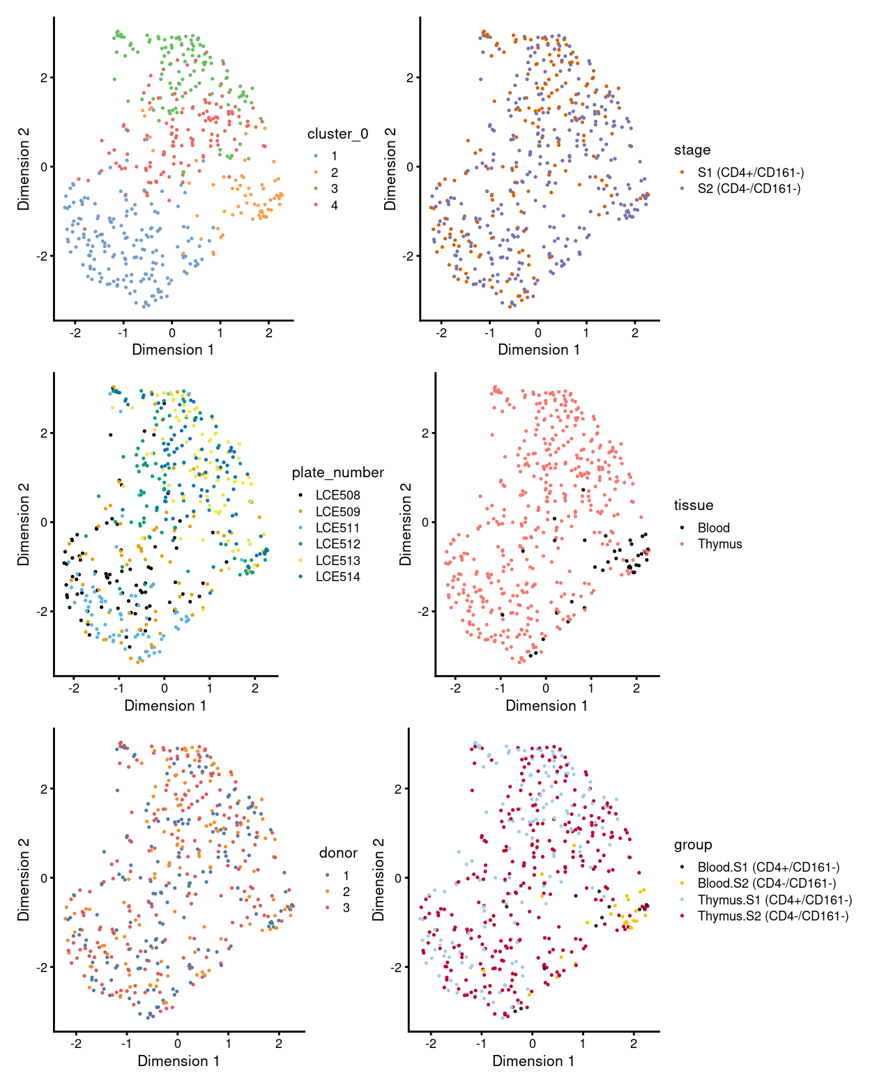
Figure 1: UMAP plot, where each point represents a cell and is coloured according to the legend.
Show code
p1 <- ggcells(sce) +
  geom_bar(aes(x = cluster_0, fill = cluster_0)) +
  coord_flip() +
  ylab("Number of samples") +
  theme_cowplot(font_size = 8) +
  scale_fill_manual(values = cluster_colours_0) +
  geom_text(stat='count', aes(x = cluster_0, label=..count..), hjust=1.5, size=2)

p2 <- ggcells(sce) +
  geom_bar(
    aes(x = cluster_0, fill = stage),
    position = position_fill(reverse = TRUE)) +
  coord_flip() +
  ylab("Frequency") +
  scale_fill_manual(values = stage_colours) +
  theme_cowplot(font_size = 8)

p3 <- ggcells(sce) +
  geom_bar(
    aes(x = cluster_0, fill = plate_number),
    position = position_fill(reverse = TRUE)) +
  coord_flip() +
  ylab("Frequency") +
  scale_fill_manual(values = plate_number_colours) +
  theme_cowplot(font_size = 8)

p4 <- ggcells(sce) +
  geom_bar(
    aes(x = cluster_0, fill = tissue),
    position = position_fill(reverse = TRUE)) +
  coord_flip() +
  ylab("Frequency") +
  scale_fill_manual(values = tissue_colours) +
  theme_cowplot(font_size = 8)

p5 <- ggcells(sce) +
  geom_bar(
    aes(x = cluster_0, fill = donor),
    position = position_fill(reverse = TRUE)) +
  coord_flip() +
  ylab("Frequency") +
  scale_fill_manual(values = donor_colours) +
  theme_cowplot(font_size = 8)

p6 <- ggcells(sce) +
  geom_bar(
    aes(x = cluster_0, fill = group),
    position = position_fill(reverse = TRUE)) +
  coord_flip() +
  ylab("Frequency") +
  scale_fill_manual(values = group_colours) +
  theme_cowplot(font_size = 8)

(p1 | p2) / (p3 | p4) / (p5 | p6)
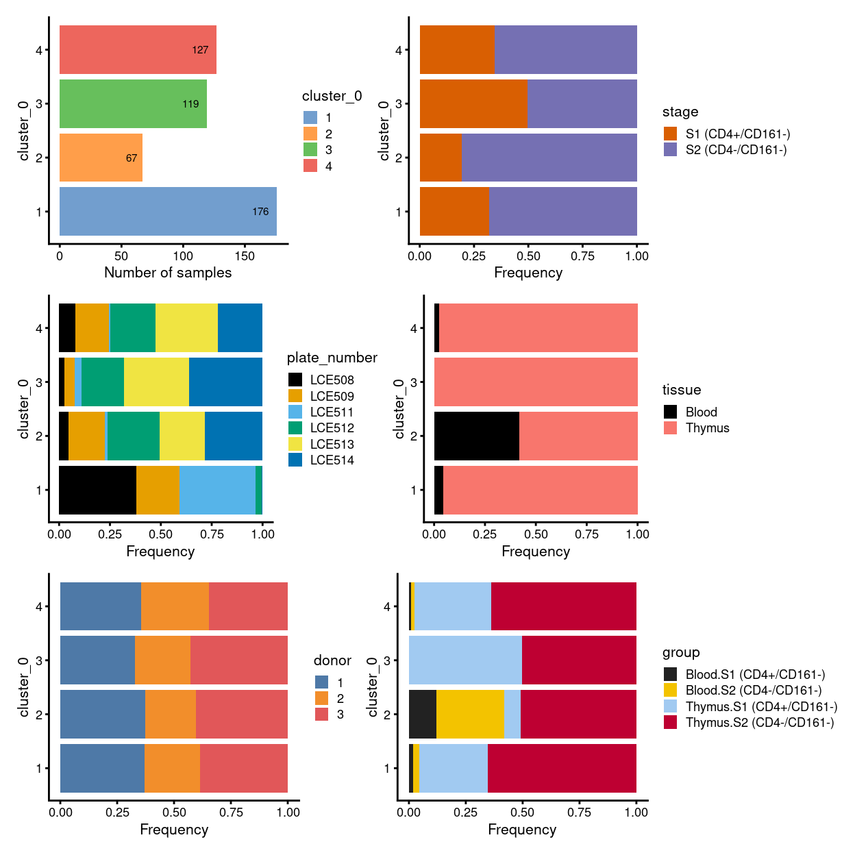
Figure 2: Breakdown of clusters by experimental factors.
NOTE for the unmerged data:
- there is one big population, which is subdivided into four clusters (i.e. cluster
1,2,3, and4) - cells in cluster
1,3, and4are mostly inS3, whilst cells in cluster2are mostly be mixture ofS1,S2, and small proportion ofS3 - plate-specific batch effect seems prominent without MNN correction
Data integration
Motivation
Large single-cell RNA sequencing (scRNA-seq) projects usually need to generate data across multiple batches due to logistical constraints. However, the processing of different batches is often subject to uncontrollable differences, e.g., changes in operator, differences in reagent quality. This results in systematic differences in the observed expression in cells from different batches, which we refer to as “batch effects.” Batch effects are problematic as they can be major drivers of heterogeneity in the data, masking the relevant biological differences and complicating interpretation of the results.
Computational correction of these effects is critical for eliminating batch-to-batch variation, allowing data across multiple batches to be combined for common downstream analysis. However, existing methods based on linear models (Ritchie et al. 2015; Leek et al. 2012) assume that the composition of cell populations are either known or the same across batches. To overcome these limitations, bespoke methods have been developed for batch correction of single-cell data (Haghverdi et al. 2018; Butler et al. 2018; Lin et al. 2019) that do not require a priori knowledge about the composition of the population. This allows them to be used in workflows for exploratory analyses of scRNA-seq data where such knowledge is usually unavailable.
We will use the Mutual Nearest Neighbours (MNN) approach of Haghverdi et al. (2018), as implemented in the batchelor package, to perform data integration. The MNN approach does not rely on pre-defined or equal population compositions across batches, only requiring that a subset of the population be shared between batches.
MNN correction
Show code
p1 <- ggcells(sce) +
  geom_bar(aes(x = plate_number, fill = plate_number)) +
  coord_flip() +
  ylab("Number of samples") +
  theme_cowplot(font_size = 8) +
  scale_fill_manual(values = plate_number_colours) +
  geom_text(stat='count', aes(x = plate_number, label=..count..), hjust=1.5, size=2)

p2 <- ggcells(sce) +
  geom_bar(
    aes(x = plate_number, fill = stage),
    position = position_fill(reverse = TRUE)) +
  coord_flip() +
  ylab("Frequency") +
  scale_fill_manual(values = stage_colours) +
  theme_cowplot(font_size = 8)

p3 <- ggcells(sce) +
  geom_bar(
    aes(x = plate_number, fill = tissue),
    position = position_fill(reverse = TRUE)) +
  coord_flip() +
  ylab("Frequency") +
  scale_fill_manual(values = tissue_colours) +
  theme_cowplot(font_size = 8)

p4 <- ggcells(sce) +
  geom_bar(
    aes(x = plate_number, fill = donor),
    position = position_fill(reverse = TRUE)) +
  coord_flip() +
  ylab("Frequency") +
  scale_fill_manual(values = donor_colours) +
  theme_cowplot(font_size = 8)

p5 <- ggcells(sce) +
  geom_bar(
    aes(x = plate_number, fill = group),
    position = position_fill(reverse = TRUE)) +
  coord_flip() +
  ylab("Frequency") +
  scale_fill_manual(values = group_colours) +
  theme_cowplot(font_size = 8)

(p1 | p2) / (p3 | p4) / (p5 | plot_spacer())
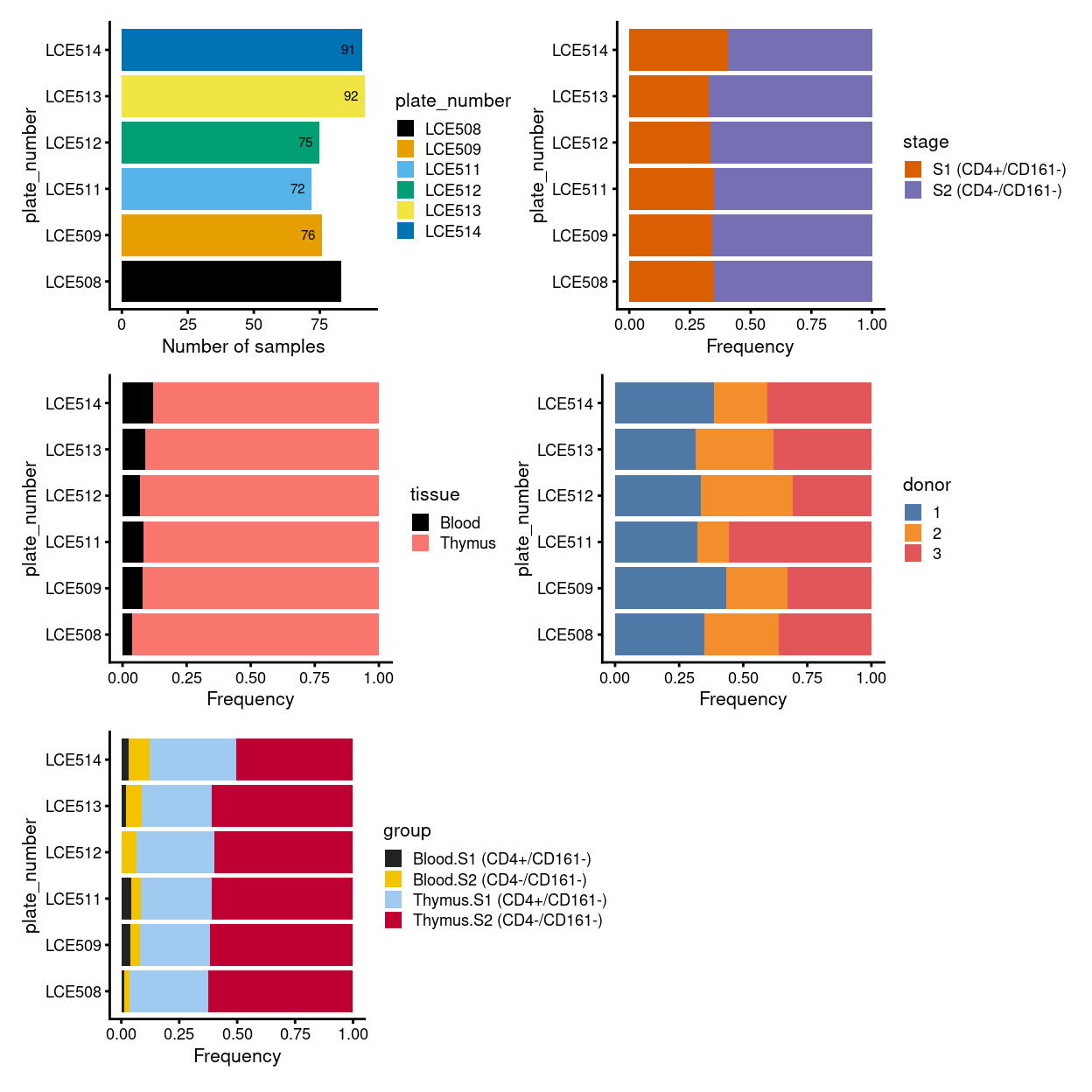
Figure 3: Breakdown of clusters by experimental factors.
We treat each plate as a batch and also test to manually provide the merge order.
Show code
library(batchelor)
set.seed(1819)
# manual merge
mnn_out <- fastMNN(
  multiBatchNorm(sce, batch = sce$batch),
  batch = sce$batch,
  cos.norm = FALSE,
  d = ncol(reducedDim(sce, "PCA")),
  auto.merge = FALSE,
  merge.order = list(list("LCE508", "LCE511", "LCE513"), list("LCE509", "LCE512", "LCE514")),
  subset.row = hvg)
One useful diagnostic of the MNN algorithm is the proportion of variance within each batch that is lost during MNN correction1. Large proportions of lost variance (\(>10 \%\)) suggest that correction is removing genuine biological heterogeneity. This would occur due to violations of the assumption of orthogonality between the batch effect and the biological subspace (Haghverdi et al. 2018).
The manual merge order we chosen (Table 1) lead to an acceptable loss of biological variance from the dataset.
Show code
tab <- metadata(mnn_out)$merge.info$lost.var
knitr::kable(
  100 * tab,
  digits = 1,
  caption = "Percentage of estimated biological variation lost within each plate at each step of the merge (manual). Ideally, all these values should be small (e.g., < 5%).")
| LCE508 | LCE509 | LCE511 | LCE512 | LCE513 | LCE514 |
|---|---|---|---|---|---|
| 0.0 | 4.5 | 0.0 | 2.4 | 0.0 | 0.0 |
| 0.0 | 1.2 | 0.0 | 0.9 | 0.0 | 7.3 |
| 4.0 | 0.0 | 5.5 | 0.0 | 0.0 | 0.0 |
| 2.7 | 0.0 | 3.6 | 0.0 | 6.1 | 0.0 |
| 6.5 | 7.7 | 5.3 | 5.8 | 7.2 | 7.5 |
Show code
reducedDim(sce, "corrected") <- reducedDim(mnn_out, "corrected")

# generate UMAP
set.seed(1248)
sce <- runUMAP(sce, dimred = "corrected", name = "UMAP_corrected")

# re-clustering after each MNN correction
set.seed(4759)

snn_gr <- buildSNNGraph(sce, use.dimred = "corrected")
clusters <- igraph::cluster_louvain(snn_gr)
sce$cluster <- factor(clusters$membership)
cluster_colours <- setNames(
  scater:::.get_palette("tableau10medium")[seq_len(nlevels(sce$cluster))],
  levels(sce$cluster))
sce$colours$cluster_colours <- cluster_colours[sce$cluster]
Figure 4 shows an overview of comparisons between the unmerged and merged data (manual merge) broken down by different experimental factors.
Show code
p1 <- plotReducedDim(sce, "UMAP", colour_by = "plate_number", theme_size = 7, point_size = 0.2) +
  scale_colour_manual(values = plate_number_colours, name = "plate_number")
p2 <- plotReducedDim(sce, "UMAP_corrected", colour_by = "plate_number", theme_size = 7, point_size = 0.2) +
  scale_colour_manual(values = plate_number_colours, name = "plate_number")

p3 <- plotReducedDim(sce, "UMAP", colour_by = "cluster_0", theme_size = 7, point_size = 0.2) +
  scale_colour_manual(values = cluster_colours_0, name = "cluster_0")
p4 <- plotReducedDim(sce, "UMAP_corrected", colour_by = "cluster", theme_size = 7, point_size = 0.2) +
  scale_colour_manual(values = cluster_colours, name = "cluster")

p5 <- plotReducedDim(sce, "UMAP", colour_by = "stage", theme_size = 7, point_size = 0.2) +
  scale_colour_manual(values = stage_colours, name = "stage")
p6 <- plotReducedDim(sce, "UMAP_corrected", colour_by = "stage", theme_size = 7, point_size = 0.2) +
  scale_colour_manual(values = stage_colours, name = "stage")

p7 <- plotReducedDim(sce, "UMAP", colour_by = "tissue", theme_size = 7, point_size = 0.2) +
  scale_colour_manual(values = tissue_colours, name = "tissue")
p8 <- plotReducedDim(sce, "UMAP_corrected", colour_by = "tissue", theme_size = 7, point_size = 0.2) +
  scale_colour_manual(values = tissue_colours, name = "tissue")

p9 <- plotReducedDim(sce, "UMAP", colour_by = "donor", theme_size = 7, point_size = 0.2) +
  scale_colour_manual(values = donor_colours, name = "donor")
p10 <- plotReducedDim(sce, "UMAP_corrected", colour_by = "donor", theme_size = 7, point_size = 0.2) +
  scale_colour_manual(values = donor_colours, name = "donor")

p11 <- plotReducedDim(sce, "UMAP", colour_by = "group", theme_size = 7, point_size = 0.2) +
  scale_colour_manual(values = group_colours, name = "group")
p12 <- plotReducedDim(sce, "UMAP_corrected", colour_by = "group", theme_size = 7, point_size = 0.2) +
  scale_colour_manual(values = group_colours, name = "group")

p1 + p2 + p3 + p4 +
  p5 + p6 + p7 + p8 +
  p9 + p10 + p11 + p12 +
  # plot_layout(ncol = 2, guides = "collect")
  plot_layout(ncol = 2)
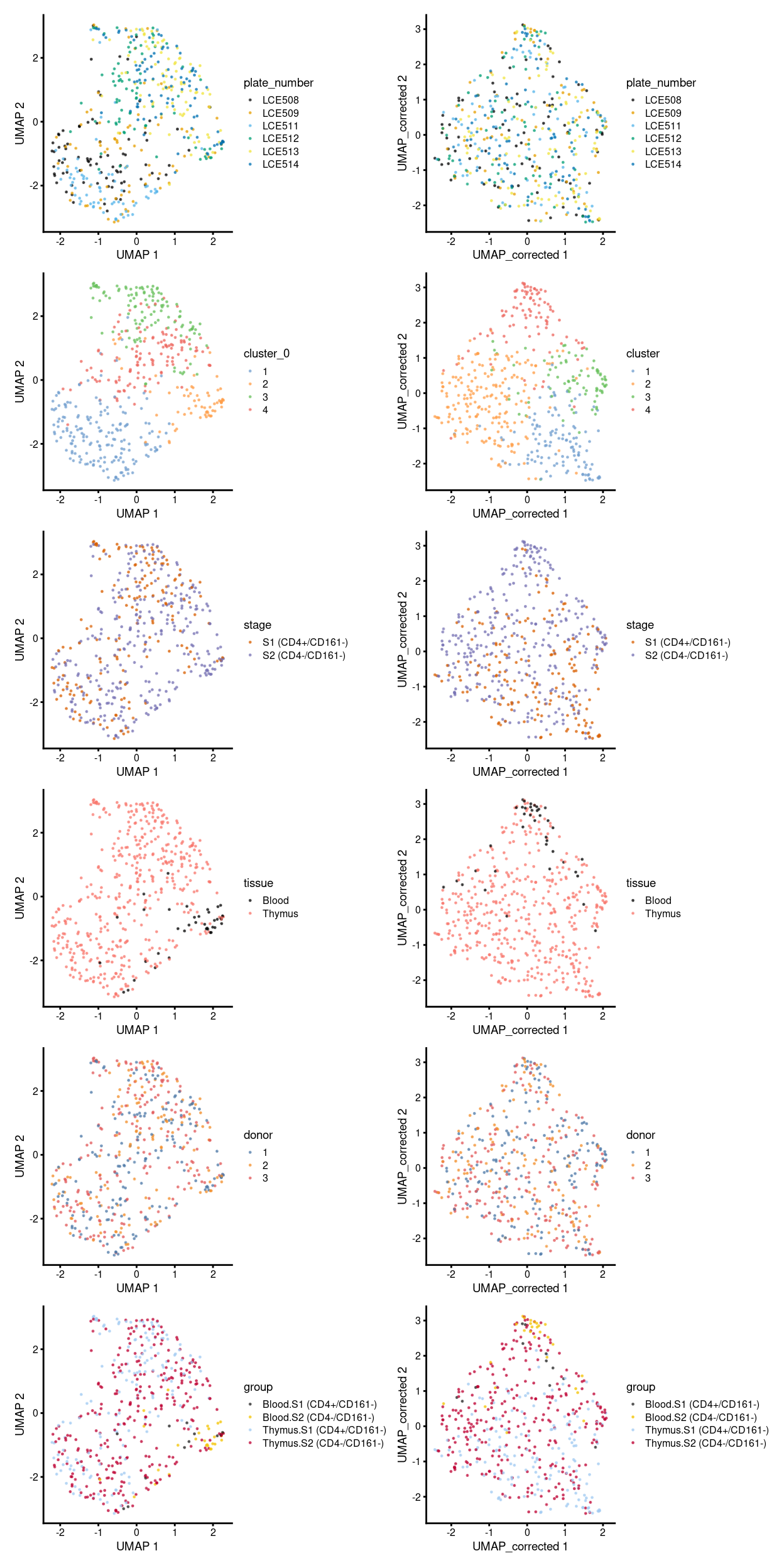
Figure 4: Comparison between batch-uncorrected data (left column) and -corrected data by manual merge orders (right column).
To get an insight, here we focus on the uncorrected and the corrected data by the manual merge, then break down the UMAP plot above further by plate_number (Figure 5), stage (Figure 6), and tissue (Figure 7).
From the perspective of correcting the batch effect, the MNN correction can effectively alleviate the plate-specific grouping of cells (Figure 5).
Show code
umap_df <- makePerCellDF(sce)
bg <- dplyr::select(umap_df, -plate_number)

plot_grid(

ggplot(aes(x = UMAP.1, y = UMAP.2), data = umap_df) +
  geom_point(data = bg, colour = scales::alpha("grey", 0.5), size = 0.125) +
  geom_point(aes(colour = plate_number), alpha = 1, size = 0.5) +
  scale_fill_manual(values = plate_number_colours, name = "plate_number") +
  scale_colour_manual(values = plate_number_colours, name = "plate_number") +
  theme_cowplot(font_size = 10) +
  xlab("UMAP 1") +
  ylab("UMAP 2") +
  facet_wrap(~plate_number, ncol = 3) +
  guides(colour = guide_legend(override.aes = list(size = 2, alpha = 1))) +
  guides(colour = FALSE),

ggplot(aes(x = UMAP_corrected.1, y = UMAP_corrected.2), data = umap_df) +
  geom_point(data = bg, colour = scales::alpha("grey", 0.5), size = 0.125) +
  geom_point(aes(colour = plate_number), alpha = 1, size = 0.5) +
  scale_fill_manual(values = plate_number_colours, name = "plate_number") +
  scale_colour_manual(values = plate_number_colours, name = "plate_number") +
  theme_cowplot(font_size = 10) +
  xlab("UMAP 1") +
  ylab("UMAP 2") +
  facet_wrap(~plate_number, ncol = 3) +
  guides(colour = guide_legend(override.aes = list(size = 2, alpha = 1))) +
  guides(colour = FALSE),

ncol= 2,
align ="h"
)
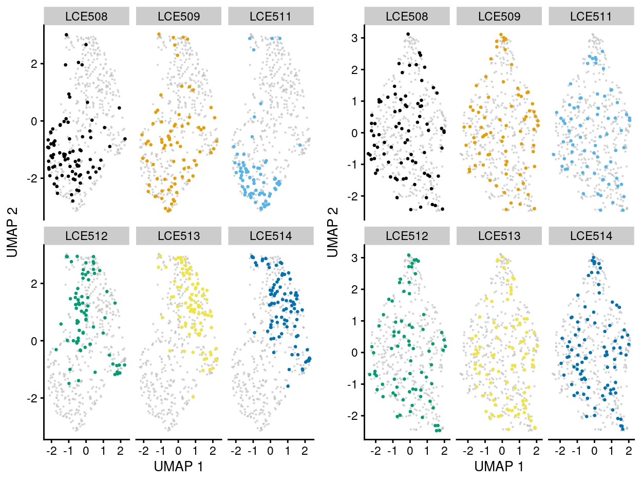
Figure 5: UMAP plot of the dataset. Each point represents a cell and each panel highlights cells from a particular plate_number when data is unmerged (left) and merged by manual merge 2 (right).
Show code
umap_df <- makePerCellDF(sce)
bg <- dplyr::select(umap_df, -stage)

plot_grid(

ggplot(aes(x = UMAP.1, y = UMAP.2), data = umap_df) +
  geom_point(data = bg, colour = scales::alpha("grey", 0.5), size = 0.125) +
  geom_point(aes(colour = stage), alpha = 1, size = 0.5) +
  scale_fill_manual(
    values = stage_colours,
    name = "stage") +
  scale_colour_manual(
    values = stage_colours,
    name = "stage") +
  theme_cowplot(font_size = 10) +
  xlab("UMAP 1") +
  ylab("UMAP 2") +
  facet_wrap(~stage, ncol = 3) +
  guides(colour = guide_legend(override.aes = list(size = 2, alpha = 1))) +
  guides(colour = FALSE),

ggplot(aes(x = UMAP_corrected.1, y = UMAP_corrected.2), data = umap_df) +
  geom_point(data = bg, colour = scales::alpha("grey", 0.5), size = 0.125) +
  geom_point(aes(colour = stage), alpha = 1, size = 0.5) +
  scale_fill_manual(
    values = stage_colours,
    name = "stage") +
  scale_colour_manual(
    values = stage_colours,
    name = "stage") +
  theme_cowplot(font_size = 10) +
  xlab("UMAP 1") +
  ylab("UMAP 2") +
  facet_wrap(~stage, ncol = 3) +
  guides(colour = guide_legend(override.aes = list(size = 2, alpha = 1))) +
  guides(colour = FALSE),

ncol= 2,
align ="h"
)
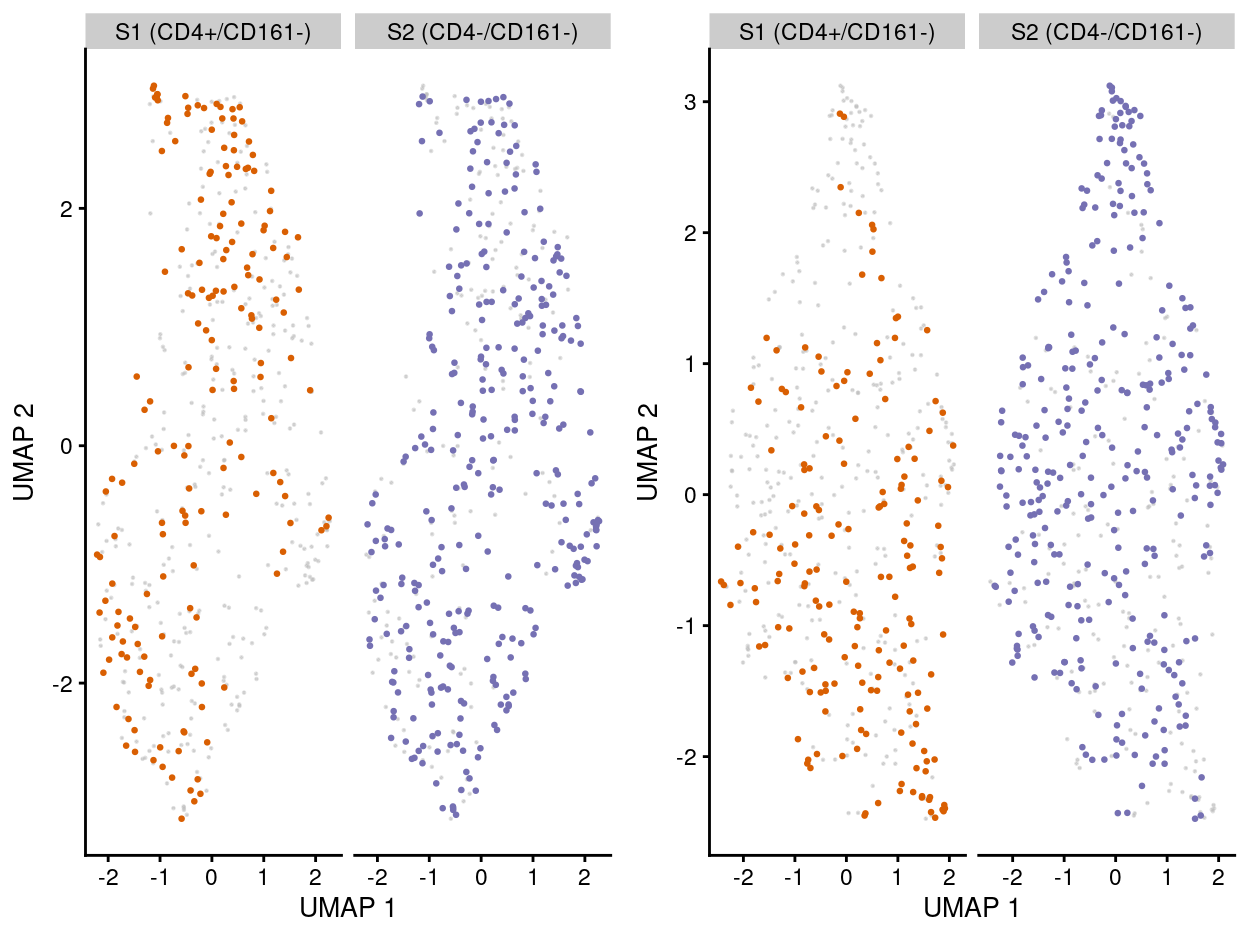
Figure 6: UMAP plot of the dataset. Each point represents a cell and each panel highlights cells from a particular stage when data is unmerged (left) and merged by manual merge 2 (right).
Show code
umap_df <- makePerCellDF(sce)
bg <- dplyr::select(umap_df, -tissue)

plot_grid(

ggplot(aes(x = UMAP.1, y = UMAP.2), data = umap_df) +
  geom_point(data = bg, colour = scales::alpha("grey", 0.5), size = 0.125) +
  geom_point(aes(colour = tissue), alpha = 1, size = 0.5) +
  scale_fill_manual(values = tissue_colours, name = "tissue") +
  scale_colour_manual(values = tissue_colours, name = "tissue") +
  theme_cowplot(font_size = 10) +
  xlab("UMAP 1") +
  ylab("UMAP 2") +
  facet_wrap(~tissue, ncol = 2) +
  guides(colour = guide_legend(override.aes = list(size = 2, alpha = 1))) +
  guides(colour = FALSE),

ggplot(aes(x = UMAP_corrected.1, y = UMAP_corrected.2), data = umap_df) +
  geom_point(data = bg, colour = scales::alpha("grey", 0.5), size = 0.125) +
  geom_point(aes(colour = tissue), alpha = 1, size = 0.5) +
  scale_fill_manual(values = tissue_colours, name = "tissue") +
  scale_colour_manual(values = tissue_colours, name = "tissue") +
  theme_cowplot(font_size = 10) +
  xlab("UMAP 1") +
  ylab("UMAP 2") +
  facet_wrap(~tissue, ncol = 2) +
  guides(colour = guide_legend(override.aes = list(size = 2, alpha = 1))) +
  guides(colour = FALSE),

ncol= 2,
align ="h"
)
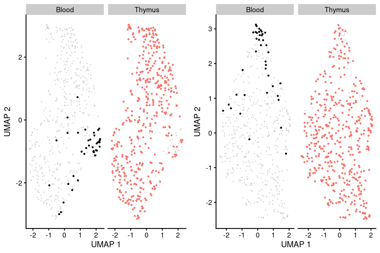
Figure 7: UMAP plot of the dataset. Each point represents a cell and each panel highlights cells from a particular tissuewhen data is unmerged (left) and merged by manual merge 2 (right).
Taken altogether, we conclude that the data corrected by the manual merge as the best possible merge order for data integration of this dataset and proceed.
To sumup, there are 4 clusters detected, broken down by experimental factors in Figure 8 and shown on the UMAP plot Figure 9.
Show code
p1 <- ggcells(sce) +
  geom_bar(aes(x = cluster, fill = cluster)) +
  coord_flip() +
  ylab("Number of samples") +
  theme_cowplot(font_size = 8) +
  scale_fill_manual(values = cluster_colours) +
  geom_text(stat='count', aes(x = cluster, label=..count..), hjust=1.5, size=2)

p2 <- ggcells(sce) +
  geom_bar(
    aes(x = cluster, fill = stage),
    position = position_fill(reverse = TRUE)) +
  coord_flip() +
  ylab("Frequency") +
  scale_fill_manual(values = stage_colours) +
  theme_cowplot(font_size = 8)

p3 <- ggcells(sce) +
  geom_bar(
    aes(x = cluster, fill = plate_number),
    position = position_fill(reverse = TRUE)) +
  coord_flip() +
  ylab("Frequency") +
  scale_fill_manual(values = plate_number_colours) +
  theme_cowplot(font_size = 8)

p4 <- ggcells(sce) +
  geom_bar(
    aes(x = cluster, fill = tissue),
    position = position_fill(reverse = TRUE)) +
  coord_flip() +
  ylab("Frequency") +
  scale_fill_manual(values = tissue_colours) +
  theme_cowplot(font_size = 8)

p5 <- ggcells(sce) +
  geom_bar(
    aes(x = cluster, fill = donor),
    position = position_fill(reverse = TRUE)) +
  coord_flip() +
  ylab("Frequency") +
  scale_fill_manual(values = donor_colours) +
  theme_cowplot(font_size = 8)

p6 <- ggcells(sce) +
  geom_bar(
    aes(x = cluster, fill = group),
    position = position_fill(reverse = TRUE)) +
  coord_flip() +
  ylab("Frequency") +
  scale_fill_manual(values = group_colours) +
  theme_cowplot(font_size = 8)

(p1 | p2) / (p3 | p4) / (p5 | p6)
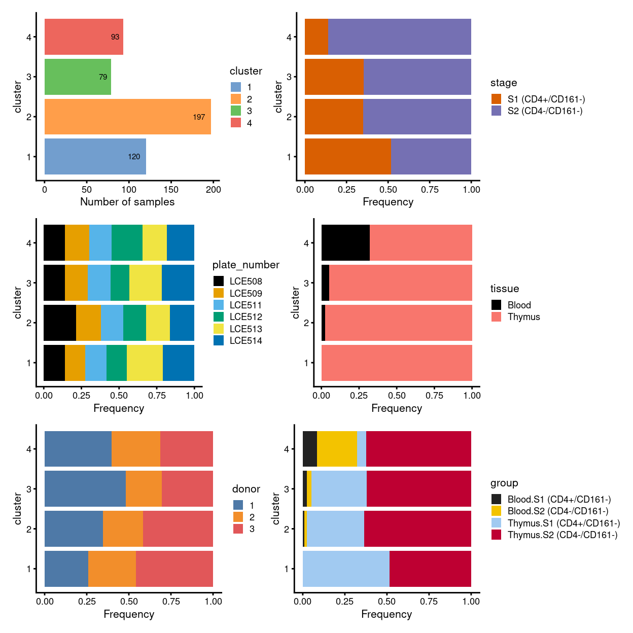
Figure 8: Breakdown of clusters by experimental factors.
Show code
p1 <- plotReducedDim(sce, "UMAP_corrected", colour_by = "cluster", theme_size = 7, point_size = 0.2) +
  scale_colour_manual(values = cluster_colours, name = "cluster")

p2 <- plotReducedDim(sce, "UMAP_corrected", colour_by = "stage", theme_size = 7, point_size = 0.2) +
  scale_colour_manual(values = stage_colours, name = "stage")

p3 <- plotReducedDim(sce, "UMAP_corrected", colour_by = "plate_number", theme_size = 7, point_size = 0.2) +
  scale_colour_manual(values = plate_number_colours, name = "plate_number")

p4 <- plotReducedDim(sce, "UMAP_corrected", colour_by = "tissue", theme_size = 7, point_size = 0.2) +
  scale_colour_manual(values = tissue_colours, name = "tissue")

p5 <- plotReducedDim(sce, "UMAP_corrected", colour_by = "donor", theme_size = 7, point_size = 0.2) +
  scale_colour_manual(values = donor_colours, name = "donor")

p6 <- plotReducedDim(sce, "UMAP_corrected", colour_by = "group", theme_size = 7, point_size = 0.2) +
  scale_colour_manual(values = group_colours, name = "group")

(p1 | p2) / (p3 | p4) / (p5 | p6)
Figure 9: UMAP plot, where each point represents a cell and is coloured according to the legend.
Figure 10 overlays the index sorting data on the UMAP plots.
Show code
tmp <- sce
colData(tmp) <- cbind(colData(tmp), t(assays(altExp(tmp, "FACS"))$raw))

facs_markers <- grep("^F|^S|^V|^B|^R|^V", colnames(colData(tmp)), value = TRUE)

corrected_umap <- cbind(
  data.frame(
    UMAP.1 = reducedDim(tmp, "UMAP_corrected")[, 1],
    UMAP.2 = reducedDim(tmp, "UMAP_corrected")[, 2]),
  as.data.frame(colData(tmp)))

p <- lapply(facs_markers, function(m) {
  p1 <- ggplot(aes(x = UMAP.1, y = UMAP.2), data = corrected_umap) +
    geom_point(aes_string(colour = m, fill = m), alpha = 1, size = 1) +
    scale_fill_viridis_c(trans = ifelse(
      grepl("^FSC|^SSC", m),
      "identity",
      scales::pseudo_log_trans(sigma = 150 / 2)),
      name = "") +
    scale_colour_viridis_c(trans = ifelse(
      grepl("^FSC|^SSC", m),
      "identity",
      scales::pseudo_log_trans(sigma = 150 / 2)),
      name = "") +
    theme_cowplot(font_size = 10) +
    xlab("Dimension 1") +
    ylab("Dimension 2") +
    ggtitle(ifelse(grepl("^FSC|^SSC", m), "Raw", "Pseudo-logged"), m)

  corrected_umap$scaled_rank <- corrected_umap %>%
    dplyr::group_by(plate_number) %>%
    dplyr::mutate(
      rank = rank(!!sym(m), na.last = "keep"),
      max_rank = max(rank, na.rm = TRUE),
      scaled_rank = rank / max_rank) %>%
    dplyr::pull(scaled_rank)

  p2 <- ggplot(aes(x = UMAP.1, y = UMAP.2), data = corrected_umap) +
    geom_point(aes(colour = scaled_rank, fill = scaled_rank), alpha = 1, size = 1) +
    scale_fill_viridis_c(name = "") +
    scale_colour_viridis_c(name = "") +
    theme_cowplot(font_size = 10) +
    xlab("Dimension 1") +
    ylab("Dimension 2") +
    ggtitle("Scaled rank", m)
  list(p1, p2)
})
multiplot(
  plotlist = unlist(p, recursive = FALSE),
  layout = matrix(seq_len(length(p) * 2), ncol = 2, byrow = TRUE))
Figure 10: Overlay of index sorting data on UMAP plot. For each marker, the left-hand plot shows the ‘raw’ or ‘pseudo-logged’ fluorescence intensity and the right-side plots the ‘scaled rank’ of the raw intensity. The pseudo-log transformation is a transformation mapping numbers to a signed logarithmic scale with a smooth transition to linear scale around 0. This transformation is commonly used when plotting fluorescence intensities from FACS. The scaled rank is applied within each mouse and assigns the maximum fluorescence intensity a value of one and the minimum fluorescence intensities a value of zero. It can be thought of as a crude normalization of the FACS data that allows us to compare fluorescence intensities from different mice.
Concluding remarks
The processed SingleCellExperiment object is available (see data/SCEs/C094_Pellicci.single-cell.merged.S1_S2_only.SCE.rds). This will be used in downstream analyses, e.g., identifying cluster marker genes and refining the cell labels.
Additional information
The following are available on request:
- Full CSV tables of any data presented.
- PDF/PNG files of any static plots.
Session info
Show code
sessioninfo::session_info()
─ Session info ─────────────────────────────────────────────────────
 setting  value
 version  R version 4.0.3 (2020-10-10)
 os       CentOS Linux 7 (Core)
 system   x86_64, linux-gnu
 ui       X11
 language (EN)
 collate  en_US.UTF-8
 ctype    en_US.UTF-8
 tz       Australia/Melbourne
 date     2021-09-29

─ Packages ─────────────────────────────────────────────────────────
 ! package              * version  date       lib source
 P annotate               1.68.0   2020-10-27 [?] Bioconductor
 P AnnotationDbi          1.52.0   2020-10-27 [?] Bioconductor
 P assertthat             0.2.1    2019-03-21 [?] CRAN (R 4.0.0)
 P batchelor            * 1.6.3    2021-04-16 [?] Bioconductor
 P beachmat               2.6.4    2020-12-20 [?] Bioconductor
 P beeswarm               0.3.1    2021-03-07 [?] CRAN (R 4.0.3)
 P Biobase              * 2.50.0   2020-10-27 [?] Bioconductor
 P BiocGenerics         * 0.36.0   2020-10-27 [?] Bioconductor
 P BiocManager            1.30.12  2021-03-28 [?] CRAN (R 4.0.3)
 P BiocNeighbors          1.8.2    2020-12-07 [?] Bioconductor
 P BiocParallel         * 1.24.1   2020-11-06 [?] Bioconductor
 P BiocSingular           1.6.0    2020-10-27 [?] Bioconductor
 P BiocStyle              2.18.1   2020-11-24 [?] Bioconductor
 P bit                    4.0.4    2020-08-04 [?] CRAN (R 4.0.0)
 P bit64                  4.0.5    2020-08-30 [?] CRAN (R 4.0.0)
 P bitops                 1.0-6    2013-08-17 [?] CRAN (R 4.0.0)
 P blob                   1.2.1    2020-01-20 [?] CRAN (R 4.0.0)
 P bluster                1.0.0    2020-10-27 [?] Bioconductor
 P bslib                  0.2.4    2021-01-25 [?] CRAN (R 4.0.3)
 P cachem                 1.0.4    2021-02-13 [?] CRAN (R 4.0.3)
 P cli                    2.4.0    2021-04-05 [?] CRAN (R 4.0.3)
 P colorspace             2.0-0    2020-11-11 [?] CRAN (R 4.0.3)
 P cowplot              * 1.1.1    2020-12-30 [?] CRAN (R 4.0.3)
 P crayon                 1.4.1    2021-02-08 [?] CRAN (R 4.0.3)
 P DBI                    1.1.1    2021-01-15 [?] CRAN (R 4.0.3)
 P DelayedArray           0.16.3   2021-03-24 [?] Bioconductor
 P DelayedMatrixStats     1.12.3   2021-02-03 [?] Bioconductor
 P DESeq2                 1.30.1   2021-02-19 [?] Bioconductor
 P digest                 0.6.27   2020-10-24 [?] CRAN (R 4.0.2)
 P distill              * 1.2      2021-01-13 [?] CRAN (R 4.0.3)
 P downlit                0.2.1    2020-11-04 [?] CRAN (R 4.0.3)
 P dplyr                  1.0.5    2021-03-05 [?] CRAN (R 4.0.3)
 P dqrng                  0.2.1    2019-05-17 [?] CRAN (R 4.0.0)
 P edgeR                * 3.32.1   2021-01-14 [?] Bioconductor
 P ellipsis               0.3.1    2020-05-15 [?] CRAN (R 4.0.0)
 P evaluate               0.14     2019-05-28 [?] CRAN (R 4.0.0)
 P fansi                  0.4.2    2021-01-15 [?] CRAN (R 4.0.3)
 P farver                 2.1.0    2021-02-28 [?] CRAN (R 4.0.3)
 P fastmap                1.1.0    2021-01-25 [?] CRAN (R 4.0.3)
 P FNN                    1.1.3    2019-02-15 [?] CRAN (R 4.0.0)
 P genefilter             1.72.1   2021-01-21 [?] Bioconductor
 P geneplotter            1.68.0   2020-10-27 [?] Bioconductor
 P generics               0.1.0    2020-10-31 [?] CRAN (R 4.0.3)
 P GenomeInfoDb         * 1.26.4   2021-03-10 [?] Bioconductor
 P GenomeInfoDbData       1.2.4    2020-10-20 [?] Bioconductor
 P GenomicRanges        * 1.42.0   2020-10-27 [?] Bioconductor
 P ggbeeswarm             0.6.0    2017-08-07 [?] CRAN (R 4.0.0)
 P ggplot2              * 3.3.3    2020-12-30 [?] CRAN (R 4.0.3)
 P Glimma               * 2.0.0    2020-10-27 [?] Bioconductor
 P glue                   1.4.2    2020-08-27 [?] CRAN (R 4.0.0)
 P gridExtra              2.3      2017-09-09 [?] CRAN (R 4.0.0)
 P gtable                 0.3.0    2019-03-25 [?] CRAN (R 4.0.0)
 P here                 * 1.0.1    2020-12-13 [?] CRAN (R 4.0.3)
 P highr                  0.9      2021-04-16 [?] CRAN (R 4.0.3)
 P htmltools              0.5.1.1  2021-01-22 [?] CRAN (R 4.0.3)
 P htmlwidgets            1.5.3    2020-12-10 [?] CRAN (R 4.0.3)
 P httr                   1.4.2    2020-07-20 [?] CRAN (R 4.0.0)
 P igraph                 1.2.6    2020-10-06 [?] CRAN (R 4.0.2)
 P IRanges              * 2.24.1   2020-12-12 [?] Bioconductor
 P irlba                  2.3.3    2019-02-05 [?] CRAN (R 4.0.0)
 P janitor              * 2.1.0    2021-01-05 [?] CRAN (R 4.0.3)
 P jquerylib              0.1.3    2020-12-17 [?] CRAN (R 4.0.3)
 P jsonlite               1.7.2    2020-12-09 [?] CRAN (R 4.0.3)
 P knitr                  1.33     2021-04-24 [?] CRAN (R 4.0.3)
 P labeling               0.4.2    2020-10-20 [?] CRAN (R 4.0.0)
 P lattice                0.20-41  2020-04-02 [3] CRAN (R 4.0.3)
 P lifecycle              1.0.0    2021-02-15 [?] CRAN (R 4.0.3)
 P limma                * 3.46.0   2020-10-27 [?] Bioconductor
 P locfit                 1.5-9.4  2020-03-25 [?] CRAN (R 4.0.0)
 P lubridate              1.7.10   2021-02-26 [?] CRAN (R 4.0.3)
 P magrittr               2.0.1    2020-11-17 [?] CRAN (R 4.0.3)
 P Matrix                 1.2-18   2019-11-27 [3] CRAN (R 4.0.3)
 P MatrixGenerics       * 1.2.1    2021-01-30 [?] Bioconductor
 P matrixStats          * 0.58.0   2021-01-29 [?] CRAN (R 4.0.3)
 P memoise                2.0.0    2021-01-26 [?] CRAN (R 4.0.3)
 P msigdbr              * 7.2.1    2020-10-02 [?] CRAN (R 4.0.2)
 P munsell                0.5.0    2018-06-12 [?] CRAN (R 4.0.0)
 P patchwork            * 1.1.1    2020-12-17 [?] CRAN (R 4.0.3)
 P pheatmap             * 1.0.12   2019-01-04 [?] CRAN (R 4.0.0)
 P pillar                 1.5.1    2021-03-05 [?] CRAN (R 4.0.3)
 P pkgconfig              2.0.3    2019-09-22 [?] CRAN (R 4.0.0)
 P Polychrome             1.2.6    2020-11-11 [?] CRAN (R 4.0.3)
 P purrr                  0.3.4    2020-04-17 [?] CRAN (R 4.0.0)
 P R6                     2.5.0    2020-10-28 [?] CRAN (R 4.0.2)
 P RColorBrewer           1.1-2    2014-12-07 [?] CRAN (R 4.0.0)
 P Rcpp                   1.0.6    2021-01-15 [?] CRAN (R 4.0.3)
 P RCurl                  1.98-1.3 2021-03-16 [?] CRAN (R 4.0.3)
 P ResidualMatrix         1.0.0    2020-10-27 [?] Bioconductor
 P rlang                  0.4.11   2021-04-30 [?] CRAN (R 4.0.5)
 P rmarkdown              2.7      2021-02-19 [?] CRAN (R 4.0.3)
 P rprojroot              2.0.2    2020-11-15 [?] CRAN (R 4.0.3)
 P RSpectra               0.16-0   2019-12-01 [?] CRAN (R 4.0.0)
 P RSQLite                2.2.5    2021-03-27 [?] CRAN (R 4.0.3)
 P rsvd                   1.0.3    2020-02-17 [?] CRAN (R 4.0.0)
 P S4Vectors            * 0.28.1   2020-12-09 [?] Bioconductor
 P sass                   0.3.1    2021-01-24 [?] CRAN (R 4.0.3)
 P scales                 1.1.1    2020-05-11 [?] CRAN (R 4.0.0)
 P scater               * 1.18.6   2021-02-26 [?] Bioconductor
 P scatterplot3d          0.3-41   2018-03-14 [?] CRAN (R 4.0.0)
 P scran                * 1.18.5   2021-02-04 [?] Bioconductor
 P scuttle                1.0.4    2020-12-17 [?] Bioconductor
 P sessioninfo            1.1.1    2018-11-05 [?] CRAN (R 4.0.0)
 P SingleCellExperiment * 1.12.0   2020-10-27 [?] Bioconductor
 P snakecase              0.11.0   2019-05-25 [?] CRAN (R 4.0.0)
 P sparseMatrixStats      1.2.1    2021-02-02 [?] Bioconductor
 P statmod                1.4.35   2020-10-19 [?] CRAN (R 4.0.2)
 P stringi                1.7.3    2021-07-16 [?] CRAN (R 4.0.3)
 P stringr                1.4.0    2019-02-10 [?] CRAN (R 4.0.0)
 P SummarizedExperiment * 1.20.0   2020-10-27 [?] Bioconductor
 P survival               3.2-7    2020-09-28 [3] CRAN (R 4.0.3)
 P tibble                 3.1.0    2021-02-25 [?] CRAN (R 4.0.3)
 P tidyselect             1.1.0    2020-05-11 [?] CRAN (R 4.0.0)
 P utf8                   1.2.1    2021-03-12 [?] CRAN (R 4.0.3)
 P uwot                   0.1.10   2020-12-15 [?] CRAN (R 4.0.3)
 P vctrs                  0.3.7    2021-03-29 [?] CRAN (R 4.0.3)
 P vipor                  0.4.5    2017-03-22 [?] CRAN (R 4.0.0)
 P viridis                0.5.1    2018-03-29 [?] CRAN (R 4.0.0)
 P viridisLite            0.3.0    2018-02-01 [?] CRAN (R 4.0.0)
 P withr                  2.4.1    2021-01-26 [?] CRAN (R 4.0.3)
 P xfun                   0.24     2021-06-15 [?] CRAN (R 4.0.3)
 P XML                    3.99-0.6 2021-03-16 [?] CRAN (R 4.0.3)
 P xtable                 1.8-4    2019-04-21 [?] CRAN (R 4.0.0)
 P XVector                0.30.0   2020-10-27 [?] Bioconductor
 P yaml                   2.2.1    2020-02-01 [?] CRAN (R 4.0.0)
 P zlibbioc               1.36.0   2020-10-27 [?] Bioconductor

[1] /stornext/Projects/score/Analyses/C094_Pellicci/renv/library/R-4.0/x86_64-pc-linux-gnu
[2] /tmp/RtmpP41dVI/renv-system-library
[3] /stornext/System/data/apps/R/R-4.0.3/lib64/R/library

P ── Loaded and on-disk path mismatch.Specifically, this refers to the within-batch variance that is removed during orthogonalization with respect to the average correction vector at each merge step.↩︎